Spring means a lot of things: blooming flowers, constant showers, and our favorite… spring-cleaning. Now, before you decide to write us off as crazy, it’s important to consider the positive outcomes that spring-cleaning can bring. In the best-case scenario, you will open up your closet (that by now looks worse than the aftermath of “Twister”), throw away your worn-out kicks and threads, and HOPEFULLY replace them with new ones. However, in the chance that you experience the worst case scenario… Well, we can’t help you with that. BUT we can produce some pretty sick photography and would LOVE to use your closet as a still-life, that is if nothing is growing in it. But, for the sake of helping you spring into style, let’s just say this is a best case scenario. So get ready to do a little seasonal shopping! With that said, let us introduce you to our favorite spring essential, one the most emblematic shoes in history, the Keds’ classic Champion Sneaker. 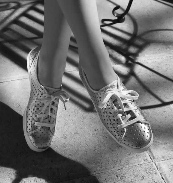
This undying style was captured by lead shooter, Craig Wagner. Craig created this elegant black and white image by doing what he does best: applying just the right amount of light and shadow for a flawless, timeless look. However, Craig isn’t the only star in this production. Did we mention our Portland Studio Producer, Liz the Whiz, is building her hand and foot modeling portfolio? If you want these photogenic stems in your next shoot, contact Studio 3 for bookings. You hear us Keds!? To put it plain and simple, if you’re one of those spring-cleaner’s out there who happens to own a pair of stylish Keds, let us be the first to admit it’s not always necessary to say “goodbye” to the old. Unless you don’t own a pair. In that case, get to cleaning your closet and say “HELLO” to the new! Get off on the right foot this morning and go get yourself a pair of Keds… the only shoe worthy enough to pass under the spring cleaning radar.
Category: Uncategorized
Ciaran Green: Our Newest Team Member!
Always excited to add great talent to the team, we’re proud to introduce our new addition: Digital Artist Ciaran Green. Read about his rock’n journey all over the world and how it ultimately led him to Studio 3!

“It is a very exciting thing for me to reflect on how I have become the newest digital artist at Studio 3. I grew up in the great Northwest and always had a strong passion for the creative arts. As a child, I would often find sketching and painting far more compelling than school work. By the time I was in high school, all my elective courses were art classes. I would draw, sculpt, build, and paint when I wasn’t sitting in math class or playing soccer.
I graduated high school with an art scholarship and decided to attend Portland State University as a Fine Arts Major. After a few years in the city, my sense of adventure kicked in and I moved to Tucson, Arizona with my brother. At that time, poetry and music peeked my interest. I traveled slowly through California and made my way back up to Portland where I started a band with some friends. We played in venues throughout the west coast and I bartended to help fund the process, but ultimately, finishing school and returning to the visual arts is what I really wanted to do.
This led me to the decision to move up to Seattle and concentrate on my education once again. I attended the Art Institute with the notion that if I wanted to be an artist moving forward, I needed to dive into the digital realm. I graduated with honors receiving my Bachelor of Arts in Media Arts and Animation. Shortly after that, I began to work in Seattle with a photography company that wanted to incorporate computer graphics to help composite photo-realistic images and create animation. For five years, I became a 3D generalist and gained valuable experience in all things digital art related. I recently moved back to Portland after some extensive traveling to Mexico, Ireland, Thailand, and Laos. I feel very fortunate to begin working in the creative professional environment again with such a fantastic company. Thank you Studio 3 for this excellent opportunity.”
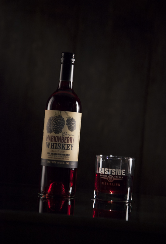
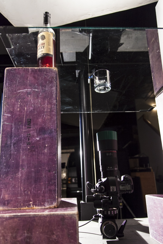
Happy Hour with Eastside Distilling
It’s 5 o’clock somewhere, right? Well it sure is here at Studio 3! Join us for a glass (or two) with Eastside Distilling! Introducing their newest flavor, the sweet and delicious Marionberry Whiskey — made with Real Oregon Marionberries!
A review of the new liquor from Willamette Week’s Matthew Korfhage mentions “…it does not cloy, and the flavor maintains just enough complexity that it cries out for curdy after-dinner cheese and grassy tobacco to stuff into a pipe. Holy shit: It’s exactly what Hobbits would drink. We would too. Recommended.”
Studio 3’s review: “Yes. More please.”
Our very own Director of Video Production, David King, makes our mouths water with this classic and cheerful 30-second clip of this tasty treat.
Thanks to Koerner Camera Systems for lending us the P+S Technik Skater Mini Camera Dolly, David was able to match the smooth transitions and angles of this clip with the smooth taste of the drink. Notice in the video how we made it rain? Yea, we do that. Here you see Lead Photographer Craig Wagner assisting David by filling a developing tray that we spray-painted black, with water. This gives off the mirroring infinity pool look. With the brown wood backdrop, and glossy tabletop finish, we have a classic polished clip of tabletop cinematography.
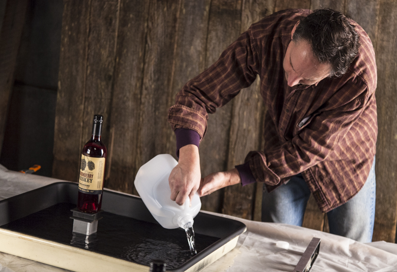
Studio 3’s teamwork did it again. Thanks to David King’s vision and assistance from Craig Wagner and Jonny Brandt, we were able to produce a classic clip of fine drink. We’re sure that the drink on-set helped them feel a bit more inspired and “spirited” 😉 As always, great job boys!
Slammin' Body Art for Digital Artist Carl Beery
Digital Artist Carl Beery brought in something new to work this morning — a great big tattoo! Congratulations, Carl! But what does it all mean? Carl writes:
I’ve often thought about getting a tattoo. Something that exemplifies my manly personality and follows the delicate contours of my muscular yet shapely bod.
I didn’t want to “start out small” and then “move up.” Sorry, Nancy, that’s not my style. My personal motto is “Go big or go home. Take it TO THE $@#&*% LIMIT.” But that is WAY too many words and symbols for rad ink. What typeface and kerning would I even use? Besides, I wanted my bold tattoo to supersede the xenophobic barriers of “language” and “literacy.”
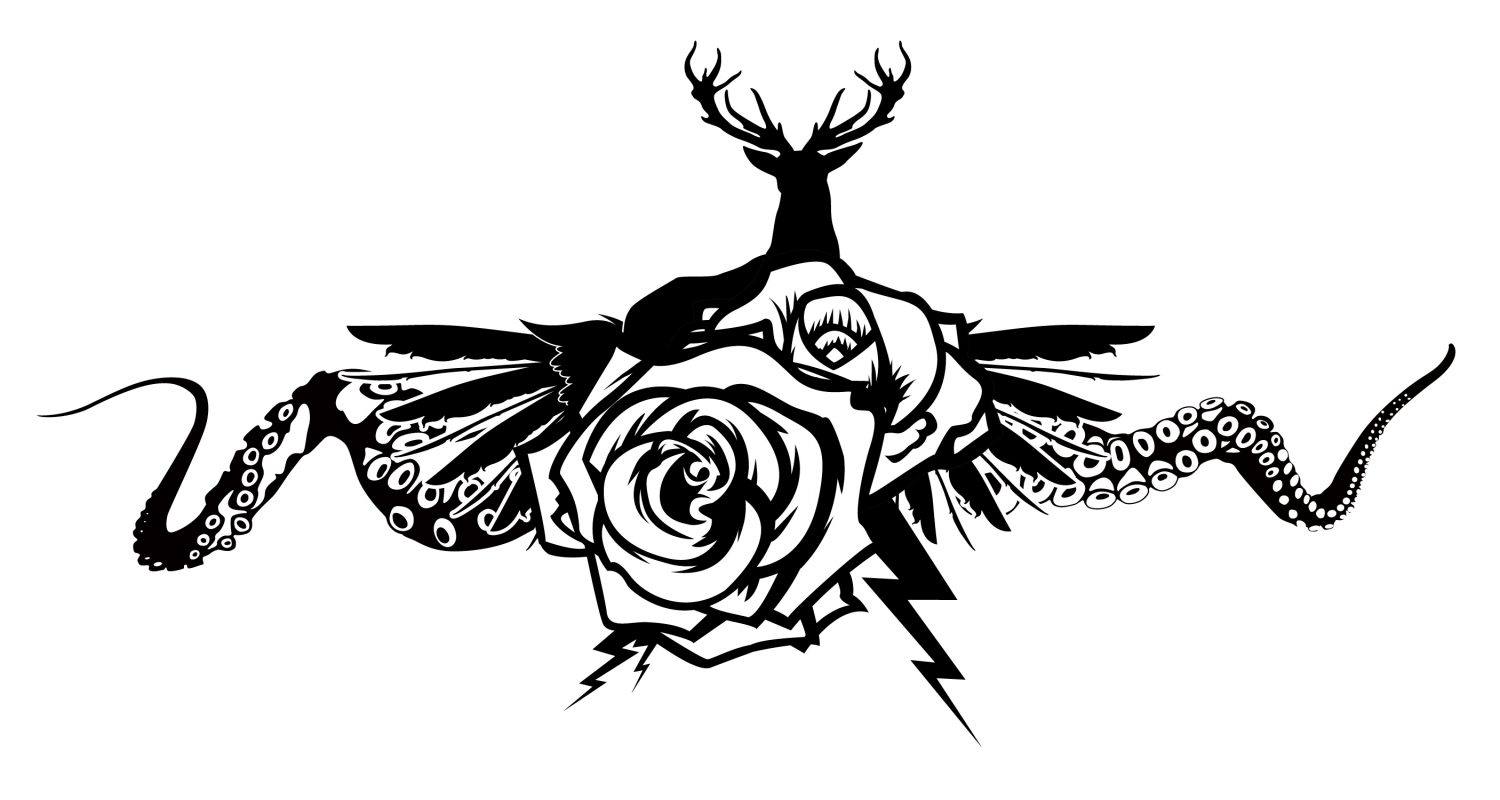
As a kid, my favorite animal was the octopus. To me, they were the bee’s knees of the animal kingdom. I recalled that when I was learning to swim, the only way my dad could get me to put my head underwater was to tell me that there was an octopus in the swimming pool. So I needed octopus tentacles on my awesome tat to remind me that people you trust will “sucker” you into achieving their own selfish ends, and that life is but a series of bitter disappointments. (There was no octopus in the swimming pool, if you were wondering.)
A rose. I also needed a rose or two in the design to symbolize my passion. Also, I’ve heard myself described as “A very thorny dude.” Don’t get too close, I’m barbed wire.
I wanted some lightning bolts in the design. I couldn’t think of a better way to illustrate how my blank stares far off into the distant horizon are suddenly interrupted with a flash of razor-sharp wit and biting sarcasm. (Usually from someone else’s mouth, but occasionally from my own.) I still wonder why my parents named me “Carl” and not “Ka-POW!”
Wings. Wings would demonstrate my inborn ability to see things from a great vantage, and to be above it all. Also my humble and angelic nature. Not only that, but wing tattoos were really cool about 6 years ago! They are nearly timeless!
Finally, I needed a silhouette of a stag. Personality tests I’ve taken – mostly while heavily sedated and in restraints – have concluded that I am not a strong alpha-type. I can only assume that means I am the Meta-Alpha-Type, The Leader of the Alphas. I wanted to let everyone who saw my tattoo know that I was their true torchbearer, The Mostest Chosen One.
I had my Malaysian team art-work the design, while I labored over the last big question: Where on my fancy bod do I place it? Arm? Nah, on these guns the design would either look too puny or cost a small fortune in ink. Thigh? Hmmm, that’s getting warmer. But the same issue with ink cost — they’d need a couple of barrels of ink to cover these tree trunks. Chest? No, nobody has wings on their chest, c’mon! I chose having my studly tattoo done on my upper back.
When I presented the final design to Jack, my tattoo artist, tears welled up in his eyes. He began to tremble, his chortles of sobs professionally confined behind his emotive grimace. Obviously, he was overcome with the beauty and rich symbolism of the Malaysian design. Just the effect I was going for. Once he’d composed himself enough to speak, he asked, “Aaarrr you sure you want this?” I knelt down and bowed. With confident humility I said, “Yes, Sir. I am worthy of this body art.” He asked where I wanted my first tattoo. I spoke with conviction, “Give it to me on my back, Cap’n Jack!”
His emotions collapsed to an unbridled joy. Jack let loose an effulgent belly laugh which sent his facial piercings and chin braids swinging fore and aft, port to starboard. Still smiling, he suggested moving it down a bit. “It’ll be less painful if it’s not on your shoulder blades, me matey.” “You’re the artist,” I said.
After a few achy hours under Jack’s gun, my body art was finally complete. I was awash in a golden glow of wholeness and self-actualization. My co-workers Alex and Megan are astounded by the raw power and awesomeness of my new skin, and how it exemplifies my true nature.

Happy April, everyone. Please don’t do anything foolish.
Throwback To The Future!

“Roads? Where we’re going we don’t need roads!”
We’re taking a flight back in time with Fluke Manufacturing! This week we’re busting out the film strips and having a flashback to the days of pre-digital shooting. Our Lead Shooter Henry Ngan captures the era in this classic Fighter Pilot Tech shot on film! Henry and the rest of the Studio 3 crew had a blast working with Art Director Val Kurita, who now Product Manages Chaudiere Design, Inc. in Seattle, WA. And with retired successful Graphic Designer Gary LaComa who is currently creating Fine Art Photography , you can check out his gallery at Saatchi Art and shop on Zentopia to snag some of his beautiful art work. Gary hops in the time machine to share a few words with us about his tenure with Studio 3…
“This image was a core brand image for a new product introduction for Fluke Manufacturing. It was designed to be the visual icon for this new product in advertising, print collateral, and point of sale posters. The overriding concept of the product was “speed” which lead to a vision loosely visualized in my head and sold to the client. The client’s trust in us to deliver the goods was the primary reason we got this project. It was a very important introduction that the company had invested in heavily. The stakes were high.
…It was always exciting working with The Boys and getting the results we did on this and many other projects. This campaign, built visually around this image, was a huge success for the client.
I would like to add however that I chose to work with Studio 3 on many of my clients projects over a decade of effort for 3 primary reasons. First their technical expertise. Henry and his support crew were, and always has been, technically way ahead of their time (even back then). This image was actually created in the camera and on film, unlike today where a computer screen and digital manipulation reign supreme. Second reason was their attitude about working as a team. Unlike many photographers, they allowed me to work with them in the trenches. We worked together hands on… as a team. Many photographers are less than enthusiastic about this collaborative style of work and prefer that you sit in a chair and yes/no “their” creations. Third my confidence in them to deliver. I knew they/we would deliver the product we sold and to do it efficiently and within my client’s budget and schedule. “
It’s always fun sharing these stories from way back in the day!
Once upon a time..
Once upon a time, believe it or not; everything wasn’t touch screen – actually there were no computer screens. There were keyboards that physically printed what you typed, ink involved in every word, and a bit of old class before the smooth cutting edge of technology took over the world. Introducing the vintage typewriter! In watching the recent Oscars Award Show, we were taken away by one of the sets background that was decorated with over 100 vintage typewriters. It was so simple, fitting, and brilliant. Placed behind presenting and award winning celebrities, it stood as a star on its own. The Typewriter Talk Blog shares with us a few snapshots of Robert DeNiro and Penelope Cruz presenting an award with the typewriter set decorating the stage behind them.
Luckily, Liz, our Producing Whiz, rambled through her box of vintage goodies and found her chic turquoise vintage Smith Corona Typewriter that had collected dust and needed it’s time to shine again. So we snatched that beauty and put it in the spotlight.

Here’s how to score your very own vintage typewriter! Have a little fun with it, use it as a beautiful backdrop like the Oscar’s, set up a clever photo shoot, or make sweet sweet music like Martin Breinschmid!
It's About That Time..
We’re springing forward with new technology! Studio 3 is keeping up with the recent time change with the new Samsung Galaxy Smartwatch! Inspired by losing an hour this past weekend, we thought we would focus on the hottest watch around. According to the Wall Street Journal and The New York Times, wearable devices are catapulting into todays market! This snazzy timepiece is compatible with the Galaxy Note 3 and other Galaxy smartphones. You can place and answer calls directly from your wrist, how crazy is that!? With this clean accessory, you get style and substance. Pairing with that, we had Senior Shooter David Bell work his magic with lighting to enhance the clean smooth timepiece of the future. Once the smartwatch presented itself as inspiration, we had David Bell run with it:
“Hip and happening are always connected, you gotta love technology! Very cool Samsung Galaxy Smartwatch that keeps you connected all day. The shot is inspired by the fact that it works where you are. Clean and simple, like the watch.”

Excited about the new wearable technology addition to our wardrobe, Studio 3 did some research on what this sexy little device can offer. Check out this commercial showing the ‘Evolution’ of the dreamed about futuristic watch that became real…
http://www.youtube.com/watch?v=32_cZvpx3D0
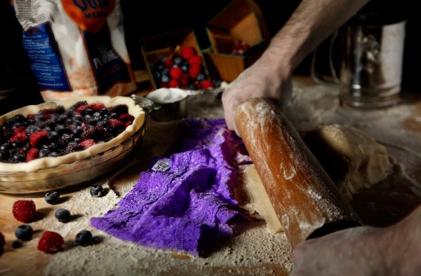
Panty Pressing Fun!!
In celebration of the world’s naughty, but nice holiday, food photographer David Bell got inspired. He created a photograph with a mix of pie, panties, and fun. It was fun for the studio to get involved in a strange photograph that incorporated food and naughty bits. Read on for the photographer’s words on this crazy shoot…
Sexy Panties – Check
Berry Pie – Check
Her two favorites ~ Ooooo this will be a Good Valentine ! ! !
Creative Direction – Shoot a fun interesting eye catching image of hands at work. Shoot it the way I shoot food, my pretty lighting and shallow focus
Art Direction – Push it…push it more !
Fun times making fun images . . yes it is a good day-David Bell
This shoot of course was not complete without our trusty producer Megan. She was nothing short but in the Valentine’s Day spirit and making this image one of a kind.
When the idea of a juxtaposed panty/baking image was initially thrown around, we all thought it was quite naughty and figured we should give it a whirl!
As the producer, I was charged with the task of prop shopping and finding the hero of the image…the perfect pair of panties. I hit Nordstrom and Victoria’s Secret HARD.
I had about A LOT of options, ranging from a perky, floral magenta to a black satin number.
Our first pick was a multi-colored, tie-dyed pair that, to me, represented a mixed berry concoction. That was looking pretty groovy, but ultimately a vibrant purple pair caught our eye and ended up being just right!
Chris Eltrich, our fab hand model, says that “It was a dream come true” to be that close to a pair of women’s underwear. Just kidding. But really.-Megan Nolan
As you can see, we absolutely love this fun image!! And from everyone at Studio 3, Happy Valentine’s Day, and we hope you have a fantastic day with your sweetie, your friends, or your cat. Whatever, makes you feel the love!!!
The Sweet Change Of Seasons!!

In the change of seasons, we at Studio 3 like to capture the highlights of what each period has to offer. Here, we’ve highlighted the rustic winter feel with its bright beautiful contributions. Senior Shooter David Bell goes in depth about his inspiration behind the shoot:
“This is one of a series of 4 shots. The harvest season was coming to an end, winter was starting to set in. I wanted to show the beauty and pretty color of the season. The dark wood and lighting with longer shadows is indicative of winter. The sun is low and we have shortened days with more darkness. Within this is the pop of colors of the season. I am always so happy to see the Satsumas return to the market. They are so bright, sweet and refreshing. The bright green leaves contrasting against the bright orange is always a treat. The rich red color of local Tart Cranberries along with sweet earthy brown Chestnuts make for delicious feast to the taste and eyes.
Pretty dappled lighting created in studio with strobe light captured with a Hasselblad camera with a longer lens to compress the elements. Bringing all of this together.”
– David Bell
Below, are the rest of the series. These gorgeous shots embody everything David spoke of. What a great way to bring bold and beautiful color to a dark and cold season. The pop of color helps us prepare for what the upcoming seasons will bring! While we wait for the sunshine, it’s warmth, gardens of colorful flowers and bold greenery to make it’s comeback; we can thank David for reminding us to skip the hot chocolate and slices of pie every once in a while, and enjoy the sweet delicacies that nature has to offer during the winter season.
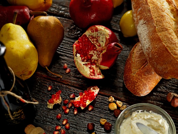
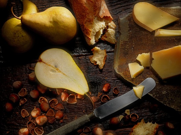

Happy sweet change of seasons!!!