The school year is here but before you say goodbye to all the summer festivities, remember there are still plenty of weekends to salvage the warm weather and sparkling sunshine. Which, as we know, is especially important to us PNWers who are used to…let’s say… a “shadier” type of living. It’s like we all announce, a packed week calls for a packed weekend!
Here at Studio 3 we LOVE cookouts. So why not sneak in one last backyard BBQ full of salad, sangria, and salmon?
It’s always great to start with fresh ingredients from Portland Farmers Market.

Easy tip: Use the Chef’n Citrus Juicer for a delectable topping to your salad.

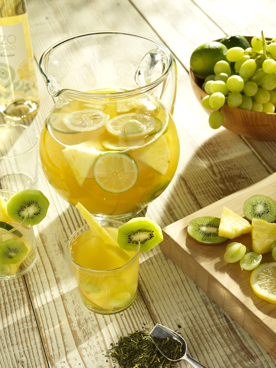
When you’re waiting for your charcoal to heat up on the grill, why not whip up this Sangria recipe made with Stash Tea.
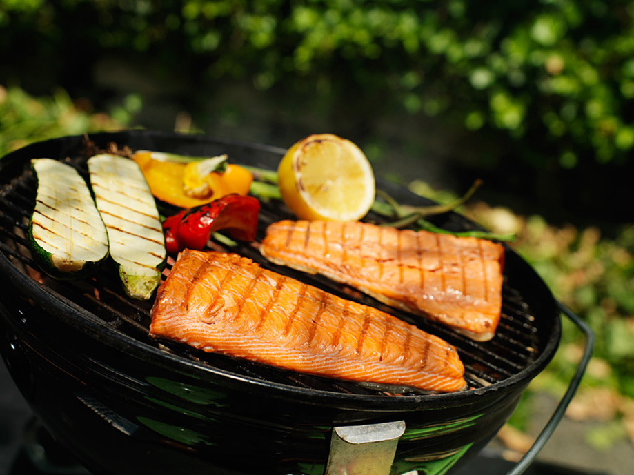
Grilling adds smokiness and texture to your salmon – it’s also an essential for any sort of backyard meal. Are you fishing for the perfect salmon recipe?
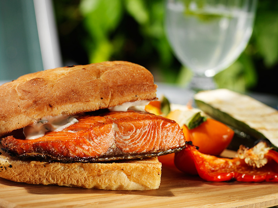
Fall is around the corner but there’s still time for fun. Enjoy this meal and remember to soak up the sun. (and DRINK!).
Category: Photography
17 Ways to Get Your Clients to Love You: A Studio 3 Guide
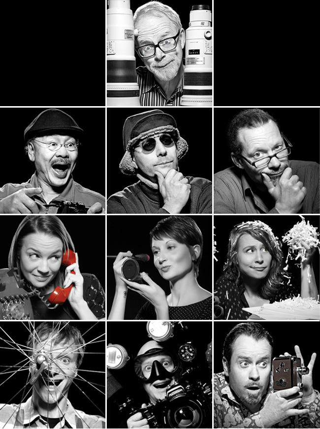 We’ve been in business a long time, working with some clients for a decade or more. To us, the client relationship is paramount, and we go above and beyond to nurture it. What would you experience if you were a client of ours? Here are some direct quotes from our Team Members about what we mean when we speak of “Studio 3 Customer Service:”
Client Relationship Manager Jessica Lynes:
We take the time to anticipate our clients’ needs, ensuring that they have exactly what they need/want before they even know that they need or want it!
We always have their “favorites” when they’re here: foods, drinks, music, etc. is met with a “Wow! Thank you so much, I can’t believe you remembered!”
Portland Producer Liz Swales:
We get the client’s job done: efficiently, flawlessly, and simply, while exceeding their their expectations.
We take care of them like royalty…AKA feeding them fun and amazing food!
Chaos Wrangler Niki Gillespie:
We streamline the behind-the-scenes details to ensure the smoothest client experience. Clients love our process but never are over-aware of it. No bottlenecks.
Seattle Producer Kaitlin McMillan:
We will do anything! If the client wants it done, we’ll get it done for them – no hesitation or questions. Any budget, any client, any person, any product… we have a solution for even the most difficult of requests.
We create an “atmosphere” while a client is on set: you can bring your laptop and do work, you can play ping pong when you’re just here tagging along for a shoot, you can watch the news and drink coffee with your feet up on a couch. We inspire creativity and hard work all while in great company.
Digital Artist Carl Beery:
Clients appreciate our experience in pre-media print and web production. Knowing how print collateral and websites are built helps me ask the right questions before problems arise.
Years of experience interpreting markup also helps us make the edits that clients want to see, ensuring a flawless final outcome for all.
Digital Artist Tom Radio:
We make the impossible POSSIBLE when it comes to post-production!
Video Director David King:
We care about building relationships throughout the creative process and we keep client satisfaction as our #1 goal.
Photographer David Bell:
Listen. Pay Attention. Make them the most important thing happening then and there. Make it fun.
Photographer Craig Wagner:
We always try to give our clients more than what they’re initially asking for (like different angles on the same setup), and we are ultimately flexible when working. We won’t consider the creative brief set in stone, and are bold enough to run with an idea, which clients appreciate on set.
Photographer and Studio 3 co-founder Henry Ngan:
By offering them any level of service they need to make their projects a success.
By thinking out of the box creatively to provide a unique vision and fresh look.
Photographer and Studio 3 co-founder Jim Felt:
We always follow through on our promises.
We care about the future relationship with every single client. We value their friendship and the ability to create fun images for them. We are proud of our relationship with each and every client, large or small.
Can’t wait to experience what it’s like to be a Studio 3 client? Reach out and bring us your next project. You’ll experience all of the above…and more.
This Photograph Inspired My Entire Career: 4 Professional Photographers Weigh In
At Studio 3 we have a number of talented professional photographers ready to take gorgeous, arresting images for any client need. But all photographers, even those at the pinnacle of their careers, got started somewhere. Often it was a single, iconic image that ignited the creative passion. For example:
Jim Felt, Photographer and Co-Founder of Studio 3, Inc.
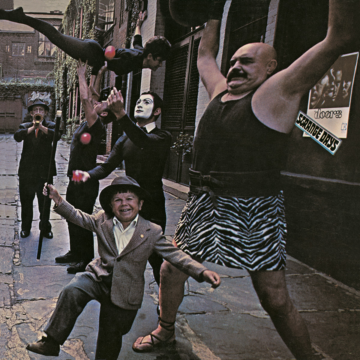
For Studio 3, Inc. co-founder Jim Felt, the iconic photograph that inspired his love of the FUN side of photography was the album cover photo from The Doors’ Strange Days. Shot by Photographer Joel Brodsky (with much of it put together on the fly with minimal budget), this photo spoke to Jim’s love of the absurdity of life. Up until he saw this photo, Jim says that he shot mostly in black & white and didn’t like color photography that much, but this photo spoke to him with its moody monochromatic palette. As a photographer he was drawn to the idea of directing any scenario imaginable and shooting it, and thought it so much fun to see the details throughout the image that wrapped all the way around to the back of the CD (where the band’s portraits were relegated!) (Interesting story behind the photo here.) Radical for its time in that it was album cover art that didn’t depict the band, this photo captured Jim’s attitude to photography in genera;: that we shouldn’t take it so darn seriously because it’s so incredibly FUN.
Jim Felt specializes in portrait, large vehicle, and lifestyle photography. His photos often depict a lot of things happening that draw you into a picture with fun and interest.
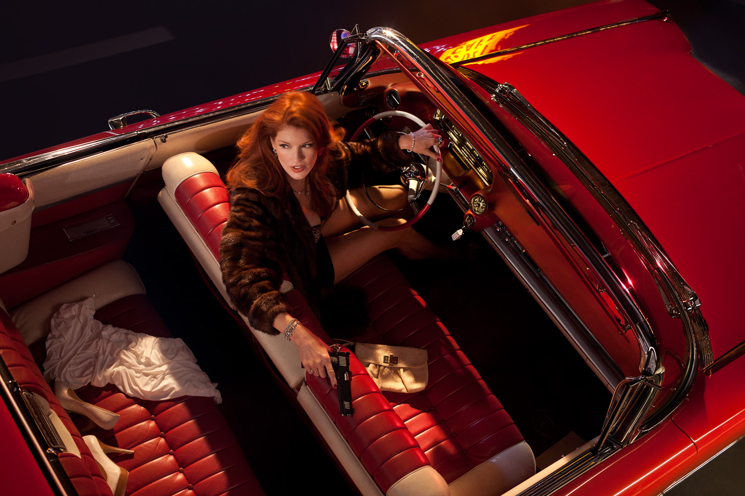 Lifestyle photography by Jim Felt.
Henry Ngan, Photographer and Co-Founder of Studio 3, Inc.
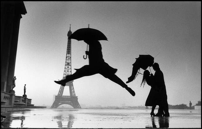
For Henry Ngan, the other co-founder of Studio 3, the French master of candid photography Henri Cartier-Bresson proved most inspirational. This particular photograph, he notes, shows Cartier-Bresson’s ability to capture the moment as it happens. The photographer carried a small 35mm Leica camera in an age when the professional camera was huge – and he did this in order to be able to shoot spontaneity unobtrusively.
Of Cartier-Bresson, Henry says: “He inspired me to capture the decisive moment.”
No matter how big or complex the project, Henry embraces all challenges and always makes the cutting-edge look its very best. A master of texture, he specializes in product, large vehicle, and technology photography.

Vehicle photography by Henry Ngan. (Shot while sitting inside a large Caterpillar shovel and hoisted aloft to get an aerial view!)
Craig Wagner, Photographer
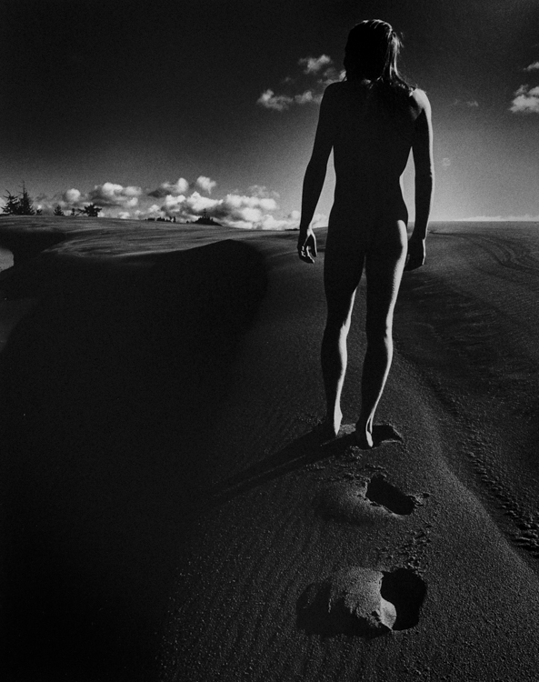 Craig Wagner originally started as a Photography Assistant at Studio 3 many years ago. For Craig the photograph that inspired him the most at the beginning of his career was Omega by Shedrick Williames (above, from Craig’s personal collection). After hearing a talk by Williames in his college class, Craig sought him out to apprentice for him. Williams (or “Shad” as he was known to friends) took young Craig under his wing and taught him high standards for black-and-white photography and his exacting methods for quality prints.
Craig says, “I still enjoy this image of his, the sense of isolation: a new beginning for Man. I feel that even today the statement he may have been making is still current.”
Craig’s photography exhibits a depth of tonal ranges, bright colors, and stellar lighting. He is known for large product, vehicle, beverage, and indoor/outdoor photography.
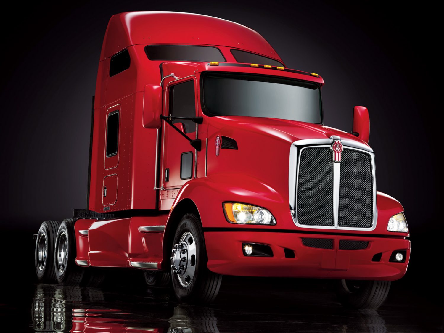
Vehicle photography by Craig Wagner.
David Bell, Photographer
![]()
Photographer David Bell has been with Studio 3 for over 10 years, and cites Bert Stern and his great pyramid shot for a Smirnoff ad as his inspiration. Shot on location and the pyramid reversed in the martini glass, all of his work at that time was very inspiring to the young photographer and provided a window into the world of advertising photography. The original bad boy photographer, Stern’s images redefined art and fashion in the 1950’s and 60’s. David was particularly drawn to the bold and graphic nature of this shot, one that changed the advertising world in its simplicity.
David says about this photo: “The light. Waiting for the right light. Beautiful.”
David Bell is known for his dedication to creating delectable food and beverage images and makes each item pop with his expert lighting. He specializes in product, food, drink, and vehicle photography.
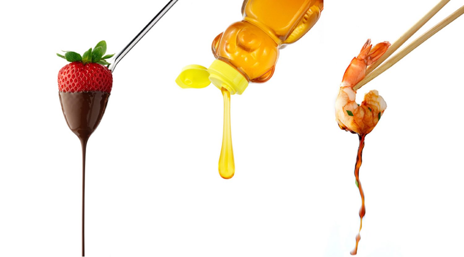
Food photography by David Bell.
Branding = Consistent Photography. So Why It Is So Darn Hard To Achieve?
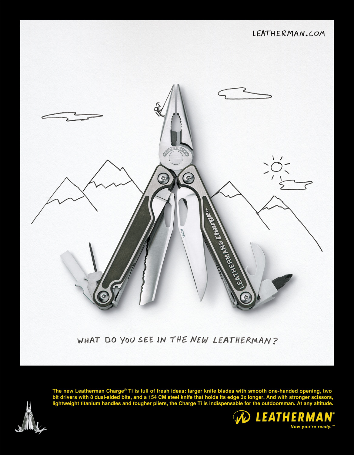
Leatherman advertisement, circa 2012. Photo by David Bell.
We all know that a company’s brand needs to have a consistent “look” when putting oneself out there. Point-of-purchase images, product photography, website design, advertising campaigns, product packaging, social media channels…all need to look as if part of the same company so as not to confuse the consumer and provide a singular branded experience.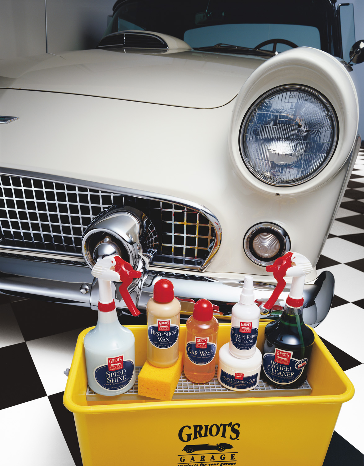
Griot’s Garage is all about products to make your car shine. David Bell’s photography for Griot’s features solid primary colors, checkered floors, and sleek collector cars.
But there are some brands out there whose images are all over the map. You know who they are. When you come across one of their product images, banner ads, or social channels you’re confused momentarily. Could this be the same company…? You definitely don’t want your audience wondering at each touchpoint. Here are 4 reasons why companies fail to show consistency in their branding photography:
1. Switching up your visual content providers too frequently
Playing switcheroo has become an issue for some brands when it comes to visual content. Often on to newer, more buzzworthy, largest online following…whatever is the latest and greatest, some companies are quick to jump on the popularity bandwagon. But does that really result in stellar, consistent visuals for your audience? Partnering with the latest Insta-star making headlines may be great for grabbing people’s attention momentarily…but does it really make sense for what your brand stands for? It could be a step backwards in your strategy that leads to muddled visuals and a garbled brand message.
2. Different people at the helm taking the visuals in different directions
Advertising, marketing, and branding agencies often suffer a high turnover due to the frenetic, high-paced nature of the work. With turnover can come multiple directions for the visuals when different people are steering the ship. Full steam ahead with all on-board is necessary when going through a comprehensive re-branding…but it takes time for those visuals to resonate in the marketplace and achieve customer acceptance. After you’ve been in business awhile, being more resistant to change (at least regarding the company visuals) can often provide reassurance and the impression of brand stability to the customer.
3. Team members having difficulty working with one another
Sometimes the message comes out garbled because the team creating it suffers from a lack of cohesion. As a vendor, it can be a challenge working with a client team where we get conflicting direction or there isn’t a clear hierarchy in decision-making. Often the resultant image isn’t as strong as it could be because of this lack of focus – something that needs to be addressed and fixed internally before reaching out to your photography provider.
4. Photographers not truly “getting” the brand
You can choose to work with a photographer or studio based on their past portfolio, but you can’t always predict what kind of visuals they will create for your brand specifically. Sometimes, the fit just isn’t right. The photographer just doesn’t “get” what you’re about. The resulting visuals fall flat, or are shaded with nuances you feel aren’t quite representative of the brand. It’s always a gamble trying a new photographer or studio, which is why once you’ve found a clear winner, you want to stick with them for life.
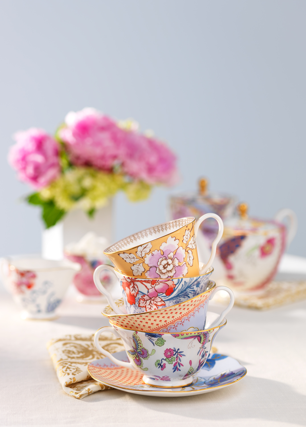
Craig Wagner’s shots for STASH Tea feature brightly-lit whimsical setups, often with Studio-created “natural”-look lighting.
Studio 3, Inc. has been shooting photography and video for a number of brands for years (in some cases, a decade or more!) As Leatherman has noted:
“Someone like David Bell has 10+ years of shooting Leatherman tools, so there is no need to train anyone in our brand guidelines each time we need images. Having that partnership [with Studio 3] has allowed us to develop the “look” of Leatherman over time, providing that consistency of visual representation of how people see our tools, which is valuable.”
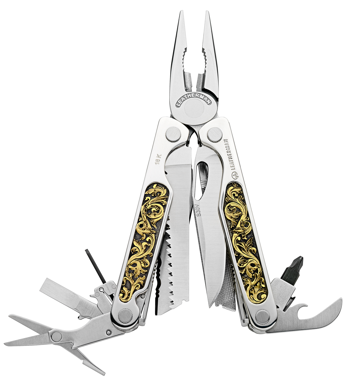
Leatherman’s photography is high-contrast to showcase the intricate detailing on each multi-tool, often open with all the tool options visible. Shot by David Bell.
Dare to do something different by staying the same. Your branding will thank you for it. And your customers will, too.
Before & After: Put Your Best Foot Forward with Studio 3's Shoe Photography Retouching
 Shooting modern athletic sneakers is actually a complex art. Studio 3, Inc. has shot a variety of footwear over the many decades we’ve been in business – in fact, shoe photography is one of our specialties!
The colors in modern sneakers pose many issues for post-processing and retouching work. Why? Because the 80’s are back to stay – and the eye-searing bright neons, pops of complimentary color, and swaths of new textures can fight for dominance in the photograph. Placed side-by-side the different colors and textures are a major selling point for the discerning consumer…but for the photographer they can be a real challenge to shoot in a way so they appear true-to-life and inviting. Also, the product itself may have certain areas that are less than perfect as-is. Enter the essential Digital Artist, who in post-processing gives all those design details the Studio 3 treatment to make them cohesive and the product a total stand-out.
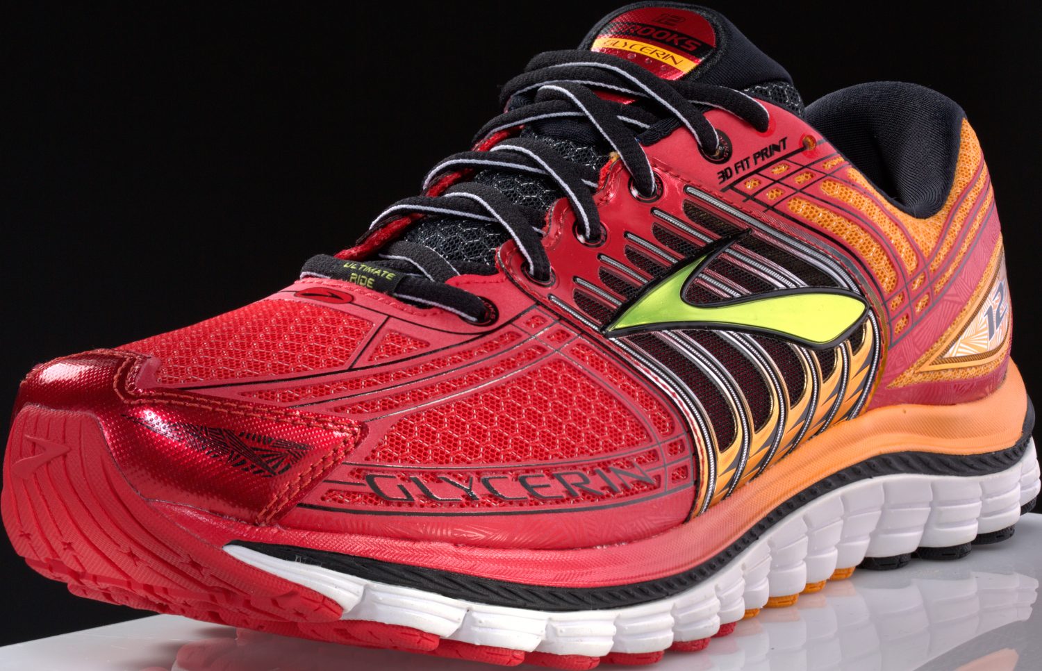
The Before photo: color looks a little “flat” in areas; adjacent color bleeds; seams need smoothing; small surface imperfections; reflective areas too reflective; logo appears not to as a solid color.
Even with our photography professionals’ extensive lighting and shooting experience, straight out of camera the sneaker presents some issues that a skilled retoucher must address before the photo can truly be called “finished.”
First the minor surface imperfections need to be addressed, including glue in the seams, divots in plastic areas, seams not appearing smooth, stitches being askew, and texture not “reading” when on a reflective part. Then the major color-correction work begins: blacks are darkened to appear “true;” color is mixed with complementary colors to tone down the brightness in some areas. Colors bleeding into areas they shouldn’t are smoothed out and toned down. Any colors that appear washed-out or with other underlying color tones are saturated more to appear more vivid.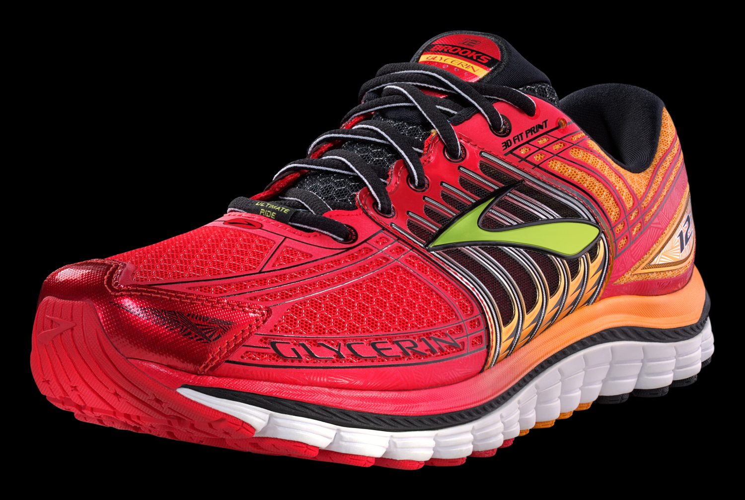
The After: the sneaker appears bright and perfect, just as the brand envisioned.
Then finally the entire sneaker was “knocked-out” (i.e., isolated from its surroundings) in order to be placed onto a clean black background for the client.
Do you see the difference? Which sneaker looks nicer, more vibrant, cooler? Which one do you think a shopper would be more drawn to? Don’t let your images fall prey to the “oh, it looks good enough” syndrome…make sure they POP with Studio 3’s retouching capabilities. Give us a ring to see how we can make your footwear FLY.
Brooks running sneakers shot by Jonny Brandt. Post-processing retouching work by Digital Artist Carl Beery.
15 Delicious Food Photography Images to Get Your Mouth Watering
A significant portion of our business comes from photographing food: all sorts of food, from yummy granola to delectable chocolates to full-on plated meals to gooey ice cream sundaes, crisp salads, and juicy burgers. Studio 3, Inc. is known for the stellar food photography we do. We don’t just photograph the food, we style and present it in the most delicious way possible to get your clients’ – and customers’ – mouths watering, fingers reaching, and minds wondering: who makes that, and how can I get it into my mouth NOW?
Here are 15 of our favorite, most delicious food photography images we’ve shot over the years:
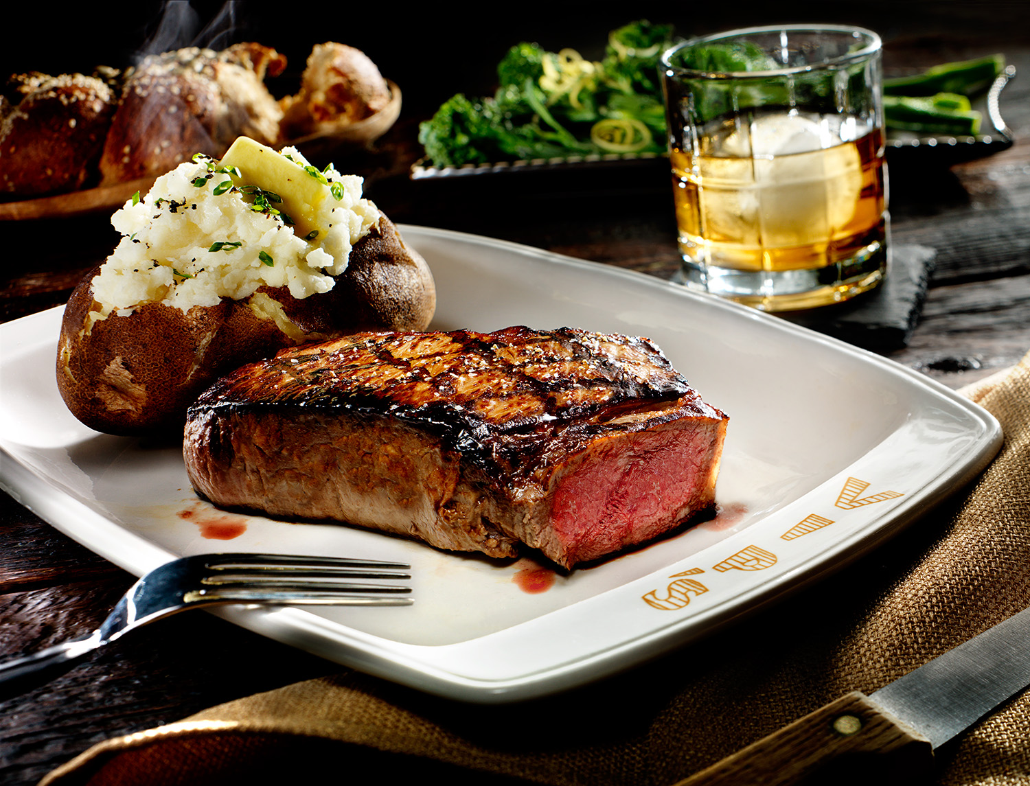 If you run a restaurant and need a hero image for your website that shows off your delicious meals and gets viewers beating a path to your door, we can do that.

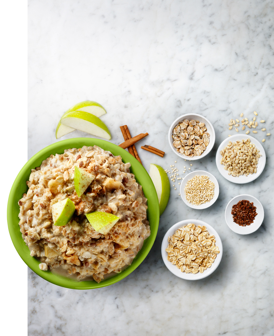 If you are a brand who needs lip-licking packaging photography to catch the consumer’s eye so they choose your brand over other competitors on the supermarket shelf, we do that. (We’ve also won an award for it recently too.)
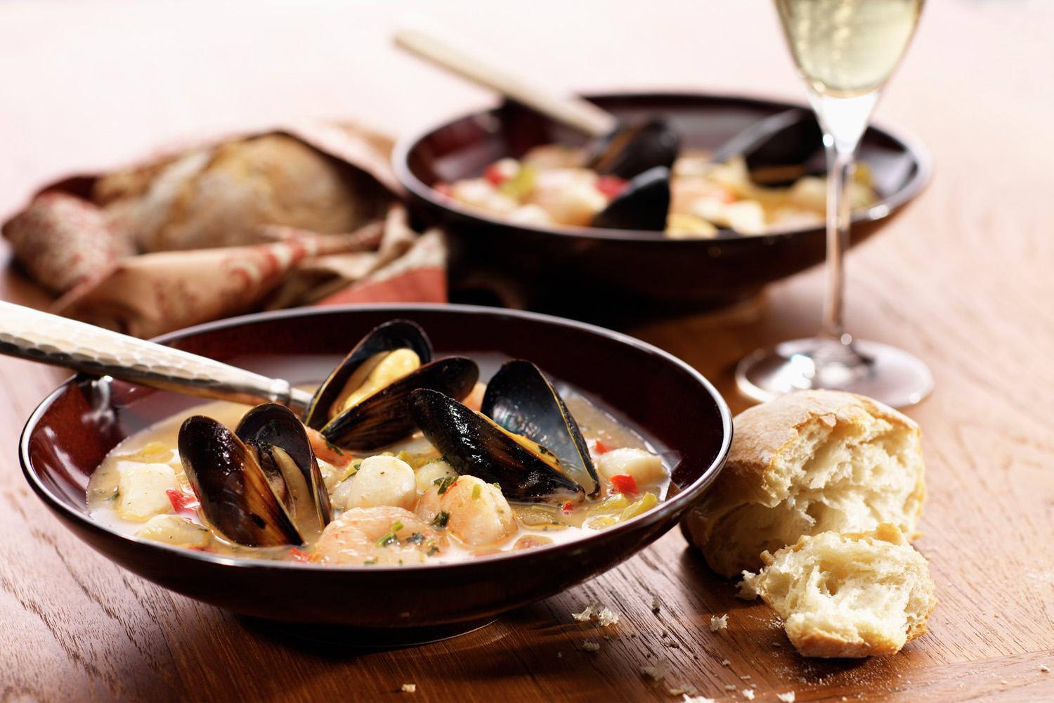
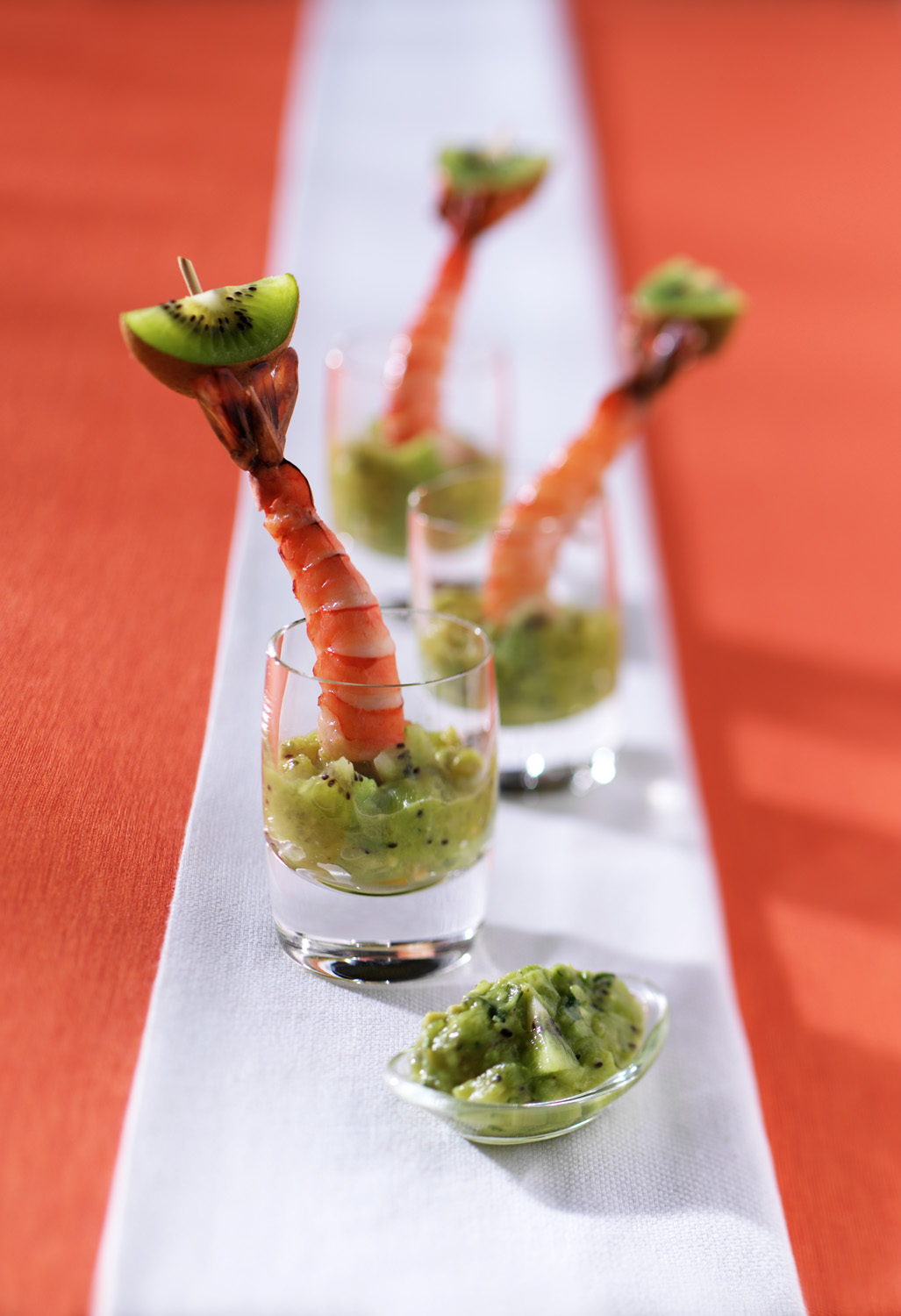
If, as a local pub or eatery, you need gorgeous images for your food menu that makes the viewer pick the special of the day – we definitely do that.
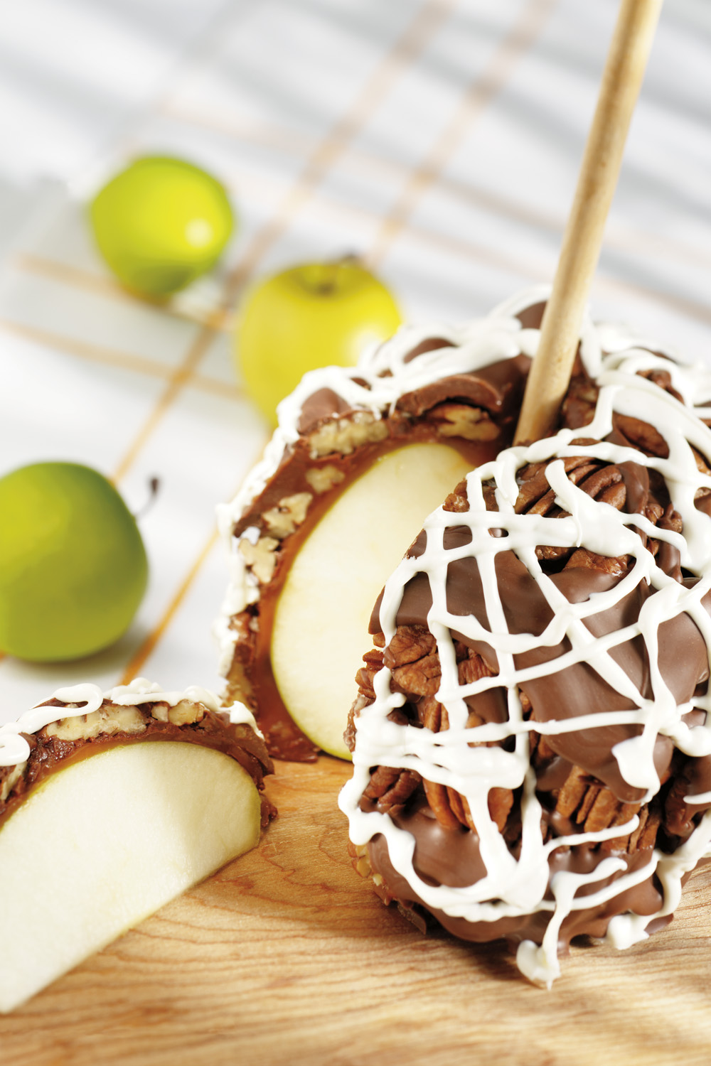
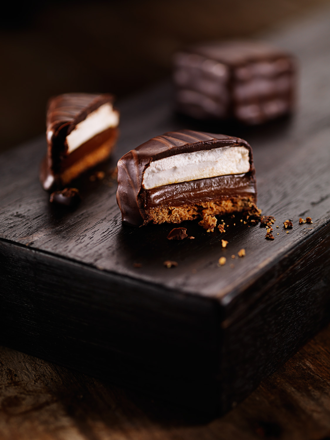
If you need shots of tasty giftable goods for your latest mail-order catalog or promotional pamphlets…so the casual looker takes the next step and fills out an order form…we do that.
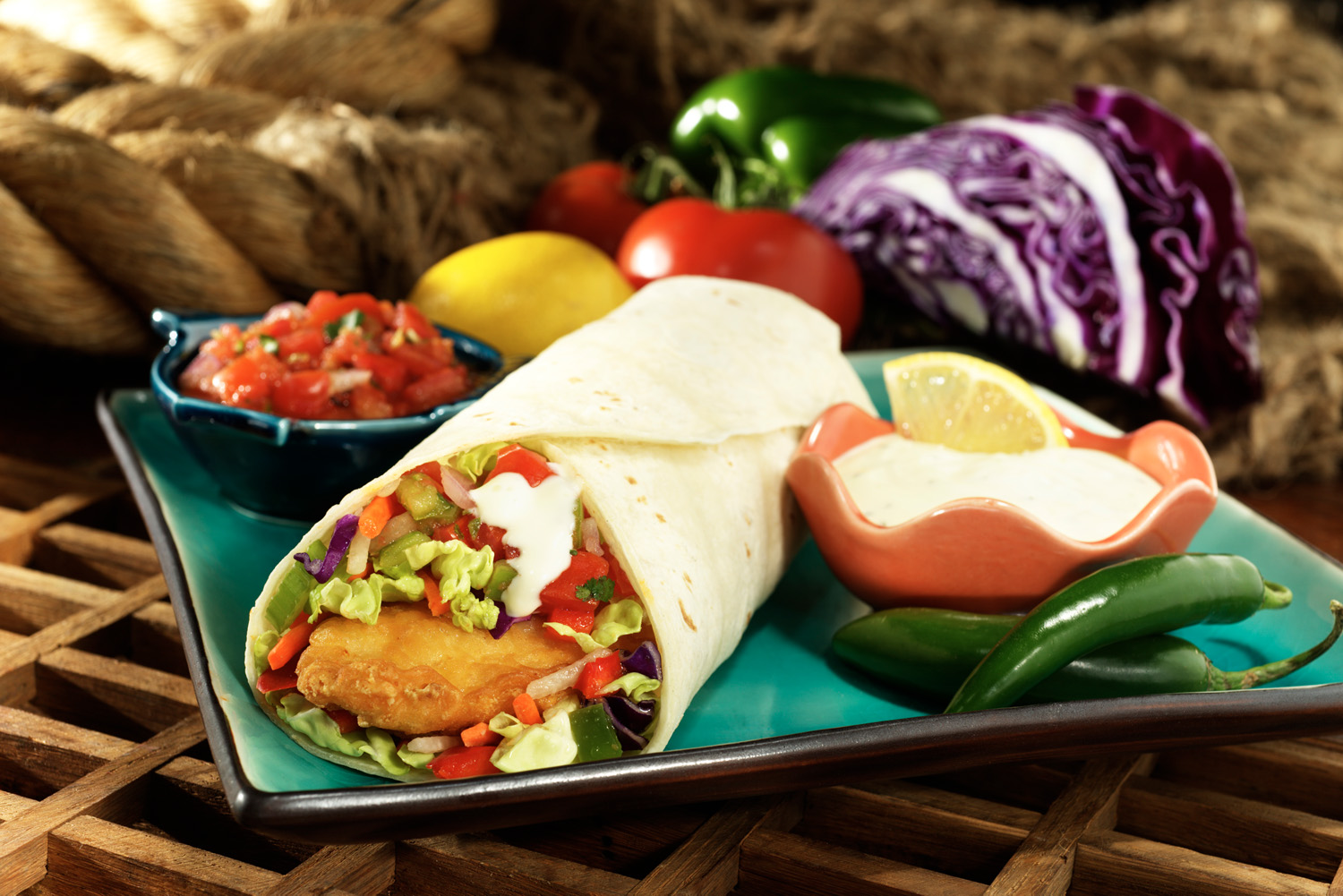 Need a huge billboard-sized image to capture attention from motorists and get them to stop in at your eatery? Oh yeah – we do that too.
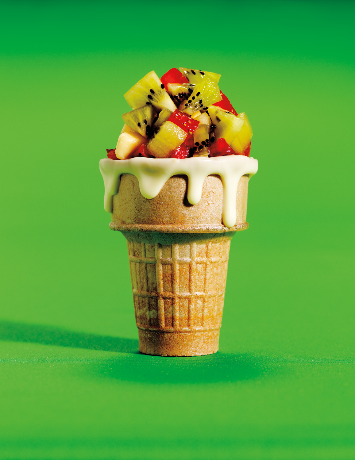
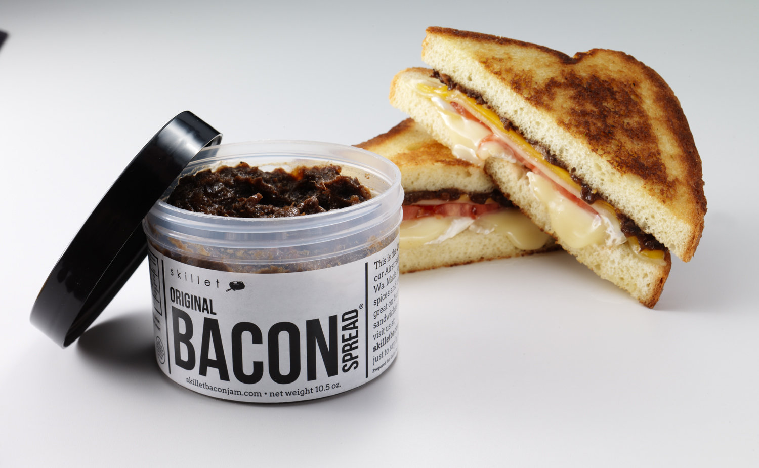
Going to a tradeshow? Well, you’ll need promotional displays and banners for your delectable edible offerings to start to build your customer base from the beginning. We do that!
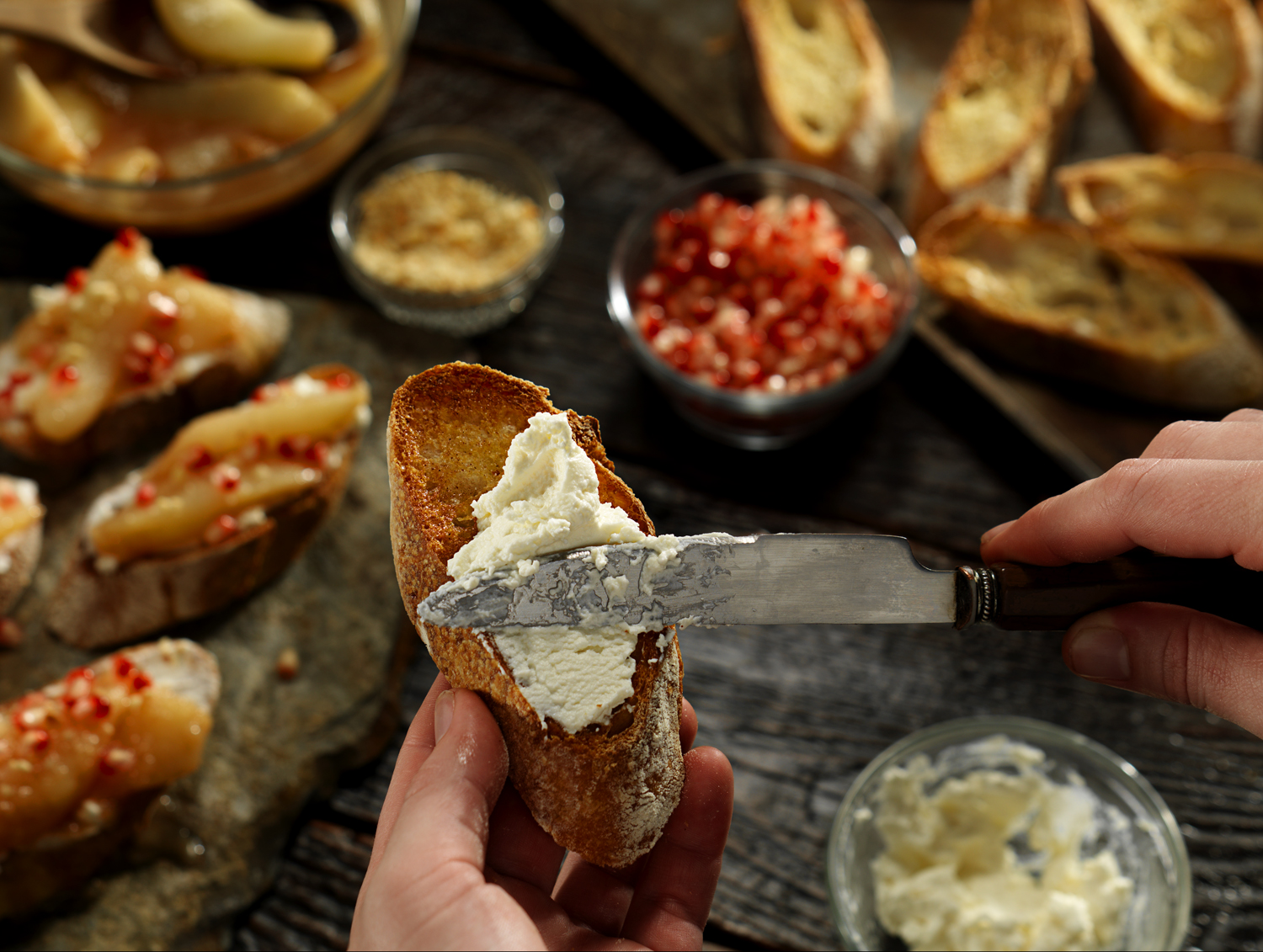
 How about finished recipes, plated delights, and gustatory indulgences? You may need those beautiful images for your food website – and we can provide.
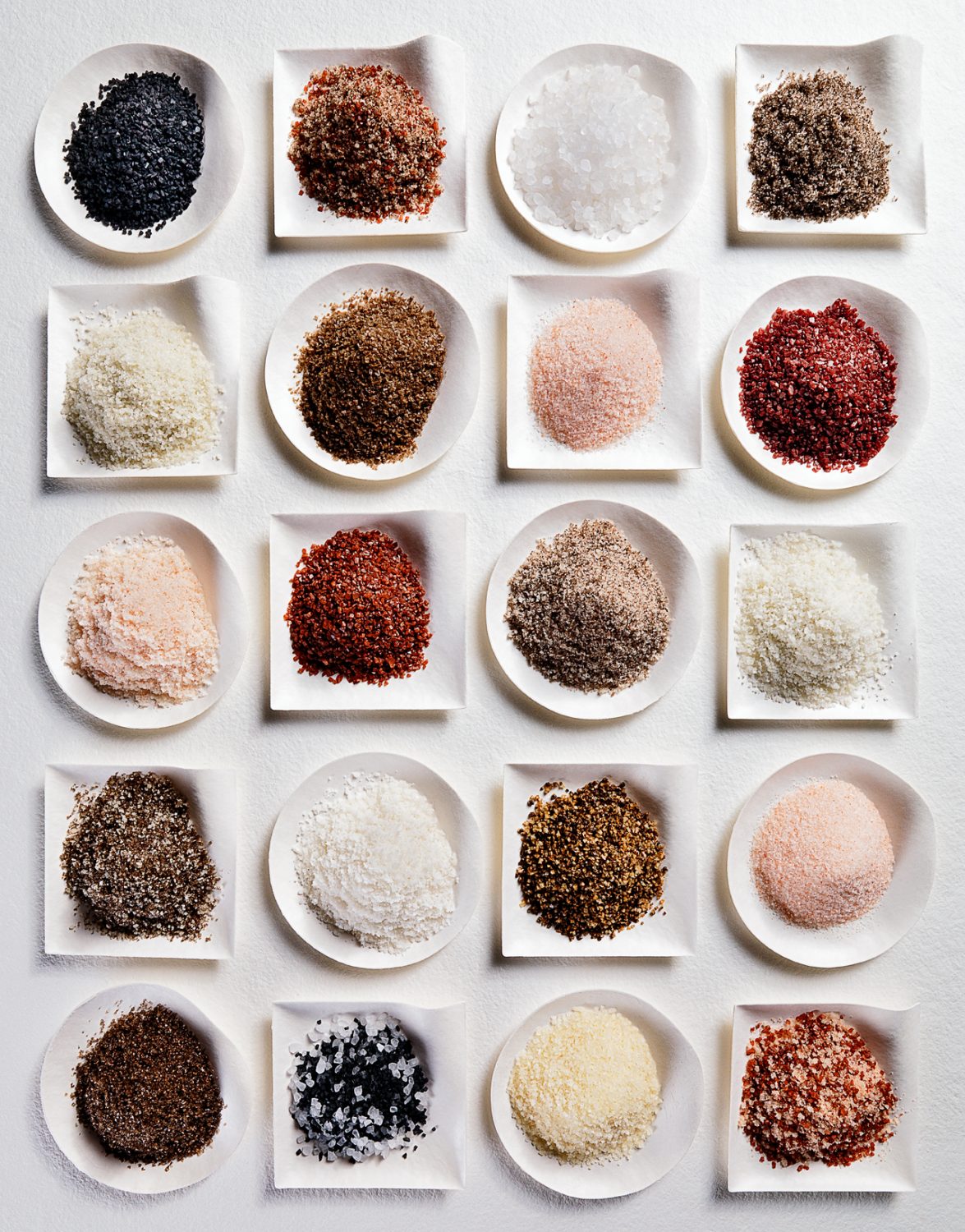
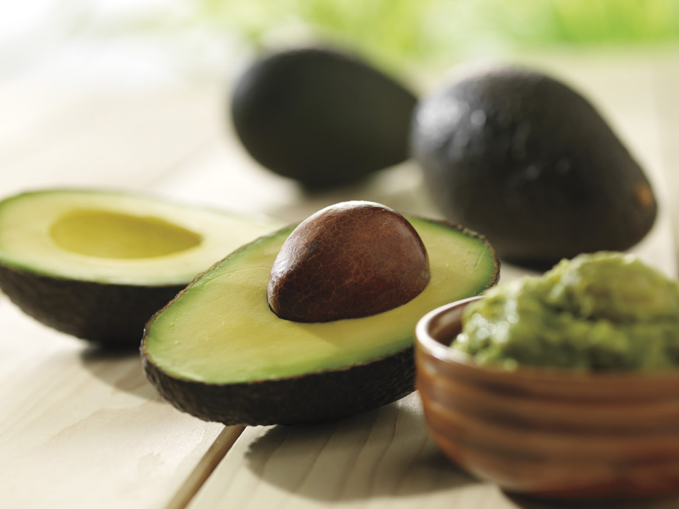 You’re a supermarket, grocery store, or gourmet food shop – and you need POP displays showcasing fruits and vegetables at their finest, bread and staples fresh from the deli, meats juicy and sliced ready for consumption, cookies and treats warm from the oven. We’d be happy to provide.
 How about a delectable magazine cover image that gets the consumer to pick YOUR magazine off the rack because the photo looks so darn delicious they HAVE to know how to make it? We do that too.
If it’s edible, Studio 3 can style it, prop it, and shoot it! And it’s not just about making food look yummy…it’s about creating a strategic image that speaks to the right audience in the right way. We know exactly how. And that’s what really gets mouths watering.
All photos by David Bell for Studio 3, Inc.
Footwear Photography – Jimmy Choo x Voodoo Donuts
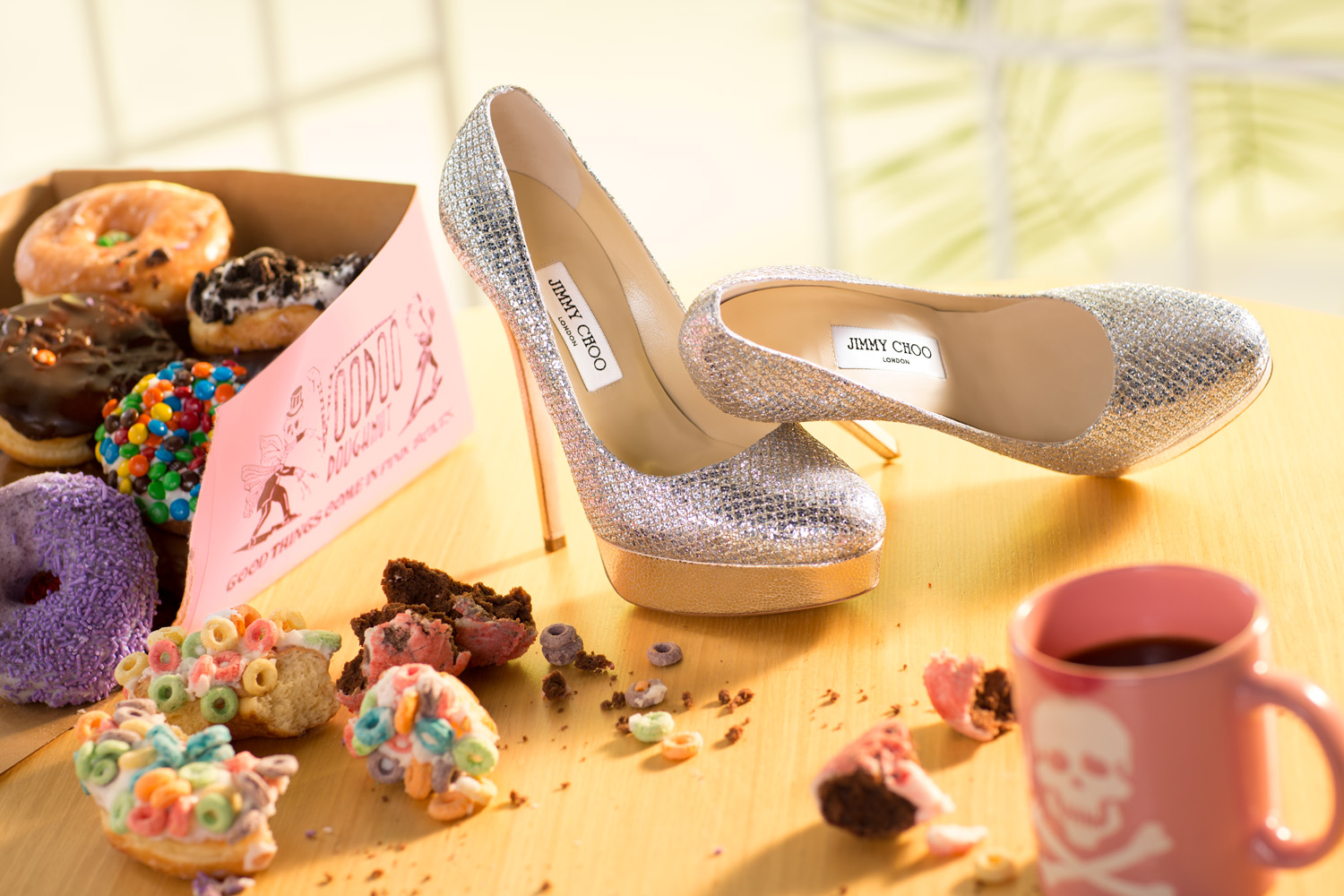
Sometimes a concept has to take a number of disparate elements and meld them together into a cohesive whole. It can be a challenge when dealing with tiny details that can make or break your vignette. When it comes to taking care of all the elements that appear in the photo, WE style it so everything appears at its best.
Take this Voodoo Doughnuts and Jimmy Choo heels project: a footwear photography meets food photography mashup with a Studio 3 spin. Voodoo Doughnuts, an iconic Portland mainstay for quirky and delicious donuts, mixes with Jimmy Choo, an iconic upscale shoe brand exemplifying everything that is luxury. Our Team has years of experience in staging props in a way that feels consistent within a single image. Captured by Photographer Matt Jebbia in a studio-designed environment with a studio lighting setup mimicking early morning sunshine, every element in the frame was artfully arranged to keep the viewer’s eye moving through the photo. Every crumb, every morsel, every donut, every prop: angles, shadows, colors, textures, and sizes were chosen specifically to show each piece at its best and tell a story.
What story do you see when you look at this photo?
And, more importantly, how can we style YOUR images to create an unforgettable iconic story? Reach out and see. We’ll have the donuts ready.
Footwear Photography – Nike Running Sneakers

Stuck in the creative process? Need a visual partner that really gets your brand and your customers? You can bring any brief to us, and we’ll collaborate with you to create the best imagery yet. You want to choose Studio 3, Inc. because no matter the idea, WE run with it.
One of our main areas of focus is footwear photography – and being located in the footwear capital of the U.S. is no accident. (Headquartered in Portland, Oregon we have Nike, Adidas, Columbia, and KEEN, just to name a few of the giants…not to mention Bogs, Skora, and On.) Studio 3 shoots all brands of footwear, big and little (and right and left), from rugged outdoor boots to sleek stiletto heels to high-performance sneakers. These Nike running sneakers, photographed by Matt Jebbia, were shot to showcase the product in action, creating in-camera motion blur to make the image lively and energetic. Do you feel how the Nikes energize the photo – and how your eye is instinctively drawn to them as a moth to a flame?
You can get your product photography done by just anyone, or you can get it shot by a company that lights your brand on fire. Call Studio 3, Inc. We’ll help you cross the finish line with our sizzling images.
Lifestyle Photography – Skateboarder in Empty Pool
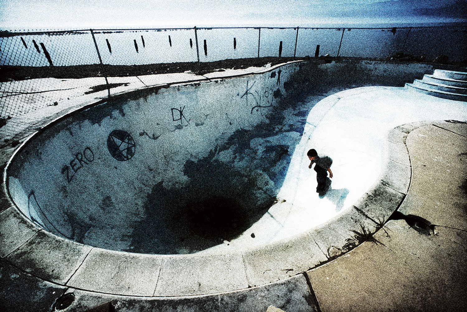
When choosing your lifestyle photography to show your products or services in action, we know you have many choices. But the world of commercial photography can be a desolate one when you’re looking for images that pack a punch and tell an arresting story. Studio 3, Inc. has ridden out the years by providing photos that, time and again, capture the viewer’s attention and draw you in to the action. You should choose Studio 3 to produce your visuals because WE make a statement with our imagery.
When it comes to lifestyle photography that captures the action as it happens, we pride ourselves on being urban archaeologists, selecting the best angle and composition to tell the story in the most pleasing manner. For this shoot Studio 3 co-founder Jim Felt traveled on location to the Salton Sea State Recreation Area in order to capture the “Mad Max” desolation and emotional poignancy to a once-thriving resort destination. In 1905 the Salton Sea was accidentally created when as engineering company cut a channel into the Colorado River that overflowed into the dry Salton Basin, filling it with fresh water that mixed with the salt beds. This created the largest lake in California: an inland lake saltier than the Pacific Ocean, around which a resort area sprung up in the 1950’s. For awhile the area was a tourist attraction, but as agricultural runoff and pesticides flowed into the sea, the water became too hostile to support any kind of life, areas of the surrounding towns flooded, and people abandoned the area. The goal for this shoot was to tell this story in a single image, and a lone kid skateboarding in one of the empty pools at the abandoned resort encompassed this perfectly. Jim set up for the best angle for lighting and composition, and had the child play as he snapped shots and adjusted the camera settings to create an otherworldly feel.
The intention was to impart the visual grittiness into actual noise in-camera, create a harsh contrast, and highlight the whole history of the Salton Sea in this single shot. How do you feel as you look at this photo?
Whatever your unique situation, Studio 3 can capture it in an instant to make that statement. We add the unexpected, we make it arresting, emotional, and fun. Call us at 503.238.1748 to see.