Food Photography – Salt

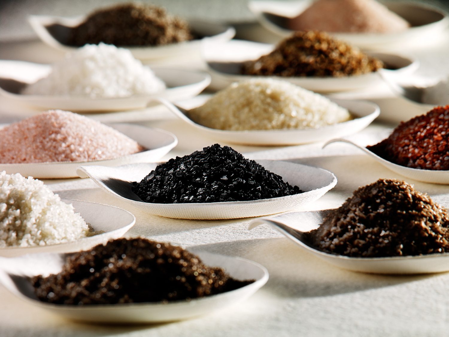
Food gradient of many piles of salt in dishes
Why should you make a change to Studio 3, Inc. for your photography needs? Because WE make it look good.
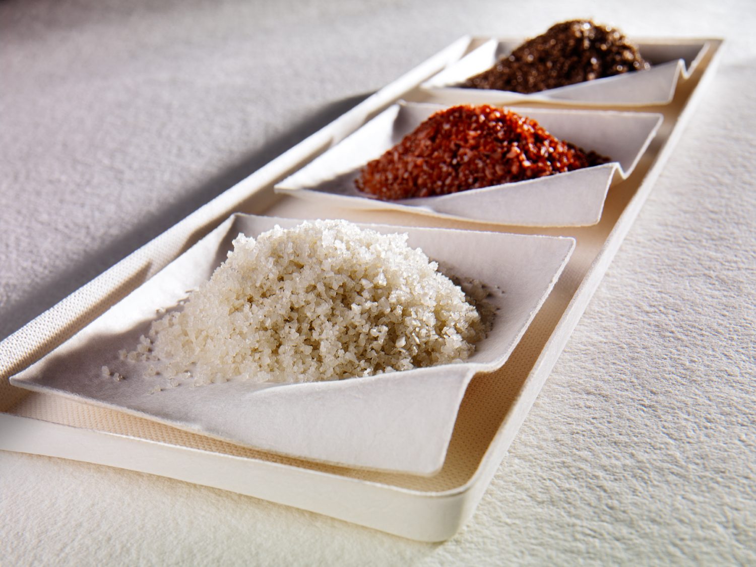
These artisan salts could have gotten any creative treatment there is – but Photographer David Bell strove to bring out the pretty in the delectable, sparkly grains. The Studio 3 Team loves all kinds of salts (since numerous varieties of artisan salts are available in dedicated salt shops and markets everywhere lately) so when the chance arose to feature some of our faves we jumped to it. David had some Japanese Wasara single-use recycled heavy duty paper dishes that he had been holding on to specifically for a project like this. The undulating waves of the dish profiles, the texture of the bamboo and bagasse against the salt grains, the dishes placed just so atop the table: all provided a stark contrast in textures and form that David brought out with his masterful use of lighting.
A crisp, hard light was essential to show of all the granules of salt and bring out all the highlights, brightness, grittiness, and coarseness simultaneously. In choosing the lighting setup David also intentionally created shadow beneath the dishes so the eye can distinguish between white table, white dish, and white salt without straining or confusion. He experimented with playing with pattern, repetition, color, and texture to create the images below, mixing salts to achieve that perfect balance of color and a pleasingly harmonious design.
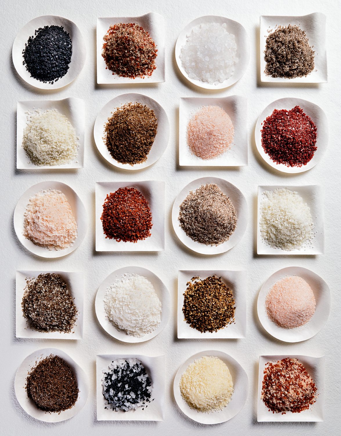
Food gradient of tiled piles of salt in dishesFeatured salts:
Hiwa Kai Black Lava Sea Salt  /  Salish Smoked (Alderwood Smoked Sea Salt)  /  Fleur de Sel (Flower of Salt)  /  Alaea (Hawaiian Sea Salt)  /  Sel Gris (French Grey Sea Salt)  /  Pure Ocean (Atlantic Sea Salt)

from Artisan Salt, Co. AKA Saltworks, Inc.

Chili Verde Sea Salt  /  Yakima Applewood Smoked Sea Salt

from Metropolitan Market, Seattle Food gradient of 3 piles of salt in dishes
Creating a look in photographs is not random but instead full of intention: highly precise and orchestrated to feature the product in its best light.

So what goes into the “look” of your photography? And how can you develop a look that embodies your brand? Call Studio 3, and we’ll make whatever you have to shoot look so amazing…you’ll never need to go looking for a photography partner again.
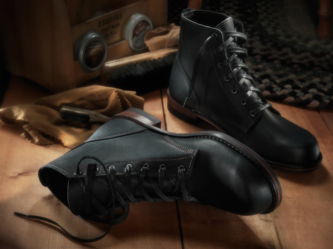
 

Shoe Photography – Danner Boots

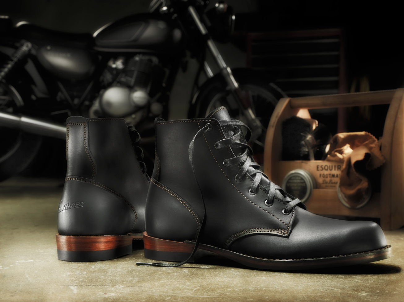
Men's Danner Williams Boots shoe photography shot by Studio 3
No matter the subject, Studio 3 shines a light on great photography and lifestyle setups that put the WOW in the everyday.
These Danner 6″ Oiled Black Boots just begged to be shot in an environment with moody lighting that reflected their rugged toughness, and Photographer Craig Wagner styled an entire garage set around them for that specific purpose. Placing our Video Director David King‘s Suzuki TU250X motorcycle in the background, he created a monochromatic set filled with blacks and browns to bring out the colors in the shoes. With overhead Speedotrons, Craig focused spotlight-style lighting on the boots in the foreground. The profile and oiled leather grain of the boots required a treatment as if photographing a high-end car, he noted, which he accomplished by choosing the ideal amount of reflectors and kickers to highlight those curves and wood grain heels. A vintage shoe-shine tote with buffs and waxes completes the story: a guy tinkering on his bike in his garage stops to give his favorite Danner boots a polish before setting out for a ride on the open country.
What resulted is a shoe photography shot where the gloss of these boots highlights their shape, workmanship, and durability…stopping anyone in their tracks, wanting to try those boots on and head out for an adventure.Studio 3 Shoe Photography Danner Boots
Ready for YOUR next adventure? Call Studio 3: WE Light It, WE make it look great, WE showcase YOUR product in the best light. Give us a call at (503) 238-1748 in Portland, or (206) 282-0939 in Seattle to experience it.


WE Do It Better

Studio 3 show photography vintage Nike sneakers
Why chose Studio 3? Because whatever you want done, WE help you do it better.
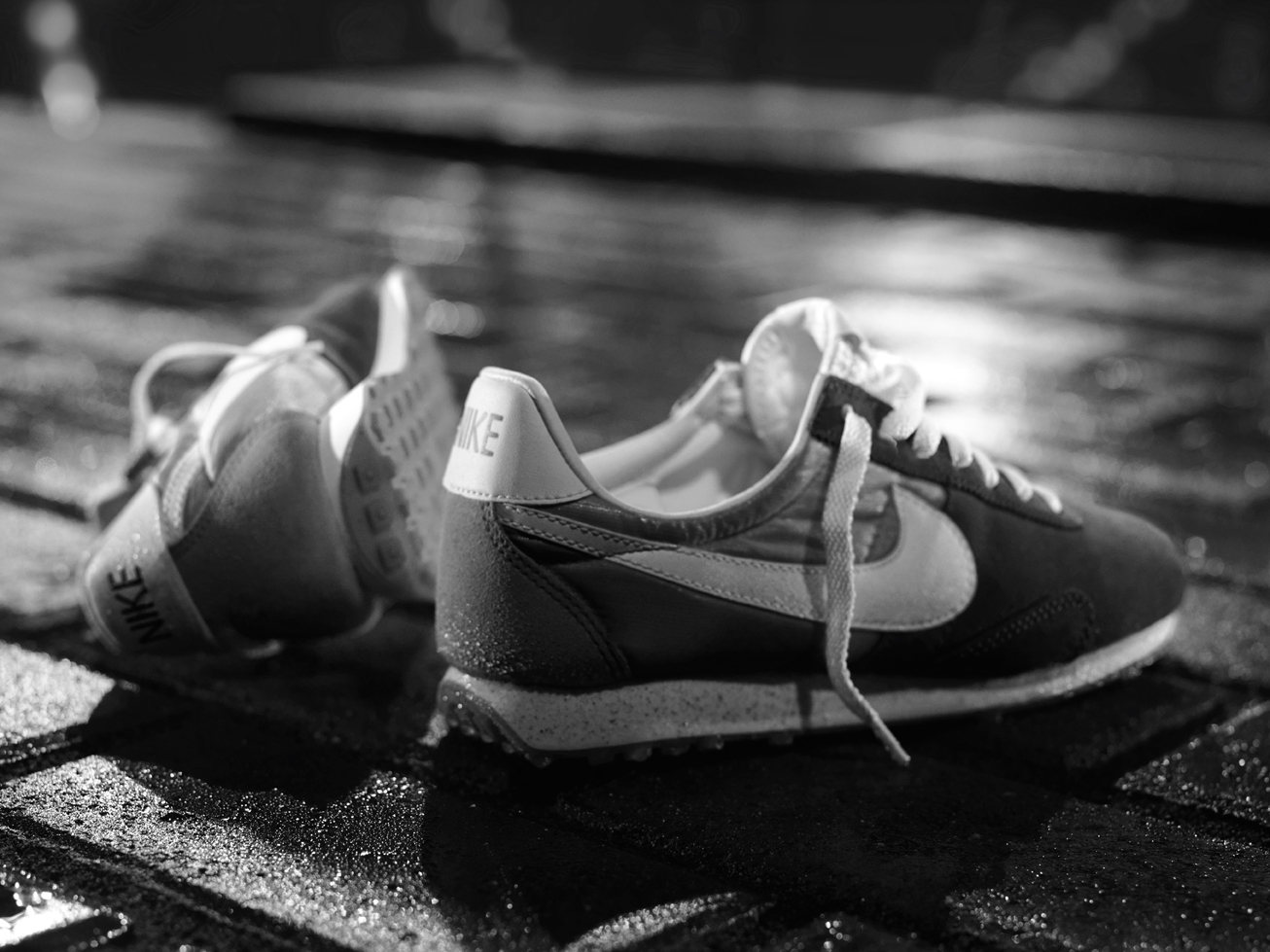
Take this shot of vintage Nikes, for example. The brief was to take a fresh approach with footwear photography and shooting a pair of vintage Nike sneakers – so the Team created a very gritty-looking night environment to showcase the shoes. But the idea was to keep the setup looking as un-styled as possible, like the person had just kicked the shoes off and they landed exactly as they did. The Team was striving for a moody atmosphere, so having reflections throughout helped underscore that mood. The “street” locale was, however, created entirely in-house. Photographer Chris Eltrich laid out 4′ by 8′ of bricks to make the paving stones, pouring sand in-between them to look like grout, and finished them off with some large pavers for the “sidewalk.” He wet the set with a spray bottle to create those reflections, which proved a challenge due to to the bricks and sand absorbing the water. He had to spray continuously all the way down to the moment he clicked the shutter, or everything would dry. All the work paid off in the end and resulted in a wet-looking, gritty set as a backdrop to the cool Nike kicks.
In post-processing, Digital Lead Alex Gumina found that the bright yellow of the sneakers didn’t look ideal against the background. The logos weren’t “reading” in the final photo and the feel was a little off, so he converted the image to black and white to play up the vintage aspect. The monochrome treatment was just right and made those logos POP!
From an open brief to an ultra-specific “mood” created entirely in the studio, our Team takes any concept from origin to exceptional execution. Perhaps anybody can just do it. But WE do it better.
Call us today to find out how we can do it better for your brief, each and every time.


WE Get It

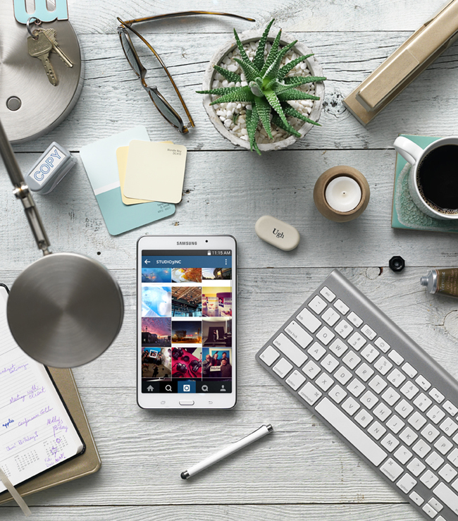
A beautiful array of items on a desk including Samsung Galaxy Tablet Shot by Studio 3
Visual imagery is your brand’s calling card, and Studio 3 understands how to get you there creatively, on budget, every time. We provide creative solutions and the peace of mind that your project will be completely handled. Whether it is a single phone or a semi truck full of SKU’s, we’ve been there. We do it all well.
Our photographers and videographer work with our production team to achieve your visual goals and timeline. Once your images are shot the digital group delivers beyond expectations, with the best processing in the business, and G7® color certification. From start to finish the process is streamlined and we take care of you. Which makes YOU look really good to your client and your boss.
That’s why we keep our clients and why you should take a meeting with us. You’ll see we make great partners. Oh, and we have a lot of fun on the way!
We’ll be reaching out…take the invite. Look forward to meeting you.

Vehicle Photography – Griot's Ferrari

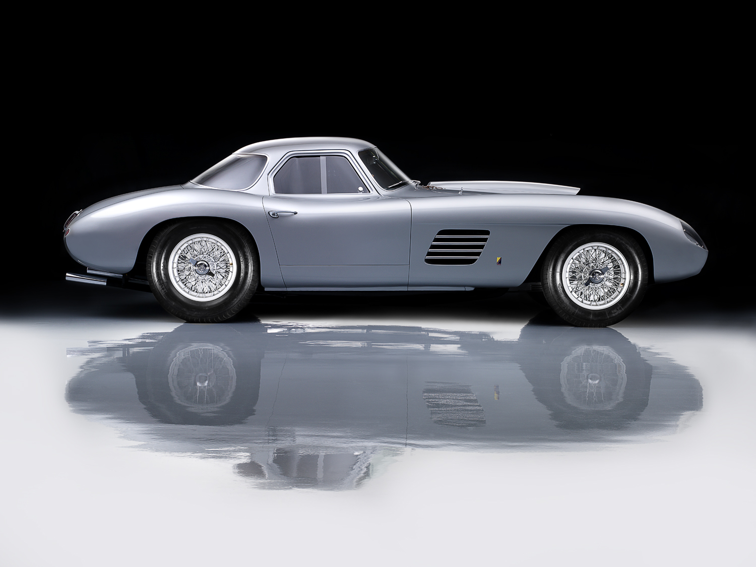
1954 Ferrari 375 MM car for Griot's Garage
The 1954 Ferrari 375 MM Scagliette Coupe featured above has a rich history and an amazing story…and is a one-of-a-kind custom car that any car enthusiast would go wild over.
This legendary car was originally built for Ingrid Bergman in “Ingrid Grey” with a lipstick red interior, and took Best of Show in 3 different Ferrari events in the United States, including Best of Show at Pebble Beach Concours d’Elegance in 2014. Shot by Studio 3 legend David Bell, this car was destined to be featured in the latest catalog for long-time client Griot’s Garage.
Griot’s Garage manufactures the world’s finest car care products for any and all vehicles out there – including, of course, one-of-a-kind Ferraris. Although the Griot’s customer may not be in possession of a Scagliette Coupe like the one above, they are discerning when it comes to car care and garage products. Griot’s Garage products will make any car look like a million bucks (or a multi-million bucks, in the Scaglietti’s case)…and Studio 3’s product and vehicle photography captures that aspirational lifestyle effortlessly.
Shot at the Griot’s facility, this photo highlights the Industrial Non-Lifting Floor Paint for garage floors that Griot’s produces,  as well as the polishes, waxes, and compounds that were lavished on the car to showcase it in its best light. Although he has shot this particular car for Griot’s Garage a few times before, this shoot presented a particular challenge to David due to the length of the car.
David wanted to highlight the Ferrari’s sleek, powerful, and undulating lines and so chose to shoot it in profile against a black backdrop. Though he had a 20′-wide sail, it wasn’t quite wide enough to accommodate the entire vehicle on set, and so the final image had to be composited from 8 different exposures layered together to encompass the full width of the car. It was an awesome challenge to fit the whole profile of the car into one single image.
He endeavored to make the car’s stunning lines stand out and enhance the shape of this iconic vehicle, as well as highlight the stellar finish that showcased the Griot’s wax products. This gorgeous aspirational image seen on the front of the Griot’s catalog would entice any car enthusiast to open the catalog and browse for products to make their vehicles look just as stellar. “It’s just about making their cars look interesting, fun, exciting, and gorgeous,” said David. Thanks, Griot’s, for 20 years of business!
Just like that uber-sleek Ferrari, Studio 3 has a rich history and amazing story behind it. We’re still shooting top-of-the-line product and catalog shots that wow our clients each and every time. Artisan photography for a true piece of art, quick turnaround, challenging shoots, elaborate staging…we can do it all and then some – and make the product the star of the show each and every time. Why not give us a ring and have us turn your photography into a sleek, one-of-a-kind, done deal?
Client: Griot’s Garage
Photographer: David Bell
Equipment: Hasselblad H3D-39, 210mm lens
Lighting: Speedotron strobes and kickers
 

Throwback Thursday – The Learning Machine

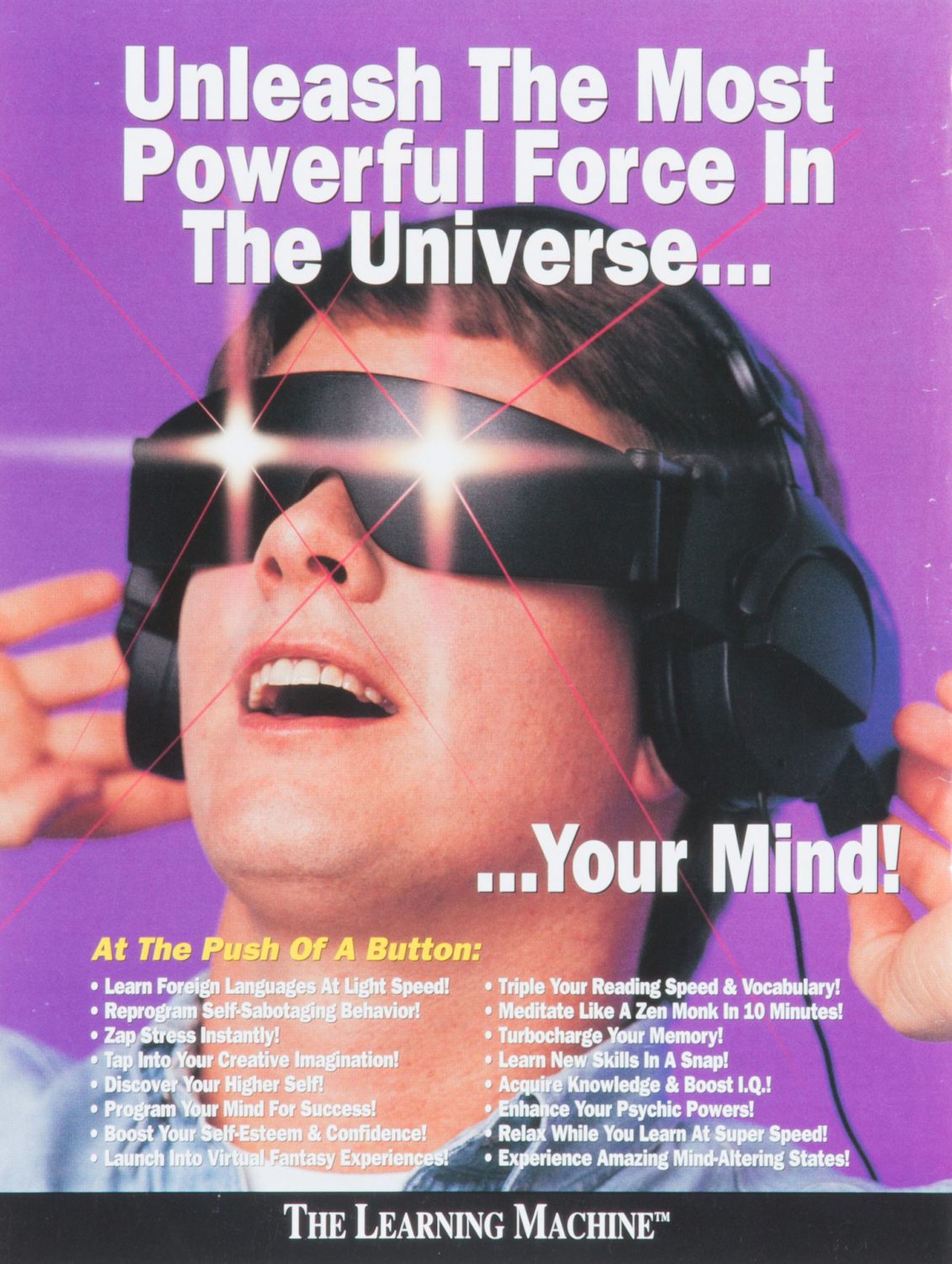
the-learning-machine-studio3You might be asking yourself, “Is THIS for real??”
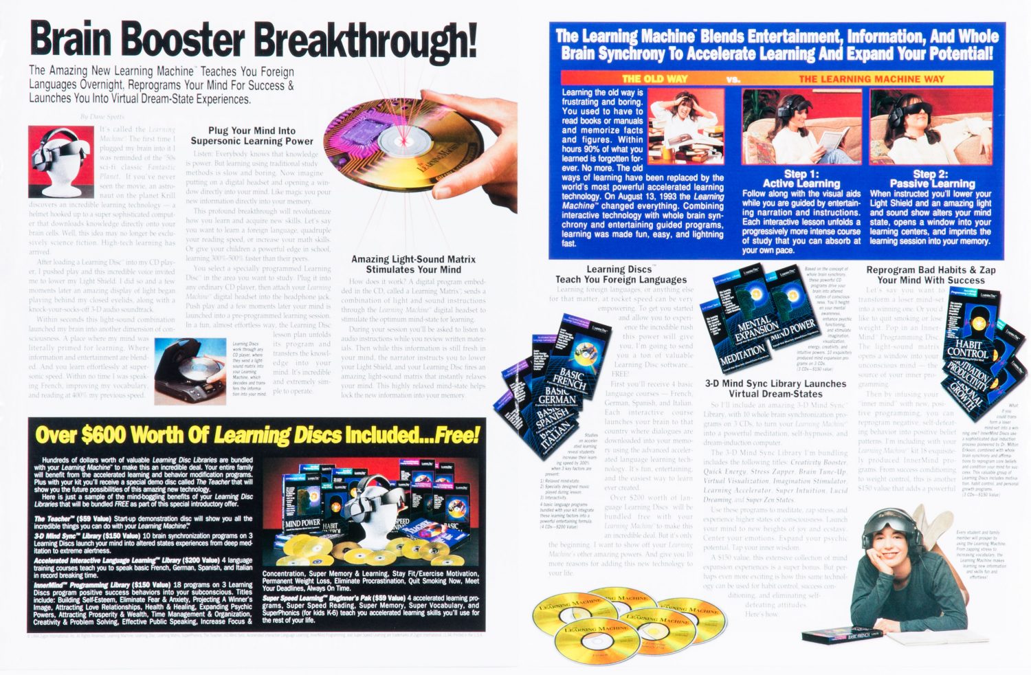
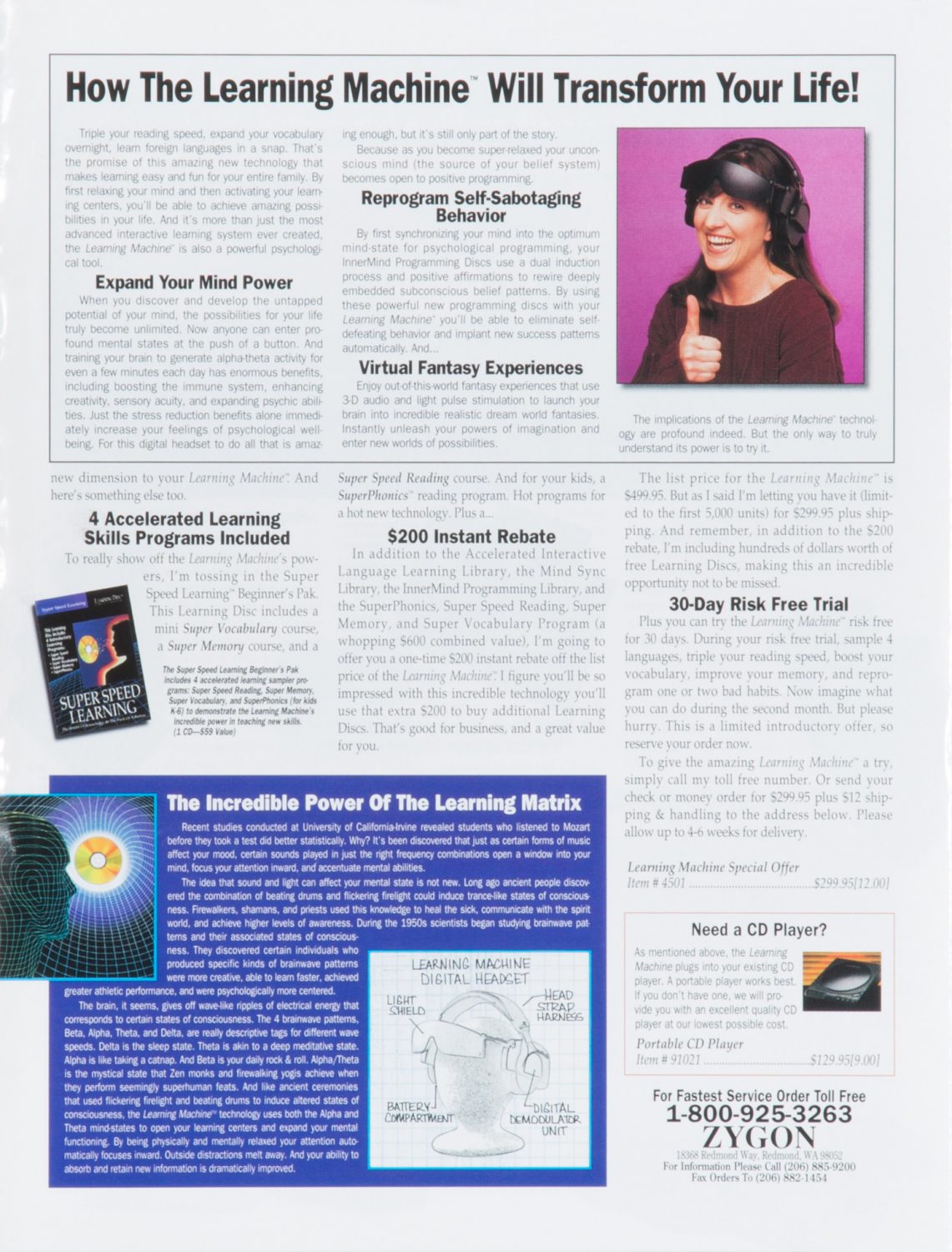
We know…it’s hard to believe, but this is TOTALLY for real!
Since the advent of this amazing technology, it is tough to recall how cumbersome it was when our noodles were all leashed up. That’s not irony. That’s progress.
On August 13, 1993, The Learning Machine hit the market – and the face of learning was never the same again.
When Zygon International Inc. approached Studio 3, the Team set about creating mesmerizing images for the front and inside of a brochure about the spectacular capabilities of The Learning Machine. It synchronizes your mind into the optimum mind-state for psychological programming! It uses Alpha and Theta mind-states to open your learning centers and expand your mental function! Wait…what?? And it boasts a state-of-the-art Light Shield and Learning Discs system that create a light-sound matrix to “launch your brain into incredibly realistic dream world fantasies!” The Studio 3 Team brought those fantasies into reality by executing a product photography shoot that was as futuristic as it was fun. But that’s not to say we have psychic powers now.
Studio 3’s very own David Bell, unafraid of this wacky new technology, agreed to shoot the mind-bending images for the brochure. When asked about the shoot, he revealed some great insight: “I don’t remember a thing about it.” Hmm. Probably because he wasn’t using The Learning Machine while on set. We’ll forgive you, David. You did shoot some hypnotic images after all.
He did finally recall using the Speedtron Strobes to get the perfect balance of the CD’s reflective qualities, while still being able to read the writing on the CD’s. Which, in the age before Photoshop, was QUITE a challenge! (CD’s and DVD’s are notoriously hard to photograph and to strike that elusive balance between readability and the changing color cast on the surface; see here for an example of Chris Eltrich’s work showcasing this.)
the-learning-machine-brochure1-studio3
 
These photos were shot with a Hasselblad C-500, with a 150 mm lens film camera. The light flares and lasers were all added at the color house during the post-processing phase. The large product shots may or may not have been shot with the SINAR-P 4×5 camera, but since we didn’t try out The Learning Machine in its heyday, it’s a little hard to remember.
And if you’re in the market for your very own Learning Machine, you may still be able to get your head inside one at Zygon International’s website here. But you might want to double-check on that money-back guarantee they offer….
the-learning-machine-brochure2-studio3
(And you can also pick up a CD player from them too for the going rate of only $129.95.)
Have some cutting-edge technology photography you need shot? Hope this has been a learning experience to what Studio 3 can provide: expert lighting, stellar photography, plus…we never take ourselves too seriously. Call us today to get in on the super happy fun times!

Product Photography – Bonavita Espresso Supply

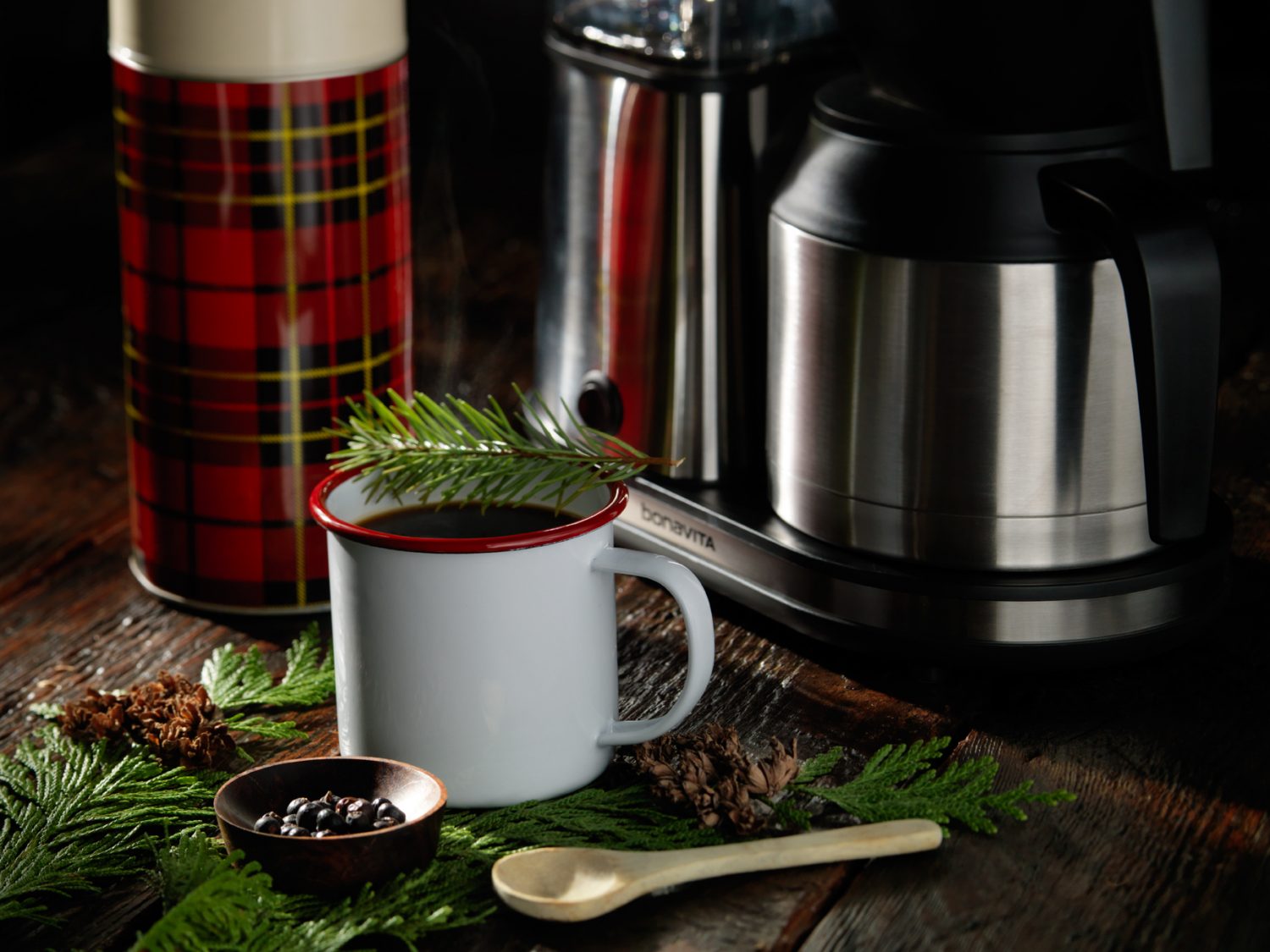
espresso-supply-coffee-drink-2-david-bell Product photography isn’t just about how great the product looks on-camera; it’s also about showing the viewers what the product does. And when your coffee brewer can whip up some fabulous coffee drinks in no time flat – and Photographer David Bell gets ahold of those drinks and casts them in the starring role on a rugged, manly set – pure magic can happen through the lens.
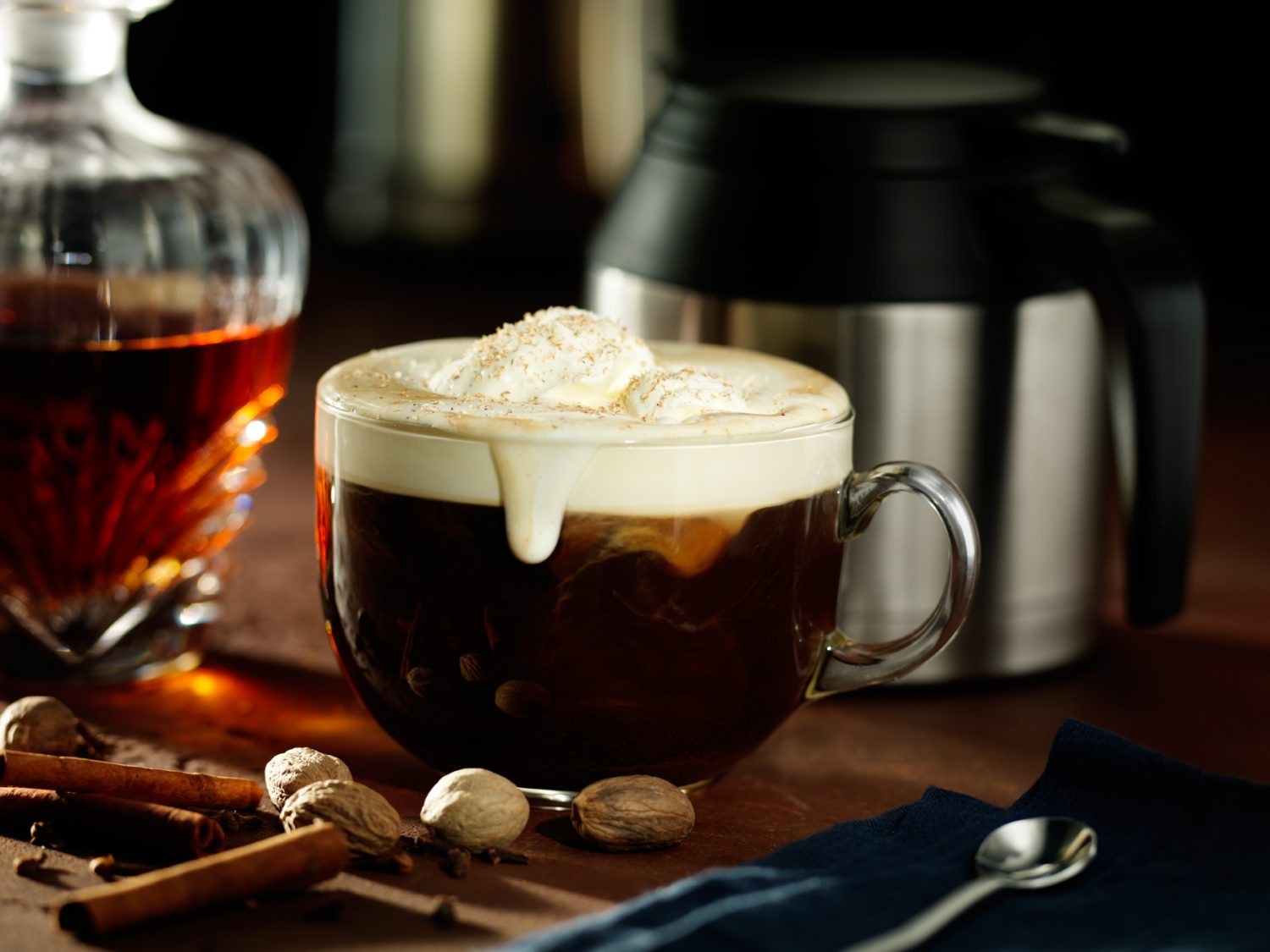
That magic began with the Bonavita 8-cup Stainless Steel Carafe Coffee Brewer, which received the 2014 Men’s Journal Gear of the Year Award. When it came time to exhibit at the Men’s Journal “Gear Lab Pop-Up” at the MLB FAN CAVE, Bonavita Espresso Supply wanted to pair their award-winning coffee brewer with some drinks you could make with said brewer, and called on the award-winning talents of the Studio 3 Team to deliver the photography. (Not to toot our own horn, but we also provided the recent product photography for Bonavita’s website if you take a gander at the link above.)
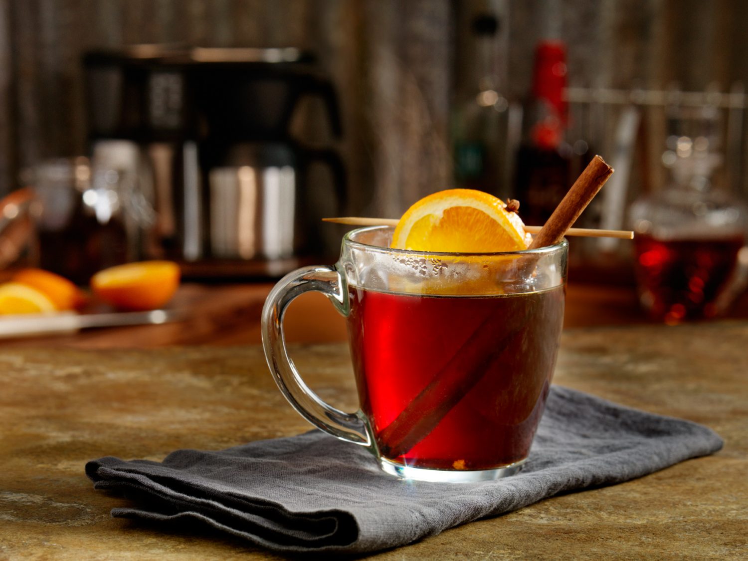
It was a blast working with 3 original and delicious coffee-centric beverages and styling them on set. With props sourced from West Elm and Crate and Barrel, and vintage thermoses from the Studio’s extensive prop closet, Producer Megan Nolan crafted a set that said M-A-N, Pacific NW-style. David Bell contributed his decades of experience with lighting surfaces and drinks, choosing exquisite textures to create the backdrop and make the drinks stand out. David lit the set using dramatic, contrasty light to bring out all the textures and reflections in the surrounding props. His unique style and eye for details was essential (like adding that refined messiness of a delectable coffee drip on the side of the cup), which made all the difference.
Unlike some drink photography where photographing the actual drink on set is too difficult (i.e., having to use stand-ins that won’t lose their temperature or look unrealistic), in this case what you see is what those drinks really look like were you to try your hand at those recipes!
espresso-supply-coffee-drink-2-david-bellThe Flannel Shirt
Ingredients

  • 3 lightly crushed juniper berries
  • ½ ounce simple syrup (or to taste)
  • 2 dashes Angostura aromatic bitters
  • 1 1/2 ounce gin
  • Bonavita-brewed *Ladro Ethiopia Wotona coffee
  • Small cedar bough and spruce sprig for garnish

How To
Put crushed juniper berries into the bottom of a pre-warmed mug. Add simple syrup, aromatic bitters and gin. Top with freshly brewed coffee. Garnish with spruce sprig and set mug on cedar bough to release aroma.
espresso-supply-coffee-drink-3-david-bell
Rummy Gingerbread Man

  • 3 teaspoons dark muscovado sugar or dark brown sugar
  • 1 teaspoon *Gingerbread Spice Blend
  • 1 ½ ounces dark rum
  • Bonavita brewed **Ladro Classic espresso blend coffee
  • Whipped cream
  • Whole nutmeg, grated as garnish

How To

Fill 8 ounce mug with hot water to warm it. Pour water out and add sugar, spice blend and dark rum. Stir to dissolve sugar. Fill mug with hot coffee, top with whipped cream and finish with grated nutmeg or a sprinkle of cinnamon.
*Gingerbread Spice Blend:

  • 2 teaspoons ginger
  • 2 teaspoons cinnamon
  • 1 teaspoon vanilla powder
  • ¼ teaspoon ground cloves
  • ¼ teaspoon allspice
  • ¼ teaspoon nutmeg

espresso-supply-coffee-drink-david-bell
Lodge Toddy
Ingredients

  • 3 cloves
  • 1 cinnamon stick
  • 1 teaspoon honey
  • 1 1/2 ounces bourbon
  • Bonavita brewed *Ladro Central American coffee
  • Slice of orange (Valencia – Blood Orange – Cara Cara)

How To

Put cloves, cinnamon stick and honey into the bottom of a mug. Add bourbon and stir to blend. Fill mug with hot coffee. Twist and squeeze a slice of orange it to release the juice and oils from the peel and drop it into the mug to finish.
All recipes by Marcus Boni and Victoria Trimmer, Bonavita.
How much is your mouth watering for these drinks…and where is your Bonavita Espresso Supply Coffee Brewer when you need one?
And if you ever need photography for your drinks, beverages, or food-related products that gets mouths thirsting for more…you know where to find the magic-makers. In both Portland and Seattle, here at Studio 3.
Client: Bonavita Espresso Supply
Featured Product: Bonavita 8-Cup Stainless Steel Carafe Coffee Brewer
Producer: Megan Nolan
Photographer: David Bell
Photography Assistant: Tom Radio
Equipment: Hasselblad H-3D, 50mm lens
Digital Artist: Alex Gumina


Editorial Photography – Fitbit Hamburger

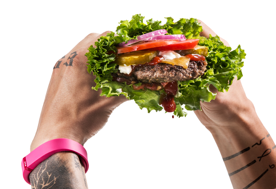
Photo of a man wearing a pink FitBit holding a dripping lettuce hamburgerIt’s the first week of the New Year already…how are those Resolutions going?
Creating Resolutions each year in an effort of renewal and self-improvement is wonderful, but Studio 3 has never veered from our Resolution of providing great photography for discerning clients. Our goal, year in and year out, is to create photographs that stop you in your tracks, make you think twice, grab your attention, and welcome you into a world of sumptuous food and drink, stellar products, cutting-edge technology, cool vehicles, and a fun lifestyle.
For our first shoot of the New Year, Studio 3 Team created a mouthwatering editorial photography shoot featuring one of our favorite fitness products: the Fitbit. A pink one. On a heavily-tattooed male arm. Because every manly man needs his Fitbit along with him, tracking his exercise, activity levels, steps per day, and most importantly, his indulgences.
The brief was to create a “healthy” version of a hamburger that would go literally hand-in-hand with the Fitbit lifestyle. To that we looked no further than Carl’s Jr.,’s Low Carb ThickBurger®, and sought to re-create the healthy lettuce-wrapped delicacy in-house. Food Stylist Allyson Carroll cooked the burger from scratch, stacked it up, wrapped it in lettuce, and added the perfect amount of ketchup to make the burger look delectably juicy.
Studio 3 Photographer Henry Ngan is a master of lighting, and for this shot he focused on the freshness of the burger utilizing a crisp, bright “beauty” light. He backlit the white wall behind, and shone a spotlight on the burger to bring out its succulent texture. The abundance of white and the absence of a background made, just like the latest iDevice from Apple, the focus all about the product in the foreground.
Unlike product photography, Editorial Photography takes a familiar concept and makes a statement. In this case the statement was made by pairing contradictory elements. In post-production the gangsta letters and right wrist tattoos were digitally added to the model’s knuckles to make him look even less likely to own a Fitbit in pink (and if we hadn’t told you, would you know those tats didn’t actually exist?) Lead Digital Artist Alex Gumina integrated the tattoos into the image seamlessly, and struck a good balance between drippy and gooey for the ketchup falling out of the burger. Finally he achieved the perfect harmony between burger and Fitbit by creating the same level of sharpening on both, and added contrast and color to the Fitbit to give it its own pop.
The Studio 3 Team can take any food or product photography brief and create a fun twist that marries them into some eye-grabbing editorial photographs. Give us a call to inquire as to how we can bring that juiciness to your next shoot, or stop by one of our Pacific NW locations to get a taste of the Studio 3 lifestyle.
Photographer: Henry Ngan
Photography Assistant: Jonny Brandt
Producer: Liz Swales
Food Stylist: Allyson Carroll
Model: Jacob Cotner, Muse Model Management
Digital Artist: Alex Gumina
Equipment: Canon 5D Mk III, 100 mm Macro Lens

Happy Holidays from Studio 3

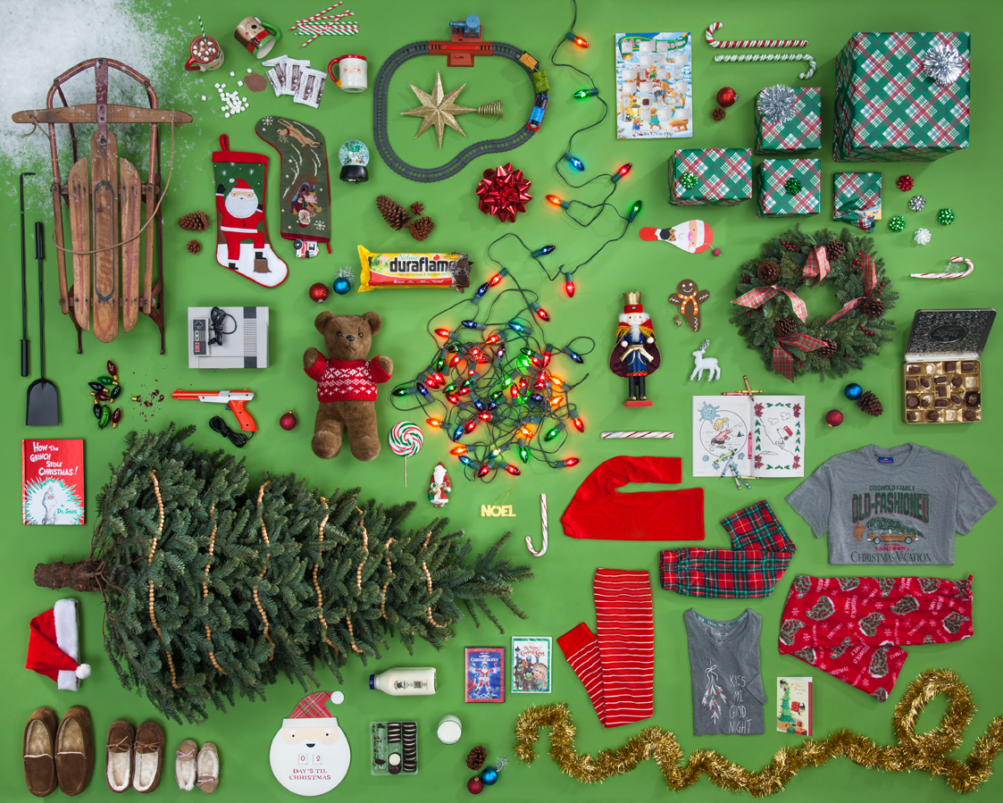
Christmas_Collage_2014
It’s all about the stylin’, baby!
Got your list? Checked it twice?
Taking a product photography shot like this doesn’t require much more than good lighting and professional hands on the shutter (and we can do both no problem!), but it’s the product styling that truly makes the photo shine. Accomplished by all-star commercial stylist Tristan Weholt, this photo took about 2 days to tweak the styling to that festively organized level. Producer Megan Nolan sourced the full array of holiday items from local stores, and Ms. Tristan set about fitting them all together like a puzzle, choosing where the bigger pieces fit and maneuvering smaller items to coordinate. Ms. Tristan says that she loves these creative briefs because “it really lets the creative mindset of styling flow…this is where my career meets my passion.” Photographer Chris Eltrich created the set and lighting, and ultimately captured the essence of spending Christmas morning at home with the fam.
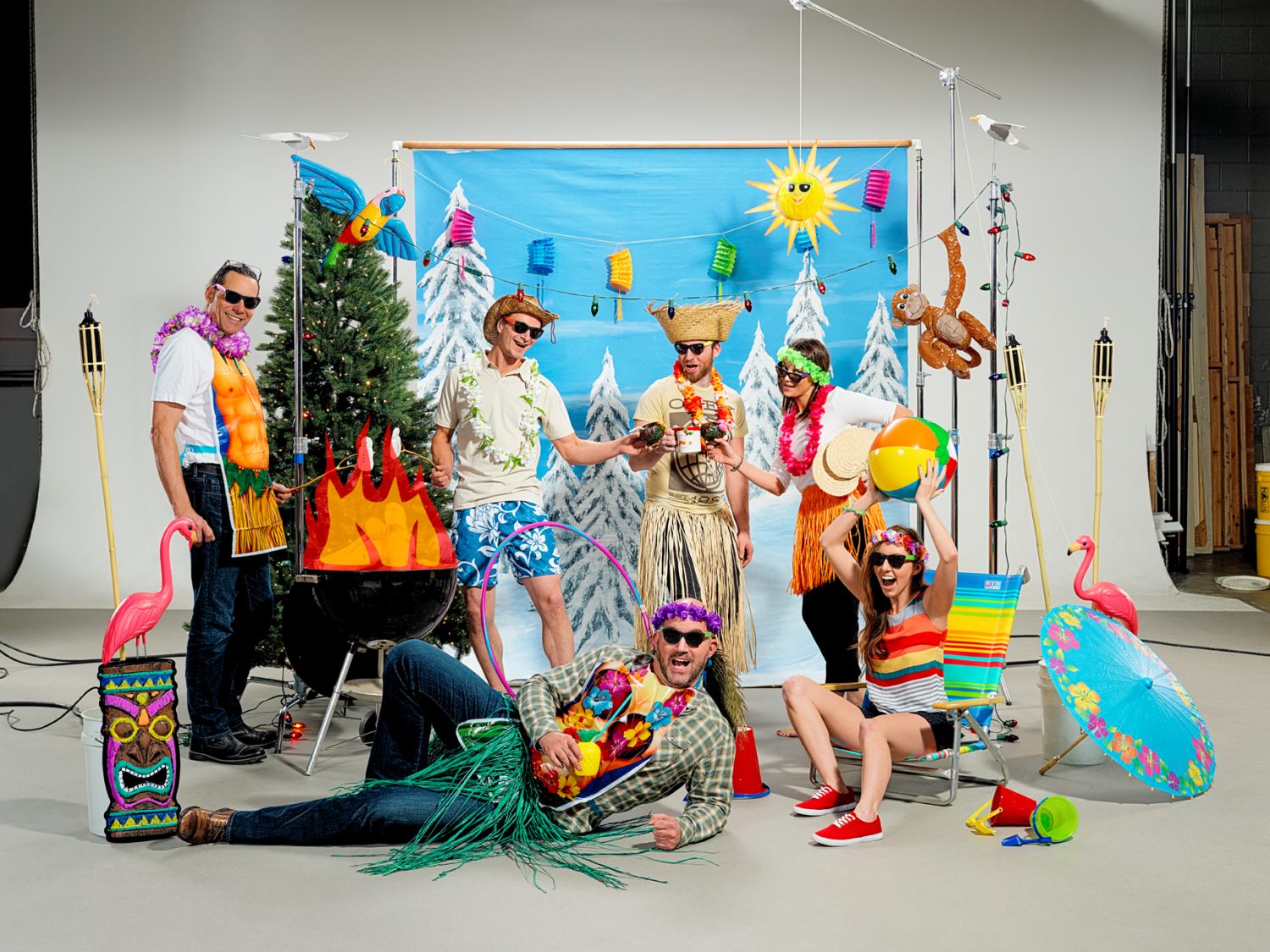
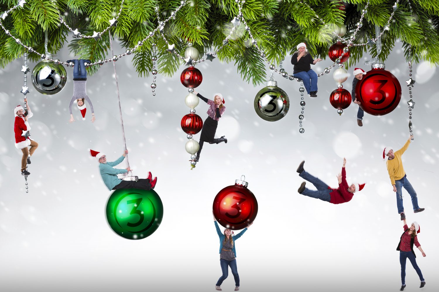
For the above photo there was a specific creative brief, but for the company Holiday card it was just to come up with an idea and execute a shoot that encapsulated the Team here at Studio 3. Each studio location shot its own top-secret creative twist on the brief, with our Santa-hatted Portland office going head-to-head with our Hawaiian-themed Seattle office. Who did it best? You be the judge.

Portland

Christmas background

Seattle

Seattle Christmas
Need a fun and unique interpretation on your company’s creative brief? Give us a ring and see the amazing and wonderful happen with Studio 3.

Happy Holidays from Studio 3!