Throwback Thursday – The Salon of the Future

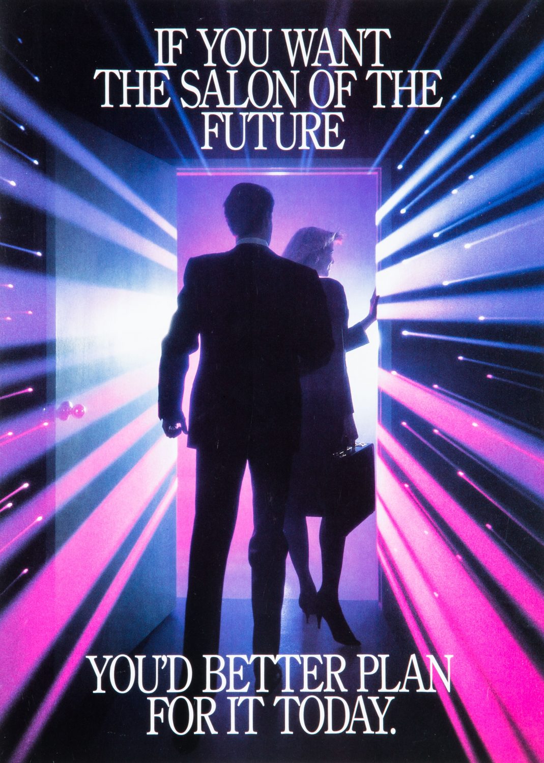
TBT_ScaWolff_006Back in the mid- to late 80’s, this was the salon of the future, but the above photo was created using the cutting-edge techniques of the past. For reals. For Throwback Thursday #TBT this week we’re sharing some product photography that was composited from three separate film-based shots, created by Studio 3 photographer Henry Ngan, assisted by Craig Wagner.
In the heyday of salon tanning (before that whole skin cancer thing got in the way), SCA Wolff System/Sun American Corporation was looking for a way to market their new tanning beds to salon owners and called on Studio 3 to execute. The brief for this shoot was to make the product look glamorous and have the cover shot act as the entrance the world of tanning, where through that open door lay a futuristic, glamorous world full of glowing beauties. At the time, laser beams in photography and visual media were mad trendy with Star Wars and Laser Tag leading the charge. The idea was to incorporate this trend with tanning beds to emphasize their futuristic and cutting-edge technology.

Mid-1980’s Product Photography

Shot in Studio 3’s earlier location at Lenora Square in Seattle, this shoot relied on large format 4×5 film for the cover image. (And 8×10 film for the image below.) What that means is that the actual 4″ x 5″ sheets of film were loaded, ViewMaster-style, into a Sinar-P technical camera, exposed, removed, flipped around, inserted, and exposed again. Creating just a single image was a great deal more hardcore than the much simpler point-and-shoot DSLR’s of today!
Here’s the 4-1-1 on how it went down: The doorway was shot first, and then on a completely different set Henry and Craig used a lithomask with different-colored gels in different areas to create the colorful pink and purple tint to the lights. The “laser” light streaks were created in-camera by either pulling or pushing the camera lens during a timed exposure. (Similar to the concept of creating a long exposure on a camera facing a highway at dusk: the cars’ tail lights appear as streaks traveling down the highway.)
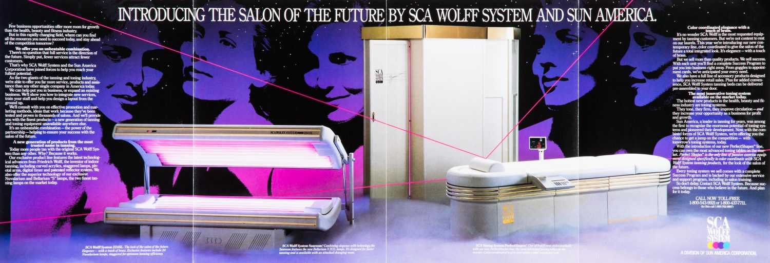
TBT_ScaWolff_008For the photo inside the brochure, the tanning beds were shot with a longer lens in our Portland location. The background star field was easily created with black seamless [paper] lit from behind, with holes punched in it.
Once all the images were shot, the superimposing of the final photographs and client-chosen artwork was done at a prepress house, rather than our own Studio 3 Digital Department like we use for post-processing today.
The process may have changed in all the years since, but we still create laser-focused, high-quality images for discerning clients. Check out our other totally awesome product imagery, and Just Say Yes to Studio 3 doing your next product photoshoot or video. Catch you later!
Video – October 1 Second Every Day


“There are so many tiny, beautiful, funny, tragic moments in your life — how are you going to remember them all?”
On the heels of our 30-second videos for July and September and we’ve created another video full of tiny, beautiful, funny moments behind the scenes with the Studio 3 Team.
From creating some buzz with a chainsaw video to mulling over a Fall cider setup and wrangling some adorable puppies for a studio photoshoot, “hard at work” can still include a lot of fun. But we’ve also taken a break with trips to Astoria, OR, visiting the Belmont Goats, attending Design Week Portland events, playing with a model train set, and splashing in some puddles. See if you can spot cameos by the Studio 3 Team, including Lead Digital Artist Alex Gumina, Photographers Henry Ngan, Craig Wagner, and Chris Eltrich , Video Director David King, and Social Media Manager Carly Cais.
Stitching all these different elements together for a Studio 3 behind-the-scenes video is just another day’s work for Director David King. When he isn’t laughing at the ridiculousness of his coworkers to create this 30-second snapshot of our month, he shoots and edits client videos for Studio 3. David specializes in branded product demonstration videos, corporate videos, holiday videos, informational videos, testimonial videos, and commercials. He and the Team work to solve each client’s creative problem, tailoring the experience to meet brand and audience needs. In each case we exceed client expectations, leading to repeat clients, some of whom have been returning to us for over 20 years! The Studio 3 experience is professional, all-inclusive, efficient, and fun from start to finish. Plus the client receives a targeted video product that achieves their goals of informing, educating, entertaining, and converting their viewers to customers.
Ready to get your brand on video and reach your ideal customer base? Reach out to the Studio 3 Team for a tailored video that showcases your company and product. Whether 5 minutes or 30 seconds every day, the video for you is sure to be memorable.

Editorial Photography – Weed Drops

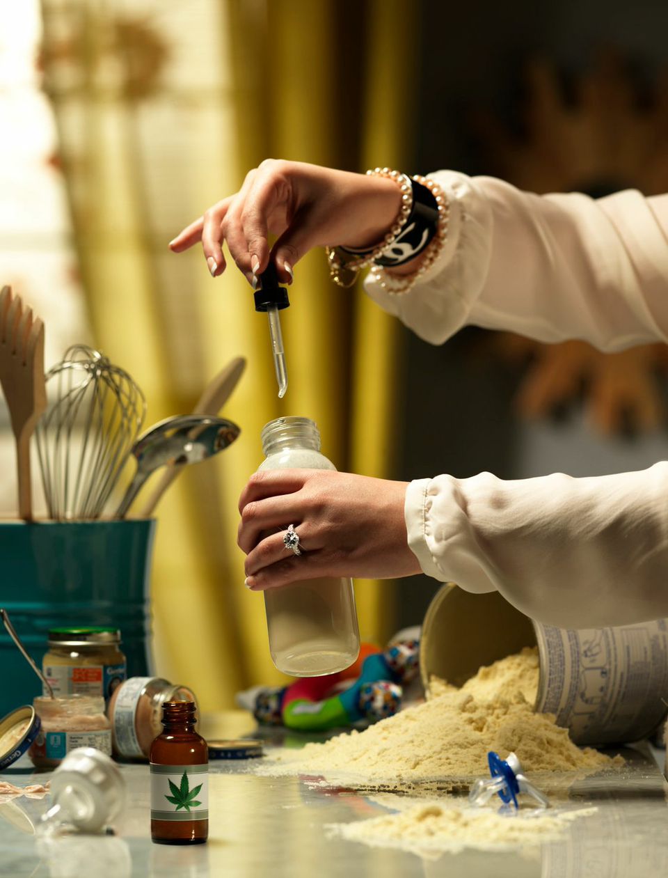
Photo of a Woman's Hands with Weed Drops and Baby BottleToday’s the day! With legalizing cannabis up for vote in Oregon, Alaska, and Washington D.C., we thought it timely to blow some smoke at the establishment and share our latest Editorial Photography project Weed Drops.
To create a visual pun requires taking a traditional environment and the viewer’s expectations – and turning both on their heads. The brief was to create something controversial and racy, telling a story by utilizing props and setting to create visual interest. The goal was to make people say “What?” and “Why?” and spark some good ol’-fashioned social commentary.
Despite the homey setting for the backdrop, the lighting had to be elegant and chic. The Studio 3 Team endeavored to evoke a moodiness to the scene with an overall warm yellow tint. Yellow was selected because not only can it evoke warm, pleasant feelings, but it can also act as a warning signal, indicating danger. That combination underscored the controversy surrounding the social issue of marijuana legalization. All of the props, wardrobe, and jewelry were selected by Producer Megan Nolan to create an environment of luxury and excess. The label on the weed bottle was created by Digital Artist Carl Beery and attached to the selected bottle.
One of Photographer Chris Eltrich’s strengths is capturing both comedy and many elements within a single shot – which made him the ideal choice for this editorial photograph. Utilizing a longer focal length on the camera, he created a shallow depth of field in the foreground to draw more attention to the hands and baby bottle. Harmonizing the many different props was a challenge, but the Team styled the ideal array of baby food jars, toy, kitchen utensils, and pacifier to focus everything on the action in the center of the frame. What came together was a blend of stellar product photography with ironic social commentary.
When we’re not pushing the envelope on high-end Editorial Photography we also create award-winning digital art, cool footwear photos, cutting-edge technology photography, and mouthwatering food and beverage photography. Check out other portfolio images above, and if you’re in Oregon, Alaska, or Washington D.C., don’t forget to cast your vote today on this burning issue!
Photographer: Chris Eltrich
Producer: Megan Nolan
Props/Set/Wardrobe: Megan Nolan
Digital Artist: Carl Beery
Lighting: Speedotron Strobes, Beauty Dish, and large Softbox
Camera: Hasselblad H-System Camera with HC 210mm Lens

Digital Art – Day of the Dead

Day of the Dead Makeup by Studio 3 Digital Artist Carl Beery
After some digital makeup

 
Day of the Dead Makeup by Studio 3 Digital Artist Carl Beery
Liz’s portrait, before Carl got creative

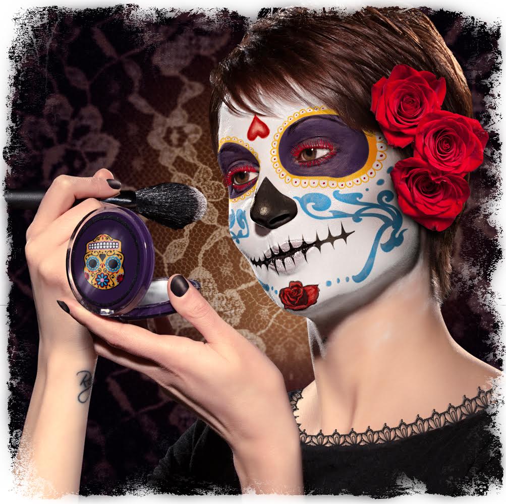
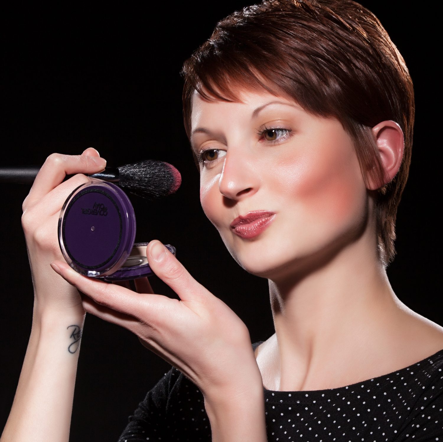
This time of year evokes the spooky, the eerie, and the haunted: graveyards, ghosts, ghouls, haunted houses, and of course, skeletons. Studio 3 went all-out this year in celebrating, creating a beauty-meets-death digital art image evoking the traditions of iconic Day of the Dead calaveras makeup.
Known as Dia de los Muertos and celebrated for more than 4000 years among Meso-American cultures, the Day of the Dead is a yearly holiday that gathers family and friends to pray for and remember those closest to them who have passed away. Though called a “Day,” the celebration actually spans the triduum of Allhallowtide: All Hallows’ Eve, Hallowmas, and All Souls’ Day (October 31, November 1 and November 2, respectively). Though people in Mexico wear traditional skull masks to celebrate, the ritual has evolved here to include a highly artistic style of make-up design (the skeletal face of La Calavera Catrina: the icon of death in Mexico), combining stunning and elaborate face-paint with various flowers, beads and any other props. The skull makeup acts as the wearer’s mask to overcome fear of death, act recklessly and get up to the mischief that is forbidden at other times of the year.
Studio 3 Digital Artist Carl Beery created this Day of the Dead-themed calaveras makeup utilizing a photo of our very own Producer Liz Swales, shot by Photographer Jim Felt. As with all projects Carl approaches, he endeavors to solve a creative problem utilizing digital tools and incorporate the different source imagery into a single image in an aesthetically pleasing manner. Carl also strives to keep an open mind during source imagery searching, since at times there can be new resources discovered that take the image in a better and more cohesive direction. In beginning the brainstorming process he first went back to his roots of traditional artistry by printing out the source imagery and sketching design ideas over Miss Liz’s photograph. During further reference image searching, he came across some skull and flower vector graphics that begged to be used. He seamlessly integrated these with the photograph and added a sugar skull graphic to the makeup case as an interesting visual pun. Employing his color skills and emphasizing color guiding the eye through the canvas, Carl utilized a favorite palette of rich purples and golds to offset the white and black tones of the makeup. The resulting image celebrates the richness of the Mexican tradition, updated with whimsical modern graphics for a boldly irreverent feel.
If you’re wanting to create your own Day of the Dead makeup, there are many tutorials out there to get you all decked out La Calavera Catrina-style. Or you can just give us a ring and let our Digital Artists do it for you, Photoshop-style. Let’s hope Miss Liz won’t be up to any mischief this year!
 

Product Photography – Water Cartons

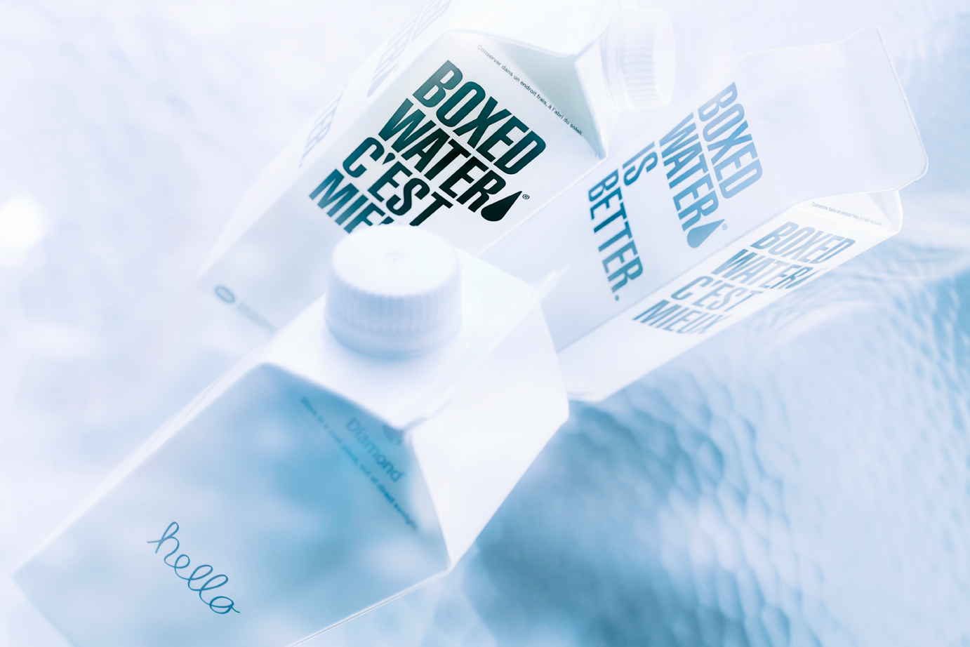
Water Carton TestWhen it comes to exceptional product photography, lighting is the essential in making the product come to life. Case in point: these simple, minimalistic water cartons begged to have the spotlight shone on their clean lines and stark contrast. The goal was to take something simple, and render it elegant and breathtaking with creating the perfect lighting setup. For the client, this creates a product that is new and sexy – elevating it to be slick, cool, and utterly covetable.  With the right lighting and direction we can make every product look amazing!
The choice of photographer was obvious. With a reputation as a maestro of light techniques, Craig Wagner is always able to attain optimal lighting to showcase products. The goal was to create the distorted water effect to the background in-camera, rather than digitally. To add interest and texture to the image, Mr. Wagner utilized a large sheet of rippled glass as the background from our extensive prop closet at the Studio. He kept the lighting simple, only using one 2000w Junior Mole, and redirecting it as needed with silver cards and a Mini-Mole as a kicker. Using the tungsten lights allowed him to drag the shutter for 4-6 seconds, during which he altered different parts of the image to create the visual wavy effect. Our post-production team adjusted the color temperature and saturation to achieve a flawless color tone, and the final beauty shot.
Producer: Liz Swales
Photographer: Craig Wagner
Digital Artist: Carl Beery
Equipment: Canon 5D MKIII w/ TS-E 45mm 2.8
Lighting: 200W Mini-Mole, 2000W Junior Mole (Key light)
Check out our other product photography, where the product sits center stage with lighting that highlights the unique attributes of each item. Then give us a ring so we can capture your product in the limelight.
 

Food Photography – Mac & Cheese Shoot

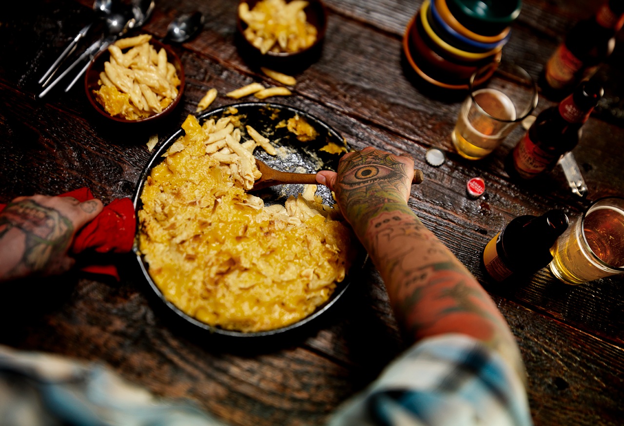
Mac n Cheese_0162This Mac & Cheese food photography shoot showcases the Studio 3 creative Team’s exceptional ability with food photography and food styling. The goal was to show the quintessential down-home comfort food (macaroni & cheese) in a cozy Fall table setting, creating a warm, family-inspired atmosphere. The color palette featured an array of rustic wood, reds, and yellows…but with a Seattle twist. A Thanksgiving with friends = a “Friendsgiving.” The resulting photo depicts a homey environment in a beautiful, relatable way.
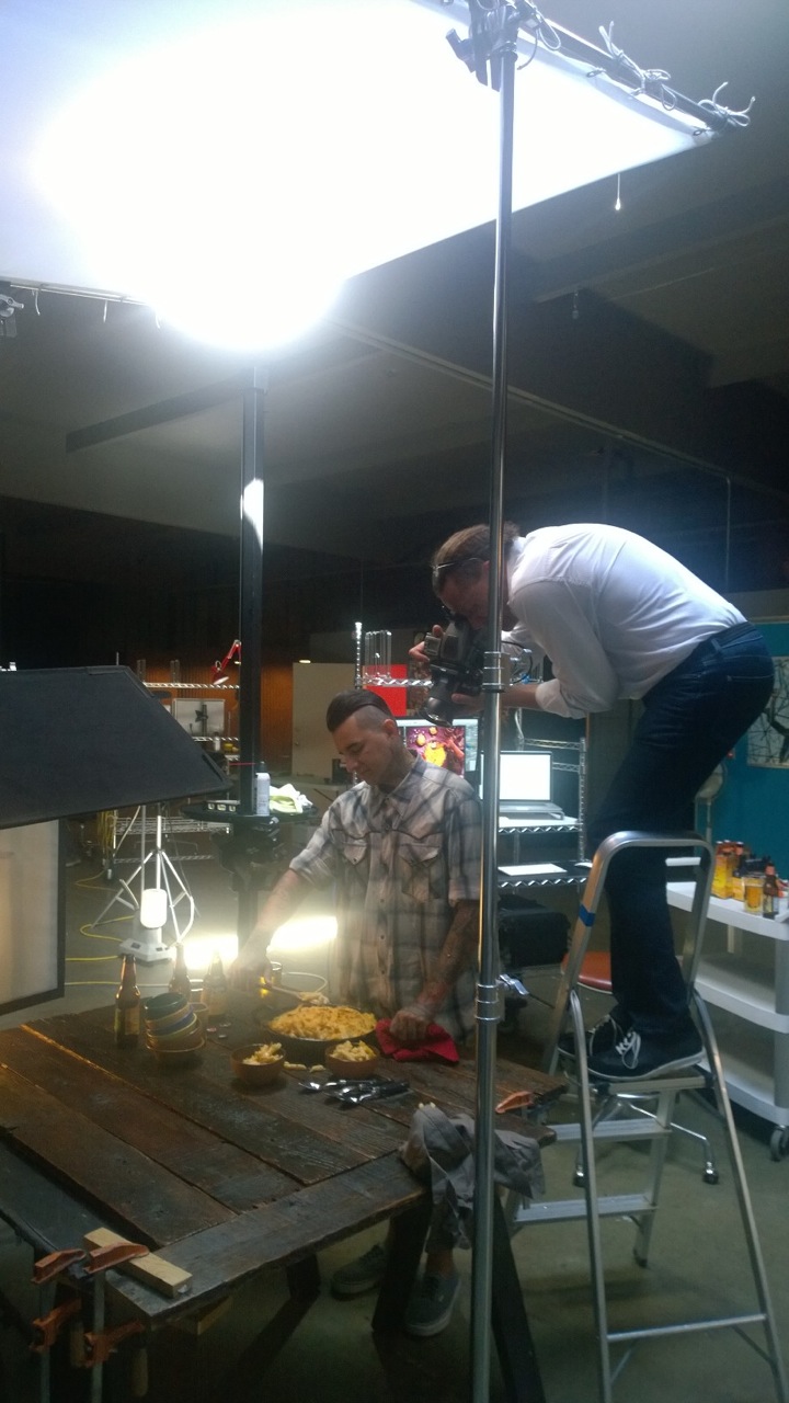
David Bell was the ideal choice as photographer for this shoot since creating a dark, moody atmosphere is one of his many skills. David and our fabulous Producer Ms. Megan spent half a day just working on the lighting and playing with the tilt-shift the week before the shoot. The tilt shift adapter is a favorite tool of Mr. Bell’s, allowing more control of the plane of focus. With this he was able to get the essential shallow focus to the shot, directing where the viewer looks. Due to the extensive lighting preparation once the model was actually on-set, the shoot was executed seamlessly within just 2 hours, making the model budget reasonable.

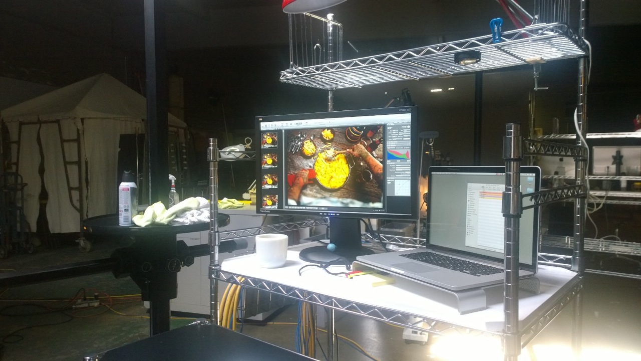
The team utilized an old cast iron skillet that had been loved for many years, and mis-matched bowls to give the sense of Seattle “found” goods. (It seems to be a recent trend in food photography and prop styling to have an eclectic collection of silverware, plates, bowls, glasses etc. instead of “matched sets” of everything – check out the latest issues of your favorite food and lifestyle magazines to see this in action!). In trying to stay authentic to the creative vision, we used the bowls as our (seemingly) random element and kept consistency with the silverware and glassware. Cider right now is the new beer (isn’t it, though?) and we have a BIG love for local ciders, so wanted to make that option available on our endless prop table. The request for a model with a hipster vibe took us visiting tattoo parlors instead of the normal modeling agencies. WP_20140910_14_18_31_Pro
Besides the food, the model’s arms were the most important element in the image. We needed someone that had interesting colors, patterns, and art covering their whole forearms, and ideally, with tattoos on their hands as well. (No makeup necessary!) We originally toyed with the idea of a woman serving the food, but thought that was too conventional. We settled on a rugged PNW (that’s Pacific Northwest for those of you not familiar with our local slang!) male with the perfect amount of unique designs, color, and composition to his tattoos. This edgy element really took the shot to the next level.WP_20140910_14_18_42_Pro

Food Photography Essentials in a Professional Photoshoot

*Food photography often has a short window of time before the food starts to cool off or look less than “appetizing.” Unlike other product photography shoots, there is a time-sensitive imperative to capture the shot quickly.
*Allow time before the shoot to extensively text lighting setups and prop styling. The more time spent beforehand on these details, the more efficiently the shoot can be carried out. (Time is money!)
*The Producer’s skills are essential in executing the shoot and in coordinating all the necessary logistics. Our Producer Megan Nolan has years of experience with Food and Beverage Photography, so is able to coordinate efficiently and effectively to capture that perfect shot.
Producer: Megan Nolan
Props: Megan Nolan
Wardrobe: Megan Nolan
Comic Relief & Prop Removal…aka eater of mac: Chris Eltrich
Photographer: David Bell
Digital Artist: Alex Gumina
Model: Michael Lopez
Camera: Hasselblad V-Series with a 35mm lens and the tilt shift adapter
Lighting: Speedotron Fresnel flash head
Check out more of our food photography here – but we’re not responsible if your mouth starts watering uncontrollably. And if you’re in the market for photography that makes your products, beverages, and food entice, give us a ring anytime.

Video – September 1 Second Every Day

“There are so many tiny, beautiful, funny, tragic moments in your life — how are you going to remember them all?”
We’ve begun a new tradition of having the Studio 3 Team record videos of tiny, beautiful, funny, tragic, and amazing 1-second moments in their lives. For our newest piece, we’ve edited another 30-second video short from September that encapsulates what we’re all about.
Studio 3 is an awesome place to work, made up of a band of cool, creative talent. We also offer videography services to discerning clients who need the very best for their commercial shoots – and it’s our video Director David King who creates all of our videos.
The above video was just for fun, but Director David King and our Team regularly produce professional videos that effectively tell the brand story and exceed client expectations. Our process begins when a client reaches out to Studio 3 with a creative conundrum. We get into the client’s head and solve their problem utilizing our technical filmmaking skills to create a compelling visual story. Check out some of the videos we have produced for past clients here.
Each clip in the video is a snapshot, a moment from the past month, compiled by Mr. King into this upbeat vignette. In reality, these 30 seconds = “a month in the life” of Studio 3. Get a glimpse into what it’s like to hang out with us for a month (in one-second intervals):


If you’re interested in showcasing your best 1-second moments, the 1 Second Everyday app is available from the App Store. See our earlier 1 Second Everyday video from July here – and get in touch for an experience you won’t easily forget.

Apparel Photography – Vintage Levi's Jacket

Jacket Test
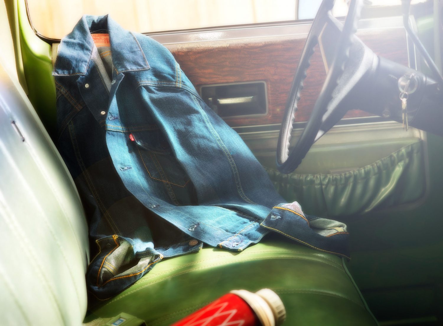
Beautiful lines, gorgeous greens, rich wood paneling: all of it harkened back to the days of yesteryear, when times were simpler. The Studio 3 Photography Team aimed to capture the nostalgia and rustic appeal of those times, through artistic prop styling and creating a snapshot of a moment in a day laborer’s life.
Craig Wagner led the shoot, setting the lighting to emulate being out in the hot sun of eastern Oregon. The team sourced a vintage 1976 Chevy Cheyenne truck, a set of barn doors to act as backdrop, and a table full of vintage, time-worn props wrangled by our own queen of vintage Ms. Liz. However after spending most of the day shooting the jacket hanging on the mirror outside the truck it just seemed too predictable, and we wanted something different. After trying countless “ideas” the team settled on a Levi’s denim jacket arranged artfully against the driver’s-side door, creating our ideal apparel photography shot. It worked, and you could feel yourself being out there in the sun. With great photography the post-production was minimal, with minor color adjustment to bring out the swaths of green and blue. And of course just a little snap added to that ever-important little red tab that was created to differentiate Levi’s from its competitors.
Creating the right lighting for this piece was essential to the mood of the finished image. This is how to do it:

What Warm Sunny Lighting?

  • Apply heavy warming gels on the lights
  • Overexpose the lighting on the backdrop by a couple stops while still holding detail in the highlights
  • For the key light: Set up a strobe head with a large reflector (16″-21″) and soften by placing some Diffusion over it
  • Bring up the fill light to show detail in the deeper shadows
  • Control the amount of lens flare using a soft silver card placed just out of frame and hit with a diffused light, bouncing it back into the lens
  • Hire Craig!

Producer: Liz Swales
Prop Styling: Liz Swales
Photographer: Craig Wagner
Photography Assistant: Jonny Brandt
Digital Artist: Alex Gumina
Camera: Hasselblad H4D, 80 mm lens
Lighting: Black Line Speedotron strobes
If you want to differentiate yourself and your clients check out more of our photography and see our advanced lighting techniques in action. Take a gander at our Portfolio (and see if you can spot where our lights were placed!)
And if you’re following us on Twitter, you’ll see much more of our lifestyle photography, product shoots, inspiration, and tips on professional lighting and photography. Check out Studio 3 on Twitter for the lowdown!
 

Product Photography Shoot – Grenade Gloves

grenade-gloves-studio-3Here at Studio 3 we are often coming up with new ideas to to push the envelope and add gorgeous images to our portfolio.
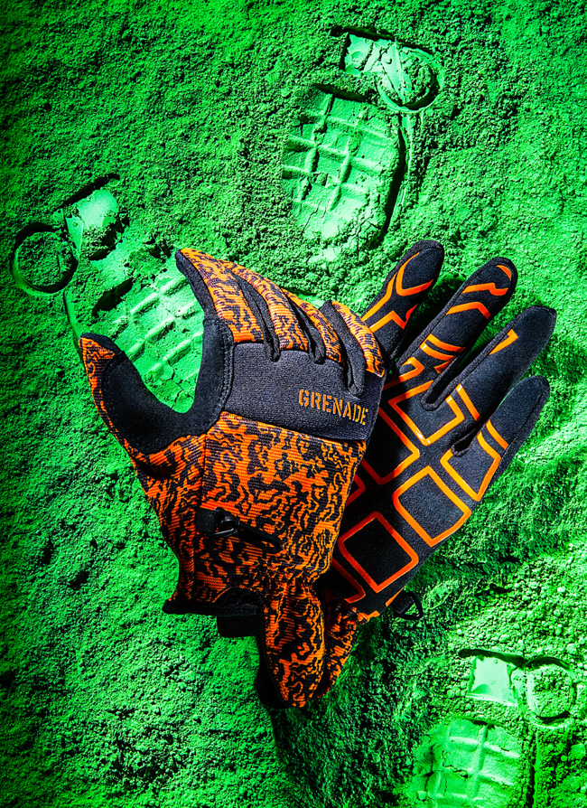
We recently completed a product photography shoot with our Photographer Henry Ngan, featuring Grenade Gloves on a bed of green powder.
We know what you’re all wondering: are these gloves used to handle grenades? Are they made from used grenade casings? If you’re not into snowboarding, Motocross, or skateboarding, you may not have heard of Grenade Gloves.
Founded in 2001 by the two professional snowboarders Matt and Danny Kass, Grenade Gloves Inc. is now a worldwide, global lifestyle brand that has hosted the annual Grenade Games since 2005. The founders chose the grenade as their logo because it was reminiscent of G.I. Joe, someone they felt was in line with their renegade image. Headquartered in Portland, OR, the Grenade Gloves brand is growing at an exponential rate and has a loyal following of extreme sports enthusiasts.
No grenades were harmed in the making of this photograph, however. The inspiration for this photo came from a recent magazine feature, where powder was used to show the imprint of the product, instead of the product itself appearing in the photo. We thought it a neat idea to incorporate this into our next product photo shoot.

Prop Styling Behind the Scenes

Henry bought toy grenades for the shoot, and had to disassemble the parts to imprint each carefully into the chosen background powder. The team carefully addressed the placement of the grenades, first trying out a full-scale pattern (which looked too busy), and then settling on one where the glove would appear to be “holding” a single grenade. Other imprints were made selectively in the powder order to balance out the initial top-heavy feel.
The gloves appeared too flat in the first test shots; in order to give them body and allow the fingers to be bent the team created an internal wire structure all the way into the fingertips. Henry wanted the feel of hard light in the image so the scene was lit by a single Fresnel key light and incorporating mirrors and bounce cards to enhance and fill the scene. In post-processing, our Digital Artist Ciaran Green removed stray fibers and increased the contrast in areas that appeared too blown-out under the hard lighting. With a little tweaking, the image turned into what you see above: a beautiful color pop of green and orange, with saturated blacks. All in all, it was a fun couple-day shoot for the team, resulting in art and photography merging on a bed of green.

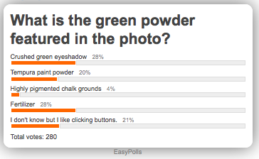
Poll: Identify that Prop Styling Material!

**Poll is now CLOSED**

easypoll_results

Find out the answer on Twitter!

And if you’re not following us there yet – go ahead and sign up; we don’t bite. And we won’t lob grenades at you. We just showcase amazing, inspiring photography that you’ll definitely want to see.
Go ahead – take a peek.