Food Photography – Mac & Cheese Shoot

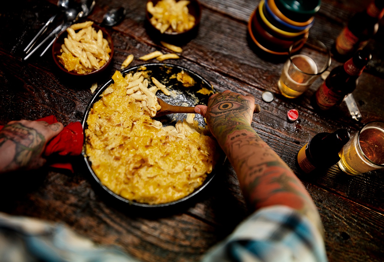
Mac n Cheese_0162This Mac & Cheese food photography shoot showcases the Studio 3 creative Team’s exceptional ability with food photography and food styling. The goal was to show the quintessential down-home comfort food (macaroni & cheese) in a cozy Fall table setting, creating a warm, family-inspired atmosphere. The color palette featured an array of rustic wood, reds, and yellows…but with a Seattle twist. A Thanksgiving with friends = a “Friendsgiving.” The resulting photo depicts a homey environment in a beautiful, relatable way.
David Bell was the ideal choice as photographer for this shoot since creating a dark, moody atmosphere is one of his many skills. David and our fabulous Producer Ms. Megan spent half a day just working on the lighting and playing with the tilt-shift the week before the shoot. The tilt shift adapter is a favorite tool of Mr. Bell’s, allowing more control of the plane of focus. With this he was able to get the essential shallow focus to the shot, directing where the viewer looks. Due to the extensive lighting preparation once the model was actually on-set, the shoot was executed seamlessly within just 2 hours, making the model budget reasonable.

The team utilized an old cast iron skillet that had been loved for many years, and mis-matched bowls to give the sense of Seattle “found” goods. (It seems to be a recent trend in food photography and prop styling to have an eclectic collection of silverware, plates, bowls, glasses etc. instead of “matched sets” of everything – check out the latest issues of your favorite food and lifestyle magazines to see this in action!). In trying to stay authentic to the creative vision, we used the bowls as our (seemingly) random element and kept consistency with the silverware and glassware. Cider right now is the new beer (isn’t it, though?) and we have a BIG love for local ciders, so wanted to make that option available on our endless prop table. The request for a model with a hipster vibe took us visiting tattoo parlors instead of the normal modeling agencies. WP_20140910_14_18_31_Pro
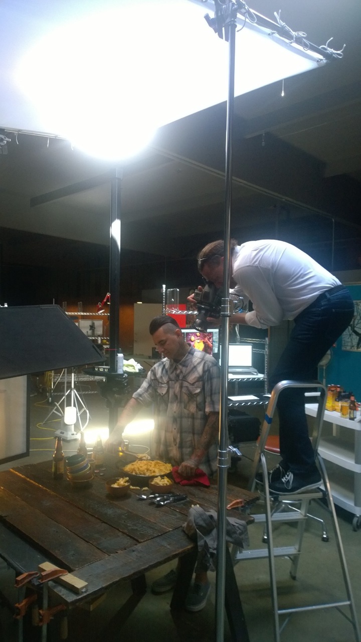
Besides the food, the model’s arms were the most important element in the image. We needed someone that had interesting colors, patterns, and art covering their whole forearms, and ideally, with tattoos on their hands as well. (No makeup necessary!) We originally toyed with the idea of a woman serving the food, but thought that was too conventional. We settled on a rugged PNW (that’s Pacific Northwest for those of you not familiar with our local slang!) male with the perfect amount of unique designs, color, and composition to his tattoos. This edgy element really took the shot to the next level.WP_20140910_14_18_42_Pro
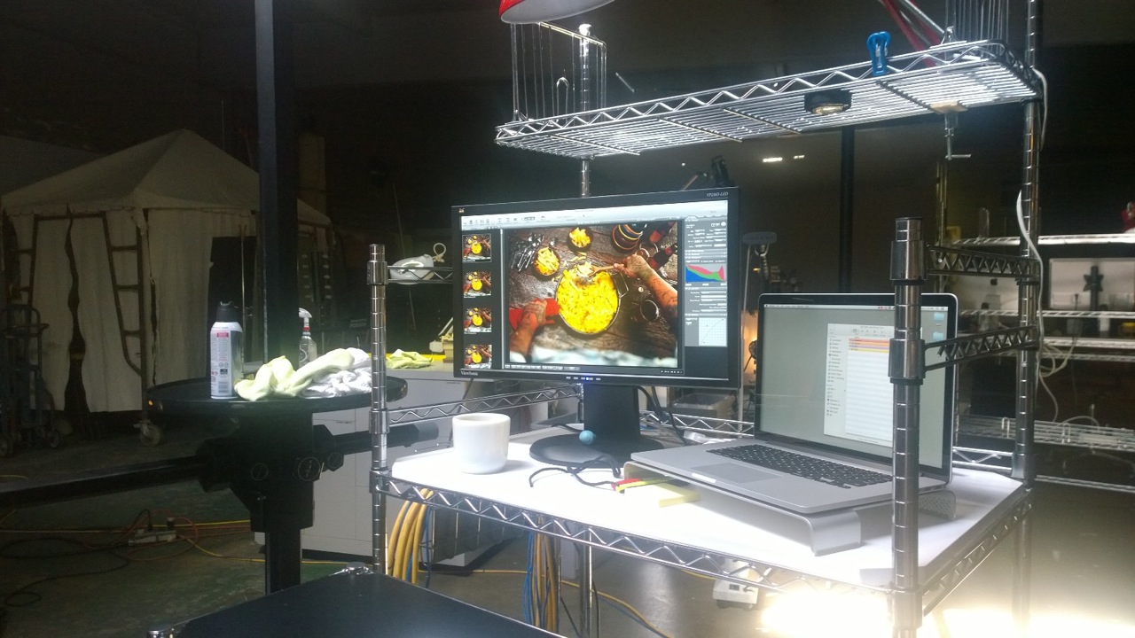
Food Photography Essentials in a Professional Photoshoot

*Food photography often has a short window of time before the food starts to cool off or look less than “appetizing.” Unlike other product photography shoots, there is a time-sensitive imperative to capture the shot quickly.
*Allow time before the shoot to extensively text lighting setups and prop styling. The more time spent beforehand on these details, the more efficiently the shoot can be carried out. (Time is money!)
*The Producer’s skills are essential in executing the shoot and in coordinating all the necessary logistics. Our Producer Megan Nolan has years of experience with Food and Beverage Photography, so is able to coordinate efficiently and effectively to capture that perfect shot.
Producer: Megan Nolan
Props: Megan Nolan
Wardrobe: Megan Nolan
Comic Relief & Prop Removal…aka eater of mac: Chris Eltrich
Photographer: David Bell
Digital Artist: Alex Gumina
Model: Michael Lopez
Camera: Hasselblad V-Series with a 35mm lens and the tilt shift adapter
Lighting: Speedotron Fresnel flash head
Check out more of our food photography here – but we’re not responsible if your mouth starts watering uncontrollably. And if you’re in the market for photography that makes your products, beverages, and food entice, give us a ring anytime.
Apparel Photography – Vintage Levi's Jacket

Jacket Test
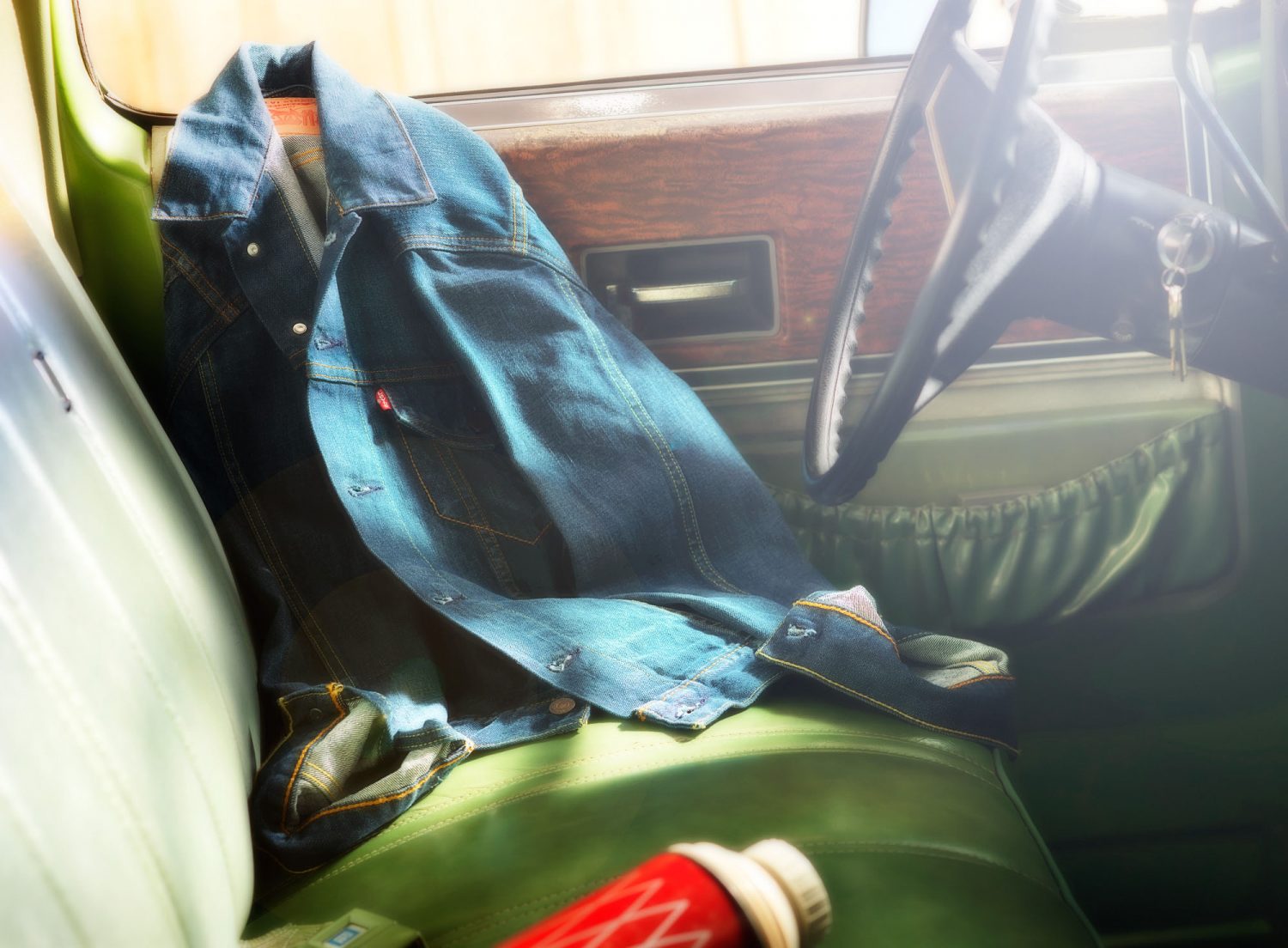
Beautiful lines, gorgeous greens, rich wood paneling: all of it harkened back to the days of yesteryear, when times were simpler. The Studio 3 Photography Team aimed to capture the nostalgia and rustic appeal of those times, through artistic prop styling and creating a snapshot of a moment in a day laborer’s life.
Craig Wagner led the shoot, setting the lighting to emulate being out in the hot sun of eastern Oregon. The team sourced a vintage 1976 Chevy Cheyenne truck, a set of barn doors to act as backdrop, and a table full of vintage, time-worn props wrangled by our own queen of vintage Ms. Liz. However after spending most of the day shooting the jacket hanging on the mirror outside the truck it just seemed too predictable, and we wanted something different. After trying countless “ideas” the team settled on a Levi’s denim jacket arranged artfully against the driver’s-side door, creating our ideal apparel photography shot. It worked, and you could feel yourself being out there in the sun. With great photography the post-production was minimal, with minor color adjustment to bring out the swaths of green and blue. And of course just a little snap added to that ever-important little red tab that was created to differentiate Levi’s from its competitors.
Creating the right lighting for this piece was essential to the mood of the finished image. This is how to do it:

What Warm Sunny Lighting?

  • Apply heavy warming gels on the lights
  • Overexpose the lighting on the backdrop by a couple stops while still holding detail in the highlights
  • For the key light: Set up a strobe head with a large reflector (16″-21″) and soften by placing some Diffusion over it
  • Bring up the fill light to show detail in the deeper shadows
  • Control the amount of lens flare using a soft silver card placed just out of frame and hit with a diffused light, bouncing it back into the lens
  • Hire Craig!

Producer: Liz Swales
Prop Styling: Liz Swales
Photographer: Craig Wagner
Photography Assistant: Jonny Brandt
Digital Artist: Alex Gumina
Camera: Hasselblad H4D, 80 mm lens
Lighting: Black Line Speedotron strobes
If you want to differentiate yourself and your clients check out more of our photography and see our advanced lighting techniques in action. Take a gander at our Portfolio (and see if you can spot where our lights were placed!)
And if you’re following us on Twitter, you’ll see much more of our lifestyle photography, product shoots, inspiration, and tips on professional lighting and photography. Check out Studio 3 on Twitter for the lowdown!
 

Product Photography Shoot – Grenade Gloves

grenade-gloves-studio-3Here at Studio 3 we are often coming up with new ideas to to push the envelope and add gorgeous images to our portfolio.
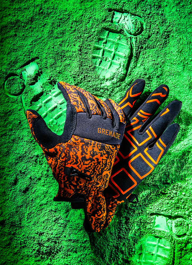
We recently completed a product photography shoot with our Photographer Henry Ngan, featuring Grenade Gloves on a bed of green powder.
We know what you’re all wondering: are these gloves used to handle grenades? Are they made from used grenade casings? If you’re not into snowboarding, Motocross, or skateboarding, you may not have heard of Grenade Gloves.
Founded in 2001 by the two professional snowboarders Matt and Danny Kass, Grenade Gloves Inc. is now a worldwide, global lifestyle brand that has hosted the annual Grenade Games since 2005. The founders chose the grenade as their logo because it was reminiscent of G.I. Joe, someone they felt was in line with their renegade image. Headquartered in Portland, OR, the Grenade Gloves brand is growing at an exponential rate and has a loyal following of extreme sports enthusiasts.
No grenades were harmed in the making of this photograph, however. The inspiration for this photo came from a recent magazine feature, where powder was used to show the imprint of the product, instead of the product itself appearing in the photo. We thought it a neat idea to incorporate this into our next product photo shoot.

Prop Styling Behind the Scenes

Henry bought toy grenades for the shoot, and had to disassemble the parts to imprint each carefully into the chosen background powder. The team carefully addressed the placement of the grenades, first trying out a full-scale pattern (which looked too busy), and then settling on one where the glove would appear to be “holding” a single grenade. Other imprints were made selectively in the powder order to balance out the initial top-heavy feel.
The gloves appeared too flat in the first test shots; in order to give them body and allow the fingers to be bent the team created an internal wire structure all the way into the fingertips. Henry wanted the feel of hard light in the image so the scene was lit by a single Fresnel key light and incorporating mirrors and bounce cards to enhance and fill the scene. In post-processing, our Digital Artist Ciaran Green removed stray fibers and increased the contrast in areas that appeared too blown-out under the hard lighting. With a little tweaking, the image turned into what you see above: a beautiful color pop of green and orange, with saturated blacks. All in all, it was a fun couple-day shoot for the team, resulting in art and photography merging on a bed of green.

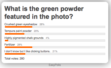
Poll: Identify that Prop Styling Material!

**Poll is now CLOSED**

easypoll_results

Find out the answer on Twitter!

And if you’re not following us there yet – go ahead and sign up; we don’t bite. And we won’t lob grenades at you. We just showcase amazing, inspiring photography that you’ll definitely want to see.
Go ahead – take a peek.
 

Polartec Punch

 
Frank Creative
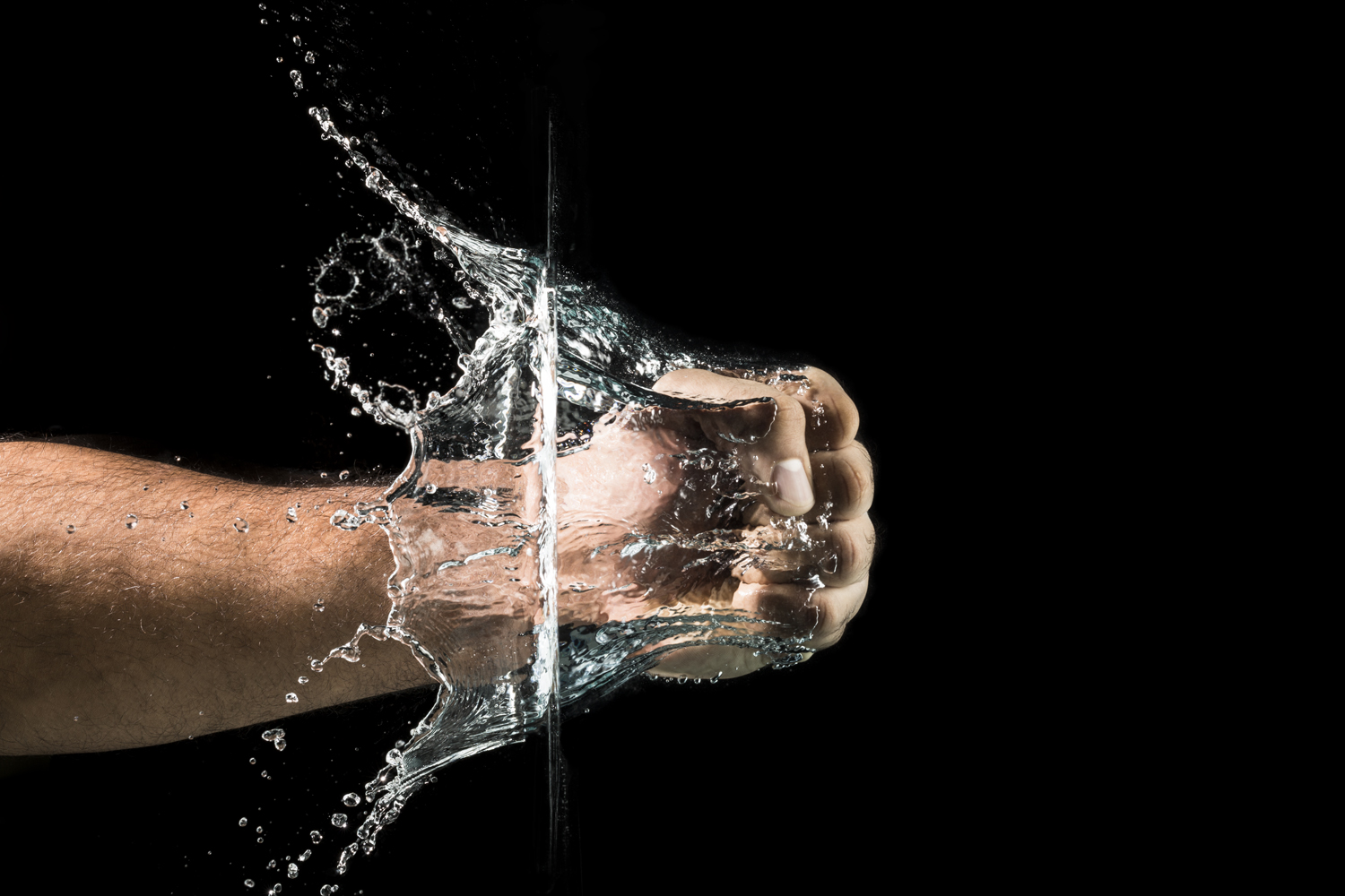
Talk about making a splash this summer! Studio 3 has been heating up on set- this time with one of our fun and creative clients, Frank’s Garage. The team at Frank’s called us to help them visually illustrate the many qualities and characteristics of Polartec High-Performance Fabrics. The goals for these images were to portray the waterproof protection and breathability of the NeoShell outwear fabric. After the production meeting, photographer, Craig Wagner couldn’t wait to get his hands dirty…or soaked. As always, he came up with a great solution for capturing this fist going through water:
“I knew Broncolor’s Scoro S power packs would provide control of the high flash duration needed to freeze the action without giving up the output needed to capture this image. Our initial approach was to shoot using a H4D-40 Hasselblad and our IR trigger setup, but found that the inconsistent speed of the punching fist didn’t give us the results we were looking for. We switched to our Canon 5D MKIII to take advantage of 6 FPS burst rate. We then made adjustments to the Scoro packs and after a few attempts, the model and I were in sync.”
Many different oils and lotions were tried on the model’s hand to reduce drag and create a smoother looking barrier between the fist and water. In the end, nothing worked better than some good-old fashioned baby oil.
So in the end, with a great concept, extraordinary photography, a fish tank and some baby oil, an image that packed tremendous punch was made. Add some punch to your photography, call us, we can deliver.

Break A Cool Sweat

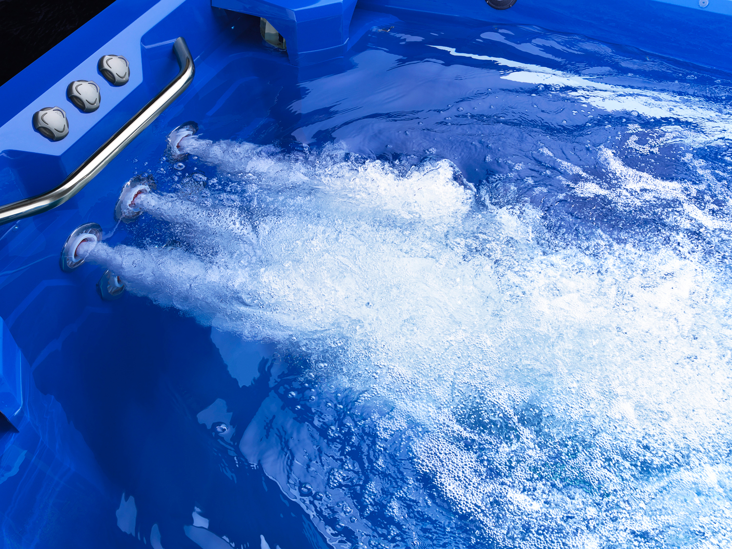
Here we are in the HOT HOT HEAT of the summer and there’s no way we are hanging up our bathing suits just yet! While breakin’ a cool sweat and trying to stay cool, Studio 3 brought in the Marquis Spas  ATV (Aquatic Training Vessel) for a much needed dip. The ATV was delivered on a trailer and was fork-lifted into Studio 3. From there, the team hauled that huge piece of heaven onto a custom-built stage. It took 2 days to fill it up and get it to a temperature that was juuuust right. Once the bubbles were flowing, the cameras started rolling. 
Marquis Spas
Studio 3 has had the pleasure of working with Marquis Spas for many years now. The California based company founded in 1980 strives to provide top-of-the-line aquatic products that aid in rest and relaxation for the “ultimate soaking experience.” 
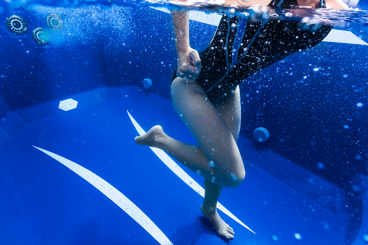
For this particular shoot Studio 3 Film Director of Video Production, David King, filmed the features of the ATV while our Lead Photographer, Craig Wagner, caught some overhead and underwater shots. Craig gives a bit of insight on this splish-splash shoot:
“I was piggy-backing on the video shoot of Marquis’ new ATV. The client wanted to feature someone working out (water aerobics) from under the water’s surface. Since the tank was blue, we chose to give the image an overall blue hue by gelling the key lights.
I shot this using a Canon 5D MKIII in our underwater housing. I also mounted a Canon 5D MKIII above the tank for the overhead image. I remotely triggered the camera and viewed the images in Lightroom. Speedotron packs and heads were used along with our 8’x14′ lightbank with custom flash tubes.”
Marquis Spas
The end result was comprised of a five-star video and brilliant stills that capture the endless capabilities of a Marquis Spas ATV. If you think you don’t need one, just wait until you watch this.
There’s still a lot more sunshine comin our way for the rest of the summer. If you can’t take the heat, give us a call! Let Studio 3 take care of business while you enjoy the non-stop flow of ice cold drinks to keep you cool.

Studio 3 Rides Out On Ducati

ducati test
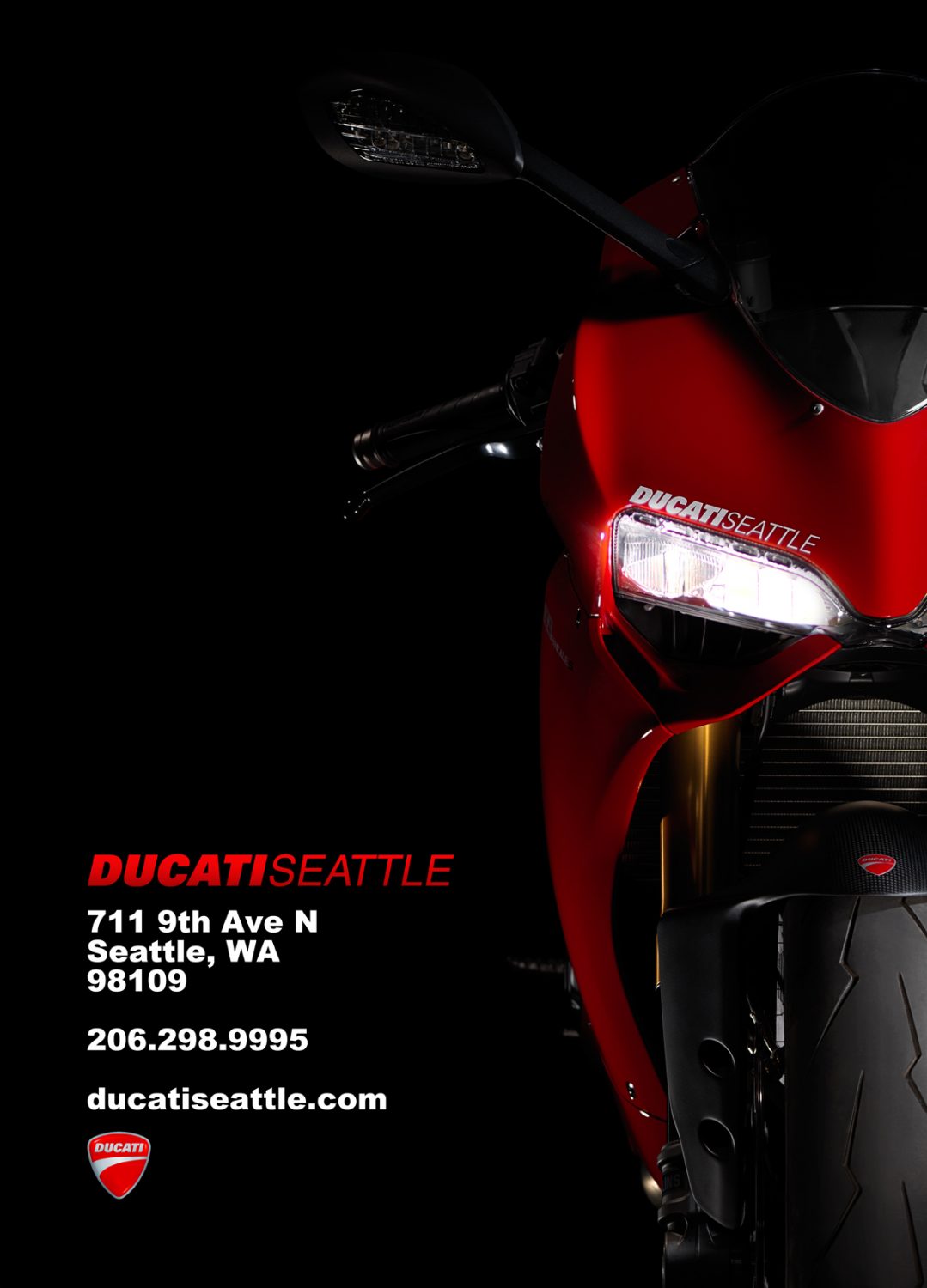
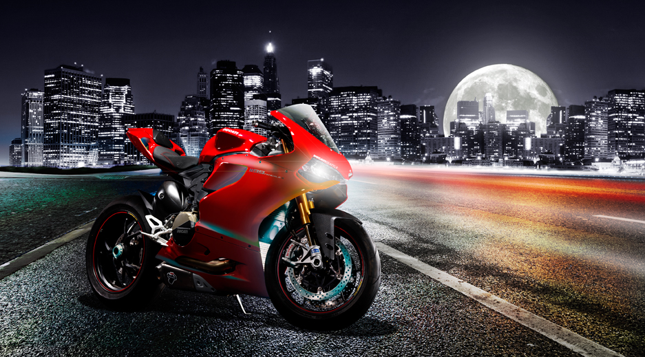
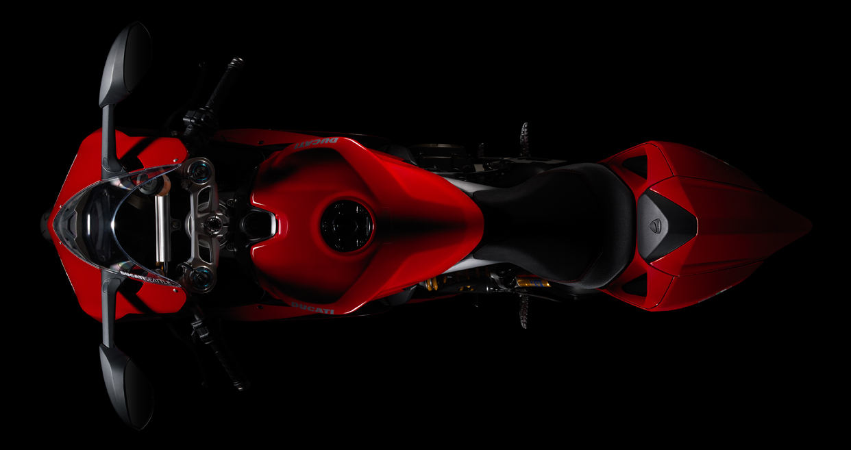
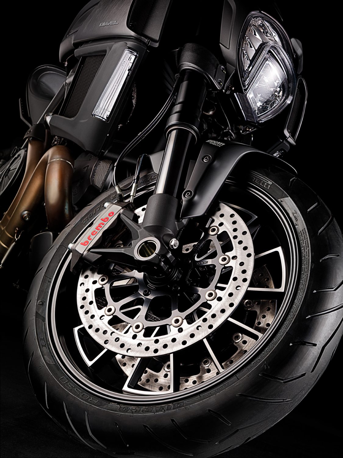
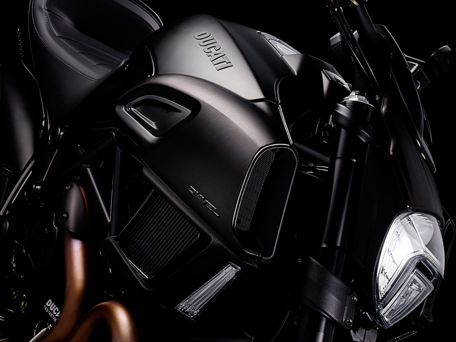
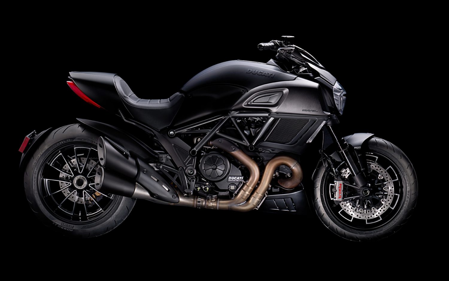
Summertime is all about fast cars and even faster Ducati motorcycles. Studio 3 wanted to explore our dare devil side and kick up the dust to catch the sunset on a few of these bad boys of the road. While the rest of us had fun forming our very own Studio 3 Biker Gang, our talented Seattle Shooters David Bell and Chris Eltrich had the pleasure of capturing these beauties with a Hasselblad Medium Format camera system. Eltrich goes a little more in depth about this sexy shoot:
“The team was looking for a darker, dramatic look… I used Studio 3’s Speedotron lights for all the shots with various light modifiers, but generally each shot had a Beauty Dish as the key light with lights through diffusion panels for accents. A lot of the planning and conceptualizing for the shoot was done by our amazing Producer, Megan Nolan and our go to Digital Lead, Alex Gumina.”
Alex shares his inspiration behind his work here:
“There seems to be a trend in vehicle advertising lately of hyper-processed, super crisp images. I thought it would be fun to do something in this style but needed a subject. That’s where Ducati Seattle came in. I pitched the idea to Megan, our studio producer, and we made our way across Aurora to Ducati Seattle to look at some beautiful motorcycles. We met with the sales manager Mike MacConaghy and before we knew it we had a couple beautiful Italian made motorcycles in the studio.
The original plan was to do a couple composites using shots of the bikes in studio, and environmental shots for the backgrounds. We would blend the two together to make one perfect, seamless image. Since we had the bikes in studio though, we decided to take full advantage of our photographers capabilities and do some amazing detail shots as well. My only request was dark, moody, high contrast, and sexy. What you see here is the end result.”
ducati testducati testducati testducati testducati test
We had a blast having the Ducati Motorcycles for a few days. We couldn’t load up on our leather gear fast enough! At least we know we’ll be prepared for next summer! If you want in on the fun, give Studio 3 a call and we’ll bring an extra helmet.
 

Pick Up The Phone!

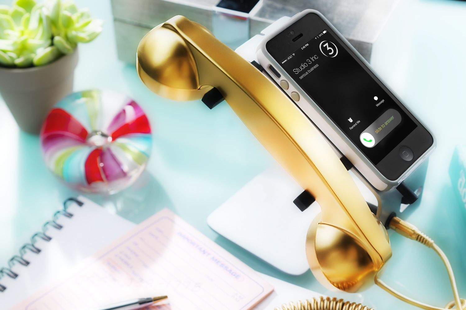
Stressed about your company’s visual needs? Would you rather spend time having fun in the sun? Let Studio 3 ease your mind this summer. We’ve been smashing out countless videos back to back, while continuously providing outstanding photography and flawless production. Oh, did we also mention that our digital team is amaze balls? Trust us, you don’t want to be the only tanless, overworked one at the company party because you didn’t know about Studio 3. Save the embarrassment of all the “are you kidding me?” looks. We’ll make sure you meet that crazy deadline. There’s no reason to miss out on all the perks of working with Studio 3. And no reason to keep on reading, you’re wasting precious beach time – make a Pina Colada, and start dialing!! Make that golden phone call!!!
CW_15086T_Pop_phone_PR_1500
And to make it that much easier, if you didn’t have our number yet, here ya go:

Portland Studio 503.238.1748, ask for Dalcetta

Seattle Studio 206.282.0939, ask for Marcella


Stop, Drop, & Knoll

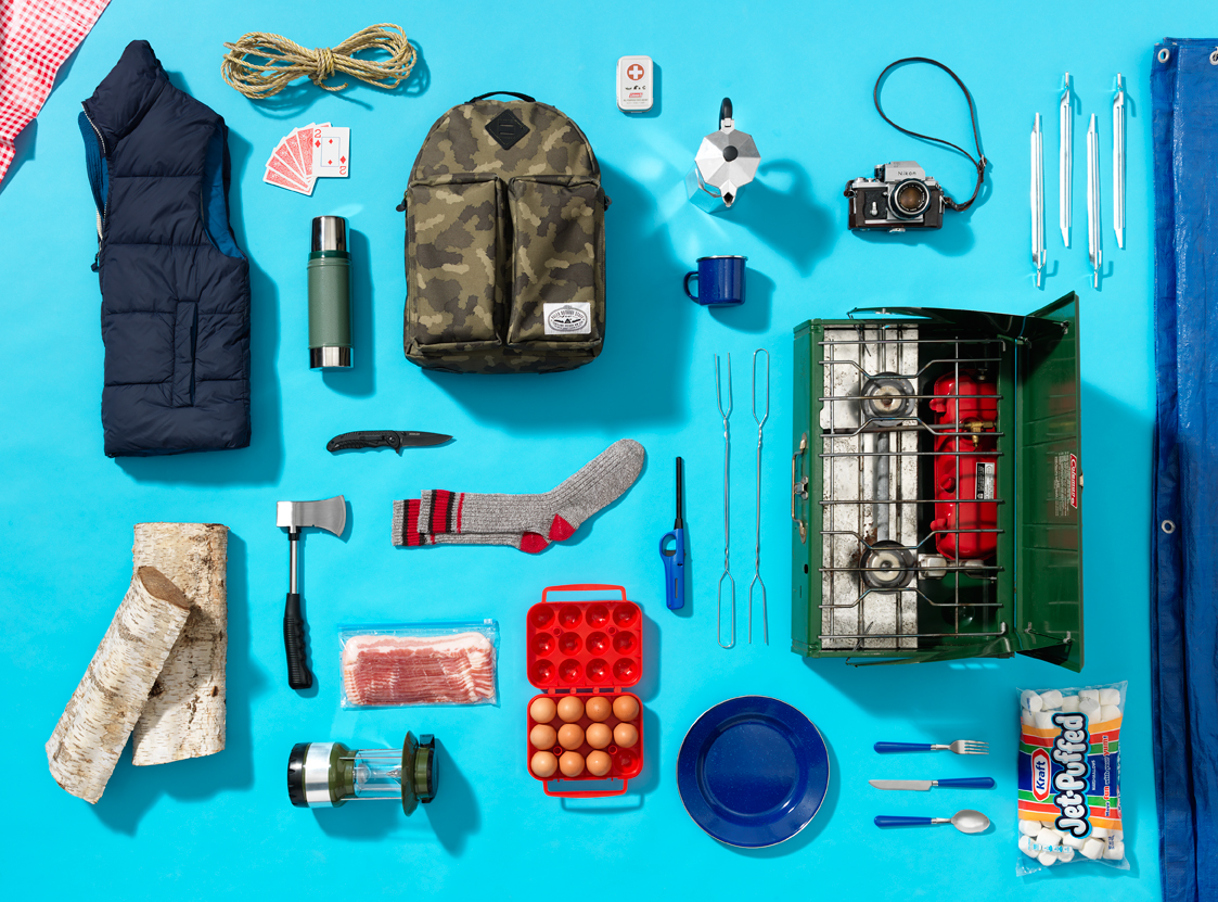
Coined in 1987 by Andrew Kromelow, Knolling is the process of arranging like objects in parallel or 90 degree angles as a method of organization.

Kromelow worked as the janitor for Frank Gehry’s furniture fabrication shop, which at the time was designing for Knoll, Inc. Knoll is known for its angular and modern designs and has over 30 pieces recognized and displayed in the Museum of Modern Art (MoMA). Each night when Kromelow would go to clean-up, he would arrange Gehry’s tools in the form of 90 degree angles for order, visibility, and optimal use. Kromelow called this process “Knolling.”

Years later when contemporary artist, Tom Sachs began working at the fabrication shop he adopted Kromelow’s style of organization as a form of art. He became so inspired by it that he came up with his own personal matra of “Always be Knolling.” This was modeled after Gehry’s famous in-house saying of “Always be closing.”

When Sach’s art became public, the Knolling craze took-off.

Camping_Story

And so, to keep Sach’s mantra alive, studio photographer, Chris Eltrich teamed up with commercial stylist, Tristan Weholt to map out and capture Studio 3’s take on camping just in time for the 4th of July.

We know what you’re thinking, “how could you forget the beer and hot dogs!?” Every 4th of July, Americans consume 155 million hot dogs; Many of which are probably roasted over an open fire and enjoyed next to a lakeside view. With that said, need the perfect place to pitch a tent? We have a few suggestions. But regardless of what you do or where you are this 4th of July, don’t forget how lucky you are to be an American. Even if that means shot-gunning as many patriotic brews as you can. Cheers and Knoll on!

#TBT: NIKE, "We Have Liftoff."

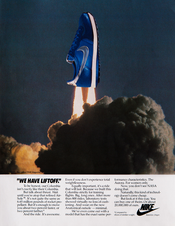
It’s a bird! It’s a plane! It’s….a….Nike Columbia? Reintroducing Nike’s soaring style named after it’s twin, NASAs Space Shuttle Columbia. This ground breaking style, very much like the Columbia Space Shuttle, is meant to endure long (st)rides. In an effort to blast this amazing new running shoe into the world of athleticism and fashion, Nike made sure to run it through several laboratory tests. According to the article below, after more than 800 miles, the shoe proved to show no loss of cushioning and minimal wear on the anatomical outsole. To launch this shoe the right way, David Kennedy, of Wieden & Kennedy, asked our team at Studio 3 to hop on board for this project. We then worked together, and knocked this Nike ad out of this world.

Nike_RocketLaunch_009_72dpi

When Studio 3 Lead Photographer, Craig Wagner, was asked to shoot this product – he was excited to the moon and back. Keep in mind, this ad was done in the early ’80s during the pre-digital days.

“We worked with Wieden & Kennedy quite a bit when they first started out. It was great to collaborate again on this project and compile an image together before the era of digital technology. Wieden & Kennedy provided the idea and the stock image of NASAs Columbia Space Shuttle. I shot this on a Sinar 4×5. This was actually my first time taking an image and lighting the product to match.”

Taking a flight back in time with this ad shows that our capabilities and imagination are beyond the world of digital art and computer technology. A little bit of old fashion simplicity and creativity, in this day in age and in the future, can still do the trick. Call us to find out how we can provide you with a stellar production.