17 Ways to Get Your Clients to Love You: A Studio 3 Guide

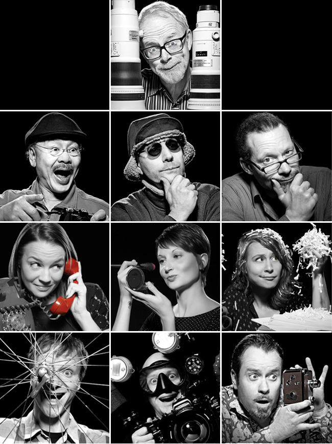
Collage of Studio 3, Inc. team member employee portraitsWe’ve been in business a long time, working with some clients for a decade or more. To us, the client relationship is paramount, and we go above and beyond to nurture it. What would you experience if you were a client of ours? Here are some direct quotes from our Team Members about what we mean when we speak of “Studio 3 Customer Service:”
Client Relationship Manager Jessica Lynes:

We take the time to anticipate our clients’ needs, ensuring that they have exactly what they need/want before they even know that they need or want it!
We always have their “favorites” when they’re here: foods, drinks, music, etc. is met with a “Wow! Thank you so much, I can’t believe you remembered!”

Portland Producer Liz Swales:

We get the client’s job done: efficiently, flawlessly, and simply, while exceeding their their expectations.
We take care of them like royalty…AKA feeding them fun and amazing food!

Chaos Wrangler Niki Gillespie:

We streamline the behind-the-scenes details to ensure the smoothest client experience. Clients love our process but never are over-aware of it. No bottlenecks.

Seattle Producer Kaitlin McMillan:

We will do anything! If the client wants it done, we’ll get it done for them – no hesitation or questions. Any budget, any client, any person, any product… we have a solution for even the most difficult of requests.
We create an “atmosphere” while a client is on set: you can bring your laptop and do work, you can play ping pong when you’re just here tagging along for a shoot, you can watch the news and drink coffee with your feet up on a couch. We inspire creativity and hard work all while in great company.

Digital Artist Carl Beery:

Clients appreciate our experience in pre-media print and web production. Knowing how print collateral and websites are built helps me ask the right questions before problems arise.
Years of experience interpreting markup also helps us make the edits that clients want to see, ensuring a flawless final outcome for all.

Digital Artist Tom Radio:

We make the impossible POSSIBLE when it comes to post-production!

Video Director David King:

We care about building relationships throughout the creative process and we keep client satisfaction as our #1 goal.

Photographer David Bell:

Listen. Pay Attention. Make them the most important thing happening then and there. Make it fun.

Photographer Craig Wagner:

We always try to give our clients more than what they’re initially asking for (like different angles on the same setup), and we are ultimately flexible when working. We won’t consider the creative brief set in stone, and are bold enough to run with an idea, which clients appreciate on set.

Photographer and Studio 3 co-founder Henry Ngan:

By offering them any level of service they need to make their projects a success.
By thinking out of the box creatively to provide a unique vision and fresh look.

Photographer and Studio 3 co-founder Jim Felt:

We always follow through on our promises.
We care about the future relationship with every single client. We value their friendship and the ability to create fun images for them. We are proud of our relationship with each and every client, large or small.

Can’t wait to experience what it’s like to be a Studio 3 client? Reach out and bring us your next project. You’ll experience all of the above…and more.
Branding = Consistent Photography. So Why It Is So Darn Hard To Achieve?

leatherman-tool-climbing-advertisement-product-photography-studio-3

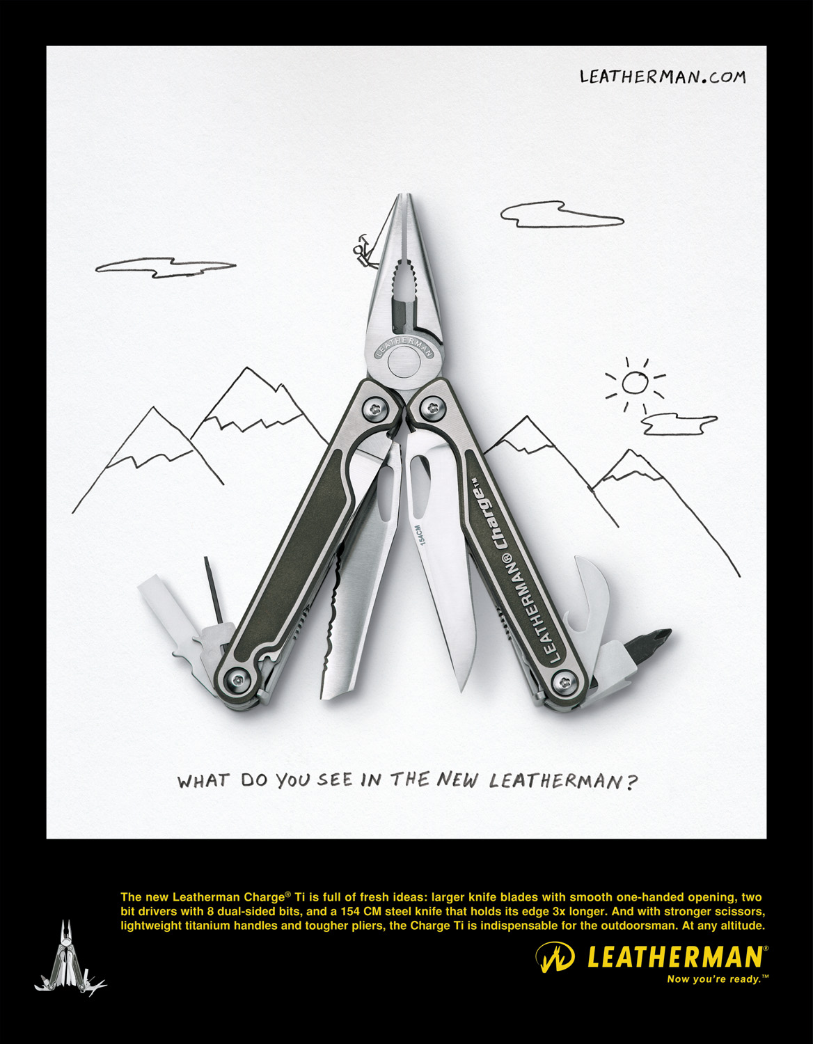
Leatherman advertisement, circa 2012. Photo by David Bell.

We all know that a company’s brand needs to have a consistent “look” when putting oneself out there. Point-of-purchase images, product photography, website design, advertising campaigns, product packaging, social media channels…all need to look as if part of the same company so as not to confuse the consumer and provide a singular branded experience.griots-garage-polishing-kit-product-photography-studio-3

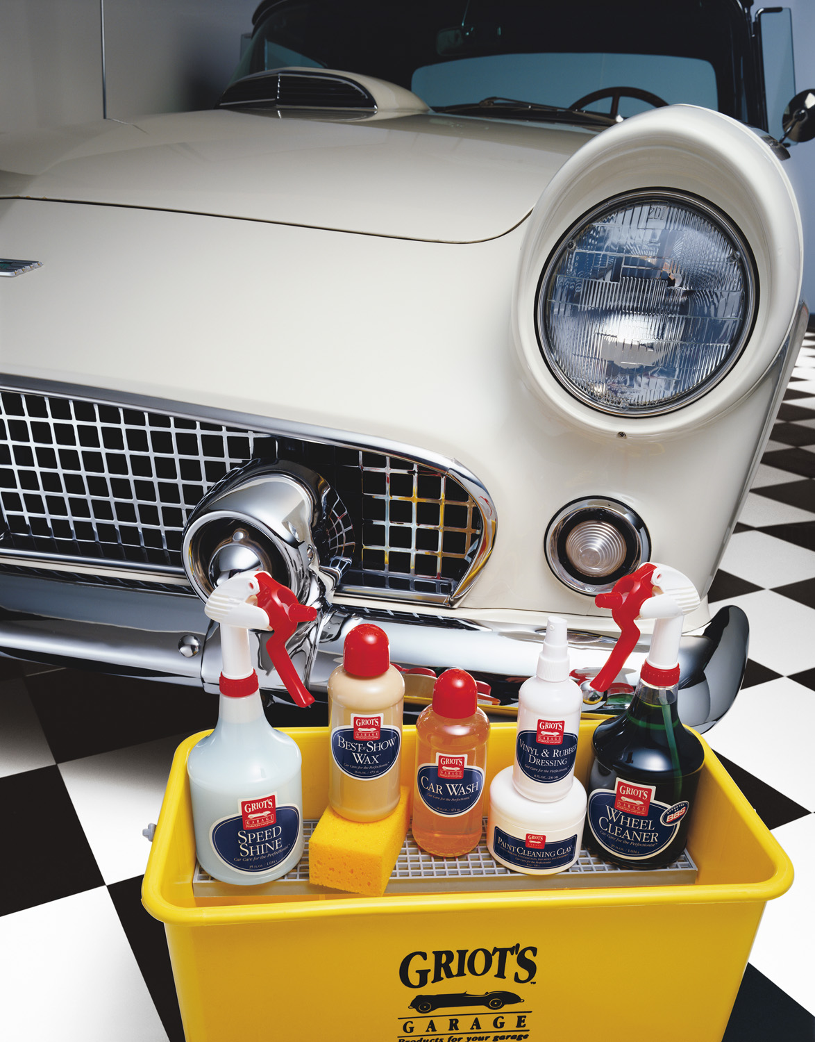
Griot’s Garage is all about products to make your car shine. David Bell’s photography for Griot’s features solid primary colors, checkered floors, and sleek collector cars.

But there are some brands out there whose images are all over the map. You know who they are. When you come across one of their product images, banner ads, or social channels you’re confused momentarily. Could this be the same company…? You definitely don’t want your audience wondering at each touchpoint. Here are 4 reasons why companies fail to show consistency in their branding photography:
1. Switching up your visual content providers too frequently

Playing switcheroo has become an issue for some brands when it comes to visual content. Often on to newer, more buzzworthy, largest online following…whatever is the latest and greatest, some companies are quick to jump on the popularity bandwagon. But does that really result in stellar, consistent visuals for your audience? Partnering with the latest Insta-star making headlines may be great for grabbing people’s attention momentarily…but does it really make sense for what your brand stands for? It could be a step backwards in your strategy that leads to muddled visuals and a garbled brand message.
2. Different people at the helm taking the visuals in different directions

Advertising, marketing, and branding agencies often suffer a high turnover due to the frenetic, high-paced nature of the work. With turnover can come multiple directions for the visuals when different people are steering the ship. Full steam ahead with all on-board is necessary when going through a comprehensive re-branding…but it takes time for those visuals to resonate in the marketplace and achieve customer acceptance. After you’ve been in business awhile, being more resistant to change (at least regarding the company visuals) can often provide reassurance and the impression of brand stability to the customer.
3. Team members having difficulty working with one another
Sometimes the message comes out garbled because the team creating it suffers from a lack of cohesion. As a vendor, it can be a challenge working with a client team where we get conflicting direction or there isn’t a clear hierarchy in decision-making. Often the resultant image isn’t as strong as it could be because of this lack of focus – something that needs to be addressed and fixed internally before reaching out to your photography provider.
4. Photographers not truly “getting” the brand
You can choose to work with a photographer or studio based on their past portfolio, but you can’t always predict what kind of visuals they will create for your brand specifically. Sometimes, the fit just isn’t right. The photographer just doesn’t “get” what you’re about. The resulting visuals fall flat, or are shaded with nuances you feel aren’t quite representative of the brand. It’s always a gamble trying a new photographer or studio, which is why once you’ve found a clear winner, you want to stick with them for life.
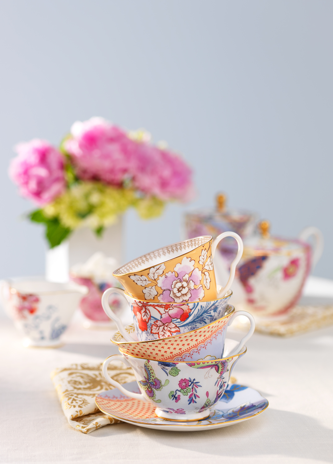
stash-tea-floral-teacups-product-photography-studio-3

Craig Wagner’s shots for STASH Tea feature brightly-lit whimsical setups, often with Studio-created “natural”-look lighting.

Studio 3, Inc. has been shooting photography and video for a number of brands for years (in some cases, a decade or more!) As Leatherman has noted:

“Someone like David Bell has 10+ years of shooting Leatherman tools, so there is no need to train anyone in our brand guidelines each time we need images. Having that partnership [with Studio 3] has allowed us to develop the “look” of Leatherman over time, providing that consistency of visual representation of how people see our tools, which is valuable.”

Leatherman

Leatherman’s photography is high-contrast to showcase the intricate detailing on each multi-tool, often open with all the tool options visible. Shot by David Bell.

Dare to do something different by staying the same. Your branding will thank you for it. And your customers will, too.

Digital Art – Stages Cycling Stationary Bike

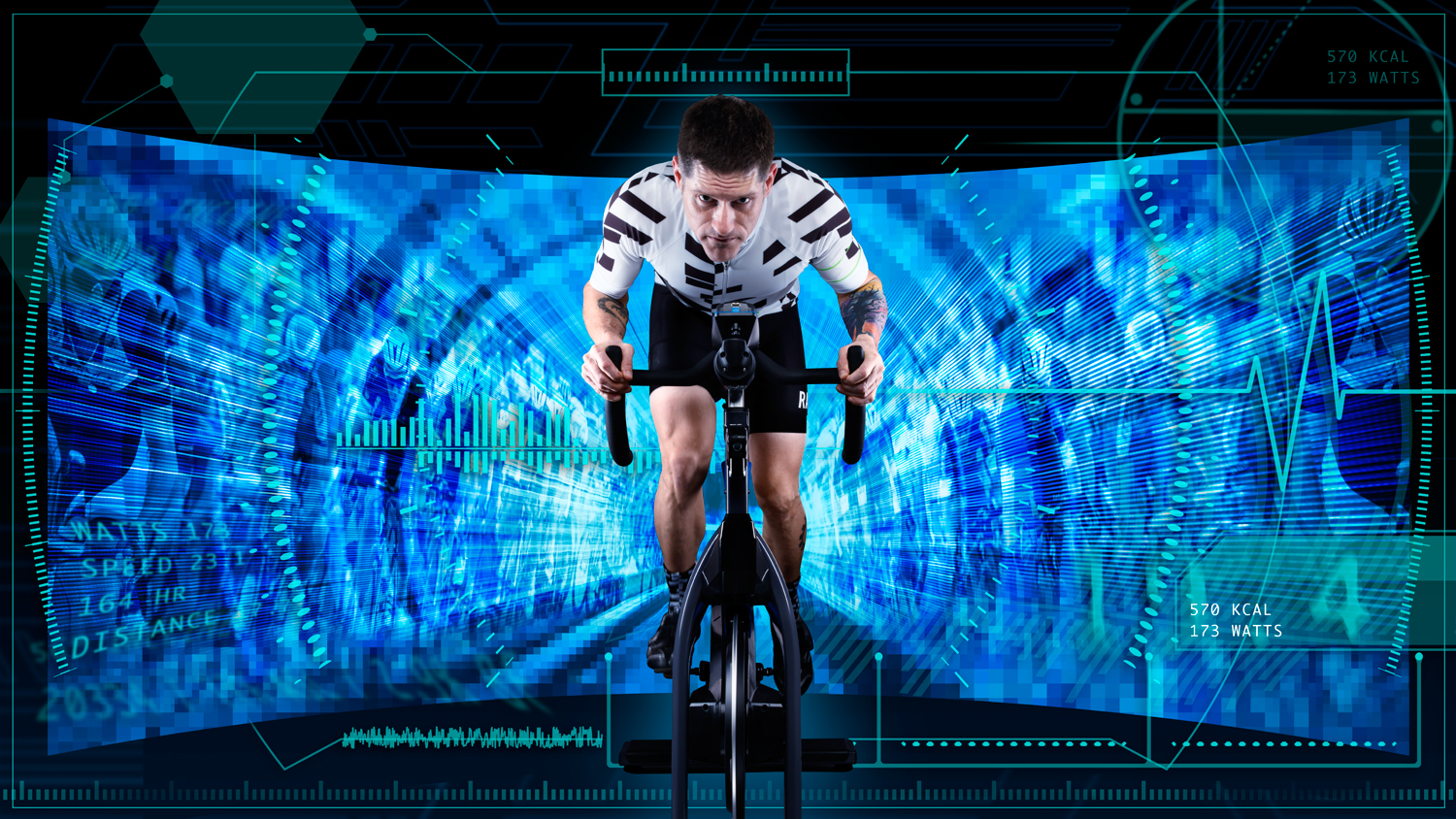
Digital art composite of rider on Stages Cycling stationary bicycle
Studio 3, Inc. is THE choice for photography, video, or digital work – because WE make it easy for everyone involved. There’s no guessing around here: we involve the client every step of the way and make the process truly collaborative. We make it easy for agencies, art directors, and brands to get exactly what they want – and consistently delight with what we produce.
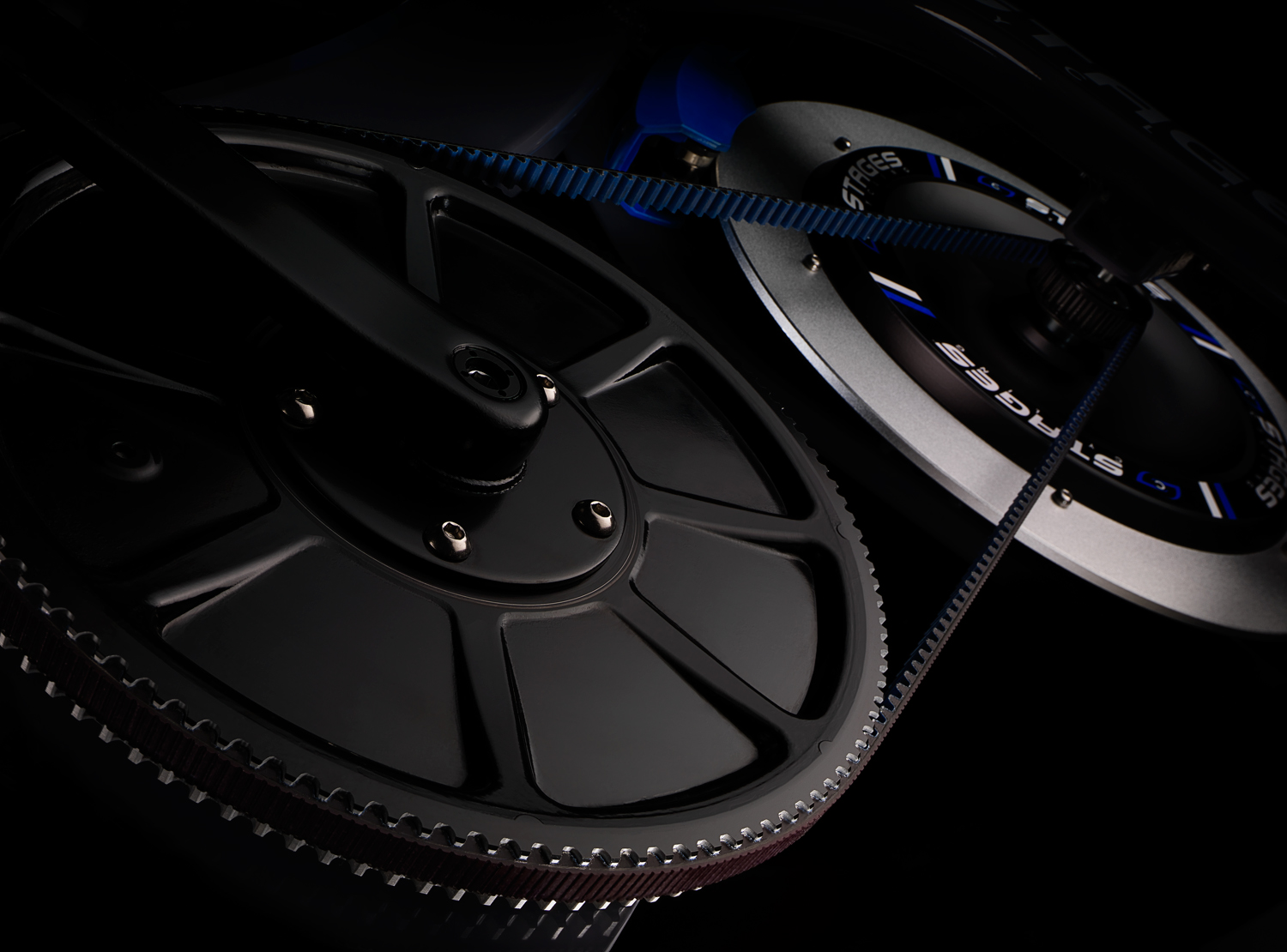
Frank Creative always has brilliant idea that we love to run with – and in this case, cycle with. Stages Cycling was just about to launch an innovative new indoor cycling bike, and they partnered up with Frank to approach the Studio 3 Team. The brief was to create some cutting-edge indoor cycling bike shots by merging dark, moody cyclist shots with Iron Man-meets-TRON-inspired digital art backgrounds to explode that coolness factor of the Stages brand. The Digital Artists here first created some mockups of composites, and we made the client and agency welcome at the Portland studio to give feedback directly.
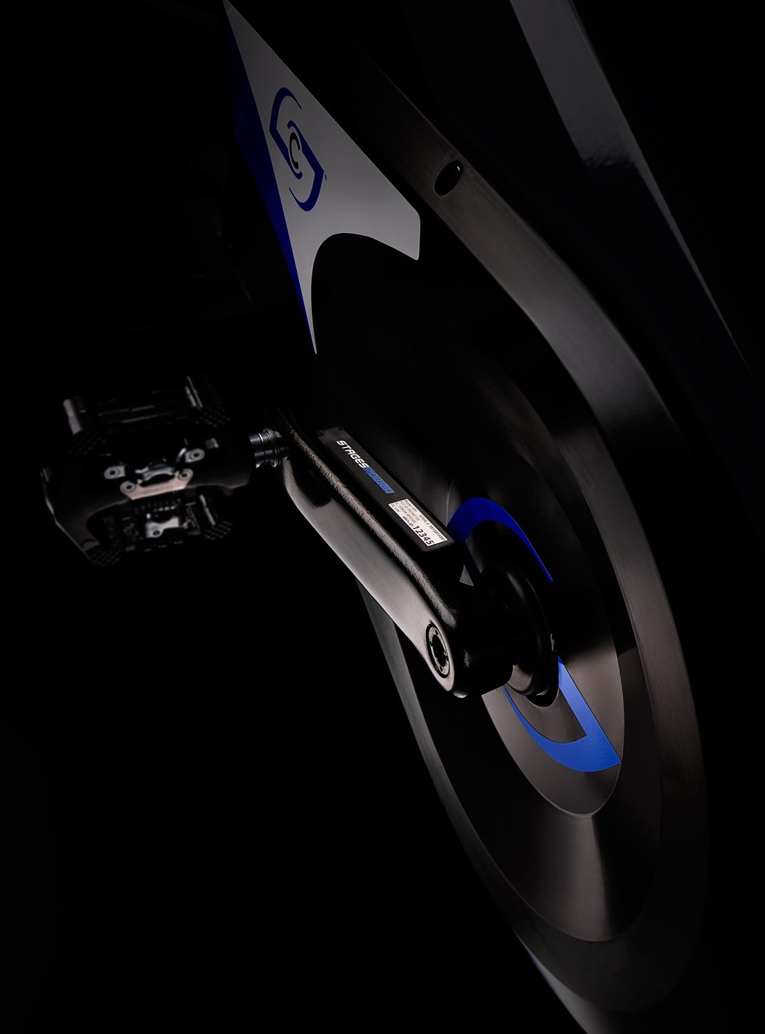
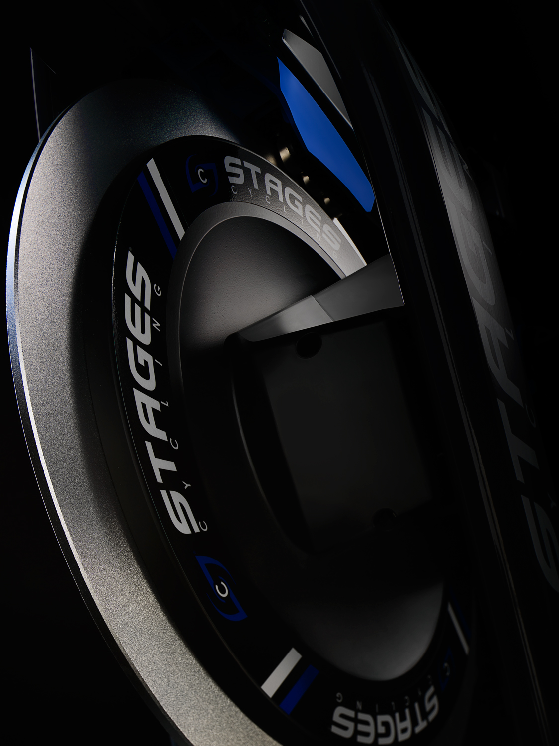
Studio 3 also took care of the casting call, and reached out to multiple cycling clubs and local bike stores to find the perfect athletes to fit the bill. Photographer Craig Wagner utilized his expertise in lighting and shooting to capture that dynamic image of the cyclists on the bikes, setting up Stages Cycling and the SC studio bikes series as the stars of the show. Digital Lead Alex Gumina worked closely with the Team in post-processing to produce a futuristic CGI background with both Frank Creative and Stages cycling in the studio giving feedback during live digital compositing sessions. The timeframe was a tight turnaround of a week – and by the end of the week the Team had knocked this one out of the park with multiple digital composites and indoor cycling bike detail shots for the updated Stages website. (Check them all out here.)
Close up detail shot of Stages bicycle rear wheel and pedalClose up detail of Stages Cycling front bicycle wheelClose up detail of Stages Cyclcing bicycle gear chain and wheels
Tired of worrying about your creative projects, or figuring out a way to coordinate all those moving parts? Take a load off. Do it the EASY way – and call the Studio 3 Team. We’ll make it so easy to get mind-blowing visual assets done and in front of your audience, you’ll forget that you’re actually at work.

WE Get It

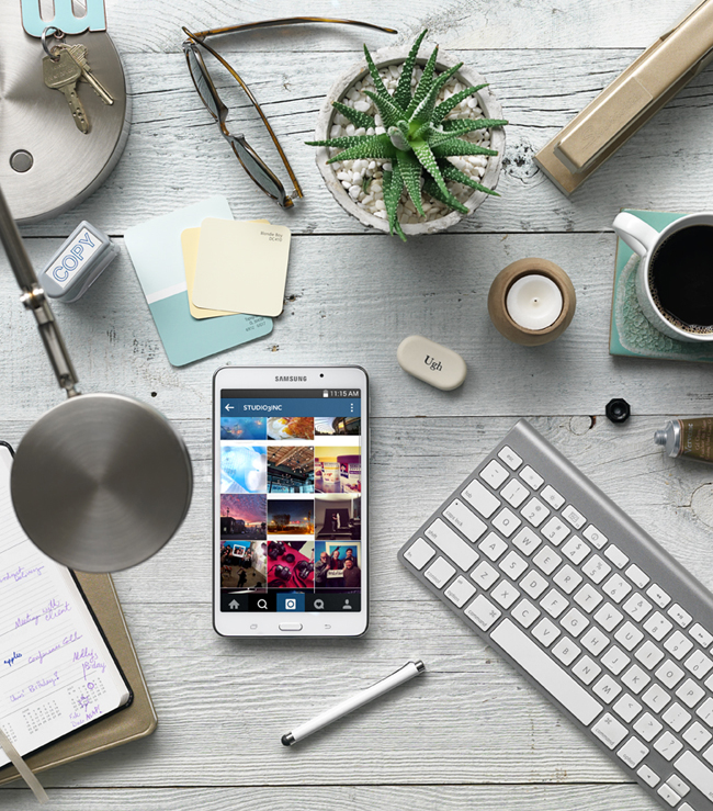
A beautiful array of items on a desk including Samsung Galaxy Tablet Shot by Studio 3
Visual imagery is your brand’s calling card, and Studio 3 understands how to get you there creatively, on budget, every time. We provide creative solutions and the peace of mind that your project will be completely handled. Whether it is a single phone or a semi truck full of SKU’s, we’ve been there. We do it all well.
Our photographers and videographer work with our production team to achieve your visual goals and timeline. Once your images are shot the digital group delivers beyond expectations, with the best processing in the business, and G7® color certification. From start to finish the process is streamlined and we take care of you. Which makes YOU look really good to your client and your boss.
That’s why we keep our clients and why you should take a meeting with us. You’ll see we make great partners. Oh, and we have a lot of fun on the way!
We’ll be reaching out…take the invite. Look forward to meeting you.

Throwback Thursday – The Learning Machine

the-learning-machine-studio3You might be asking yourself, “Is THIS for real??”


We know…it’s hard to believe, but this is TOTALLY for real!
Since the advent of this amazing technology, it is tough to recall how cumbersome it was when our noodles were all leashed up. That’s not irony. That’s progress.
On August 13, 1993, The Learning Machine hit the market – and the face of learning was never the same again.
When Zygon International Inc. approached Studio 3, the Team set about creating mesmerizing images for the front and inside of a brochure about the spectacular capabilities of The Learning Machine. It synchronizes your mind into the optimum mind-state for psychological programming! It uses Alpha and Theta mind-states to open your learning centers and expand your mental function! Wait…what?? And it boasts a state-of-the-art Light Shield and Learning Discs system that create a light-sound matrix to “launch your brain into incredibly realistic dream world fantasies!” The Studio 3 Team brought those fantasies into reality by executing a product photography shoot that was as futuristic as it was fun. But that’s not to say we have psychic powers now.
Studio 3’s very own David Bell, unafraid of this wacky new technology, agreed to shoot the mind-bending images for the brochure. When asked about the shoot, he revealed some great insight: “I don’t remember a thing about it.” Hmm. Probably because he wasn’t using The Learning Machine while on set. We’ll forgive you, David. You did shoot some hypnotic images after all.
He did finally recall using the Speedtron Strobes to get the perfect balance of the CD’s reflective qualities, while still being able to read the writing on the CD’s. Which, in the age before Photoshop, was QUITE a challenge! (CD’s and DVD’s are notoriously hard to photograph and to strike that elusive balance between readability and the changing color cast on the surface; see here for an example of Chris Eltrich’s work showcasing this.)
the-learning-machine-brochure1-studio3
 
These photos were shot with a Hasselblad C-500, with a 150 mm lens film camera. The light flares and lasers were all added at the color house during the post-processing phase. The large product shots may or may not have been shot with the SINAR-P 4×5 camera, but since we didn’t try out The Learning Machine in its heyday, it’s a little hard to remember.
And if you’re in the market for your very own Learning Machine, you may still be able to get your head inside one at Zygon International’s website here. But you might want to double-check on that money-back guarantee they offer….
the-learning-machine-brochure2-studio3
(And you can also pick up a CD player from them too for the going rate of only $129.95.)
Have some cutting-edge technology photography you need shot? Hope this has been a learning experience to what Studio 3 can provide: expert lighting, stellar photography, plus…we never take ourselves too seriously. Call us today to get in on the super happy fun times!

Product Photography – Bonavita Espresso Supply

espresso-supply-coffee-drink-2-david-bell Product photography isn’t just about how great the product looks on-camera; it’s also about showing the viewers what the product does. And when your coffee brewer can whip up some fabulous coffee drinks in no time flat – and Photographer David Bell gets ahold of those drinks and casts them in the starring role on a rugged, manly set – pure magic can happen through the lens.
That magic began with the Bonavita 8-cup Stainless Steel Carafe Coffee Brewer, which received the 2014 Men’s Journal Gear of the Year Award. When it came time to exhibit at the Men’s Journal “Gear Lab Pop-Up” at the MLB FAN CAVE, Bonavita Espresso Supply wanted to pair their award-winning coffee brewer with some drinks you could make with said brewer, and called on the award-winning talents of the Studio 3 Team to deliver the photography. (Not to toot our own horn, but we also provided the recent product photography for Bonavita’s website if you take a gander at the link above.)
It was a blast working with 3 original and delicious coffee-centric beverages and styling them on set. With props sourced from West Elm and Crate and Barrel, and vintage thermoses from the Studio’s extensive prop closet, Producer Megan Nolan crafted a set that said M-A-N, Pacific NW-style. David Bell contributed his decades of experience with lighting surfaces and drinks, choosing exquisite textures to create the backdrop and make the drinks stand out. David lit the set using dramatic, contrasty light to bring out all the textures and reflections in the surrounding props. His unique style and eye for details was essential (like adding that refined messiness of a delectable coffee drip on the side of the cup), which made all the difference.
Unlike some drink photography where photographing the actual drink on set is too difficult (i.e., having to use stand-ins that won’t lose their temperature or look unrealistic), in this case what you see is what those drinks really look like were you to try your hand at those recipes!
espresso-supply-coffee-drink-2-david-bellThe Flannel Shirt
Ingredients

  • 3 lightly crushed juniper berries
  • ½ ounce simple syrup (or to taste)
  • 2 dashes Angostura aromatic bitters
  • 1 1/2 ounce gin
  • Bonavita-brewed *Ladro Ethiopia Wotona coffee
  • Small cedar bough and spruce sprig for garnish

How To
Put crushed juniper berries into the bottom of a pre-warmed mug. Add simple syrup, aromatic bitters and gin. Top with freshly brewed coffee. Garnish with spruce sprig and set mug on cedar bough to release aroma.
espresso-supply-coffee-drink-3-david-bell
Rummy Gingerbread Man

  • 3 teaspoons dark muscovado sugar or dark brown sugar
  • 1 teaspoon *Gingerbread Spice Blend
  • 1 ½ ounces dark rum
  • Bonavita brewed **Ladro Classic espresso blend coffee
  • Whipped cream
  • Whole nutmeg, grated as garnish

How To

Fill 8 ounce mug with hot water to warm it. Pour water out and add sugar, spice blend and dark rum. Stir to dissolve sugar. Fill mug with hot coffee, top with whipped cream and finish with grated nutmeg or a sprinkle of cinnamon.
*Gingerbread Spice Blend:

  • 2 teaspoons ginger
  • 2 teaspoons cinnamon
  • 1 teaspoon vanilla powder
  • ¼ teaspoon ground cloves
  • ¼ teaspoon allspice
  • ¼ teaspoon nutmeg

espresso-supply-coffee-drink-david-bell
Lodge Toddy
Ingredients

  • 3 cloves
  • 1 cinnamon stick
  • 1 teaspoon honey
  • 1 1/2 ounces bourbon
  • Bonavita brewed *Ladro Central American coffee
  • Slice of orange (Valencia – Blood Orange – Cara Cara)

How To

Put cloves, cinnamon stick and honey into the bottom of a mug. Add bourbon and stir to blend. Fill mug with hot coffee. Twist and squeeze a slice of orange it to release the juice and oils from the peel and drop it into the mug to finish.
All recipes by Marcus Boni and Victoria Trimmer, Bonavita.
How much is your mouth watering for these drinks…and where is your Bonavita Espresso Supply Coffee Brewer when you need one?
And if you ever need photography for your drinks, beverages, or food-related products that gets mouths thirsting for more…you know where to find the magic-makers. In both Portland and Seattle, here at Studio 3.
Client: Bonavita Espresso Supply
Featured Product: Bonavita 8-Cup Stainless Steel Carafe Coffee Brewer
Producer: Megan Nolan
Photographer: David Bell
Photography Assistant: Tom Radio
Equipment: Hasselblad H-3D, 50mm lens
Digital Artist: Alex Gumina


Happy Holidays from Studio 3

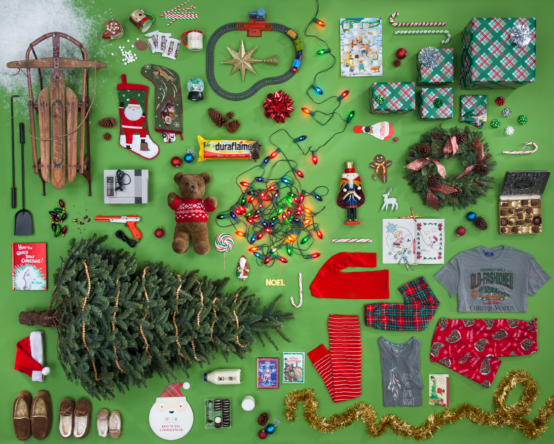
Christmas_Collage_2014
It’s all about the stylin’, baby!
Got your list? Checked it twice?
Taking a product photography shot like this doesn’t require much more than good lighting and professional hands on the shutter (and we can do both no problem!), but it’s the product styling that truly makes the photo shine. Accomplished by all-star commercial stylist Tristan Weholt, this photo took about 2 days to tweak the styling to that festively organized level. Producer Megan Nolan sourced the full array of holiday items from local stores, and Ms. Tristan set about fitting them all together like a puzzle, choosing where the bigger pieces fit and maneuvering smaller items to coordinate. Ms. Tristan says that she loves these creative briefs because “it really lets the creative mindset of styling flow…this is where my career meets my passion.” Photographer Chris Eltrich created the set and lighting, and ultimately captured the essence of spending Christmas morning at home with the fam.
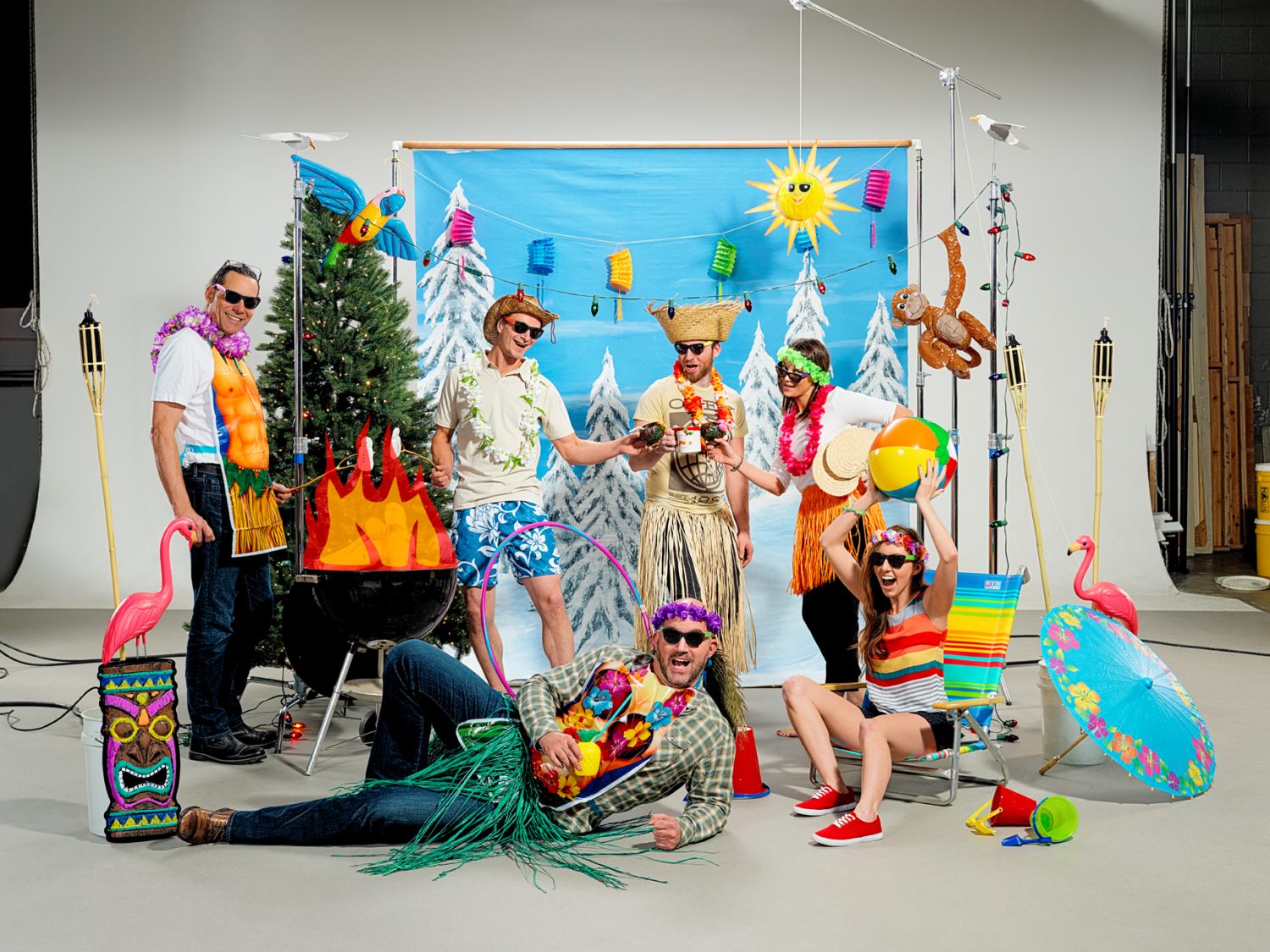
For the above photo there was a specific creative brief, but for the company Holiday card it was just to come up with an idea and execute a shoot that encapsulated the Team here at Studio 3. Each studio location shot its own top-secret creative twist on the brief, with our Santa-hatted Portland office going head-to-head with our Hawaiian-themed Seattle office. Who did it best? You be the judge.

Portland

Christmas background

Seattle

Seattle Christmas
Need a fun and unique interpretation on your company’s creative brief? Give us a ring and see the amazing and wonderful happen with Studio 3.

Happy Holidays from Studio 3!


Throwback Thursday – The Salon of the Future

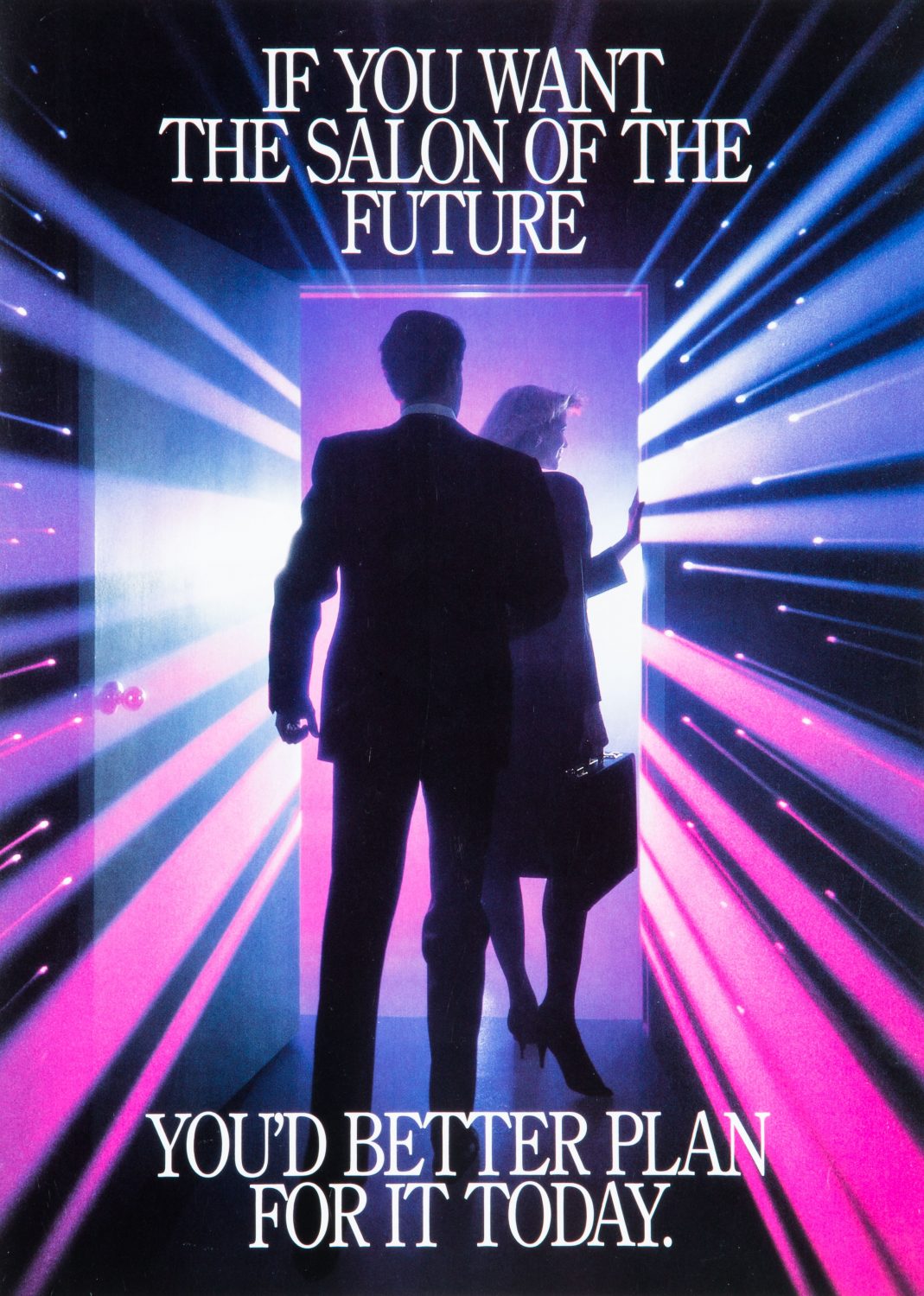
TBT_ScaWolff_006Back in the mid- to late 80’s, this was the salon of the future, but the above photo was created using the cutting-edge techniques of the past. For reals. For Throwback Thursday #TBT this week we’re sharing some product photography that was composited from three separate film-based shots, created by Studio 3 photographer Henry Ngan, assisted by Craig Wagner.
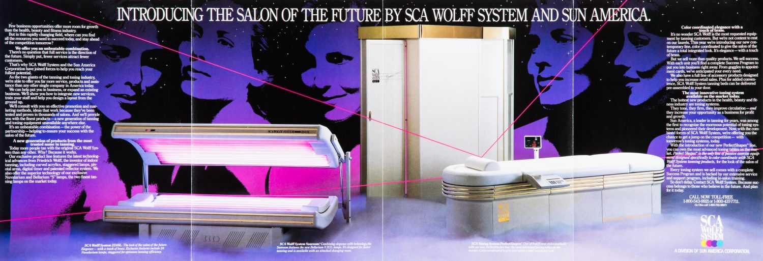
In the heyday of salon tanning (before that whole skin cancer thing got in the way), SCA Wolff System/Sun American Corporation was looking for a way to market their new tanning beds to salon owners and called on Studio 3 to execute. The brief for this shoot was to make the product look glamorous and have the cover shot act as the entrance the world of tanning, where through that open door lay a futuristic, glamorous world full of glowing beauties. At the time, laser beams in photography and visual media were mad trendy with Star Wars and Laser Tag leading the charge. The idea was to incorporate this trend with tanning beds to emphasize their futuristic and cutting-edge technology.

Mid-1980’s Product Photography

Shot in Studio 3’s earlier location at Lenora Square in Seattle, this shoot relied on large format 4×5 film for the cover image. (And 8×10 film for the image below.) What that means is that the actual 4″ x 5″ sheets of film were loaded, ViewMaster-style, into a Sinar-P technical camera, exposed, removed, flipped around, inserted, and exposed again. Creating just a single image was a great deal more hardcore than the much simpler point-and-shoot DSLR’s of today!
Here’s the 4-1-1 on how it went down: The doorway was shot first, and then on a completely different set Henry and Craig used a lithomask with different-colored gels in different areas to create the colorful pink and purple tint to the lights. The “laser” light streaks were created in-camera by either pulling or pushing the camera lens during a timed exposure. (Similar to the concept of creating a long exposure on a camera facing a highway at dusk: the cars’ tail lights appear as streaks traveling down the highway.)
TBT_ScaWolff_008For the photo inside the brochure, the tanning beds were shot with a longer lens in our Portland location. The background star field was easily created with black seamless [paper] lit from behind, with holes punched in it.
Once all the images were shot, the superimposing of the final photographs and client-chosen artwork was done at a prepress house, rather than our own Studio 3 Digital Department like we use for post-processing today.
The process may have changed in all the years since, but we still create laser-focused, high-quality images for discerning clients. Check out our other totally awesome product imagery, and Just Say Yes to Studio 3 doing your next product photoshoot or video. Catch you later!

Product Photography – Water Cartons

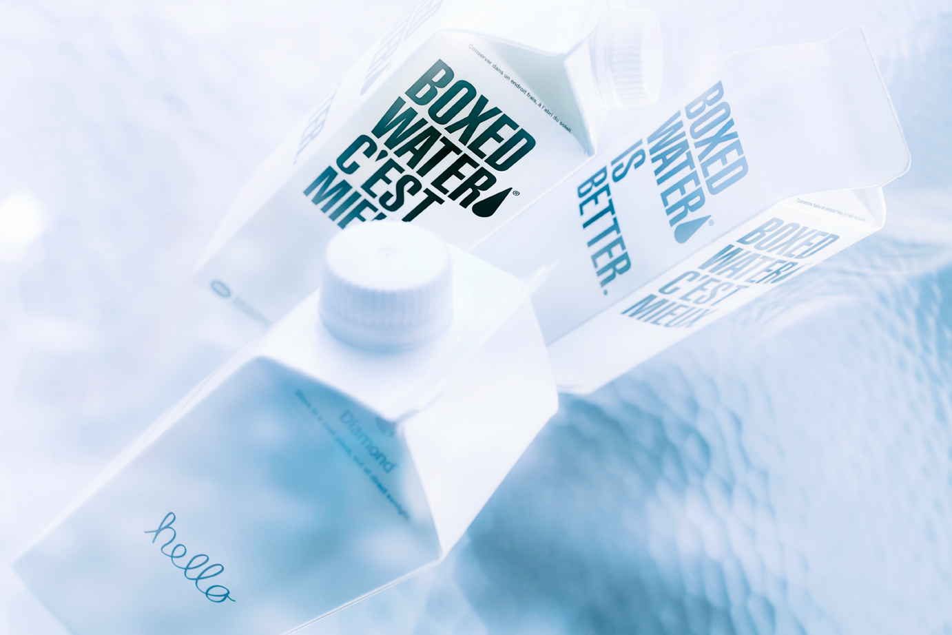
Water Carton TestWhen it comes to exceptional product photography, lighting is the essential in making the product come to life. Case in point: these simple, minimalistic water cartons begged to have the spotlight shone on their clean lines and stark contrast. The goal was to take something simple, and render it elegant and breathtaking with creating the perfect lighting setup. For the client, this creates a product that is new and sexy – elevating it to be slick, cool, and utterly covetable.  With the right lighting and direction we can make every product look amazing!
The choice of photographer was obvious. With a reputation as a maestro of light techniques, Craig Wagner is always able to attain optimal lighting to showcase products. The goal was to create the distorted water effect to the background in-camera, rather than digitally. To add interest and texture to the image, Mr. Wagner utilized a large sheet of rippled glass as the background from our extensive prop closet at the Studio. He kept the lighting simple, only using one 2000w Junior Mole, and redirecting it as needed with silver cards and a Mini-Mole as a kicker. Using the tungsten lights allowed him to drag the shutter for 4-6 seconds, during which he altered different parts of the image to create the visual wavy effect. Our post-production team adjusted the color temperature and saturation to achieve a flawless color tone, and the final beauty shot.
Producer: Liz Swales
Photographer: Craig Wagner
Digital Artist: Carl Beery
Equipment: Canon 5D MKIII w/ TS-E 45mm 2.8
Lighting: 200W Mini-Mole, 2000W Junior Mole (Key light)
Check out our other product photography, where the product sits center stage with lighting that highlights the unique attributes of each item. Then give us a ring so we can capture your product in the limelight.