Branding = Consistent Photography. So Why It Is So Darn Hard To Achieve?

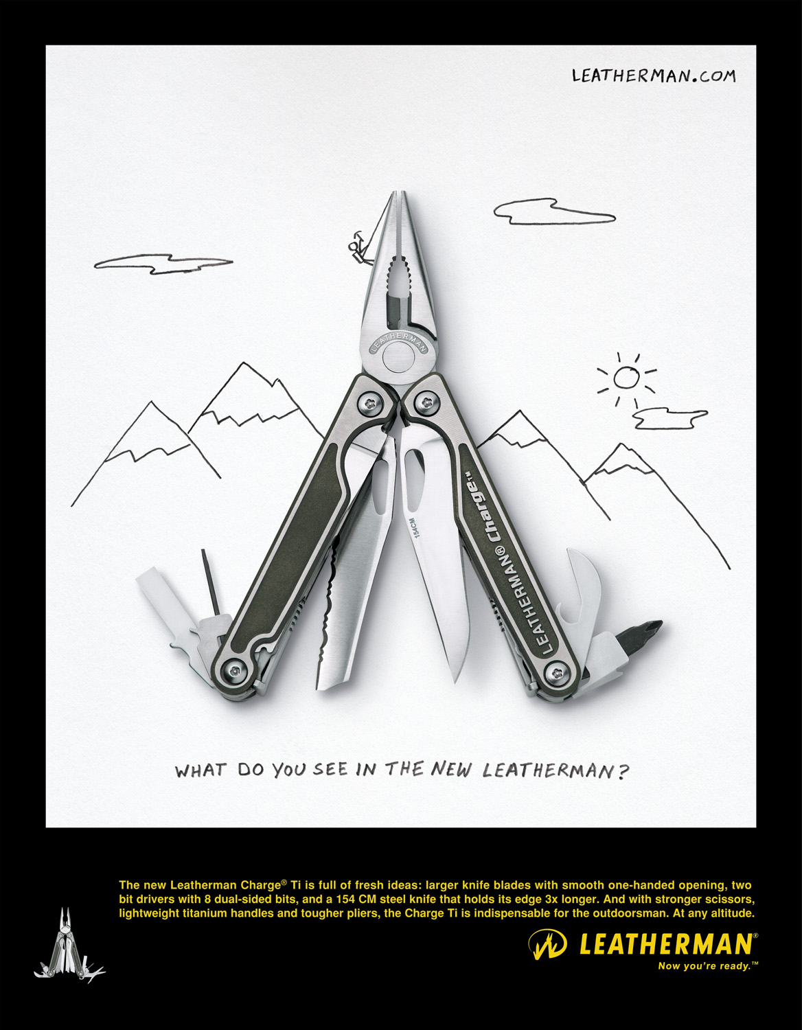
Leatherman advertisement, circa 2012. Photo by David Bell.
We all know that a company’s brand needs to have a consistent “look” when putting oneself out there. Point-of-purchase images, product photography, website design, advertising campaigns, product packaging, social media channels…all need to look as if part of the same company so as not to confuse the consumer and provide a singular branded experience.
Griot’s Garage is all about products to make your car shine. David Bell’s photography for Griot’s features solid primary colors, checkered floors, and sleek collector cars.
But there are some brands out there whose images are all over the map. You know who they are. When you come across one of their product images, banner ads, or social channels you’re confused momentarily. Could this be the same company…? You definitely don’t want your audience wondering at each touchpoint. Here are 4 reasons why companies fail to show consistency in their branding photography:
1. Switching up your visual content providers too frequently
Playing switcheroo has become an issue for some brands when it comes to visual content. Often on to newer, more buzzworthy, largest online following…whatever is the latest and greatest, some companies are quick to jump on the popularity bandwagon. But does that really result in stellar, consistent visuals for your audience? Partnering with the latest Insta-star making headlines may be great for grabbing people’s attention momentarily…but does it really make sense for what your brand stands for? It could be a step backwards in your strategy that leads to muddled visuals and a garbled brand message.
2. Different people at the helm taking the visuals in different directions
Advertising, marketing, and branding agencies often suffer a high turnover due to the frenetic, high-paced nature of the work. With turnover can come multiple directions for the visuals when different people are steering the ship. Full steam ahead with all on-board is necessary when going through a comprehensive re-branding…but it takes time for those visuals to resonate in the marketplace and achieve customer acceptance. After you’ve been in business awhile, being more resistant to change (at least regarding the company visuals) can often provide reassurance and the impression of brand stability to the customer.
3. Team members having difficulty working with one another
Sometimes the message comes out garbled because the team creating it suffers from a lack of cohesion. As a vendor, it can be a challenge working with a client team where we get conflicting direction or there isn’t a clear hierarchy in decision-making. Often the resultant image isn’t as strong as it could be because of this lack of focus – something that needs to be addressed and fixed internally before reaching out to your photography provider.
4. Photographers not truly “getting” the brand
You can choose to work with a photographer or studio based on their past portfolio, but you can’t always predict what kind of visuals they will create for your brand specifically. Sometimes, the fit just isn’t right. The photographer just doesn’t “get” what you’re about. The resulting visuals fall flat, or are shaded with nuances you feel aren’t quite representative of the brand. It’s always a gamble trying a new photographer or studio, which is why once you’ve found a clear winner, you want to stick with them for life.

Craig Wagner’s shots for STASH Tea feature brightly-lit whimsical setups, often with Studio-created “natural”-look lighting.
Studio 3, Inc. has been shooting photography and video for a number of brands for years (in some cases, a decade or more!) As Leatherman has noted:
“Someone like David Bell has 10+ years of shooting Leatherman tools, so there is no need to train anyone in our brand guidelines each time we need images. Having that partnership [with Studio 3] has allowed us to develop the “look” of Leatherman over time, providing that consistency of visual representation of how people see our tools, which is valuable.”

Leatherman’s photography is high-contrast to showcase the intricate detailing on each multi-tool, often open with all the tool options visible. Shot by David Bell.
Dare to do something different by staying the same. Your branding will thank you for it. And your customers will, too.