Studio 3, Inc.

Advertising Photography

Screen Shot 2019-03-13 at 11.47.53 AM

Creating Sunshine: Lighting, Props, And Backdrops

Posted on February 13, 2019

Here at Studio 3, we create warm summer days year-round.

Our amazing team brings sunshine and warmth to the office every day. Likewise, we bring sunshine solutions to your product photography with lighting, props, backdrops, and our digital media team.

You bring the product, we’ll bring the summer. Location your budget approves.

Product Photography Summer Lighting  — Studio 3, Inc.Product Photography Summer Lighting  — Studio 3, Inc.

Lighting and backdrops and props, oh my!

The most important technique our team applies to create sunshine for a photo is the lighting. For example, one of our photographers, Craig Wagner, modifies and utilizes lighting at different angles to create specialized shadows and ambiance for your creative projects. Just call him walking sunshine. The key is properly spaced lighting to obtain the perfect shadow every time. High ceilings are used to our advantage for room sets creating that needed distance for a large subject like this shot for Marquis Spas.

Marquis Spa Behind The Scene Lighting Photo  — Studio 3, Inc.Marquis Spa Photo In Studio Lighting  — Studio 3, Inc.

Our photographer’s crisp shadows and dramatic sunlight are not all we can provide in-studio. We also have amazing props and backdrops. The color and texture of the background add a sentiment to the photo evoking a mood. Backdrops can range from subtle soft colors to a crisp white or a seamless backdrop to create that sunny day.

In this photo, you can see how the backdrop, lighting, and various props tell a summer story on their own.
DJ 9118 RootBeerFloat b PO 1500  — Studio 3, Inc.Summer Lighting Photo In Studio  — Studio 3, Inc. 

 Our Digital Media team:

Along with our photographers, our digital media team create sunshine and warmth even on the rainiest days. For composite images, they combine multiple layers to create one beautiful and flawless scene. When putting together a composite image, one has to consider many different variables. The most obvious are the colors, placement, and size of different elements. As a result, these decisions will affect how, where, and in what order the viewer focuses their attention. CW 15609DA 1500 Fetch Test a DA 1500  — Studio 3, Inc.

‘For this piece, I played a lot with the placement of the surfboard and boombox to make it feel natural, organic, and compositionally pleasing. Light and color also play a critical role in how a viewer responds to a piece and whether an image looks “realistic”. I wanted this particular piece to have a nostalgic, yet timeless vibe, and I think the long shadows and warm tones created by the sunset help convey this feeling.’

Lucio Barbarino Digital Artists at Studio 3

Rain or shine, we at Studio 3 have your back to create that perfect photo you visualize for your brand. Give us a call. We would love to add a little sunshine to your day.

Related posts:

DB_9016_Sprouts_browser_PR_1500 (1)

A Focus On Food: Our Tricks And Tips Behind Food + Beverage Photography

Posted on November 19, 2018

Most people don’t think about the way food is photographed – they think about how it will taste! But ask any professional photographer that has worked with food or beverages, and they’ll tell you that there’s a litany of tricks and tips to making food look delicious and distinctive. From Hollywood trickery to spatial geometry – we’ve put together a list of our own to help you capture your next meal with expert-level elegance.

  1. Choosing the right background for the food at hand

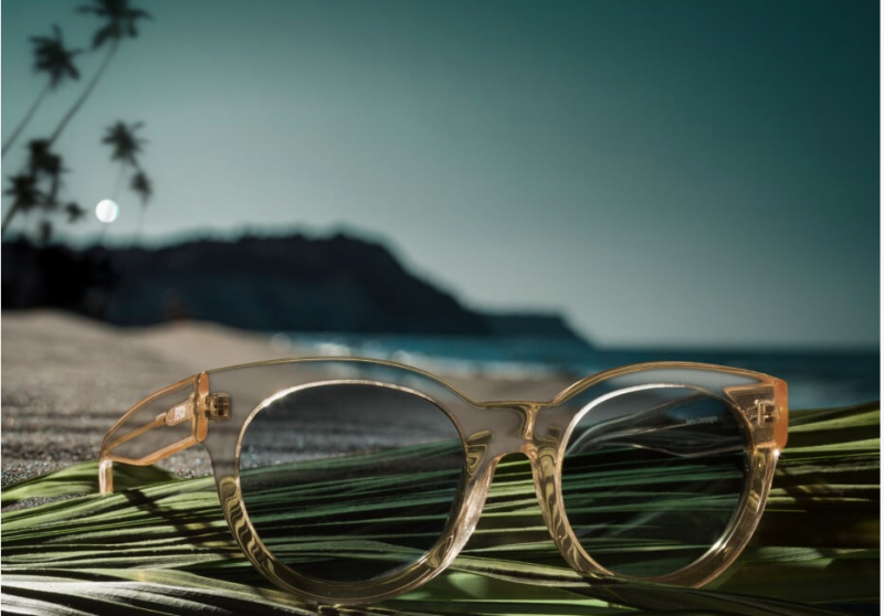
Not all surfaces and backgrounds are photogenic. And while others might be beautiful on their own, they still may not necessarily complement the food/beverage at hand. So, what are some factors to consider when selecting a background? Color is a big one. Ideally, you want to avoid overly-bright colors or busy patterns that will distract from your subject. A shiny surface probably wouldn’t be a good choice either. Using neutral or pastel color palettes can go a long way in making your food/beverage ‘pop’- in a similar way that a certain color might bring out a person’s eyes. For instance, if most food contains warm color tones, it might be a good idea to shoot against cool-toned surfaces to create a pleasing contrast. If you want to learn more about how to create ‘color harmony,’ check out this helpful article on the subject, which also includes some useful guides.

You can also use the background to express character, suggest a mood, or establish a sense of place. Here’s a photo taken by Studio 3’s very own David Bell, which showcases a delicious chocolate cake placed in a rustic environment. The flooring suggests farm-style, naturalism, organic ingredients etc., while the rich brown tones in the wood compliment the chocolate perfectly.     

9866 Judy Woods Flavor Right  — Studio 3, Inc.

  1. Knolling style – to use or not to use?

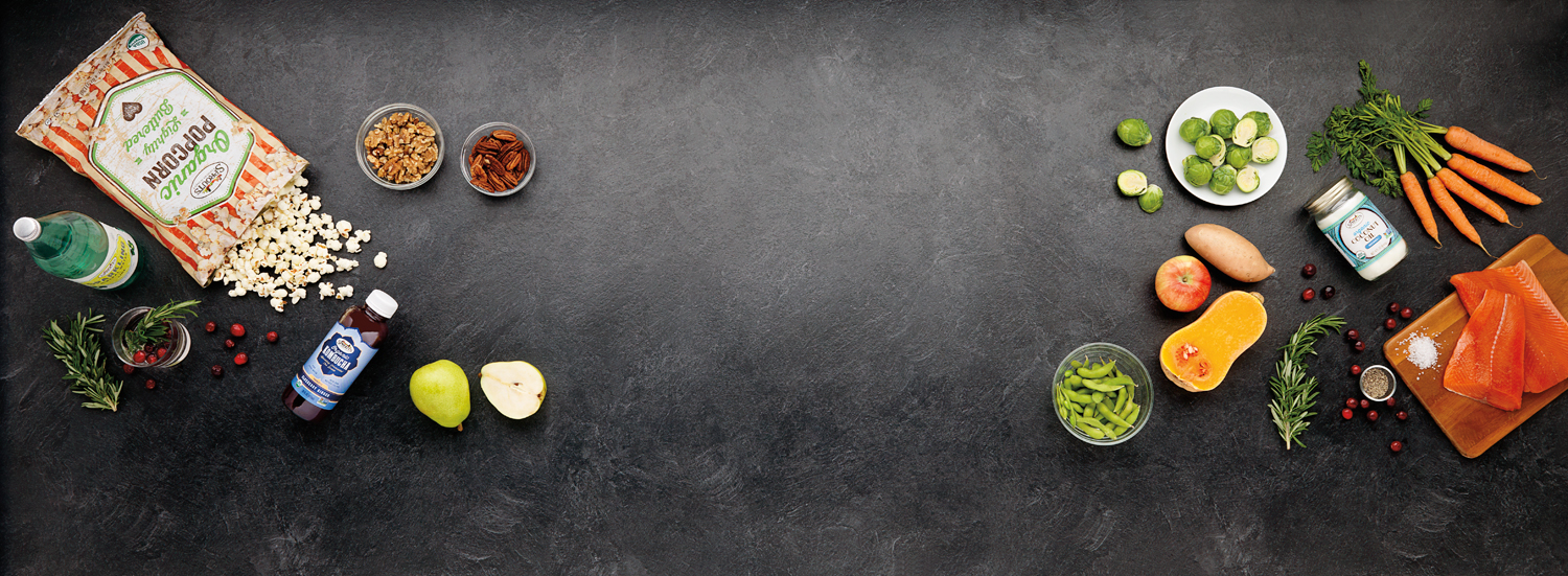
You may not be familiar with the term, but you’re definitely familiar with the style. ‘Knolling’ refers to this style of photography:

Screen Shot 2018 11 07 at 12.59.01 PM  — Studio 3, Inc.

Bright + even lighting, Birds-Eye point-of-view, and a meticulous arrangement of items. First popularized in 1987 by a janitor who would fastidiously arrange the various construction tools he found around the warehouse, ‘Knolling’ photography has recently taken over Instagram as one of the most prolific trends in recent years – and has also found a strong niche in food/beverage photography. It’s easy to see why: if executed correctly, Knolling photography has a unique way of making any subject look bold and dazzling – even if it’s just some popcorn. Right angles, clusters of color, and clean/crisp lines are the name of the game. An appreciation of image composition, as well as the spatial relationships between objects will help your Knolling photography soar.

  1. Using mist, glycerine, and other fakery

Want that ultra-fresh, dripping condensation look? Simply hit your glass with some mist! Or even better yet, many professionals will use Glycerin to the same effect. It gives your food/drinks a cold, fresh look, which in turn makes them appear more delectable. This is especially true of foods like fruits and veggies. If you see food in photographs looking wet or frosty, then you can bet your top dollar that glycerin was used! Think of your classic vending machine: can you picture those big water droplets rolling off a cold can of Coke on the front image? Yup, that’s either mist or Glycerin.

CW 13672 Imbibe a FD 1500 (1)  — Studio 3, Inc.

If your image requires ice, we highly suggest the use of fake ice cubes. Obviously, real ice melts, thus requiring frequent re-sets, which can take time and money away from your project (and also make a mess!). If you happen to be using glass, real ice will also cause significant fogging, obscuring your subject even more. These are just a few of the reasons professional photographers have embraced the use of fake ice and other perishable food prop replacements.   

  1. Styling: Paint, pins, and putty

Screen Shot 2018 11 07 at 1.00.32 PM  — Studio 3, Inc.
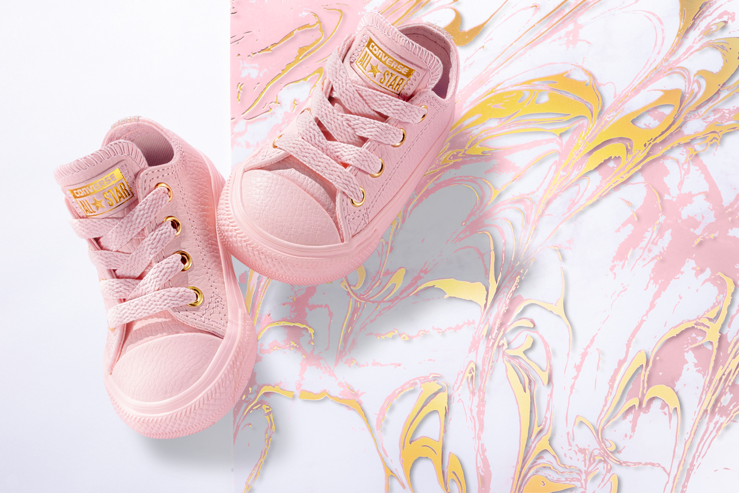
It takes a fine touch. There are countless cosmetic steps food stylists can take to improve the overall quality and composition of your food/beverage photography. Remember, we’re not actually serving the food, so no need to shy away from using un-edible items to get the necessary shot. Metal pins, for instance, can be used to hold food in place if you want to display the perfect balance of ingredients without them falling over. Photographer and food stylists will also use non-stick putty to the same effect, like so:

Screen Shot 2018 11 07 at 1.01.08 PM  — Studio 3, Inc.

Ultimately, it’s about arranging and styling your subject to maximize it’s photogenic potential. Is your food stackable, or should it be fanned out, serving style? Does your subject have green stems? Should a side dish be included? What about some unique serving flatware? You can even utilize acrylic paint to boost colors, cover up blemishes, and even create patterns if desired. Get creative here! Like any good dish, there is a lot more to the finished product than merely the sum of the individual parts. It’s about how they all interact!

Here at Studio 3 Inc., we not only specialize in food and beverage photography, but also portraiture, lifestyle, sports, and product photography. Since 1974, we’ve been making your photography dreams come to life! Partner with us for your next creative endeavor, and see just how we stay inspired.


Related posts:

Craig Wagner

Our Process: From Start To Finish With Studio 3

Posted on October 1, 2018


DA 15622DT Lexus Fish DA 1500  — Studio 3, Inc.

When Studio 3 begins a photography or branding project, our first step is to sit down with the client and dream up ideas. Collaborating on a concept might involve a handful of approaches, depending on the project at hand – anything from examining examples of similar work, creative brainstorming with our in-house team, and establishing a shared visual language using Style Guides, Mood Boards, or Pinterest. Below you can see an example of what a typical brainstorming session looks like at Studio 3.

IMG 5522  — Studio 3, Inc.Once an idea is hatched, our Producer-Extraordinaire Eva Goldfarb kicks it into high-gear – scheduling stylists, organizing set builds, balancing budgets, and handling any propping/costuming as needed. This work frees up our clients and photographers to stay in a creative mindset, and not get caught up in the operational details of the project.
15611T Tea Test  — Studio 3, Inc.Onto the shoot! Photographer Craig Wagner is among the best photographers in the Northwest – and has been with the studio since the early days. Forever perfecting his craft, Craig does what it takes to get the perfect shot – even if it means inventing a new piece of equipment specifically for the shoot at hand.   

15463 Production Stills 029  — Studio 3, Inc.
We have a good time on set

 DSC0489  — Studio 3, Inc.Lastly, our Digital Team steps in and works their magic.  The processes of Color Grading and Digital Retouching are extremely intricate – just ask Sean Yates, one of our in-house Graphic Artists:

Screen Shot 2018 10 01 at 12.57.56 PM  — Studio 3, Inc.

“Color and clarity are of central importance when retouching images. …We always strive for and deliver accurate color.”

In reality, the Digital Team does a lot more than just retouching:

pjimage copy  — Studio 3, Inc.


Finished product:

CW LanternMoon CL 1500  — Studio 3, Inc.

And that’s not the end! Studio 3 partners with the same clients year after year because they love the end result, and appreciate the creative relationships formed. We take the utmost pride in these collaborations and are always striving to bring something new and exciting to the table for the next shoot. Give us a call today, and find out how Studio 3 can help elevate your brand with the coolest+catchiest photography in the Pacific Northwest.


Related posts:

CW_15582T_Spring_Colors_a_FW_1500

HOW DO YOU HUE?
Three Ways Studio 3 Makes It Pop

Posted on July 30, 2018

When is the last time you were blown away by an image? Why was that? Perhaps you noticed a vivid background, strategically hued font, or impressively monochromatic scheme. You noticed color. Color impacts product integrity, branding, and consumer reactions.

A lot of components go into creating “the shot,” and Studio 3, Inc. handles them all from styling to post production. Our colorful team is here to make your visual dreams pop off the screen.

CW 15583T Pickleball PR 1500  — Studio 3, Inc.


1.  On-Set Color Matching

Royal blue textured paper, the precise shade of orange gel, and Craig Wagner’s masterful lighting will get you out of any pickle. Our stylists and photographers address the details on set to ensure color is spot on from project start to finish.

Leatherman Color Up   Three Hues  — Studio 3, Inc.


2. Add a Little Retouching Magic

In addition to phenomenal photography – we have a top-of-the-line digital team equipped with the tools to save you time and money, making your technicolor dreams come true. They are our color wizards: flawlessly color matching, and coloring up your product photography.

Colorful Instagram triptic   Three Hues  — Studio 3, Inc.


3. Set Your Social Scene

It is important to be visible, impactful, and purposeful with social media posts so that potential clients can easily find what they might be looking for. Let us help you content create.

We like to use Instagram as a social portfolio. Our audience can then see that beyond our stellar images, we have an eye for style, beauty, and purpose. It’s important to keep content fresh, colorful, and trendy for your followers and future followers.

Phone Photography in varying Red Hues   Monochrome  — Studio 3, Inc.

Color psychology plays an important role in your marketing goals. Research has shown that color branding influences 90% of shopping decisions. That is a number opportunity we definitely would not want to miss.

What colors are consumers loving this month? Season? Year?

What does this mean for you? How can we help?

The most exciting part of the rainbow world in which we work is getting to put our skills to good use. Our commitment to client satisfaction and beautiful photography is unmatched in our field. From styling – to shooting – to retouching – to bragging about our clients – we love keeping life colorful. DO HUE?


Related posts:

CW_ReynoldsOpti_PR_1500

Show Don’t Tell: How Commercial Photography Changes the Game

Posted on May 18, 2018

We have a mantra here at Studio 3 Inc: Beautiful Photography Sells Product.


Yes, stock photos are easy to get in today’s culture of immediacy.
Yes, it’s also easy to take your own photos due to the evolution of smartphone cameras. What’s not easy is making the decision to invest in advertising photography for your company. But let’s face it – you will absolutely use ALL those professional photos. Commercial photography – complete with a photography studio, lighting, styling, and retouching- legitimizes your business and propels your online exposure. Here’s why…

Nike Features  — Studio 3, Inc.
YOU GET AND KEEP THEIR ATTENTION: Did you know that posts with featured images are 120%-180% more visible online? That means simply having a photo available TRIPLES your clientele and sales. If you are trying to hook clients without photos, you’re doing it wrong. And if you’re trying to hook buyers with amateaur photos, again – you’re doing it wrong. You want your photos to reflect your kick-ass products, right? Well then it might be time to turn to a kick-ass studio – shameless plug.

We are all subject to the algorithm. Social media platforms measure how long visitors stay on a website, and if it’s less than a minute, your links drop to the bottom of the feed. Make sure you’re fostering customer relationships and enticing shoppers to click “add to cart.” Having stellar product photography drives sales up by 60%, and allowing shoppers to see a life sized image of the product – or at least zoomed in – again DOUBLES the purchase potential of the client. The more they know the more they buy. A great photography studio like Studio 3 can tell the story of your product from beginning to end.

Screen Shot 2018 05 16 at 12.28.07 PM  — Studio 3, Inc.

YOU’RE EDUCATIONAL: SHOW your clients, and then TELL them what they’re seeing. Process photos are all the rage. To be honest, it’s probably because reading is NOT all the rage. We don’t want to follow instructions, we want to follow a picture. We don’t want to read a menu, we want to see a picture of what could shortly be on steaming plates in front of us. Well give the people what they want! Create a video of your product in use or a photo menu for your restaurant with killer food photography. Photo stories allow people to envision themselves using your product, visiting your location, eating your food, or feeling the emotion of your models. Clients need the reassurance that you are supporting their need to understand the process. Seeing a product “in-action” solidifies client trust and increases purchase percentage. Building your customer’s confidence in their ability to utilize your product is a necessary step in brand evangelism. SHOW them it’s not too good to be true.

YOUR IMAGES ARE VARIED AND INTERESTING – YET CONSISTENT.
E-commerce and Instagram business accounts are looking more and more like twins these days. Have you noticed? Both are feeds of new products with a consistent tone, lighting, colors – Brand Identity. If a product image looks out of place in the feed, it stands out as a flaw. Clients view branding inconsistencies as a lack of quality and could lose trust in the website. ONE IN FOUR clients are lost because of brand inconsistency. Having consistent and quality branding practices make companies 20% more successful than companies who make their clients unsure or untrusting of their brand.

Danner  — Studio 3, Inc.What does this mean for you? In order to consistently provide impactful branding and quality content for your clients you must be consistent in the look of your products. Working with Studio 3 Inc means working with photographers and designers who are dedicated to your brand identity and consistency, ensuring that your products always look amazing. Because Beautiful Photography Sells Product – and Consistent Quality Builds a Brand Empire, my friends. It’s as simple as that.

Related posts: