Product Photography Shoot – Grenade Gloves
 Here at Studio 3 we are often coming up with new ideas to to push the envelope and add gorgeous images to our portfolio.
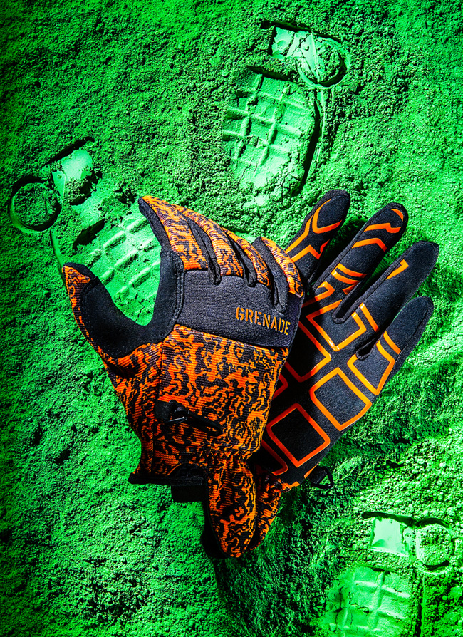
We recently completed a product photography shoot with our Photographer Henry Ngan, featuring Grenade Gloves on a bed of green powder.
We know what you’re all wondering: are these gloves used to handle grenades? Are they made from used grenade casings? If you’re not into snowboarding, Motocross, or skateboarding, you may not have heard of Grenade Gloves.
Founded in 2001 by the two professional snowboarders Matt and Danny Kass, Grenade Gloves Inc. is now a worldwide, global lifestyle brand that has hosted the annual Grenade Games since 2005. The founders chose the grenade as their logo because it was reminiscent of G.I. Joe, someone they felt was in line with their renegade image. Headquartered in Portland, OR, the Grenade Gloves brand is growing at an exponential rate and has a loyal following of extreme sports enthusiasts.
No grenades were harmed in the making of this photograph, however. The inspiration for this photo came from a recent magazine feature, where powder was used to show the imprint of the product, instead of the product itself appearing in the photo. We thought it a neat idea to incorporate this into our next product photo shoot.
Prop Styling Behind the Scenes
Henry bought toy grenades for the shoot, and had to disassemble the parts to imprint each carefully into the chosen background powder. The team carefully addressed the placement of the grenades, first trying out a full-scale pattern (which looked too busy), and then settling on one where the glove would appear to be “holding” a single grenade. Other imprints were made selectively in the powder order to balance out the initial top-heavy feel.
The gloves appeared too flat in the first test shots; in order to give them body and allow the fingers to be bent the team created an internal wire structure all the way into the fingertips. Henry wanted the feel of hard light in the image so the scene was lit by a single Fresnel key light and incorporating mirrors and bounce cards to enhance and fill the scene. In post-processing, our Digital Artist Ciaran Green removed stray fibers and increased the contrast in areas that appeared too blown-out under the hard lighting. With a little tweaking, the image turned into what you see above: a beautiful color pop of green and orange, with saturated blacks. All in all, it was a fun couple-day shoot for the team, resulting in art and photography merging on a bed of green.
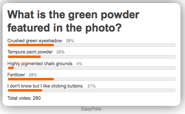
Poll: Identify that Prop Styling Material!
**Poll is now CLOSED**

Find out the answer on Twitter!
And if you’re not following us there yet – go ahead and sign up; we don’t bite. And we won’t lob grenades at you. We just showcase amazing, inspiring photography that you’ll definitely want to see.
Go ahead – take a peek.
