Studio 3, Inc.

Digital Art

studio-3-team-member-employee-portraits-collage

17 Ways to Get Your Clients to Love You: A Studio 3 Guide
Posted on August 12, 2015

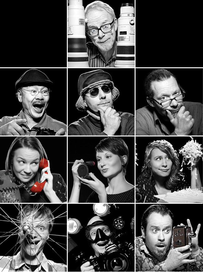
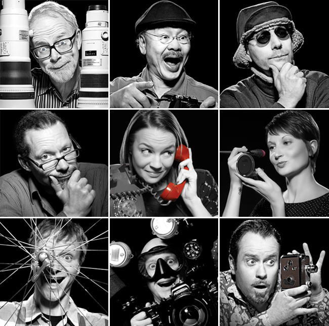
Collage of Studio 3, Inc. team member employee portraits  — Studio 3, Inc.We’ve been in business a long time, working with some clients for a decade or more. To us, the client relationship is paramount, and we go above and beyond to nurture it. What would you experience if you were a client of ours? Here are some direct quotes from our Team Members about what we mean when we speak of “Studio 3 Customer Service:”

Client Relationship Manager Jessica Lynes:

We take the time to anticipate our clients’ needs, ensuring that they have exactly what they need/want before they even know that they need or want it!

We always have their “favorites” when they’re here: foods, drinks, music, etc. is met with a “Wow! Thank you so much, I can’t believe you remembered!”

Portland Producer Liz Swales:

We get the client’s job done: efficiently, flawlessly, and simply, while exceeding their their expectations.

We take care of them like royalty…AKA feeding them fun and amazing food!

Chaos Wrangler Niki Gillespie:

We streamline the behind-the-scenes details to ensure the smoothest client experience. Clients love our process but never are over-aware of it. No bottlenecks.

Seattle Producer Kaitlin McMillan:

We will do anything! If the client wants it done, we’ll get it done for them – no hesitation or questions. Any budget, any client, any person, any product… we have a solution for even the most difficult of requests.

We create an “atmosphere” while a client is on set: you can bring your laptop and do work, you can play ping pong when you’re just here tagging along for a shoot, you can watch the news and drink coffee with your feet up on a couch. We inspire creativity and hard work all while in great company.

Digital Artist Carl Beery:

Clients appreciate our experience in pre-media print and web production. Knowing how print collateral and websites are built helps me ask the right questions before problems arise.

Years of experience interpreting markup also helps us make the edits that clients want to see, ensuring a flawless final outcome for all.

Digital Artist Tom Radio:

We make the impossible POSSIBLE when it comes to post-production!

Video Director David King:

We care about building relationships throughout the creative process and we keep client satisfaction as our #1 goal.

Photographer David Bell:

Listen. Pay Attention. Make them the most important thing happening then and there. Make it fun.

Photographer Craig Wagner:

We always try to give our clients more than what they’re initially asking for (like different angles on the same setup), and we are ultimately flexible when working. We won’t consider the creative brief set in stone, and are bold enough to run with an idea, which clients appreciate on set.

Photographer and Studio 3 co-founder Henry Ngan:

By offering them any level of service they need to make their projects a success.

By thinking out of the box creatively to provide a unique vision and fresh look.

Photographer and Studio 3 co-founder Jim Felt:

We always follow through on our promises.

We care about the future relationship with every single client. We value their friendship and the ability to create fun images for them. We are proud of our relationship with each and every client, large or small.

Can’t wait to experience what it’s like to be a Studio 3 client? Reach out and bring us your next project. You’ll experience all of the above…and more.

Related posts:

Brooks Macros

Before & After: Put Your Best Foot Forward with Studio 3’s Shoe Photography Retouching

Posted on July 18, 2015

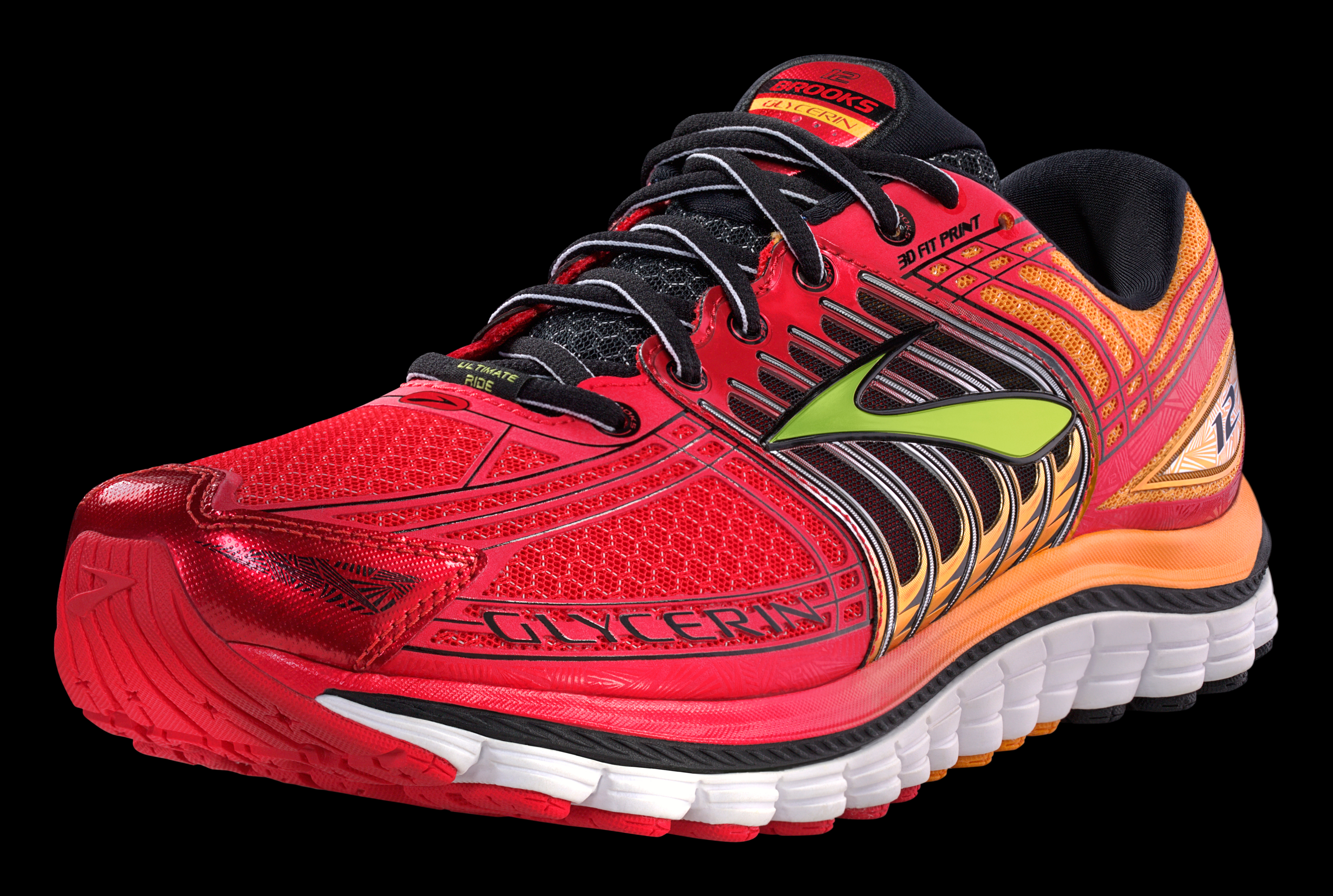
before and after brooks sneakers retouching shoe photography studio 3  — Studio 3, Inc.Shooting modern athletic sneakers is actually a complex art. Studio 3, Inc. has shot a variety of footwear over the many decades we’ve been in business – in fact, shoe photography is one of our specialties!
The colors in modern sneakers pose many issues for post-processing and retouching work. Why? Because the 80’s are back to stay – and the eye-searing bright neons, pops of complimentary color, and swaths of new textures can fight for dominance in the photograph. Placed side-by-side the different colors and textures are a major selling point for the discerning consumer…but for the photographer they can be a real challenge to shoot in a way so they appear true-to-life and inviting. Also, the product itself may have certain areas that are less than perfect as-is. Enter the essential Digital Artist, who in post-processing gives all those design details the Studio 3 treatment to make them cohesive and the product a total stand-out.

Brooks Macros  — Studio 3, Inc.

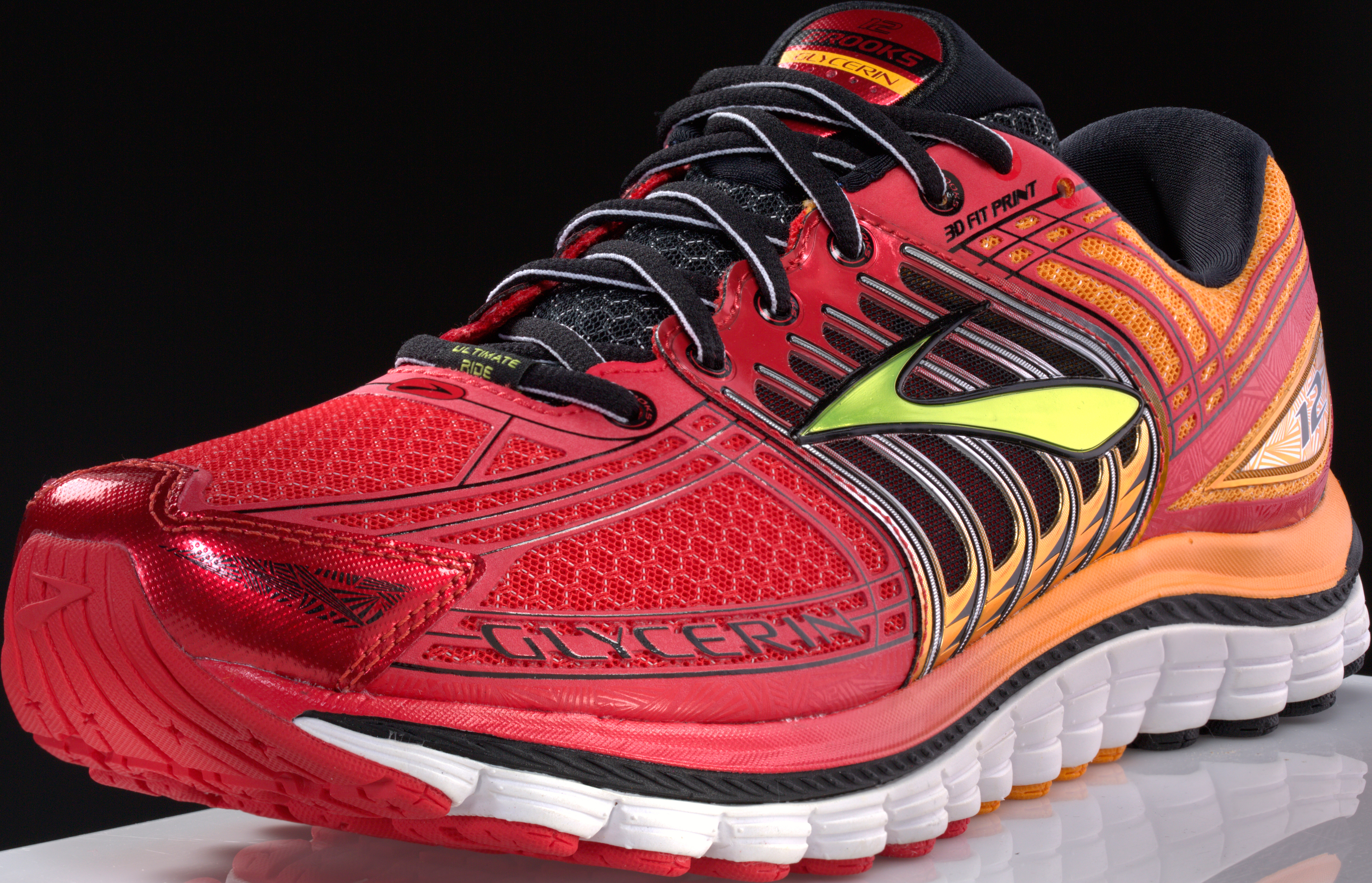
The Before photo: color looks a little “flat” in areas; adjacent color bleeds; seams need smoothing; small surface imperfections; reflective areas too reflective; logo appears not to as a solid color.

Even with our photography professionals’ extensive lighting and shooting experience, straight out of camera the sneaker presents some issues that a skilled retoucher must address before the photo can truly be called “finished.”

First the minor surface imperfections need to be addressed, including glue in the seams, divots in plastic areas, seams not appearing smooth, stitches being askew, and texture not “reading” when on a reflective part. Then the major color-correction work begins: blacks are darkened to appear “true;” color is mixed with complementary colors to tone down the brightness in some areas. Colors bleeding into areas they shouldn’t are smoothed out and toned down. Any colors that appear washed-out or with other underlying color tones are saturated more to appear more vivid.Brooks Macros  — Studio 3, Inc.

The After: the sneaker appears bright and perfect, just as the brand envisioned.

Then finally the entire sneaker was “knocked-out” (i.e., isolated from its surroundings) in order to be placed onto a clean black background for the client.

Do you see the difference? Which sneaker looks nicer, more vibrant, cooler? Which one do you think a shopper would be more drawn to? Don’t let your images fall prey to the “oh, it looks good enough” syndrome…make sure they POP with Studio 3’s retouching capabilities. Give us a ring to see how we can make your footwear FLY.

Brooks running sneakers shot by Jonny Brandt. Post-processing retouching work by Digital Artist Carl Beery.


Related posts:

Stages-cycling-bike-digital-art

Digital Art – Stages Cycling Stationary Bike

Posted on April 21, 2015

Digital art composite of rider on Stages Cycling stationary bicycle  — Studio 3, Inc.

Studio 3, Inc. is THE choice for photography, video, or digital work – because WE make it easy for everyone involved. There’s no guessing around here: we involve the client every step of the way and make the process truly collaborative. We make it easy for agencies, art directors, and brands to get exactly what they want – and consistently delight with what we produce.

Frank Creative always has brilliant idea that we love to run with – and in this case, cycle with. Stages Cycling was just about to launch an innovative new indoor cycling bike, and they partnered up with Frank to approach the Studio 3 Team. The brief was to create some cutting-edge indoor cycling bike shots by merging dark, moody cyclist shots with Iron Man-meets-TRON-inspired digital art backgrounds to explode that coolness factor of the Stages brand. The Digital Artists here first created some mockups of composites, and we made the client and agency welcome at the Portland studio to give feedback directly.

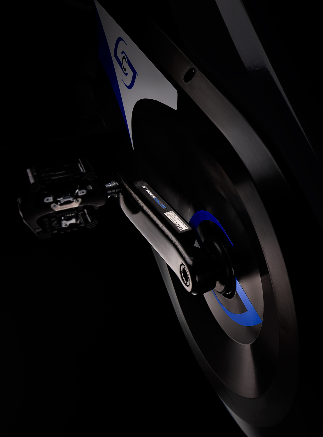
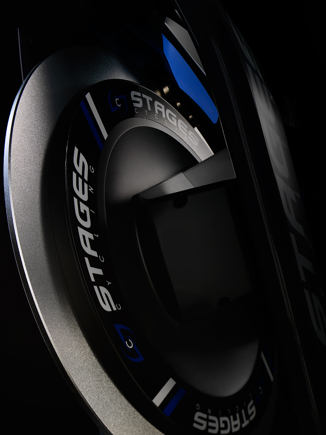
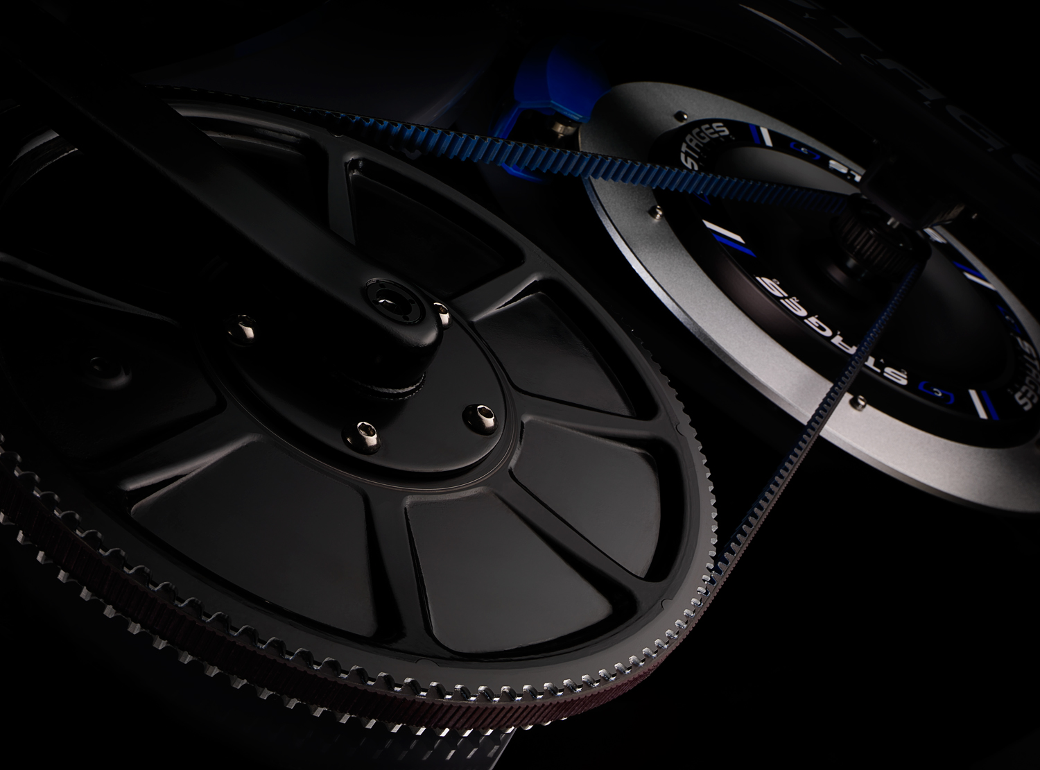
Studio 3 also took care of the casting call, and reached out to multiple cycling clubs and local bike stores to find the perfect athletes to fit the bill. Photographer Craig Wagner utilized his expertise in lighting and shooting to capture that dynamic image of the cyclists on the bikes, setting up Stages Cycling and the SC studio bikes series as the stars of the show. Digital Lead Alex Gumina worked closely with the Team in post-processing to produce a futuristic CGI background with both Frank Creative and Stages cycling in the studio giving feedback during live digital compositing sessions. The timeframe was a tight turnaround of a week – and by the end of the week the Team had knocked this one out of the park with multiple digital composites and indoor cycling bike detail shots for the updated Stages website. (Check them all out here.)

Close up detail shot of Stages bicycle rear wheel and pedal  — Studio 3, Inc.Close up detail of Stages Cycling front bicycle wheel  — Studio 3, Inc.Close up detail of Stages Cyclcing bicycle gear chain and wheels  — Studio 3, Inc.

Tired of worrying about your creative projects, or figuring out a way to coordinate all those moving parts? Take a load off. Do it the EASY way – and call the Studio 3 Team. We’ll make it so easy to get mind-blowing visual assets done and in front of your audience, you’ll forget that you’re actually at work.

Related posts:

Digital Art – Day of the Dead

Posted on October 31, 2014
Day of the Dead Makeup by Studio 3 Digital Artist Carl Beery  — Studio 3, Inc.

After some digital makeup


Day of the Dead Makeup by Studio 3 Digital Artist Carl Beery  — Studio 3, Inc.

Liz’s portrait, before Carl got creative

This time of year evokes the spooky, the eerie, and the haunted: graveyards, ghosts, ghouls, haunted houses, and of course, skeletons. Studio 3 went all-out this year in celebrating, creating a beauty-meets-death digital art image evoking the traditions of iconic Day of the Dead calaveras makeup.

Known as Dia de los Muertos and celebrated for more than 4000 years among Meso-American cultures, the Day of the Dead is a yearly holiday that gathers family and friends to pray for and remember those closest to them who have passed away. Though called a “Day,” the celebration actually spans the triduum of Allhallowtide: All Hallows’ Eve, Hallowmas, and All Souls’ Day (October 31, November 1 and November 2, respectively). Though people in Mexico wear traditional skull masks to celebrate, the ritual has evolved here to include a highly artistic style of make-up design (the skeletal face of La Calavera Catrina: the icon of death in Mexico), combining stunning and elaborate face-paint with various flowers, beads and any other props. The skull makeup acts as the wearer’s mask to overcome fear of death, act recklessly and get up to the mischief that is forbidden at other times of the year.

Studio 3 Digital Artist Carl Beery created this Day of the Dead-themed calaveras makeup utilizing a photo of our very own Producer Liz Swales, shot by Photographer Jim Felt. As with all projects Carl approaches, he endeavors to solve a creative problem utilizing digital tools and incorporate the different source imagery into a single image in an aesthetically pleasing manner. Carl also strives to keep an open mind during source imagery searching, since at times there can be new resources discovered that take the image in a better and more cohesive direction. In beginning the brainstorming process he first went back to his roots of traditional artistry by printing out the source imagery and sketching design ideas over Miss Liz’s photograph. During further reference image searching, he came across some skull and flower vector graphics that begged to be used. He seamlessly integrated these with the photograph and added a sugar skull graphic to the makeup case as an interesting visual pun. Employing his color skills and emphasizing color guiding the eye through the canvas, Carl utilized a favorite palette of rich purples and golds to offset the white and black tones of the makeup. The resulting image celebrates the richness of the Mexican tradition, updated with whimsical modern graphics for a boldly irreverent feel.

If you’re wanting to create your own Day of the Dead makeup, there are many tutorials out there to get you all decked out La Calavera Catrina-style. Or you can just give us a ring and let our Digital Artists do it for you, Photoshop-style. Let’s hope Miss Liz won’t be up to any mischief this year!


Related posts:

Studio 3 Rides Out On Ducati

Posted on July 22, 2014

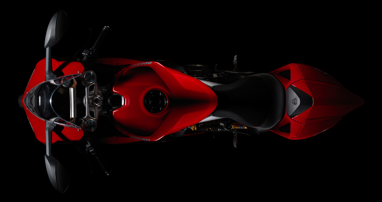
ducati test  — Studio 3, Inc.

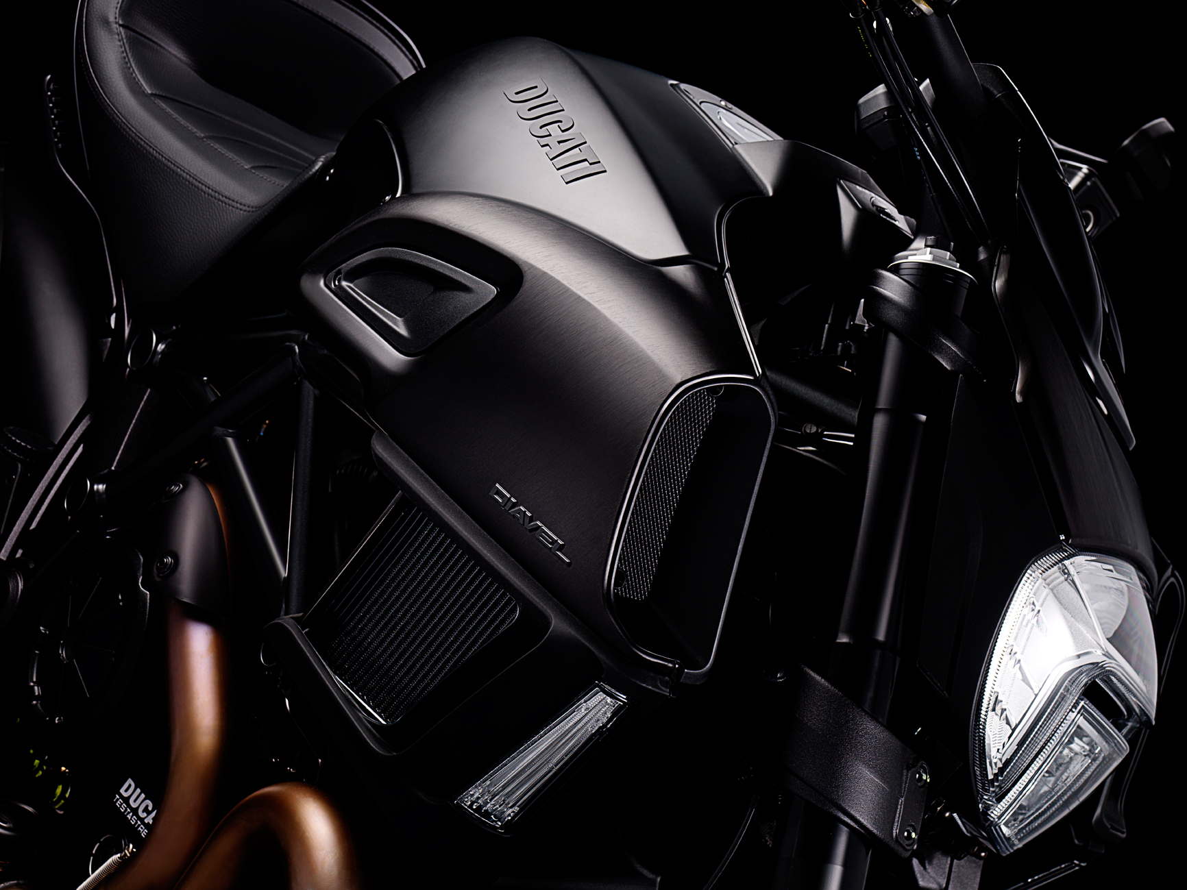
Summertime is all about fast cars and even faster Ducati motorcycles. Studio 3 wanted to explore our dare devil side and kick up the dust to catch the sunset on a few of these bad boys of the road. While the rest of us had fun forming our very own Studio 3 Biker Gang, our talented Seattle Shooters David Bell and Chris Eltrich had the pleasure of capturing these beauties with a Hasselblad Medium Format camera system. Eltrich goes a little more in depth about this sexy shoot:

“The team was looking for a darker, dramatic look… I used Studio 3’s Speedotron lights for all the shots with various light modifiers, but generally each shot had a Beauty Dish as the key light with lights through diffusion panels for accents. A lot of the planning and conceptualizing for the shoot was done by our amazing Producer, Megan Nolan and our go to Digital Lead, Alex Gumina.”

Alex shares his inspiration behind his work here:

“There seems to be a trend in vehicle advertising lately of hyper-processed, super crisp images. I thought it would be fun to do something in this style but needed a subject. That’s where Ducati Seattle came in. I pitched the idea to Megan, our studio producer, and we made our way across Aurora to Ducati Seattle to look at some beautiful motorcycles. We met with the sales manager Mike MacConaghy and before we knew it we had a couple beautiful Italian made motorcycles in the studio.

The original plan was to do a couple composites using shots of the bikes in studio, and environmental shots for the backgrounds. We would blend the two together to make one perfect, seamless image. Since we had the bikes in studio though, we decided to take full advantage of our photographers capabilities and do some amazing detail shots as well. My only request was dark, moody, high contrast, and sexy. What you see here is the end result.”

ducati test  — Studio 3, Inc.ducati test  — Studio 3, Inc.ducati test  — Studio 3, Inc.ducati test  — Studio 3, Inc.ducati test  — Studio 3, Inc.

We had a blast having the Ducati Motorcycles for a few days. We couldn’t load up on our leather gear fast enough! At least we know we’ll be prepared for next summer! If you want in on the fun, give Studio 3 a call and we’ll bring an extra helmet.


Related posts:

Pick Up The Phone!

Posted on July 8, 2014

Stressed about your company’s visual needs? Would you rather spend time having fun in the sun? Let Studio 3 ease your mind this summer. We’ve been smashing out countless videos back to back, while continuously providing outstanding photography and flawless production. Oh, did we also mention that our digital team is amaze balls? Trust us, you don’t want to be the only tanless, overworked one at the company party because you didn’t know about Studio 3. Save the embarrassment of all the “are you kidding me?” looks. We’ll make sure you meet that crazy deadline. There’s no reason to miss out on all the perks of working with Studio 3. And no reason to keep on reading, you’re wasting precious beach time – make a Pina Colada, and start dialing!! Make that golden phone call!!!

CW 15086T Pop phone PR 1500  — Studio 3, Inc.

And to make it that much easier, if you didn’t have our number yet, here ya go:

Portland Studio 503.238.1748, ask for Dalcetta

Seattle Studio 206.282.0939, ask for Marcella


Related posts:

Studio 3’s Digital Artists: One Baaahh-d Team!

Posted on May 20, 2014

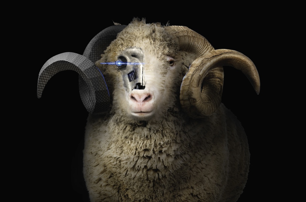
Everyone has their own prediction of what the future has in store for our world. Some say flying cars and others say crashing computers… For Studio 3’s Digital Artists, it’s bionic sheep.

SheepFinal  — Studio 3, Inc.

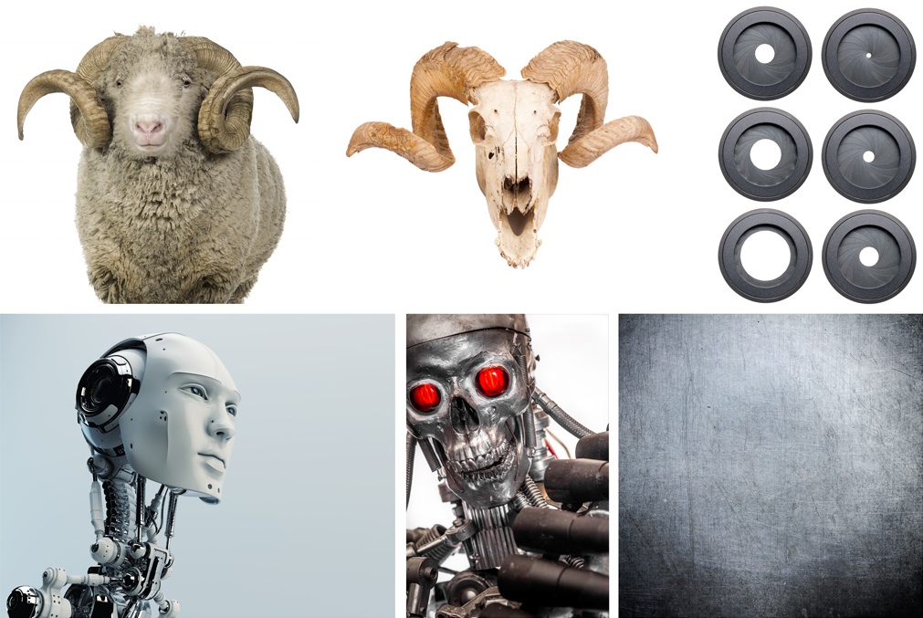
This freaky farm friend was brought to life by our deft digital dudes who were approached by Frank Creative to make their furry vision a reality. Lead Digital Artist, Alex Gumina, who worked on this project states that “…in a way, putting together this digital art piece was like making a collage. We sourced different mechanical pieces and worked to make them blend well together.”

SheepProcess  — Studio 3, Inc.

Here at Studio 3 we do a lot more than take and make top-notch pictures. We envision. We create. And we deliver.

To Alex, the essential main objective of the production was “try to make a sheep look like a badass.” The project began with an average farm dweller much like this one. But after a series of trial and error, what once began as a timid, hornless sheep later turned into a fearless, powerful, ram.

The future is all about being innovative and original and we take that very seriously. We believe in being pioneers for visual solutions and producing the most unique and inventive images that are fit to “WOW” any crowd. We love creativity and we support the future and as a result, there isn’t a project too crazy or insane for us, because after all, the best inventions began as wild dreams.


Related posts:

Throwback To The Future!

Posted on March 27, 2014

fluke  — Studio 3, Inc.

“Roads? Where we’re going we don’t need roads!”

We’re taking a flight back in time with Fluke Manufacturing! This week we’re busting out the film strips and having a flashback to the days of pre-digital shooting. Our Lead Shooter Henry Ngan captures the era in this classic Fighter Pilot Tech shot on film! Henry and the rest of the Studio 3 crew had a blast working with Art Director Val Kurita, who now Product Manages Chaudiere Design, Inc. in Seattle, WA.  And with retired successful Graphic Designer Gary LaComa who is currently creating Fine Art Photography , you can check out his gallery at Saatchi Art and shop on Zentopia to snag some of his beautiful art work. Gary hops in the time machine to share a few words with us about his tenure with Studio 3…

“This image was a core brand image for a new product introduction for Fluke Manufacturing. It was designed to be the visual icon for this new product in advertising, print collateral, and point of sale posters. The overriding concept of the product was “speed” which lead to a vision loosely visualized in my head and sold to the client. The client’s trust in us to deliver the goods was the primary reason we got this project. It was a very important introduction that the company had invested in heavily. The stakes were high. 

…It was always exciting working with The Boys and getting the results we did on this and many other projects. This campaign, built visually around this image, was a huge success for the client.

I would like to add however that I chose to work with Studio 3 on many of my clients projects over a decade of effort for 3 primary reasons. First their technical expertise. Henry and his support crew were, and always has been, technically way ahead of their time (even back then). This image was actually created in the camera and on film, unlike today where a computer screen and digital manipulation reign supreme. Second reason was their attitude about working as a team. Unlike many photographers, they allowed me to work with them in the trenches. We worked together hands on… as a team. Many photographers are less than enthusiastic about this collaborative style of work and prefer that you sit in a chair and yes/no “their” creations. Third my confidence in them to deliver. I knew they/we would deliver the product we sold and to do it efficiently and within my client’s budget and schedule. “

It’s always fun sharing these stories from way back in the day!

Related posts:

It’s In The Details

Posted on February 20, 2014

Another one from our creative and innovative team of Digital Artists! Being experts in the industry, they’re crazy efficient and solution-oriented artists, with crazy teamwork that collectively gets us to where we need to be. Let our Digital lead, Alex Gumina, tell you how we never overlook the small details and work together with our clients to get to the final product!

“When I originally received this image for post-production it was so clean that I wondered what needed to be done to it. Upon reading the photographers notes I discovered that the client wanted the reflections removed from the marble tile, the imagery on some of the screens changed, and a host of other fairly intensive edits. Swapping out the images on the screens was easy – we do this sort of thing all the time. However, when it came to removing the reflections from the marble tile I had to formulate a game plan. Because of the perspective, simply cloning tile to tile wouldn’t work. The grout lines wouldn’t match up. My first inclination was to path out each individual tile and clone sample in from other areas, but I knew there had to be a better way. I decided to make a complex system of open-ended paths over the grout areas in between the tiles themselves. I then created separate paths for the different areas of colored tile. I filled in each of these areas with a solid color, which I sampled from the actual floor tile color. After I had each of the areas filled, I used the path I made over the grout lines to fill in the grout and applied an inner bevel. The result looked good, but didn’t really make sense because the reflection was completely gone. I scaled it back, showed the client, made a few minor adjustments, and arrived at the end result.”

Faustrollean Fixture Company  — Studio 3, Inc.

Related posts:

Meet Corban: Digital Artist, Video Editor, Animator, Illustrator, an all-around Artist!

Posted on September 16, 2013

We are so excited to introduce Corban who’s now a part of the Digital Art Studio 3 team in Portland! He has many amazing talents. Read below to learn more:

Digital Artist Corban Monger  — Studio 3, Inc.

“I’m a renaissance man, jack-of-all-trades, or as Wile E. Coyote put it: “Super Genius”. The universe is my playground. Even though I’m not yet a master, I’m a journeyman at so many things I can do practically anything. This curious state of being comes from my insatiable thirst for knowledge. There’s always something new to discover. My mind rebells at stagnation. I need problems to solve. I need work to create. Who needs television when the real world is one big sandbox?

Born and raised in Oregon, I was encouraged to follow in the footsteps of my grandfather by becoming an engineer. It certainly made sense considering my aptitude for math and science. Electrical engineering in particular seemed a good choice. I loved technology and what could be done with it. Being on the cutting edge of electronics seemed an exciting prospect.

I enrolled in engineering school at the University of Portland. By day I was your mild mannered engineering student. But by night I was an artist teaching myself drawing, animation, and graphic design. Often people would ask me “What are you doing in engineering school? You should be an artist!” And they were probably right.

The arts were part of my life since childhood. I would draw my favorite cartoon characters or sculpt them out of clay. I’d listen to radio plays or construct cities with Lego bricks on the living room floor. In school I was involved with music and theater, playing multiple instruments, acting in Shakespeare plays, and singing in musicals. From drawing and sculpture to film and theater, the arts captured my attention. But, strangely, it never struck me to pursue it as a career.

The summer after graduation, it finally dawned on me that I was meant to be an artist. Engineering just wasn’t as entirely satisfying as I had hoped. The work was fairly easy. But life in a cubicle didn’t sound exciting or creative. It sounded like a dependable boring job. And that wasn’t really what I wanted.

So it was off to DigiPen Institute of Technology for four years to get educated in the digital arts. It was during that time I fell in love with story, film, and animation. Storyboarding and video editing in particular are my two favorite parts of production. In fact the digital arts as a whole have been wonderfully engaging. As an artist you need to learn everything there is to know about everything to synthesize new art. And the technical nature of the industry satisfies the part of my brain that enjoys solving the puzzles of process.

After working in Seattle for a year, once school was finished, I finally returned to what I consider home: Portland. Seattle was nice, and one day I may return, but for now I’m right where I want to be.” ~ Corban Monger, Digital Artist/Studio3, Inc.

Related posts:

Newer Posts
Older Posts