Studio 3, Inc.

Lifestyle

Sculpting Portlands Past

Posted on December 10, 2013

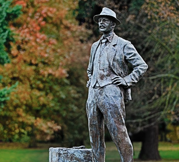
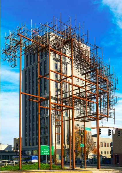
Studio 3 Portland had our Senior Photographer, Henry Ngan, take a walk around this beautiful city capturing what Portland had to offer. Amongst the many landmarks that keep Portland weird and unique, he came across a couple of sculptures that reminds this fresh and hip city of its rich history.

Italian Immigrant  — Studio 3, Inc.

You can find James Gion’s sculpture of the dapper “Italian Immigrant” statue in the traffic island at the intersection of NE 99th Ave, Sandy Blvd and Killingsworth. Many statues honor an individual, a war, an event. The “Italian Immigrant” gives tribute to anyone and everyone who took a path that led us here. It reminds Portland of our sense of community. Those who came before that laid the foundation for us, is now brought back to the Rose City where they are honored at the heart of the Parkrose district. Standing tall and confident, the Italian Immigrant invites all that come from around the world, to set their briefcase down in search for a new adventure here in Portland.

Inversion Belmont  — Studio 3, Inc.

Artists/Architects Annie Han and Daniel Mihalyo of Lead Pencil Studio wanted their representation of the past from a different point of view. The bold new art projects titled, “Inversion: Plus Minus” is a set of towering sculptures that stand along SE Grand Ave. Pictured, is the tower on Belmont street. Using weathered steel angle iron; the artists’ brings “ghosts” of former buildings to life. One half of the towering set (not pictured) is located on the Hawthorne corner. This structure will feature a matrix of metal that almost appears as a solid building. The other half, the Belmont sculpture, emphasizes negative space. Referencing the outer shells of ordinary industrial buildings. Portlanders continue to find ways to remind the present, invite the future and remember the past. Whether it be honoring people, places or things; it all represents Portland. And we SUPPORTland!


Related posts:

Studio 3's Photographer Craig Wagner & CMD's Art Director Lawrence Wolf collaborate!

Posted on September 10, 2013

See below to view Craig Wagner’s in-studio Product Photography and his lifestyle images!

Studio 3, Inc, Behind the Scenes, Commercial Product Photography, Commercial Lifestyle Photography, Lawrence Wolf, CMD

We are excited at Studio 3 about our latest partnership with CMD in Portland. Craig Wagner (Photographer) and Lawrence Wolf (Art Director) talk about their thoughts around their latest creative venture. Read below to hear more about the collaboration between Studio 3 Inc. and CMD.

A few words from Lawrence Wolf at CMD.

“One of the great things about working at CMD is the way the company embraces the Rose City’s bike culture. Bike commuting is actively encouraged year round, with a lot of extra support for people who get into the saddle for the Bike Commute Challenge each September. And, as an art director, I get to spend my days crafting the visual language of all the things we make for our clients: websites, mobile apps, brochures, you name it. It’s a process where I’m fortunate to work with some really talented individuals. This brings me to Studio 3 Photography, and partnering on a creative project that reflects my personal passion for cycling as well as that embraced by Portland and CMD.

I first worked with Studio 3 in December 2010, shooting bird’s eye views of two Western Star trucks. It wasn’t an easy shoot, given the sheer size of the trucks. And thanks to the unpredictable nature of Pacific Northwest skies in winter, we were forced to shoot inside a warehouse. In that kind of situation, you can only get an angle so wide before running into problems with distortion.

But Craig was very methodical in overcoming these logistic issues. Over the two days we shot, we bonded over a mutual appreciation for all things on wheels, be it two, four or eighteen. That shoot was just the beginning of a strong professional relationship, and then this past spring, something got us talking about my old bike.
Studio 3, Inc.  — Studio 3, Inc.

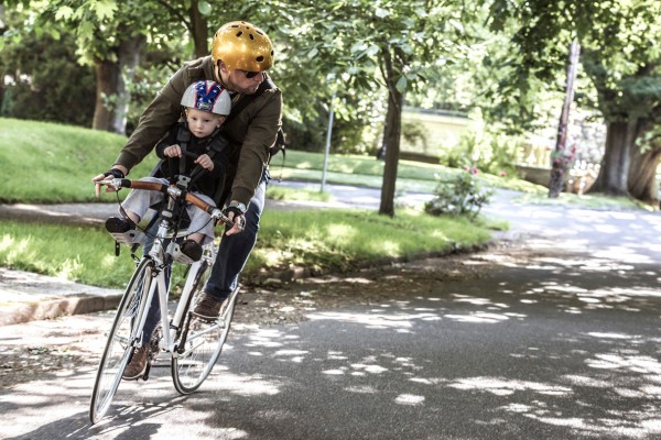
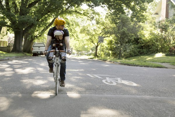
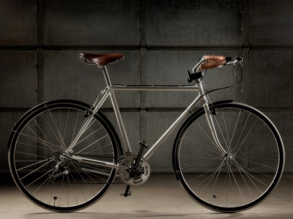
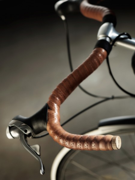
I’ve been customizing this vintage Trek touring bike since the birth of my son. It had sat in my garage, collecting dust for several years, because it’s so much heavier than my aluminum road bike and I tend to opt for speed. But it’s always been a great bike. The steel frame gives it a really comfortable ride. It reminds me of the matching, yellow Schwinns that my parents used to pedal me around on. When I started thinking about how to introduce my boy to cycling, I swapped out the drop bars for mustache bars (to accommodate a front-mounted child seat). This gave the bike a totally different look, and I suddenly developed a new appreciation for the bike’s classic styling.
Studio 3, Inc.  — Studio 3, Inc.

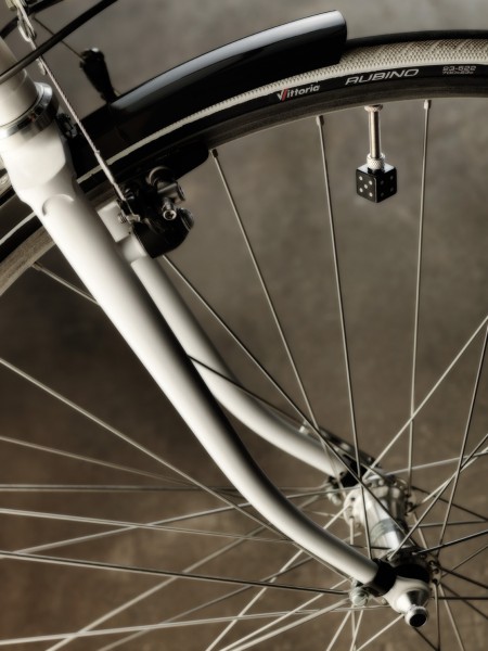
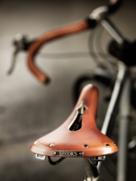
Soon after, I added a Brooks leather saddle and matching bar tape. Then it kind of took on a life of its own. Since then, I continue to adjust little details like striped white tires, or black dice valve covers.
Studio 3, Inc.  — Studio 3, Inc.

Studio 3, Inc.  — Studio 3, Inc.

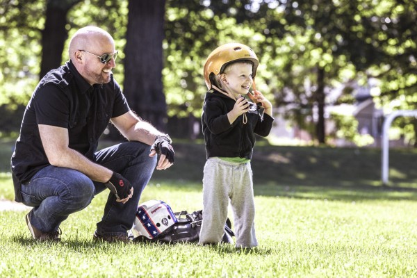
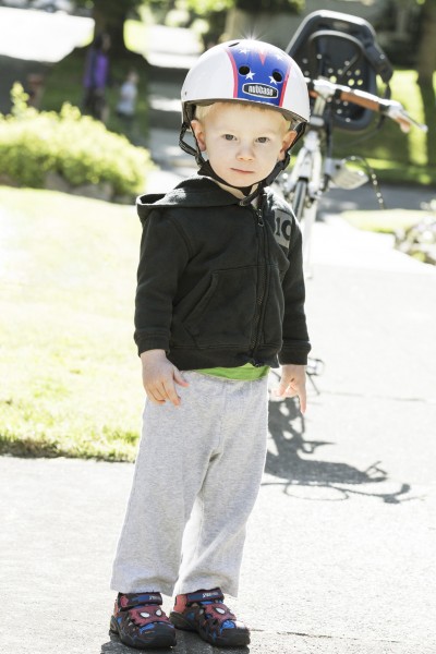
My latest addition was designing the “Slow Ride” aluminum head badge, which I had made at International Graphics. “Slow Ride” was influenced by a few things: My son’s 70s-era, Evel Knievel helmet, and the fact that the bike weighs upwards of 30 pounds. We won’t be winning any races on this thing, but that’s hardly the point of our rides.
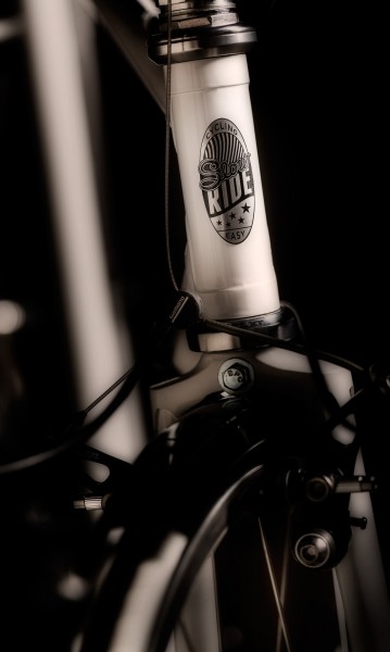
Studio 3, Inc.  — Studio 3, Inc.

I was thrilled that Craig was interested in collaborating on a “Slow Ride” shoot featuring the customized bike. As an art director, I really admire his attention to detail and the way he plans a shot. He’s keenly aware of potential challenges, and always has a good solution for telling a story through his lens. Half the fun of this shoot was working together on the idea, putting together moodboards, and scouting locations.”
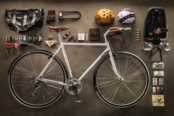
Studio 3, Inc.  — Studio 3, Inc.


A few words from Craig Wagner at Studio 3, Inc.

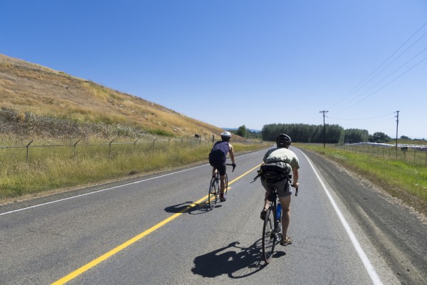
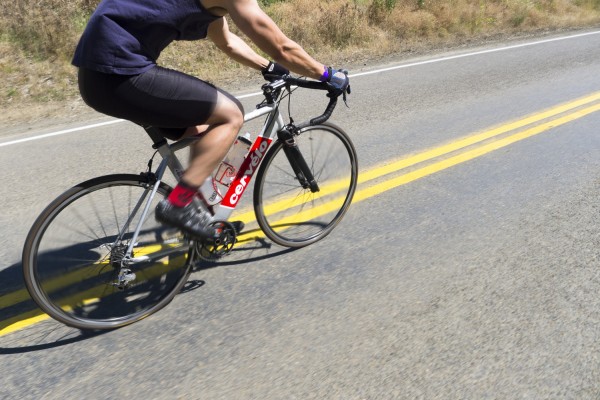
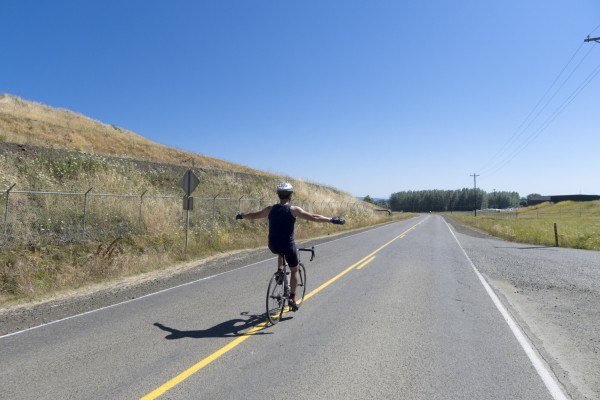
“Working with Lawrence’s “Slow Ride” concept was fun and allowed me plenty of creative freedom. The mood boards were coherent and well designed. With a clear understanding of the desired outcome and tone, we were ready to go. I look forward to many more future projects with Lawrence’s creative concept development and the CMD team. See below for some of the shots we got on-location!”
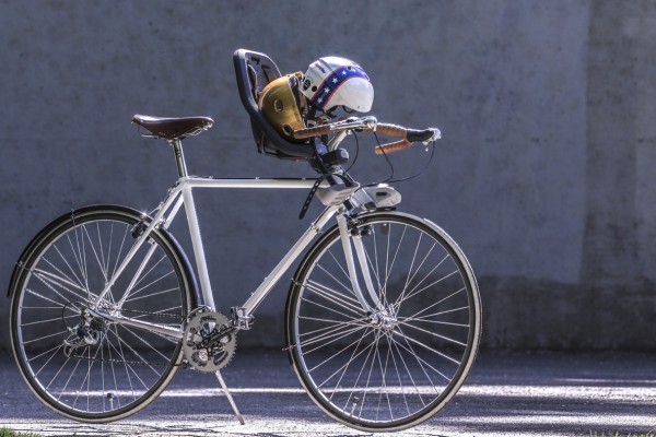
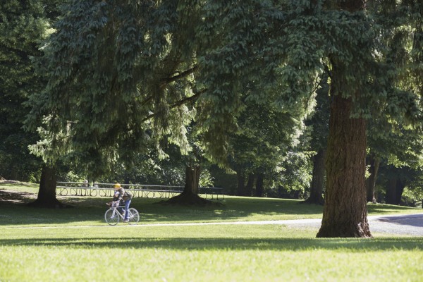
Studio 3, Inc.  — Studio 3, Inc.

Studio 3, Inc.  — Studio 3, Inc.

Studio 3, Inc.  — Studio 3, Inc.

Studio 3, Inc.  — Studio 3, Inc.

Studio 3, Inc.  — Studio 3, Inc.

Studio 3, Inc.  — Studio 3, Inc.

Studio 3, Inc.  — Studio 3, Inc.

Get involved in the Bicycle Transportation Alliance’s Bike Commute Challenge by clicking here.To view CMD’s joint blog post click here.

Related posts:

Lifestyle Photographer Matt Jebbia & Digital Artist Alex Gumina "Peace of Mind"

Posted on July 30, 2013

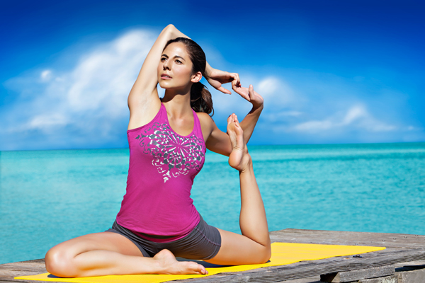
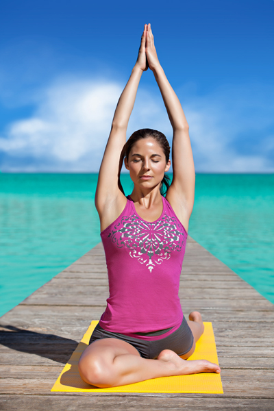
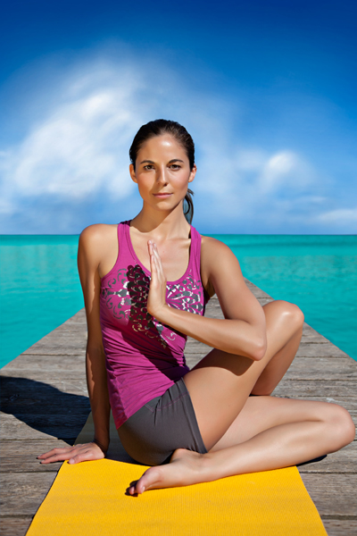
It’s summer in the Northwest, the perfect opportunity to get outside and shoot. Recently, Lifestyle Photographer Matt Jebbia headed to Green Lake to capture the practice of yoga in a peaceful setting. He came out with some great pictures, read below for his inspiration behind the shoot:

There is just something amazing about shooting outside in the NW. Seattle being one of my favorite areas to live and work has just an astounding amount of parks with water that just add an awesome element to any photographer’s photo shoots. These yoga images were shot on a pier at Green Lake in North Seattle. I was a bit concerned that my choice of time of day was a bit ambitious given that the sun is usually at its hottest point at 4:30pm. Turns out that in relationship to my model the sun created some pretty nice lighting on her face when she turned just the right way. This inspired me further, knowing with the help of our digital team, we could create an awesome tropical, yet serene image.

The pictures inspired a collaboration between Matt and Alex, with the end result of the model appearing as if she were in a tropical place like Bali or the Maldives. Alex Gumina shares how he created the tropical feel:

When Studio 3 photographer Matt Jebbia originally came to me with these yoga images he wanted to give them a more tropical feel. They were shot on location at Green Lake and although a beautiful setting, it certainly feels more like the Pacific Northwest than it does a tropical paradise. His initial edits for me were “remove the houses, lengthen the dock where needed / remove the railing, and see what you can do with the background in general”. The words “see what you can do…” sort of opened up the door for me to get creative, and I decided to take full advantage.

I thought to myself “where would be a really beautiful, peaceful place to do some yoga?” and the Maldive Islands came to mind. After a quick Google search I found an inspiration image and went to work. If you look closely, you’ll actually see this image at the top of my layers palette. I pasted it in so I could sample the blues for my sky gradient. For the clouds I considered using a Photoshop brush or some vector art, but I wanted something a little more original so I decided to hand “paint” them in on my own. It was at this point that I decided to start recording a video (see below).

I had already drawn my path around the model and used an alpha channel for her hair, so it was really just a matter of cleaning the image up, dropping in the background, and changing the color of the water. While reviewing the image with our Studio Producer, Megan Nolan, she pointed out that it looked like the model was struggling a bit with the sun in her eyes. I did some quick adjusting to fix it and I think the end result is perfect.

I spent about half an hour on the image before I started recording, and about three hours on it after. When I finished I imported the video into Adobe Premiere, did some quick editing, squished it down to three minutes, and added an audio track. What you have here is the final product. Enjoy!

Lifestyle Photographer  — Studio 3, Inc.

Lifestyle Photographer  — Studio 3, Inc.

Lifestyle Photographer  — Studio 3, Inc.

Related posts:
Cycle Oregon 2013 with Photographer Henry Ngan!

Posted on July 26, 2013

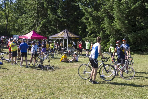
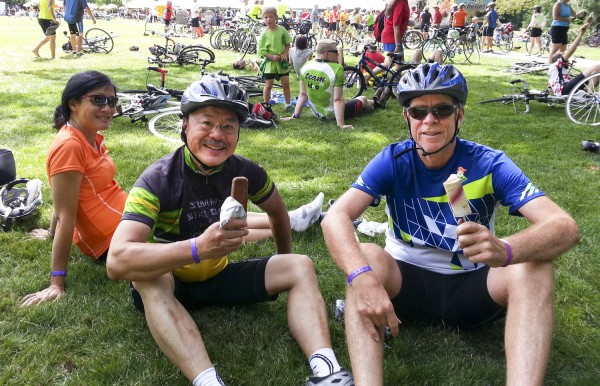
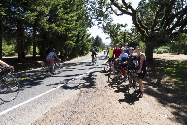
Once again this year’s Cycle Oregon 2013 weekend ride was an amazing experience both days! The weather could not be more perfect. My brother Ben, sister Betty, nephew Paul Schommer and his uncle Bob of Schommer & Sons were all along for the ride and encouraged me along the way. Ben and wife Julie did their ride on a tandem, Betty and husband Tom rode their own bikes. I personally rode on a custom no name frame outfitted with hand-me-down parts from Ben’s old bike parts.

Cycle Oregon 2013  — Studio 3, Inc.

Someday I may get a Specialized or a Cervelo or a Cannondale but for now this is the perfect bike.

Cycle Oregon 2013  — Studio 3, Inc.

I could have used one lower gear on Sunday’s climb to the north up to the Lewisburg Saddle Trailhead. The rest of the 42 mile ride through a series of rollers was palatable and actually fun. I learned a lot on how to attack the next hill.

Cycle Oregon 2013  — Studio 3, Inc.

Saturday was a picture perfect postcard day through beautiful country roads to the east of Corvallis. Except for a few headwinds, and a swarm of honey bees trying to get back to their hive, it was a blissful 51 miles of fun. Our host, Oregon State University provided really nice facilities and generous hospitality for camping, eating, and entertainment.

Cycle Oregon 2013  — Studio 3, Inc.

The folks from the Bike Gallery provided the technical expertise to make everyone’s bike a perfect riding machine. They adjusted the new chain I purchased at their Hollywood store in Portland. We had live entertainment from Funk Shui (Fri) and Madison Jones (Sat) and a beer garden at the Memorial Union Quad. Everyone came home to the finish line amongst a cheering crowd and ice cream from the Schwan’s catering truck.

For the Studio 3 blog, I captured all these images of the Cycle Oregon 2013 weekend ride using two cameras. Some of the images were captured using my Samsung Galaxy Note 2. The rest were captured using my Panasonic Lumix DMC-LX5. These did a great job and kept the weight under control and storage manageable.

Cycle Oregon 2013  — Studio 3, Inc.

Cycle Oregon 2013  — Studio 3, Inc.

Related posts:
Commercial Lifestyle Photographer Matt Jebbia Summer Fun!

Posted on July 2, 2013

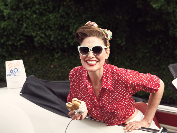
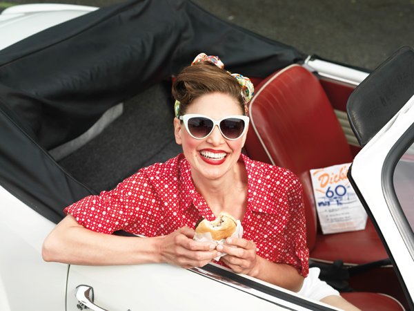
This shoot was a fun collaboration between many of us here at the studio. What made it work was having access to some great vintage props, a great model and a perfect morning of Seattle summer weather. A few words from Commercial Lifestyle Photographer Matt Jebbia!

We came up with the concept of using Dick’s burgers due to the upcoming 60th anniversary of “Dick’s Drive-In”, and we were lucky that fellow Studio 3’s Commercial Product Photographer David Bell had the perfect vintage VW that he allowed us to use.

Commercial Lifestyle Photographer  — Studio 3, Inc.

Since we were a bit worried about taking this awesome vintage car on location I decided to use the Studio 3 parking lot. It provided a nice backdrop and allowed us to utilize some studio equipment that would have been harder to use out on location.

We set up a 6×12 foot sail in the parking lot that helped to diffuse the harsh noon sun, added a medium soft-box to add some light to our models face, and played around with some different camera angles and props to bring this shoot to life.  We use a variety of camera systems at Studio 3 but for this shoot I opted to use the Hasselblad H2d with an 80mm lens.  It’s not my camera of choice for location shoots but since we were 10 feet from the studio door it made it easy to use and allowed us to shoot tethered for quick image review.

Commercial Lifestyle Photographer  — Studio 3, Inc.

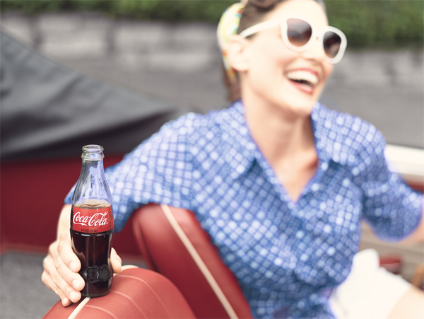
I have a coca cola image in my portfolio already and decided to add the coke bottle at the end of the shoot, just to add a different prop and I felt that we had the perfect model, vehicle, and location to make it work. It was a bit stressful working so closely with a vintage convertible owned by our Senior Photographer. But once we all got into the flow of creating the perfect shot, it all seemed to come together. And luckily for all of us no vehicles were damaged in the process!

Commercial Lifestyle Photographer  — Studio 3, Inc.

To view more Commercial Lifestyle images created at Studio 3, Inc. click here!

Related posts:
Film Director David King What a beautiful campus!

Posted on April 5, 2013

One of our favorite places to visit and shoot, is the beautiful campus of Washington State University, Vancouver. The scenic views from the campus’ hilltop location are breathtaking and change dramatically through out the seasons. Our crew visited the campus again for our second video collaboration with WUSV’s marketing department. Here are a few words from our Film Director David King.

For the second video in our series for Washington State University Vancouver, we were asked to help the university highlight how “non-traditional” students thrive at the Vancouver campus. With an enrollment of just over three thousand students, an average class size of twenty, and a student to faculty ratio of 1:14, WSUV truly caters to the student that is serious about furthering their education without sacrificing the whole university experience.

For this video, we directed our focus at transfer students, students that have families, those that hold down jobs outside of school, and those that are looking for help with financial aid. We spent the day on campus, interviewing five students with very diverse backgrounds and career aspirations. The common thread for each of them was how easy it was to be a student at Washington State University Vancouver while working and in some cases, raising a family. It was great to hear them talk about what makes Washington State University Vancouver so special.

We were able to utilize some of the scenic footage we captured on our earlier visit in the fall, before school had started for the year, as well as shooting some new footage with the campus bustling with student activity. The video ultimately ended up on the WSUV website and is viewed often by prospective students who may be looking for a university that will fit their unique circumstance.

Check it out here, or visit the WSUV website at http://www.vancouver.wsu.edu.

To view more Videos created at Studio 3 Films please click here!

Related posts:
Studio 3 Films Director David King and Hog Wild's President Joe Rooper discuss their latest video project!

Posted on March 19, 2013

Studio 3 Films, Behind the Scenes, Click Shot Commercial Video, Power Popper Commercial Video


Studio 3 Films is so excited to partner with Hogwild in Portland to highlight their latest products! For insight into this video project read below to hear from our Director, David King!

Hog Wild, a Portland toy company and one of our long-time photography clients, came to us with a need for two video commercials to launch their newest products: Click Shots and Power Poppers. Both spots were to be shot in studio, featuring kids, voiceover and a lot of action.  We brought in frequent collaborator and Director of Photography Andy Maser with his RED Epic for the shoot.  We wanted to shoot with the RED for a couple of reasons: 240 frames per second, slow motion would help us capture the fast action of the products and the 4k resolution at 24 frames would give us the option of doing some fast, optical zooms in post production.

We shot the spots over two days; one day at Studio 3, and because our stage was already booked for another shoot, we shot the next day at Picture This Studios. While not professionals, the kids were fantastic. The RED Epic performed as expected. Two weeks later, the post production was done and the spots were on their way to Hong Kong for one of the biggest toy trade shows in the world.

“Studio 3 produced two .30 TV commercials for us. Both were for toy products brand new to the market and both need high energy and pizzazz. We gave them a decent script and storyboard but what they came back with based upon their creative input, camera techniques, direction and post production was a mile above where we started. We’ve used other companies for our TV spots in the past but we’re incredibly happy with the results we received from Studio 3.  Three thumbs up for their creative smarts, direction and technical expertise.” President/CEO Hogwild

Related posts:
Commercial Photographer David Bell Tick Tock!

Posted on February 5, 2013

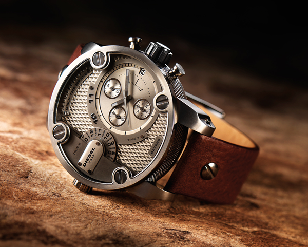
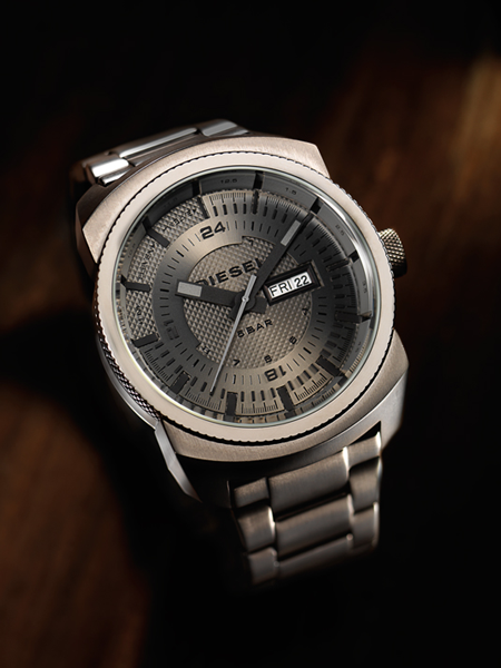
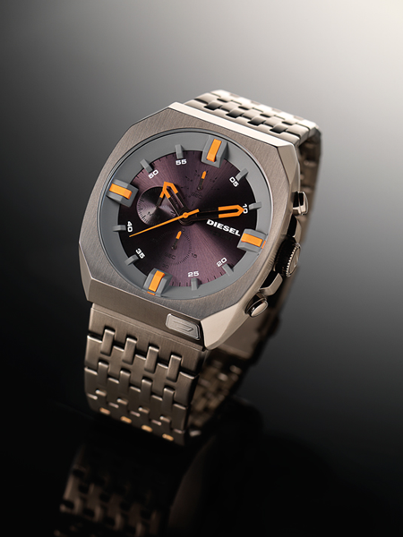
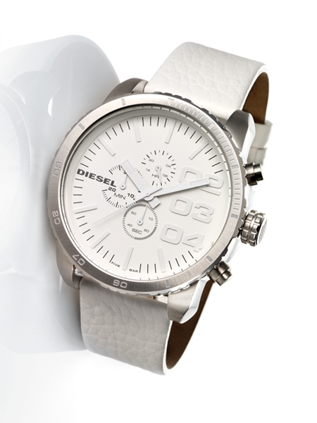
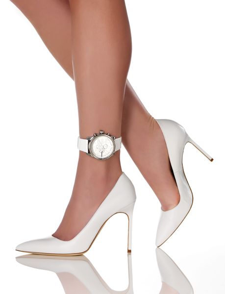
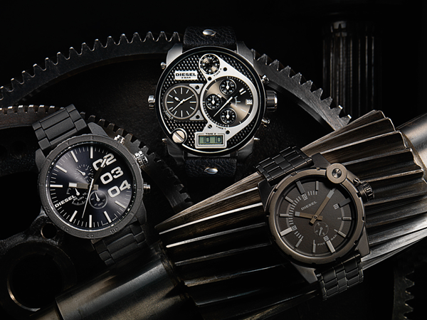
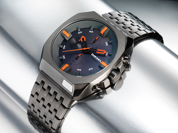
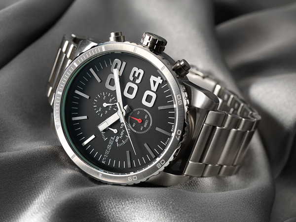
Commercial Photographer David Bell had some spare time on his hands, and the inspiration to create a collection of beautiful images showcasing the technology and texture of the Diesel watch collection. A few words from David…

I decided to shoot a collection of Deisel watches in order to create a new product photography series for my portfolio. I’ve always loved how fascinating a watch can be from the technology, materials, gadgets, weight, and pure beauty of the details.

I included added textures to highlight the specific components of each watch by photographing them in different environments to compliment the design. I chose these products due to the challenge and pleasure I derive from photographing something with extreme complexity. My goal was to make the watches stand out individually and seen as a series. I wanted them to pop and stand alone from the backgrounds in a hero type fashion. I chose the backgrounds based on specific element in the watches so it had a beautiful composition. As you can see the bold watches were matched with dark and gritty backgrounds to compliment the gears.

I chose to work with the Hasselblad H3D-39 megapixel back camera with the tilt shift adapter. The decision to use this camera which is a medium format platform is due to the large sensor that allows for capturing fine details. The high res nature of this equipment is my ideal shooting device. My chosen lighting technique was either dramatic or high key depending on the background and the end look I desired. I used the Speedtron Studio Strobe Lighting kit with utilizing grids, spots and floods; that helped with creating the desired effect. I am looking forward to my next inspiration and having a day off to play and be creative. Enjoy the collection below!

Commercial Photographer  — Studio 3, Inc.

Commercial Photographer  — Studio 3, Inc.

Commercial Photographer  — Studio 3, Inc.

Commercial Photographer  — Studio 3, Inc.

Commercial Photographer  — Studio 3, Inc.

Commercial Photographer  — Studio 3, Inc.

Commercial Photographer  — Studio 3, Inc.

Commercial Photographer  — Studio 3, Inc.

Related posts:
Product Photographer Henry Ngan Danner!

Posted on November 27, 2012

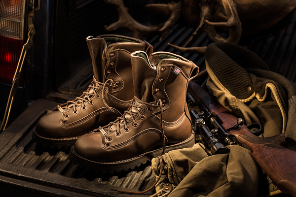
Product Photographer Henry Ngan continues to amaze us.  He recently began a series of images capturing still life in a new light.  We decided to celebrate the upcoming changing of the seasons with an outdoor lifestyle shoot featuring Danner boots.  For more insight into the creativity of this fantastic shoot here are a few words from photographer Henry Ngan.

First of all, this is why I like Danner boots. You can kick the living daylights out of them and then have what’s remaining re-crafted. Mine are made in the USA right here in Portland Oregon, my own back yard. They just get more comfortable the longer I wear them and that’s why you don’t want to get rid of them when they seem worn out. Just send them back to the factory in Portland, Oregon and they will re-craft them. They feel like bedroom slippers once you wear them in. They are the boots you need to get for rough, heavy duty use. If you take care of them they will last a lifetime and then some. Don’t make the mistake of getting one of the ones made offshore. They won’t last because they are made differently and you won’t be able to re-craft them.

My intention for this shoot was to create a dramatic image through warm detailed lighting.  Highlighting the Danner boot in this fashion was my focus. I wanted to show the viewer a beautifully crafted product that will eventually become even better after lots of hard wear and tear. Just 2 lights were used on this set. But I re-directed multiple beams of light using various reflectors to create this image. The story is told by the sum of all the components. But the lighting is concentrated on the boots and fall off on the rest of the image. I am currently working on a series focusing on this type of lighting and warmth. Stay tuned for more images to come!

A sneak peak into Henry’s latest shoot!

Product Photographer  — Studio 3, Inc.

Related posts:
Henry Ngan: Deep Under the Earth!

Posted on August 7, 2012

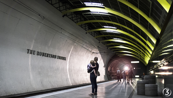
Sometimes you can find inspiration in your backyard, other times you find inspiration in the third deepest train station in the world! Photographer Henry Ngan recently found himself in the super cool Robertson Tunnel, a local engineering gem that passes through the west hills of Portland, filled with basalt up to 16 million years old. Whoa!

Lets hear what Henry had to say about his adventure in the deep:

The Robertson Tunnel is truly a great achievement of Industrial Design and the technology required to create this tunnel inspires me. The designers created a people friendly space in an unlikely place and capturing the human element within it was what I aimed for. Feeling the rush of the wind, people reacting to the mystery of the emerging train  — preserving this moment was my intention.

  — Studio 3, Inc.

Related posts:
Newer Posts
Older Posts