Studio 3, Inc.

Industry Highlights

unnamed

Stacked Focus: How We Rock The Details

Posted on November 15, 2019

Creative client concepts rock. Take a peak into the process behind the imagery created for Domaine Serene’s newest clubhouse set to open in Lake Oswego this fall.

unnamed  — Studio 3, Inc.

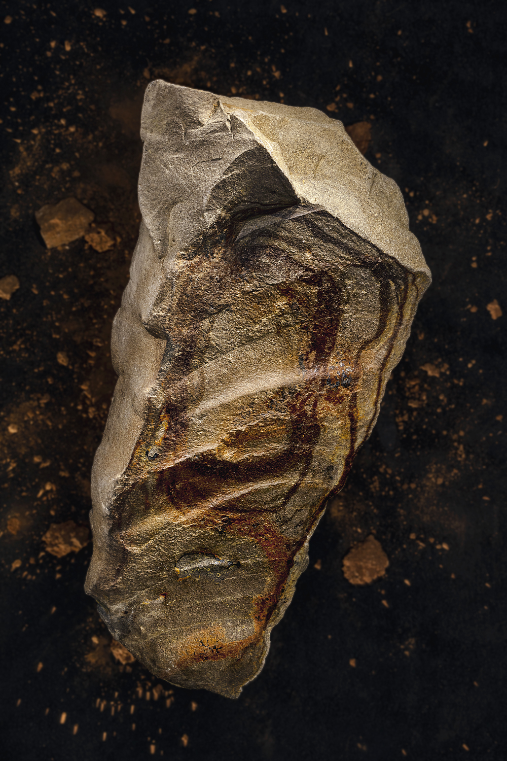
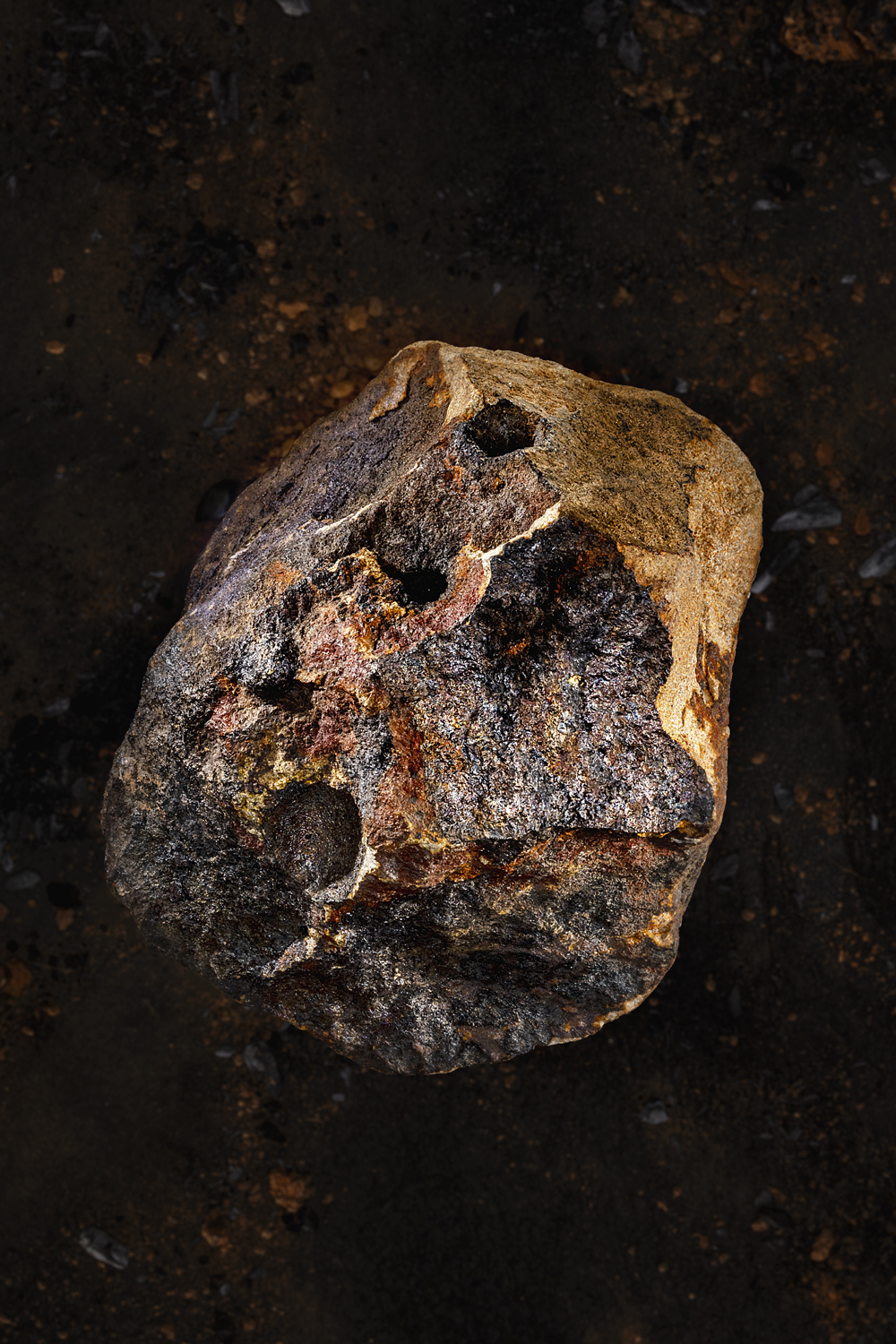
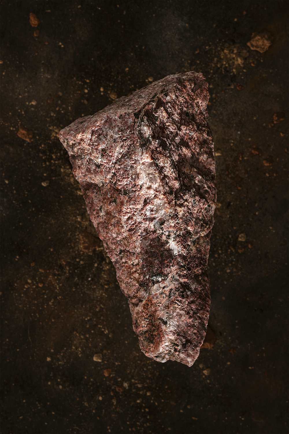
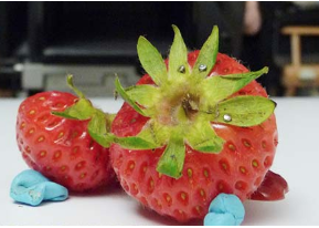
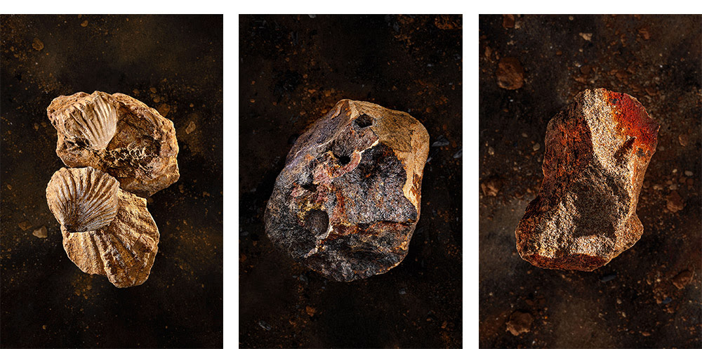
Using clay and soil taken directly from the vineyards that make Domain Serene famous, we created large-scale beauty features to commemorate the earth in which the renowned grapes are grown.

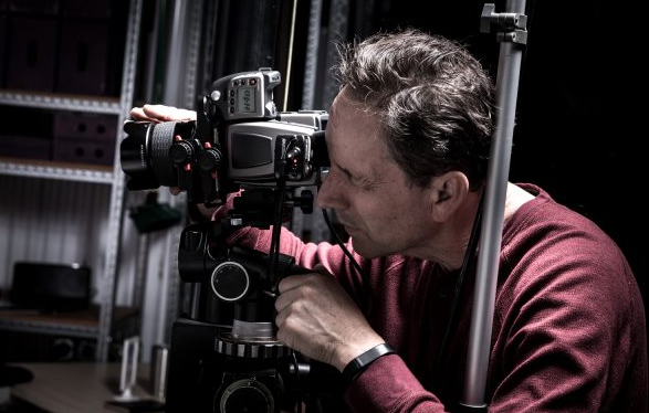
Sitting down with photographer, Craig Wagner, I bring you the inside scoop on how these “larger-than-life” images were created.

15689 Domaine Serene  — Studio 3, Inc.

Q: How did you incorporate the client’s vision in your shooting style?

A: I knew the client wanted these rocks to really stand out. I had this vision of asteroids floating in space. I knew I wanted to carry the focus in such a way that the onlooker wouldn’t know that they are looking at something you could hold in the palm of your hand. – Photographer, Craig Wagner

15689 Domaine Serene  — Studio 3, Inc.

Q: Why did you use a stacked focus for this shoot?

A: To carry the focus deep enough into the shot and create the larger-than-life effect we were after – emphasizing the impact of this soil and rock matter. Stacked focus gives me more precise control over my focus on a shoot of this size. This allowed me more options when shooting at such a low focus. – Photographer, Craig Wagner

15689 Domaine Serene  — Studio 3, Inc.

Q: What Changes when you take on a project of this size?

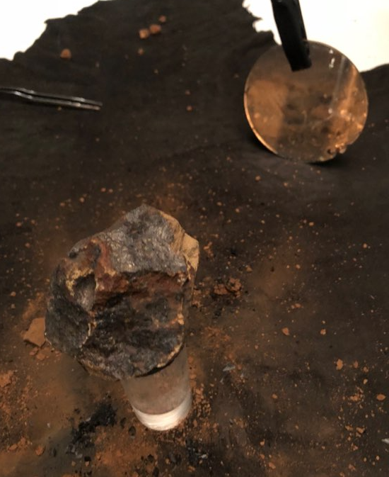
A: If I am shooting a truck or a spa all of my gear is smaller than the product. Here, it is the exact opposite. I get to be creative on how I bring all of the technical lighting finesse to a small set – using mirrors and reflectors to minimize my lighting tools and maximize my space. – Photographer, Craig Wagner


Untitled  — Studio 3, Inc.

Related posts:

Happy Earth Day from Studio 3, Inc.

Posted on April 22, 2019

We not only create green brand campaigns for clients, we live them.

Earth Day is the world’s largest environmental movement, celebrating sustainability, environmental protection, and the green movement across the globe. Today, we celebrate the earthy efforts of our team and clients- highlighting six clients who put their green foot forward.

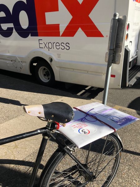
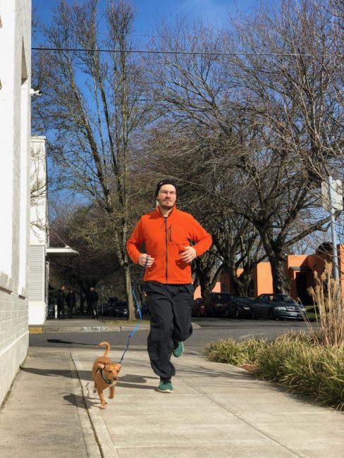
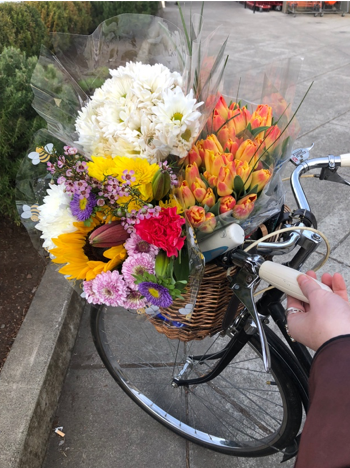
Working to reduce our ecological footprint our team jogs to work, takes the Tri-met and Metro Transit systems, and runs errands on our bikes.

  — Studio 3, Inc.Studio 3 Team  — Studio 3, Inc.Bike Portland  — Studio 3, Inc.

Many members of our team have adopted an eco-friendly plant-based diet, positively impacting the planet with each meal. Here are a few of our favorite neighborhood eateries: Sudra, the Slice Pizza Company, and Providore.

Meet the Studio 3, Inc Team  — Studio 3, Inc.

Studio 3 Service Day

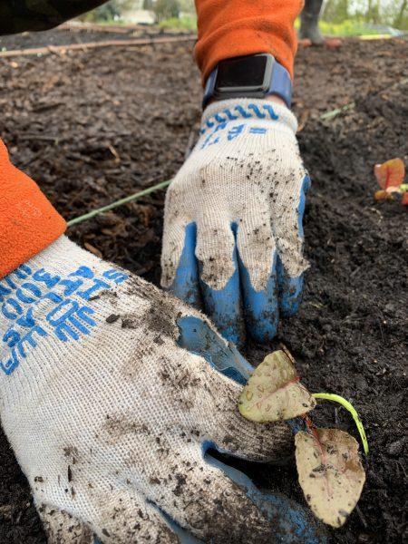
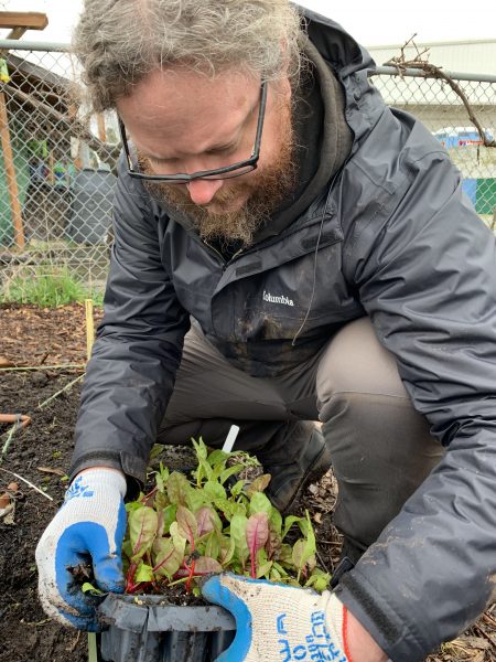
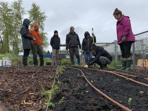
Each year our team decides on a service day to honor our community and environment. This year we volunteered at the Oregon Food Bank’s Eastside Learning Garden to dig in and work together on seasonal gardening projects. We prepped, weeded, and cleared garden beds to then plant rows of swiss chard. Go, team!

sFVJwrhGR+iZ3BxOSyvU5Q thumb 64e  — Studio 3, Inc.IMG 0464  — Studio 3, Inc.IMG 0454  — Studio 3, Inc.

In alignment with our office values, many of our clients strongly believe in and practice social and environmental responsibility.

Stash Tea reuses and recycles packing materials in their shipping department while investing in renewable energy through the purchase of green power through Portland General Electric.

Have you heard of Ecoroofs?

HN 14645L EnvironServices b SP 2  — Studio 3, Inc.

We captured Portland’s Ecoroof Program for Portland client, Environmental Services. These Ecoroofs replace conventional roofing with a living, breathing vegetated roof system. They save energy, reduce pollution, decrease erosion, and significantly lower stormwater runoff.

Other Studio 3 clients such as Costco, Amazon, Adidas, and Nike do their part to reduce, reuse, and recycle.

Costco understands that it has a responsibility to source its products in a way that is respectful to the environment and to the people associated with that environment. Our goal is to help provide a net positive impact for communities in commodity-producing landscapes, by doing our part to help reduce the loss of natural forests and other natural ecosystems, which include native and/or intact grasslands, peatlands, savannas, and wetlands.” – Costco Spokesperson

Amazon has installed rooftop solar on distribution warehouses and has implemented wind and solar farms in Ireland, Switzerland, and the United States.

HN 13826L Bonneville b SP 1500  — Studio 3, Inc.Solar Panel  — Studio 3, Inc.

Adidas recently unveiled Futurecraft Loop, a running shoe that was made to be re-made. Adidas designed the shoe with 100 percent reusable TPU and it’s constructed with no other added chemicals or adhesives.

Nike started a Reuse-a-Shoe program which encourages its customers to recycle their shoes. The program accepts any brand of athletic shoes and grinds them into new sports surfaces. So far, 28 million shoes have been tossed in the shredder box.

We have entered the era of conscious consumerism.

In need of photography or videography for your farm, production, recycling, or shipping methods to demonstrate your eco-friendly side? Studio 3 will capture the greener side of your company. We’ll bring cameras, drones, and herbivorous snacks.

Happy Earth Day from Studio 3, Inc.

  — Studio 3, Inc.

Related posts:

DB_9016_Sprouts_browser_PR_1500 (1)

A Focus On Food: Our Tricks And Tips Behind Food + Beverage Photography

Posted on November 19, 2018

Most people don’t think about the way food is photographed – they think about how it will taste! But ask any professional photographer that has worked with food or beverages, and they’ll tell you that there’s a litany of tricks and tips to making food look delicious and distinctive. From Hollywood trickery to spatial geometry – we’ve put together a list of our own to help you capture your next meal with expert-level elegance.

  1. Choosing the right background for the food at hand

Not all surfaces and backgrounds are photogenic. And while others might be beautiful on their own, they still may not necessarily complement the food/beverage at hand. So, what are some factors to consider when selecting a background? Color is a big one. Ideally, you want to avoid overly-bright colors or busy patterns that will distract from your subject. A shiny surface probably wouldn’t be a good choice either. Using neutral or pastel color palettes can go a long way in making your food/beverage ‘pop’- in a similar way that a certain color might bring out a person’s eyes. For instance, if most food contains warm color tones, it might be a good idea to shoot against cool-toned surfaces to create a pleasing contrast. If you want to learn more about how to create ‘color harmony,’ check out this helpful article on the subject, which also includes some useful guides.

You can also use the background to express character, suggest a mood, or establish a sense of place. Here’s a photo taken by Studio 3’s very own David Bell, which showcases a delicious chocolate cake placed in a rustic environment. The flooring suggests farm-style, naturalism, organic ingredients etc., while the rich brown tones in the wood compliment the chocolate perfectly.     

9866 Judy Woods Flavor Right  — Studio 3, Inc.

  1. Knolling style – to use or not to use?

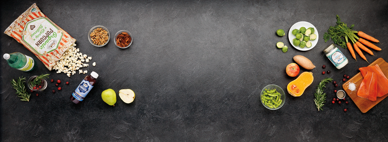
You may not be familiar with the term, but you’re definitely familiar with the style. ‘Knolling’ refers to this style of photography:

Screen Shot 2018 11 07 at 12.59.01 PM  — Studio 3, Inc.

Bright + even lighting, Birds-Eye point-of-view, and a meticulous arrangement of items. First popularized in 1987 by a janitor who would fastidiously arrange the various construction tools he found around the warehouse, ‘Knolling’ photography has recently taken over Instagram as one of the most prolific trends in recent years – and has also found a strong niche in food/beverage photography. It’s easy to see why: if executed correctly, Knolling photography has a unique way of making any subject look bold and dazzling – even if it’s just some popcorn. Right angles, clusters of color, and clean/crisp lines are the name of the game. An appreciation of image composition, as well as the spatial relationships between objects will help your Knolling photography soar.

  1. Using mist, glycerine, and other fakery

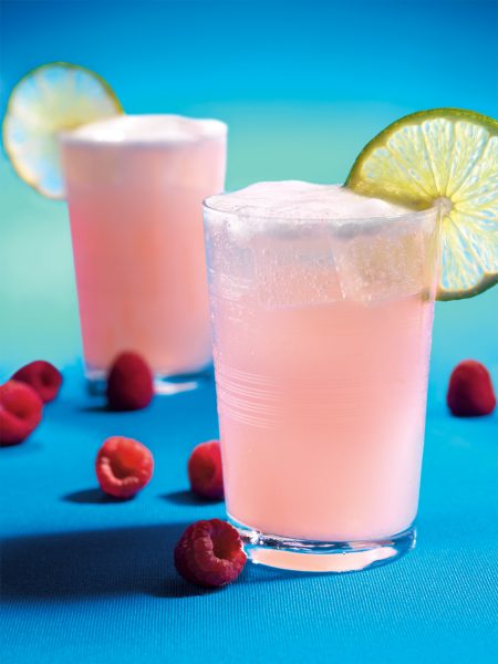
Want that ultra-fresh, dripping condensation look? Simply hit your glass with some mist! Or even better yet, many professionals will use Glycerin to the same effect. It gives your food/drinks a cold, fresh look, which in turn makes them appear more delectable. This is especially true of foods like fruits and veggies. If you see food in photographs looking wet or frosty, then you can bet your top dollar that glycerin was used! Think of your classic vending machine: can you picture those big water droplets rolling off a cold can of Coke on the front image? Yup, that’s either mist or Glycerin.

CW 13672 Imbibe a FD 1500 (1)  — Studio 3, Inc.

If your image requires ice, we highly suggest the use of fake ice cubes. Obviously, real ice melts, thus requiring frequent re-sets, which can take time and money away from your project (and also make a mess!). If you happen to be using glass, real ice will also cause significant fogging, obscuring your subject even more. These are just a few of the reasons professional photographers have embraced the use of fake ice and other perishable food prop replacements.   

  1. Styling: Paint, pins, and putty

Screen Shot 2018 11 07 at 1.00.32 PM  — Studio 3, Inc.It takes a fine touch. There are countless cosmetic steps food stylists can take to improve the overall quality and composition of your food/beverage photography. Remember, we’re not actually serving the food, so no need to shy away from using un-edible items to get the necessary shot. Metal pins, for instance, can be used to hold food in place if you want to display the perfect balance of ingredients without them falling over. Photographer and food stylists will also use non-stick putty to the same effect, like so:

Screen Shot 2018 11 07 at 1.01.08 PM  — Studio 3, Inc.

Ultimately, it’s about arranging and styling your subject to maximize it’s photogenic potential. Is your food stackable, or should it be fanned out, serving style? Does your subject have green stems? Should a side dish be included? What about some unique serving flatware? You can even utilize acrylic paint to boost colors, cover up blemishes, and even create patterns if desired. Get creative here! Like any good dish, there is a lot more to the finished product than merely the sum of the individual parts. It’s about how they all interact!

Here at Studio 3 Inc., we not only specialize in food and beverage photography, but also portraiture, lifestyle, sports, and product photography. Since 1974, we’ve been making your photography dreams come to life! Partner with us for your next creative endeavor, and see just how we stay inspired.


Related posts:

Craig Wagner

Our Process: From Start To Finish With Studio 3

Posted on October 1, 2018


DA 15622DT Lexus Fish DA 1500  — Studio 3, Inc.

When Studio 3 begins a photography or branding project, our first step is to sit down with the client and dream up ideas. Collaborating on a concept might involve a handful of approaches, depending on the project at hand – anything from examining examples of similar work, creative brainstorming with our in-house team, and establishing a shared visual language using Style Guides, Mood Boards, or Pinterest. Below you can see an example of what a typical brainstorming session looks like at Studio 3.

IMG 5522  — Studio 3, Inc.Once an idea is hatched, our Producer-Extraordinaire Eva Goldfarb kicks it into high-gear – scheduling stylists, organizing set builds, balancing budgets, and handling any propping/costuming as needed. This work frees up our clients and photographers to stay in a creative mindset, and not get caught up in the operational details of the project.
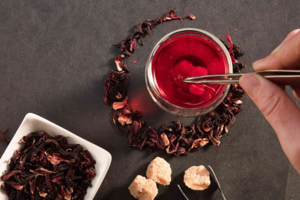
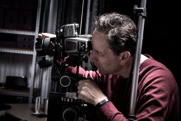
15611T Tea Test  — Studio 3, Inc.Onto the shoot! Photographer Craig Wagner is among the best photographers in the Northwest – and has been with the studio since the early days. Forever perfecting his craft, Craig does what it takes to get the perfect shot – even if it means inventing a new piece of equipment specifically for the shoot at hand.   

15463 Production Stills 029  — Studio 3, Inc.
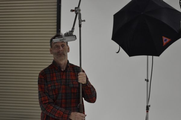
We have a good time on set

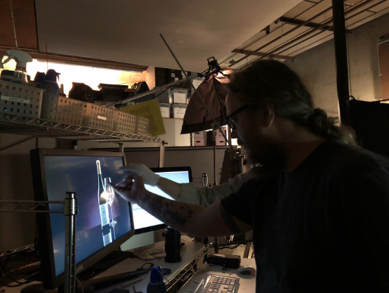
 DSC0489  — Studio 3, Inc.Lastly, our Digital Team steps in and works their magic.  The processes of Color Grading and Digital Retouching are extremely intricate – just ask Sean Yates, one of our in-house Graphic Artists:

Screen Shot 2018 10 01 at 12.57.56 PM  — Studio 3, Inc.

“Color and clarity are of central importance when retouching images. …We always strive for and deliver accurate color.”

In reality, the Digital Team does a lot more than just retouching:

pjimage copy  — Studio 3, Inc.


Finished product:

CW LanternMoon CL 1500  — Studio 3, Inc.

And that’s not the end! Studio 3 partners with the same clients year after year because they love the end result, and appreciate the creative relationships formed. We take the utmost pride in these collaborations and are always striving to bring something new and exciting to the table for the next shoot. Give us a call today, and find out how Studio 3 can help elevate your brand with the coolest+catchiest photography in the Pacific Northwest.


Related posts:

Carousel Horses abandoning their post

Digital Retouching, Can you Didg’ it?

Posted on October 17, 2017

“Keep away from people who try to belittle your ambitions. Small people always do that, but the really great make you feel that you, too, can become great.”
― Mark Twain

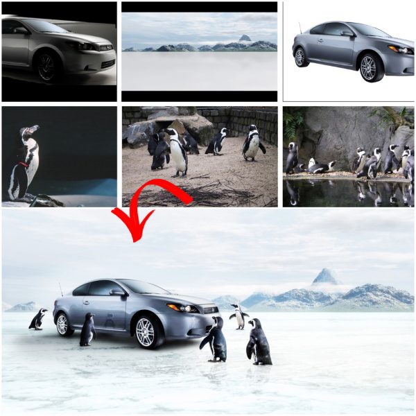
The million dollar question: What sets us apart from all of the other photography studios in the PNW? Well, quite a few things. But it’s hard to talk about them all in 500 words, so I am going to focus on our in-house digital department.

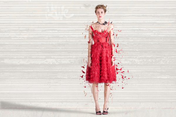
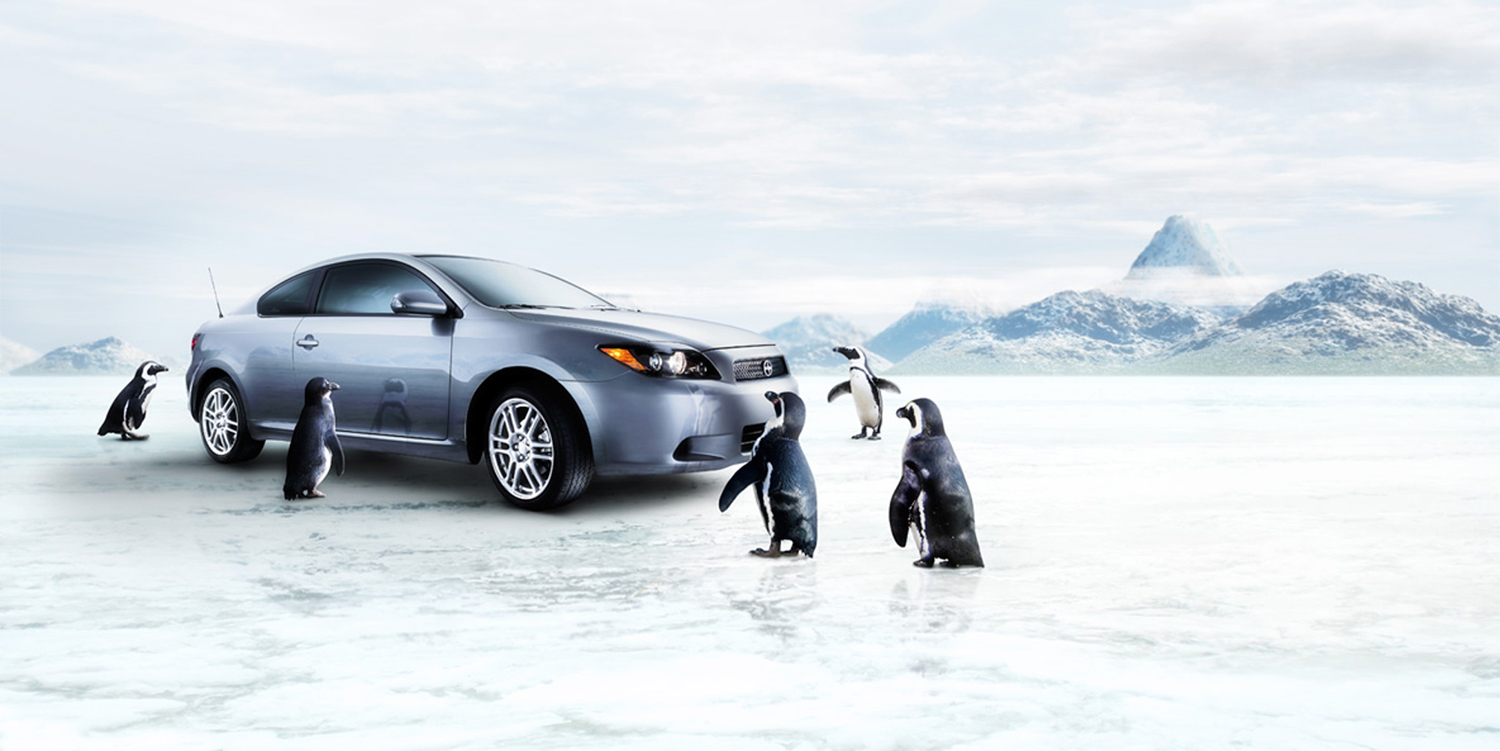
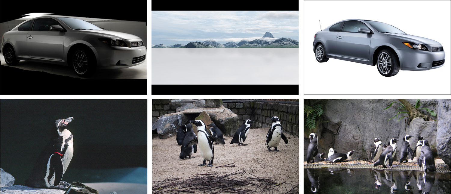
Not only are our digital artists pixel-perfect, they have the ability to turn photos around faster than I can type this sentence. No, we’re not a marketing agency, but we love working with them. We are photography pioneers. We look past the norm and find answers to questions you have yet to ask. How? Magic. Or Intuition, as they call it nowadays.

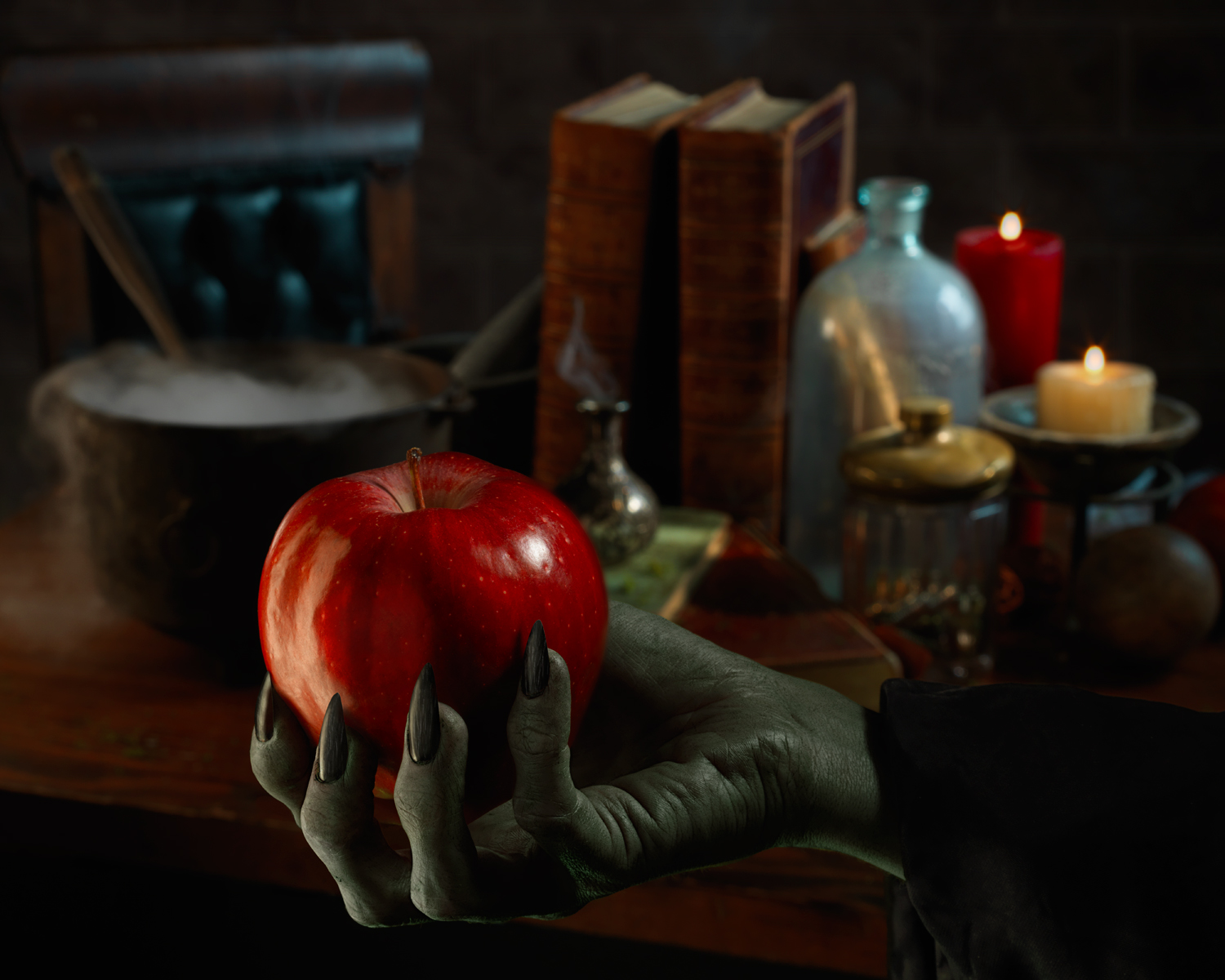
DA Seaplane red dress fragments digital art 1500  — Studio 3, Inc.

Our award-winning photographers work closely with clients and the digital artists who render our images flawless. Communication is our biggest secret for success.

“Without each other, the quality standards we achieve here would not be possible.” -Craig Wagner, Photographer

 — Studio 3, Inc.
 — Studio 3, Inc.

“Having an in-house [digital department] allows me to have face-to-face conversation before, during, and after a shoot. Whether we’re discussing how we should approach a job, or what my intention was in how I shot it, I have the asset of having a digital team that feels like an extension of myself.”

Craig Wagner, Photographer

Our digital team not only makes photos look better in post, they help the photographers shoot more efficiently. It’s photography plus.

“I have the opportunity to talk directly with clients, nipping problems in the bud, saving everyone time and money. We remove a step for the client without compromising the photos.” –Michelle Smith, Lead Digital Artist

 — Studio 3, Inc.
 — Studio 3, Inc.

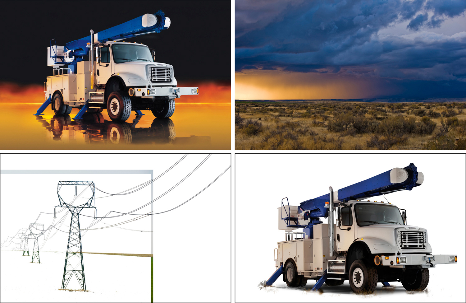
Working with a vast array of clients, we have shot some behemoths over the years; trains, planes, and automobiles to name a few. That’s a lot of surface area to make drop-dead gorgeous, which is why we keep stylists on the ready to spot check, scrub out smudges, and make sure each vehicle’s best side is showing. But we don’t have favorites. Whether it be a fleet for Freightliner, or a detailed shot of a Leatherman tool, each job gets the same level of attentiveness and digital mastery.

“It all breaks down to textures and tones. Fifteen minutes of proper styling and lighting prep during a shoot can save an hour of digital retouching.” –Michelle Smith

So what’s next? We are dreaming up bigger and better ways to make you look fabulous. Stay tuned, we’re 40 years young and constantly evolving.

 — Studio 3, Inc.
 — Studio 3, Inc.

Related posts:

Nike Athlete Running

Brand Identity; Telling YOUR Story Through Photography and Video

Posted on August 11, 2017

In an era of constant online noise, brand identity becomes quintessential. Customers are seeking not only quality, but also an authentic buying experience; the real people behind the business. They are seeking companies with similar values and lifestyles as their own.

How do you build an unmistakable brand identity? How do you tell your story? Whether you are creating a new ad campaign, or updating your catalogue’s product photography, every image should speak to your customers.

Once you have defined your brand, you can begin to effectively market it. That’s where we come in. Studio 3, Inc. works with you to create personal visual solutions. We show the world how awesome you are.

Let’s take a closer look at how different photos craft different emotional responses. In other words, what your photography is saying about your brand.

1.   Your Colorways; Cool vs. Warm

View over Side of Boat  — Studio 3, Inc.

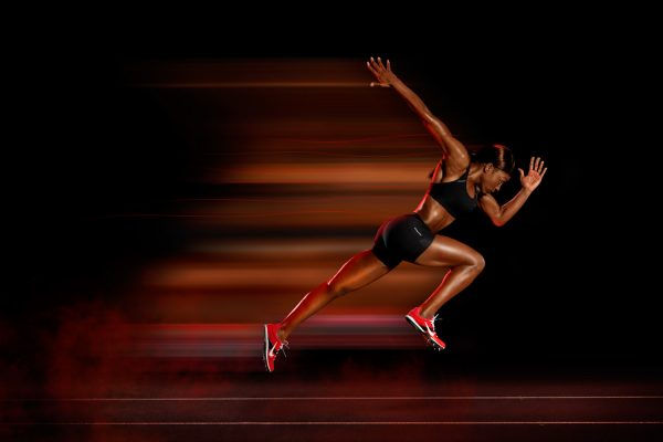
Colors evoke emotion. Cool colors calm, while warm colors educe action—like this photo for Nike that encourages me to get out of this chair and go for a run.
Nike Athlete Running  — Studio 3, Inc.

2.   Your Lighting; Studio vs. Natural

Whether your image is sun-soaked or sleekly structured, the quality can’t be compromised.

Glass of Whiskey with Ice Dropped In  — Studio 3, Inc.

This beautiful cocktail shot for Seattle Magazine is captured with a splash! Inspiring thought on what a customer should do next (hint: buy some whiskey). Need help deciding? Here are Five new Washington Whiskeys to Try.
Two Smiling Women Drinking Coca Cola  — Studio 3, Inc.

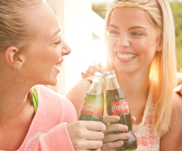
Embracing the brand identity of Coca-Cola, natural lighting was used to flood the scene with a sense of summer. Now that’s affective lifestyle photography.

3.   Your Audience; Outdoor vs. Luxury

Who is your target market? What do they value? Creating environments for your product takes target market research.
Hiker Wearing Danner Boots  — Studio 3, Inc.

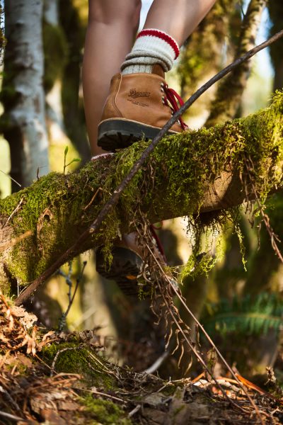
What better way to appeal to Danner Boot’s outdoor customer, while staying true to the Brand’s value of craftsmanship, than to put their boots to the test in the Pacific Northwest.

“Hold a Danner boot in your hand and you’ll notice the hand crafted precision. Try it on and you’ll feel the difference. Test it against the elements and you’ll appreciate the value of a product that is built to last.”   -Danner, Since 1932
Jimmy Choo Red Shoes  — Studio 3, Inc.

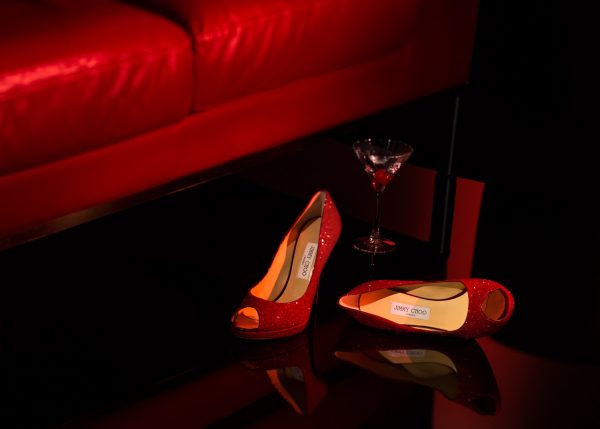
However, when your marketing luxury like Jimmy Choo, the environment changes with the contrasting brand identity.

“A 21st Century Luxury Accessories Brand, with shoes at its heart, offering an empowered sense of glamour and a playfully daring Spirit.”   – Jimmy Choo

4.   Your Appearance; Organic vs. Styled
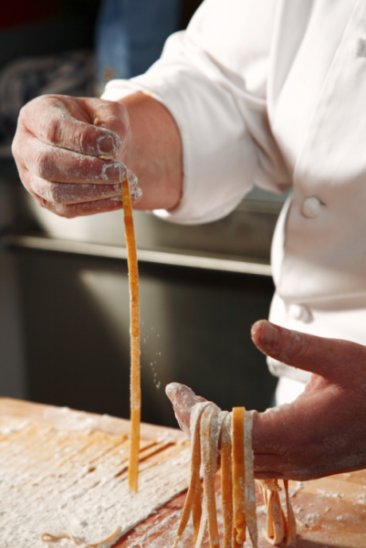
Cook Making Pasta  — Studio 3, Inc.

Are you showing a process or presenting it’s end result? As brands and agencies move towards targeting the holistic customer, we see the shift manifest in an increase of lifestyle photography… And that’s in addition to the perfect product shot, 360-degree spin, and detail so good you can almost feel it. It’s a comprehensive marketing approach. You are your brand, and we are your people for all things photography, videography, and retouching.
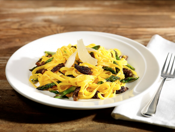
Plate of Pasta  — Studio 3, Inc.

5.   Your Quality; iPhone vs. Professional Photographer

If you think it’s expensive to hire a professional, just wait until you hire an amateur… said a brilliant person. After meeting with a client, and doing a little research on their product, we stumbled upon this brilliant blog post that couldn’t say it any better.

“It’s amazing how big of a difference having really nice pictures of your space can make. A few months ago I ran an informal experiment (as research for another project) where I listed my apartment for rent on craigslist. They were both the same price, in the same area. One listing had really nice pictures taken with a high quality dslr and wide angel lens and the other had badly lit pictures taken with my iPhone. The listing with the nice pictures got 10x the emails.”   – Jon Wheatley of Need/Want

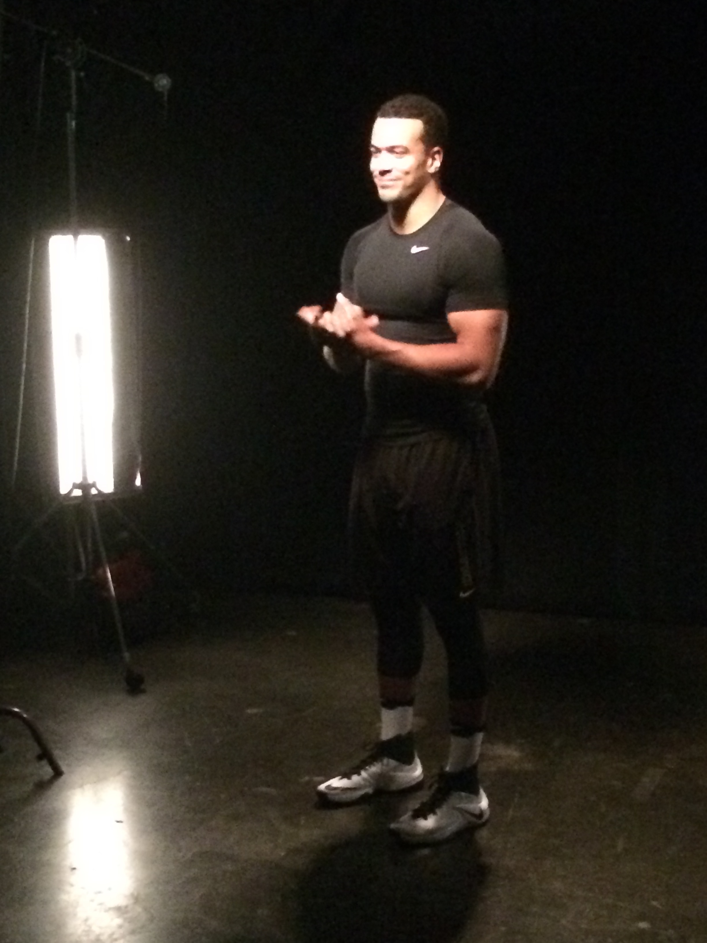
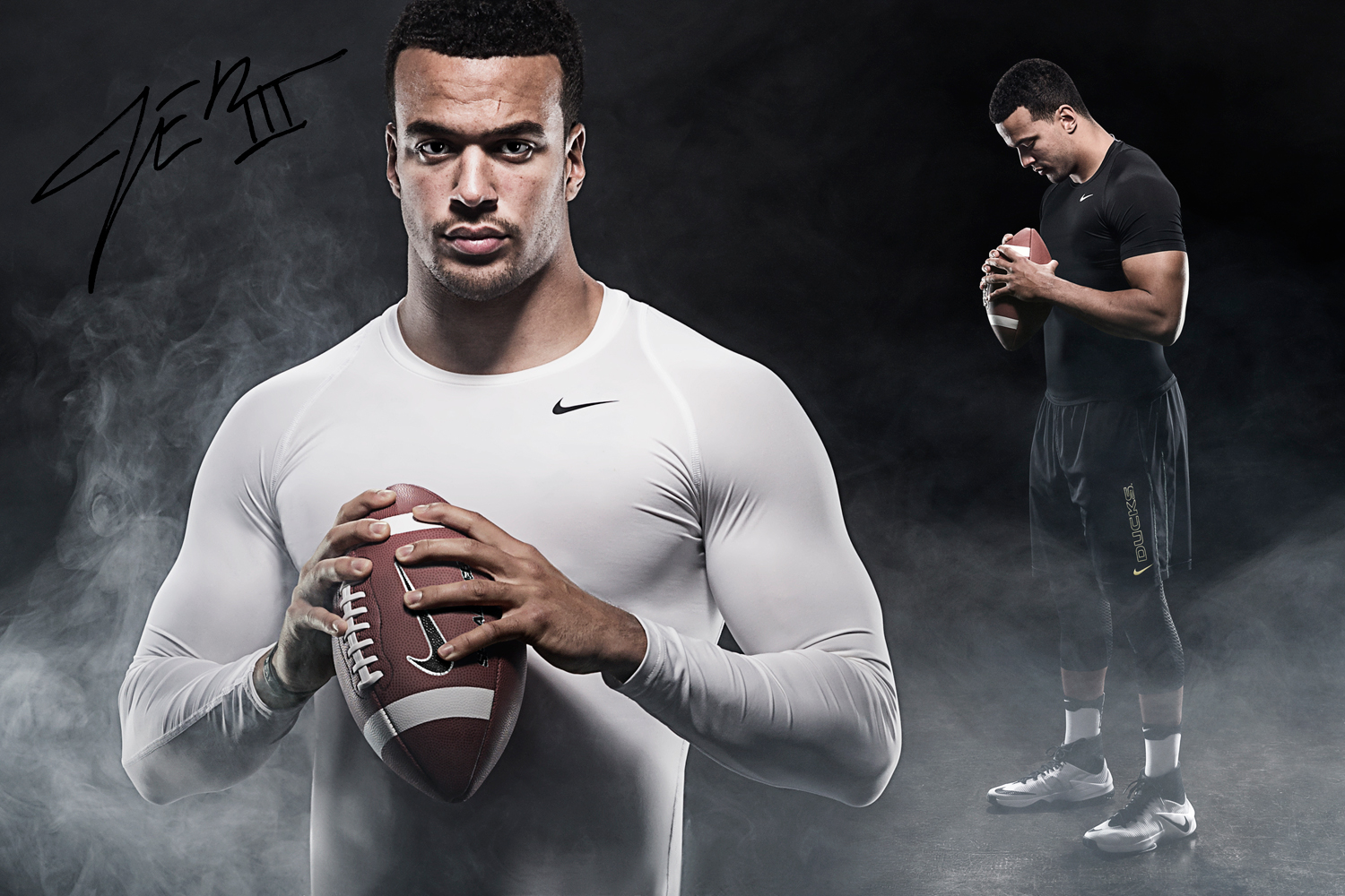
Maybe it’s obvious, but maybe not. In today’s digital age everyone has a camera in their pocket, and iPhone 7s are promoted as so good they can be used for magazine covers and advertising (We won’t name names). We are bombarded with mediocre images… like this production still that I took versus Craig Wagner’s beautiful image masterfully finished by digital artist Michelle Smith. See the difference?

 — Studio 3, Inc.
 — Studio 3, Inc.

Regardless of the project or scope, Studio 3, Inc. works with our clients, building relationships and crafting the perfect image for their brand. If you have yet to work with us, what are you waiting for? Drop us a line, let’s put our heads together to create something beautiful.

Related posts:
10540694_861590417184306_9110136454327137472_o (1)

I Have a Therapist, Her Name Is Nature

Posted on July 7, 2017

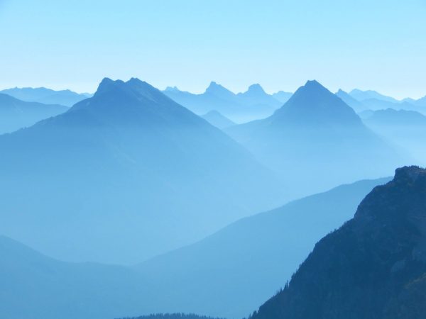
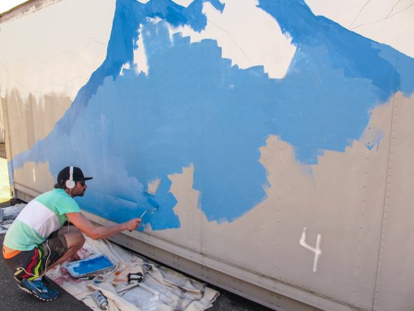
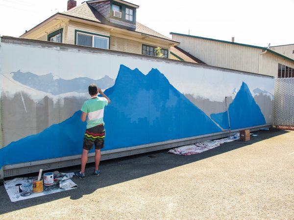
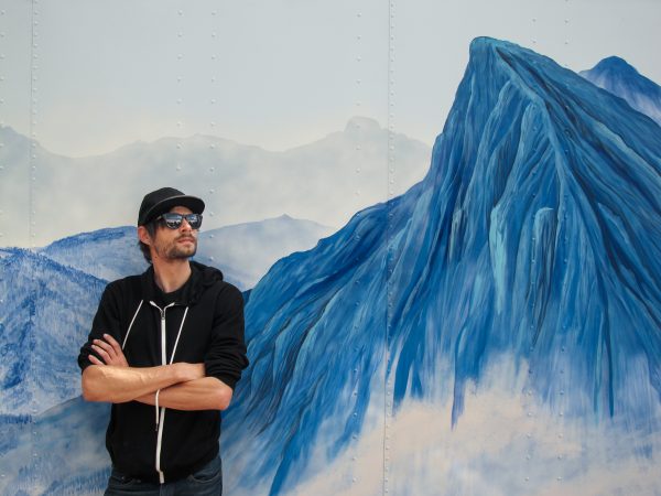
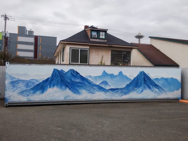
Studio 3, Inc. has commissioned a new tourist attraction in the shadow of the Space Needle. When we’re not moving mountains for clients, we are painting them. With artist and mountain-man Trace Gough’s mural, we have brought a bit of the PNW beauty to our own backyard. How is that for the highest quality visual solutions? Come by, check it out, and while you’re here let’s talk photography, videography and retouching.

“The mural is my interpretation of a photo taken while climbing in the Cascade Mountain Range. The photo was taken very early in the morning, from a high camp near the Neve Glacier in North Cascades National Park.  I’ve been all over the Cascades, and this is hands-down one of the prettiest places, though laborious to get to. There was a layer of haze hanging in the valleys to the north.  “ – Trace Gough, Artist

10540694 861590417184306 9110136454327137472 o (1)  — Studio 3, Inc.

Inspiration Image photographed and painted by Trace Gough @Studio 3, Inc.


Transforming a storage container into a mural in 7 easy steps:

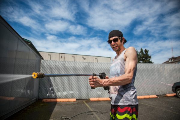
Step 1: Power washing and prepping the storage container, or “the can” as we at Studio 3, Inc. fondly refer to it.

pressure washer  — Studio 3, Inc.

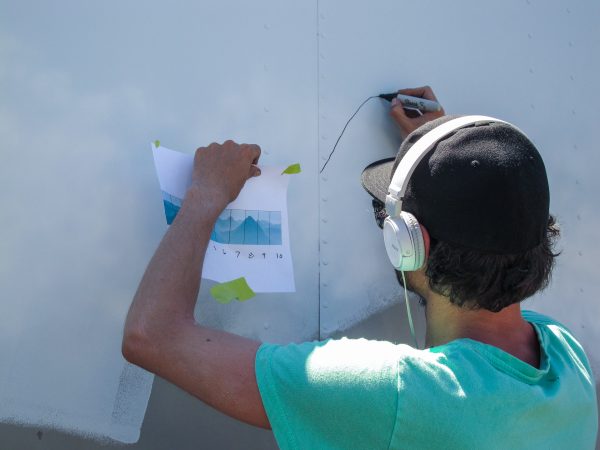
Step 2: Use the Grid Method to enlarge the reference image onto the scale of your surface.

Outlining Mountains  — Studio 3, Inc.

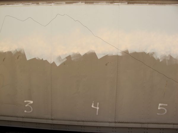
Step 3: Outline the mural in sharpie or paint.

Mountains Outlined  — Studio 3, Inc.

Step 4: Start from the back, painting first the sky, then the mountains.

IMG 6119  — Studio 3, Inc.

Step 5: Gradually get darker as you paint your way forward, creating depth of field.

IMG 6123  — Studio 3, Inc.

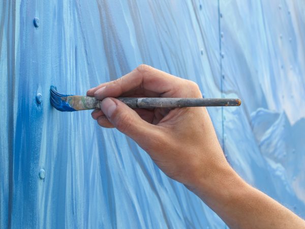
Step 6: Save the details for last, enhancing the “wow” factor with textured ridges and moody clouds.

IMG 6219  — Studio 3, Inc.

Step 7: Step back and admire your work, you’ve just created a masterpiece.  (Now if only we could paint that house in the background).

Trace Gough and Mural  — Studio 3, Inc.

Finished Mural  — Studio 3, Inc.


Related posts:

David-Bell

Something Only an ’80s Kid Would Remember- Studio 3, Inc.’s First Digital Camera

Posted on June 12, 2017


Digital Photography in 1993 = Big, Ugly, and Awesome… and boy did we think we were cool. Before the digital camera was the norm, it was enormous!

David Bell  — Studio 3, Inc.


Take a Hasselblad, attach a HUGE digital back, and add cooling fans, a dehumidifying unit, and a large filter wheel, then you can start to imagine our first digital camera. The digital back was a Scitex Leaf DCB, it was 4 megapixels, and it cost $36,000. All of this was attached to a computer slower than molasses, packing a whopping 8 megabytes of RAM.

To take a picture, you would trigger the camera at the computer. The filter would rotate in front of lens to red and shoot. Then green and shoot. Then blue and shoot. One million years later, you would see the image come up on the computer. By aligning the three layers in the camera software, you got to finally see the finished photograph. Piece of cake, really.

This software really was sophisticated. The early versions had a button that was labeled “Guess”… we didn’t like to click that, but it worked. Later versions changed the label to “Auto,” a little easier to stomach.

The thing they must have hidden in the fine print was how much the lenses would be used. Every time you took a shot, it was actually three shots. Due to the fact that our equipment was being used three times as often we had a lot of lenses going in for repair and rebuild. The local shop got to know us pretty well and would give us the heads up when it were time to retire a lens.

This was the beginning of digital photography in the commercial world. It was a huge investment for the studio, and we where the first to take the plunge. It brings back a lot of fun and crazy memories, not to mention the price!  $2000.00 for a 2gig hard drive… and that was a Deal!

What a ride it has been.

Related posts:

RAZ SIMONE 9075T (26 of 38)

Stepping On-Location with Studio 3, Inc.

Posted on April 10, 2017

Three weeks into the job and it was time for my first on-location shoot with Studio 3, Inc. I boarded Bolt Bus, a company favorite, and set off for Seattle, eager to see Studio 3, Inc.’s cool studio space in the shadow of the Space Needle.

Screen Shot 2017 04 05 at 12.59.41 PM  — Studio 3, Inc.

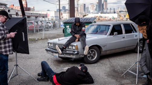
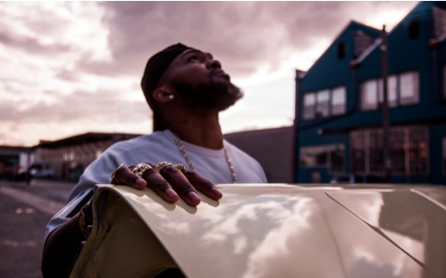
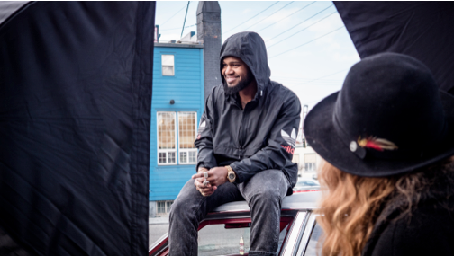
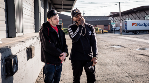
The day started with Chanel Everett, the studio’s Princess of Production, hand selecting an Adidas wardrobe that interpreted the clients’ art direction. With a mood board compiled of different lifestyle, apparel and shoe photography, we set off for the previously scouted Seattle setting.

Screen Shot 2017 04 05 at 1.01.40 PM  — Studio 3, Inc.

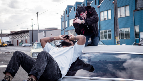
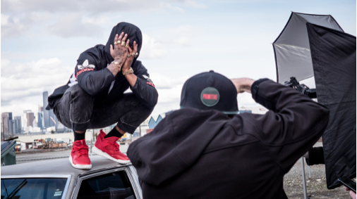
Two vintage cars, a cooler, breakfast, lunch, snacks, racks of athletic apparel, dope enough to make any rapper weep, and the slaying photography skills of Studio 3, Inc.’s Trevor Boone—all the ingredients needed for success. I loved the Seattle cityscape, lifestyle photography theme and getting to assist with production stills.

Screen Shot 2017 04 05 at 1.00.01 PM  — Studio 3, Inc.

The location was picked to compliment the Seattle rapper’s song “Hometown.” Bringing the urban background of the city into portrait photography, Trevor Boone was able to capture stunning duality that showcased not only his professional talent, but the personality of Raz Simone and an edge to Adidas footwear photography.

Screen Shot 2017 04 05 at 1.00.20 PM  — Studio 3, Inc.

Images just came through the Studio 3, Inc. digital team, and we are stoked! Our in-house digital department works closely with our photographers and marketing team—removing power lines, clearing alleyway undesirables, and bringing the client’s vision to life every time. Check out a few of our favorite shots from the day.

Screen Shot 2017 04 05 at 1.00.58 PM  — Studio 3, Inc.

We will be dropping more images from the shoot, so be sure to follow us on Twitter, Instagram and Facebook. When you decide to become a part of the fun, give us a call or stop by one of our studios to talk photography, video and serious retouching skills.

Screen Shot 2017 04 05 at 1.01.14 PM  — Studio 3, Inc.

Screen Shot 2017 04 05 at 1.01.50 PM  — Studio 3, Inc.

Written by: Eva Goldfarb, Marketing Coordinator @ Studio 3, Inc.

Related posts:

Photo Credit: David Bell, Studio 3, Inc.

14 Reasons to Love Studio 3, Inc.

Posted on February 9, 2017
Photo Credit: David Bell, Studio 3, Inc.  — Studio 3, Inc.

Photo Credit: David Bell, Studio 3, Inc.

Reaching out to clients and our team, we have compiled a list of just a few reasons you will love Studio 3, Inc. The balance of exceptional skill, competitive pricing and LOTS of fun is what brings our long-term clients back again and again, while also attracting new ones. In other words, what is it that makes you say “Wow! Maybe it’s time to work with Studio 3.”

“Beyond expectation”

“Creative people, all day every day”

“Dynamic, visual storytelling”

“Top-notch production”

“Good people. Great Photos”

“On budget. On time. Every time.”

“Savvy producers”

“Best Mexican food in Seattle”

“Collaborative group”

“Naturally on the same page”

“Consistency & meticulousness”

“Decades of experience”

“Audgie, the studio dog”

“Teamwork and creativity that make our client’s creative ambitions come to life”

Don’t take our word for it, visit our Portland or Seattle studio and see for yourself! Drop us a line, we would love to talk photography, video or retouching with you over a cup of Stash tea or a game of ping-pong.

Related posts:

Older Posts