Studio 3, Inc.

Photography

Editorial Photography – Fitbit Hamburger
Posted on January 6, 2015

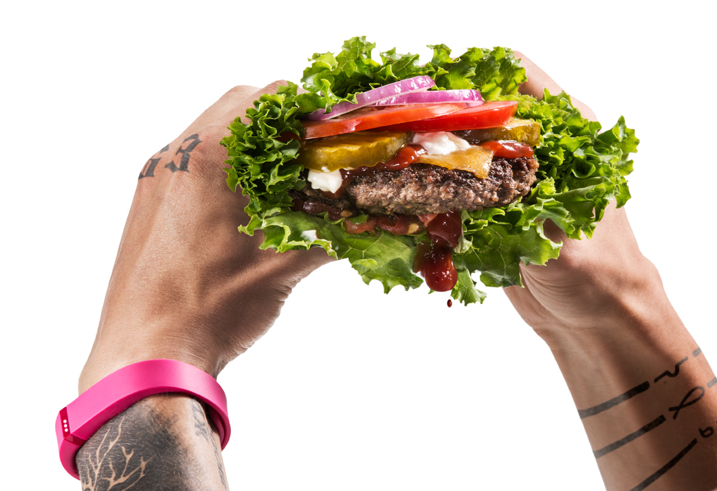
Photo of a man wearing a pink FitBit holding a dripping lettuce hamburger  — Studio 3, Inc.It’s the first week of the New Year already…how are those Resolutions going?

Creating Resolutions each year in an effort of renewal and self-improvement is wonderful, but Studio 3 has never veered from our Resolution of providing great photography for discerning clients. Our goal, year in and year out, is to create photographs that stop you in your tracks, make you think twice, grab your attention, and welcome you into a world of sumptuous food and drink, stellar products, cutting-edge technology, cool vehicles, and a fun lifestyle.

For our first shoot of the New Year, Studio 3 Team created a mouthwatering editorial photography shoot featuring one of our favorite fitness products: the Fitbit. A pink one. On a heavily-tattooed male arm. Because every manly man needs his Fitbit along with him, tracking his exercise, activity levels, steps per day, and most importantly, his indulgences.

The brief was to create a “healthy” version of a hamburger that would go literally hand-in-hand with the Fitbit lifestyle. To that we looked no further than Carl’s Jr.,’s Low Carb ThickBurger®, and sought to re-create the healthy lettuce-wrapped delicacy in-house. Food Stylist Allyson Carroll cooked the burger from scratch, stacked it up, wrapped it in lettuce, and added the perfect amount of ketchup to make the burger look delectably juicy.

Studio 3 Photographer Henry Ngan is a master of lighting, and for this shot he focused on the freshness of the burger utilizing a crisp, bright “beauty” light. He backlit the white wall behind, and shone a spotlight on the burger to bring out its succulent texture. The abundance of white and the absence of a background made, just like the latest iDevice from Apple, the focus all about the product in the foreground.

Unlike product photography, Editorial Photography takes a familiar concept and makes a statement. In this case the statement was made by pairing contradictory elements. In post-production the gangsta letters and right wrist tattoos were digitally added to the model’s knuckles to make him look even less likely to own a Fitbit in pink (and if we hadn’t told you, would you know those tats didn’t actually exist?) Lead Digital Artist Alex Gumina integrated the tattoos into the image seamlessly, and struck a good balance between drippy and gooey for the ketchup falling out of the burger. Finally he achieved the perfect harmony between burger and Fitbit by creating the same level of sharpening on both, and added contrast and color to the Fitbit to give it its own pop.

The Studio 3 Team can take any food or product photography brief and create a fun twist that marries them into some eye-grabbing editorial photographs. Give us a call to inquire as to how we can bring that juiciness to your next shoot, or stop by one of our Pacific NW locations to get a taste of the Studio 3 lifestyle.

Photographer: Henry Ngan

Photography Assistant: Jonny Brandt

Producer: Liz Swales

Food Stylist: Allyson Carroll

Model: Jacob Cotner, Muse Model Management

Digital Artist: Alex Gumina

Equipment: Canon 5D Mk III, 100 mm Macro Lens

Related posts:

Happy Holidays from Studio 3

Posted on December 23, 2014

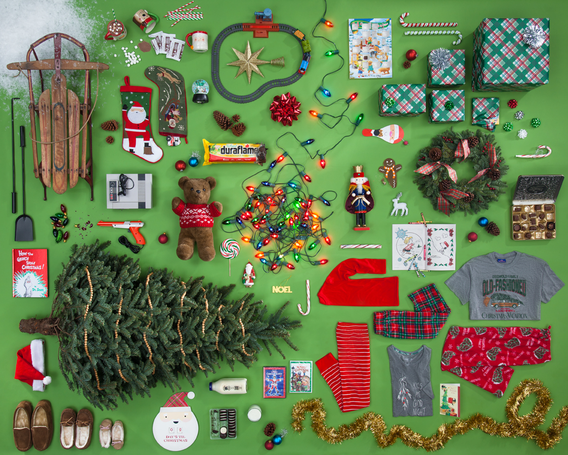
Christmas Collage 2014  — Studio 3, Inc.

It’s all about the stylin’, baby!

Got your list? Checked it twice?

Taking a product photography shot like this doesn’t require much more than good lighting and professional hands on the shutter (and we can do both no problem!), but it’s the product styling that truly makes the photo shine. Accomplished by all-star commercial stylist Tristan Weholt, this photo took about 2 days to tweak the styling to that festively organized level. Producer Megan Nolan sourced the full array of holiday items from local stores, and Ms. Tristan set about fitting them all together like a puzzle, choosing where the bigger pieces fit and maneuvering smaller items to coordinate. Ms. Tristan says that she loves these creative briefs because “it really lets the creative mindset of styling flow…this is where my career meets my passion.” Photographer Chris Eltrich created the set and lighting, and ultimately captured the essence of spending Christmas morning at home with the fam.

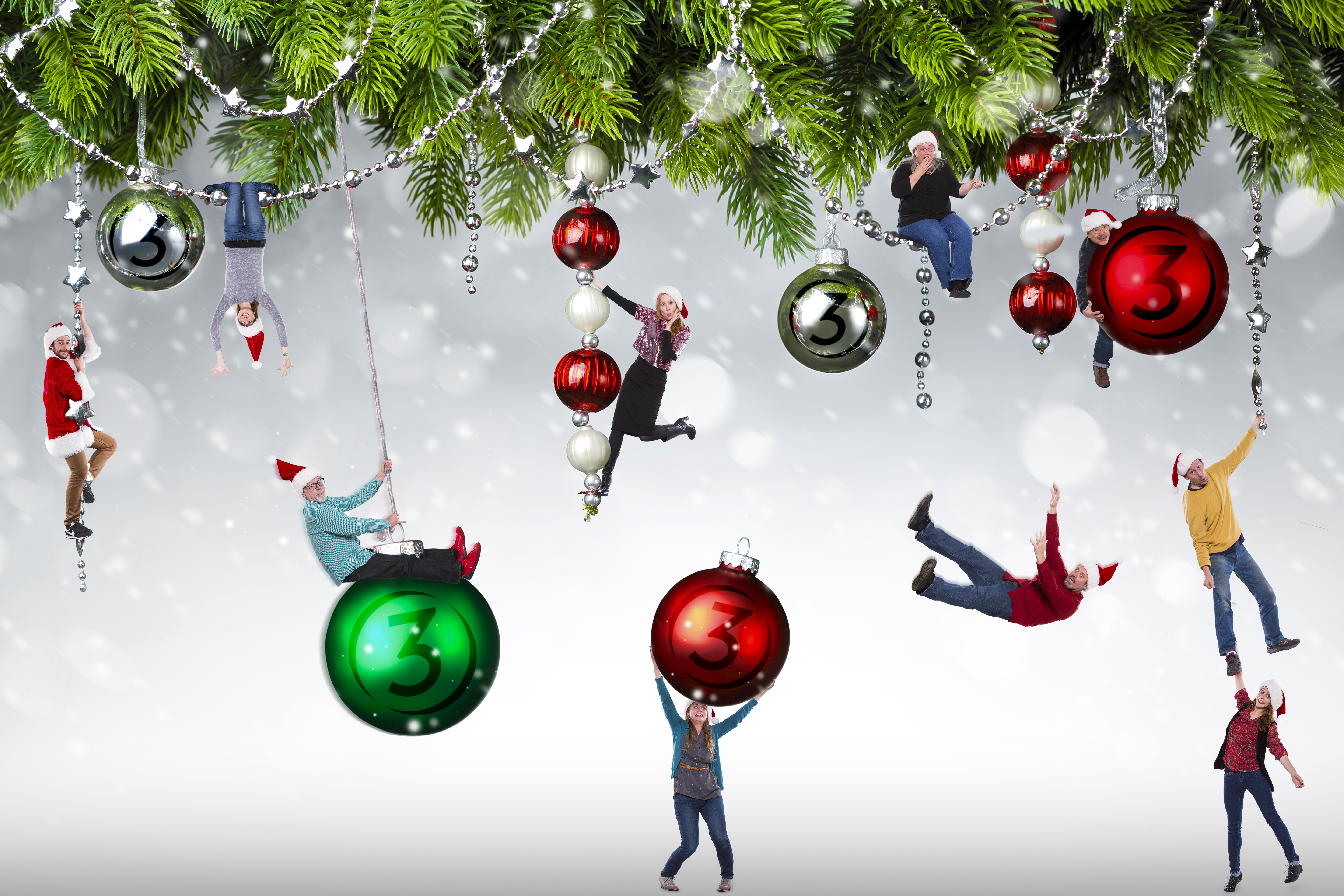
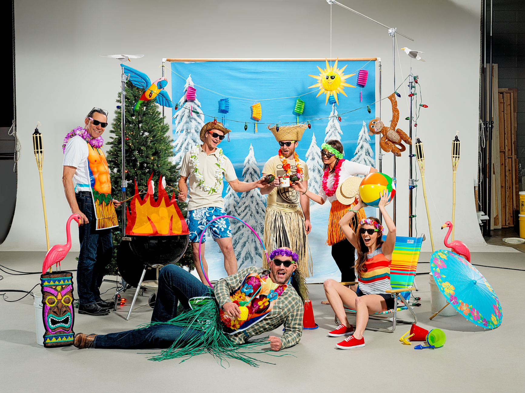
For the above photo there was a specific creative brief, but for the company Holiday card it was just to come up with an idea and execute a shoot that encapsulated the Team here at Studio 3. Each studio location shot its own top-secret creative twist on the brief, with our Santa-hatted Portland office going head-to-head with our Hawaiian-themed Seattle office. Who did it best? You be the judge.

Portland

Christmas background  — Studio 3, Inc.

Seattle

Seattle Christmas  — Studio 3, Inc.

Need a fun and unique interpretation on your company’s creative brief? Give us a ring and see the amazing and wonderful happen with Studio 3.

Happy Holidays from Studio 3!


Related posts:

Footwear Photography – Kate Spade Heels on Ice

Posted on December 9, 2014

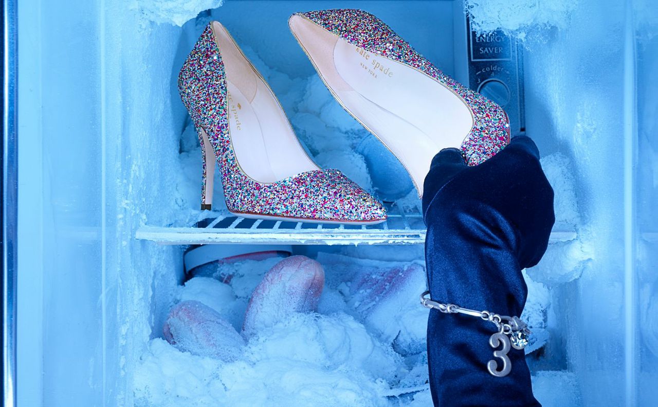
A photo of Kate Speed glitter heels in a freezer  — Studio 3, Inc.

One of Studio 3’s specialties is compelling footwear photography -and our Team works tirelessly to come up with new and interesting ways to depict shoes. Because shoe photos can get run-of-the-mill unless presented in a cool (sometimes literally!) way.

The brief was to shoot a really hot pair of Kate Spade heels…in a really cold environment. To juxtapose the literal with the figurative, mix creative concepts, and craft something eye-catching and arresting. The background needed to be drenched in cold, impersonal blue tones, but the shoes needed to look on FIRE. As soon as you flip to this ad in a magazine, these shoes needed to shout: “BUY ME, I’M SASSY!”

Photographer Chris Eltrich was instrumental in bringing this shoot to life: he built the freezer scene from the fridge ground up in order to make those pumps POP. Producer Megan Nolan sourced all the props as well as the [canned] snow for the freezer burn. Originally the model’s hand was bare with icy-colored nails; after feedback we adjusted to have the model wear a sleek evening glove as she grasped the shoe.

In post-processing, Digital Artist Alex Gumina worked to downplay the cool blue tones being thrown onto the shoe from the freezer, and bring the shoe back to life without compromising the frigid background. Placing the shoes in the Studio 3 light box to obtain neutral lighting, and then color matching them in the digital process was the perfect solution. In order to showcase the Kate Spade logo, he also had to recreate the logo separately and adjust the angle and tone to fit the footbed of the shoe. In this way the heel and the brand are the focus, and the background pulls the viewer in and makes them curious enough to pause and wonder what’s afoot.

Does your brand need to warm up your footwear photography with some sassy new concepts? Contact the Studio 3 Team to add that fire to your next campaign. Because ice is nice…but HOT images are our specialty.

Related posts:

Lifestyle Photography – Legs Under the Table

Posted on December 2, 2014

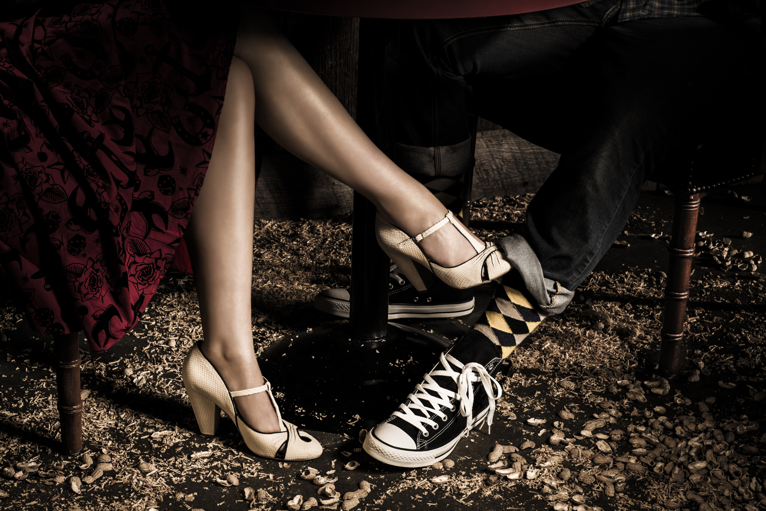
A photo of a womans legs playing footsie with a man  — Studio 3, Inc.Who was your first love? Bringing you back to the days of innocent flirting, shy smiles, accidental touching, and sideways glances, we wanted to capture that special spark between two lovers. Back to the days of when first love blossomed, when the world was magical and amazing and a peanut shell-strewn floor was just a backdrop to the Beginning of That Sweetest Thing.
One of Studio 3’s specialties is shooting provocative lifestyle photography that tells a story. We are also known for high-end footwear photography. With this project the brief was to combine the two by focusing on some fabulous shoes…worn by a young couple in love. We strove to create a new twist on standard shoe photography by creating a fun, moody, sexy environment, with a setup that could be open to a variety of interpretations. Where is this happening? Is it their first date? Did they just meet? Are they playing? Are they flirting?  Is their love forbidden? Are these teenagers? Is the guy just not that into her?  Open-ended setups in lifestyle and editorial photography can invite more interest from the casual viewer: extremely valuable for the Client and realizing a good ROI on ad campaigns.

For the set we created a warehouse-style look littered with peanut shells on the floor, inspired by the iconic Rodeo Bar & Grill in New York. (R.I.P., Rodeo Bar – we’ll miss you!) The lighting for this piece was stark, created by an oversized spotlight pointed in through the windows. It was aimed directly at the legs and the shoes to bring attention to the product featured. The contrasty look helped highlight the rich colors of the clothing and set, as well as bring out the roundness and sexy contours of the female model’s legs.

Photographer Henry Ngan‘s ability to capture fun sets and people in their environment was essential to making this shoot work. (The peanut shells were actually his idea!) In his direction, Henry created a simple, casual setup where nothing was absolutely perfect and straight-laced: the look he was going for was fun, young, and sexy but overall realistic. The peanut shells on the floor were placed in a manner where they looked messy…but not too messy. The shoelace on our male model was purposely styled in disarray, and his jeans were rolled up casually. Everything had to evoke a sultry mood paired with a sense of humor to make it work and be thought-provoking.

So how did we do? Are you brought back to your first date and young love in its prime? And how do you feel about those shoes?

If you’re looking for more lifestyle photography that tells a story check out our full portfolio here, and if you’re ready to fall in love with your advertising photography all over again, give us a ring. Dial L for L-O-V-E or 503-238-1748 [Portland] or 206-282-0939 [Seattle] for Studio 3.

Producer: Liz Swales

Photographer: Henry Ngan

Digital Artist: Alex Gumina

Equipment: Canon Mark III, 85 mm lens, Speedotron Fresnel optical spotlight

Featured Footwear: Delman Shoes, Converse

Related posts:

A photo of a spiked rum holiday punch for Thanksgiving by Studio 3

Happy Thanksgiving – Punch Up Your Holiday Tolerance!

Posted on November 25, 2014

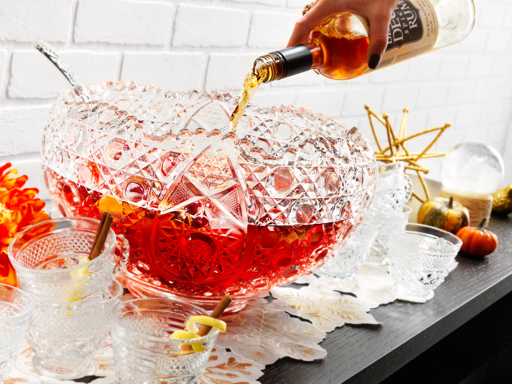
A photo of a spiked rum holiday punch for Thanksgiving by Studio 3  — Studio 3, Inc.Punch up your holiday tolerance with Studio 3….because the time for family arriving is nigh. For Thanksgiving this year, we wanted to go the less traditional route and showcase some arresting Editorial Photography with a irreverent holiday twist.
Thanksgiving usually brings to mind turkey, stuffing, and time with the fam, so Studio 3 created a concept that breaks with the tradition of poultry and instead puts the spotlight on a festive holiday gathering…with a subtle kick! So the concept that evolved was to feature a bowl of punch being spiked at a large, brightly-lit party setting.

Behind the Scenes of Editorial Photography

Rather than focusing on the product as we might for a straightforward product photography shoot, Photographer Craig Wagner brought out the irony of the scene in-camera with the use of a tilt-shift to control the plane of focus. The camera angle was established ahead of time with our Photography Assistant Jonny Brandt. Ms. Liz whipped up a delicious Spiked Spiced Rum Punch from scratch (recipe appears below). We used a Studio 3 favorite, Below Deck Spiced Rum from Eastside Distilling for the “liquid courage” to add to the punch. For the shot the liquor bottle was not actually filled with rum- why waste good spirits in drink photography? Instead, we removed the citrusy rum (to enjoy for later)  and replaced with a Studio 3 standby: Kitchen Bouquet, a food styling tool of ours for creating browned foods and beverages in photos. Thus in the final image above, the model is actually pouring Kitchen Bouquet into a concealed catch basin inside the punchbowl so the punch does not change color or increase in volume during the shot – a little trick we’ve been using for decades in our beverage photography. And no, that doesn’t make for a consumable beverage afterwards…but it’s all in how it appears on camera.

Since this holiday brings to mind both the happiness and disharmony of putting in an appearance at the yearly family gathering, why not make your own Studio 3 Tolerance Punch (sans Kitchen Bouquet) to get yourself blitzed ahead of time? You’ll be ultra-ready for when those in-laws come ringing your doorbell, guaranteed.

Happy Thanksgiving from the Studio 3 Team!

Producer: Liz Swales

Photographer: Craig Wagner

Photography Assistant: Jonny Brandt

Equipment: Hasselblad H-4D camera, 50mm lens with tilt-shift

Lighting: Speedotron with diffusion and modifiers

Cranberry and Spiced Rum Punch Recipe

Ingredients

  • 1 orange, zested
  • 2 Mexican cinnamon sticks
  • 5 whole cloves
  • 3 tablespoons finely chopped peeled ginger
  • ⅓ cup water
  • ⅓ cup sugar
  • 1 (25 ¼-ounce) bottle sparkling cider (about 3¼ cups), chilled
  • 4 cups cranberry juice cocktail, chilled
  • 1 (1-liter) bottle club soda
  • 1 cup dark rum

Directions
1. Bring the orange zest, cinnamon sticks, cloves, ginger, water, and sugar to a boil in a small heavy saucepan, stirring until the sugar has dissolved. Reduce the heat and then simmer, covered, 5 minutes. Remove from the heat and let steep, uncovered, for 1 hour.
2. Strain through a fine-mesh sieve into a bowl, discarding the solids.
3. Combine the remaining ingredients with the spiced syrup in a punch bowl and stir. Add ice before serving.

Recipe by Aaron Sanchez, from Food Network

Related posts:

TBT_ScaWolff_006

Throwback Thursday – The Salon of the Future

Posted on November 20, 2014

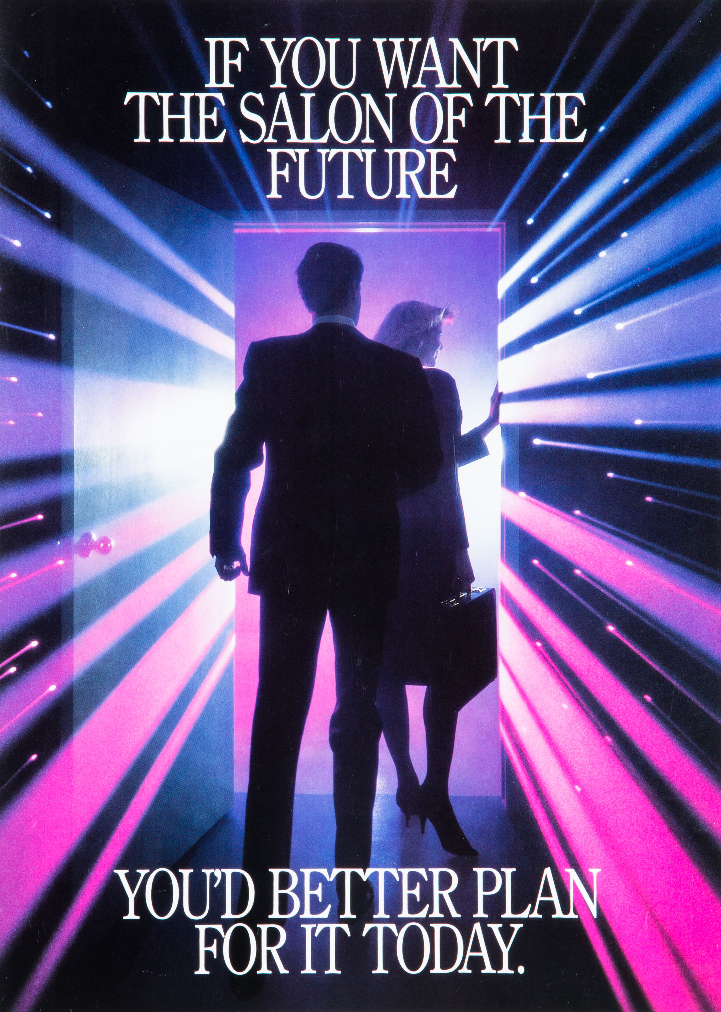
TBT ScaWolff 006  — Studio 3, Inc.Back in the mid- to late 80’s, this was the salon of the future, but the above photo was created using the cutting-edge techniques of the past. For reals. For Throwback Thursday #TBT this week we’re sharing some product photography that was composited from three separate film-based shots, created by Studio 3 photographer Henry Ngan, assisted by Craig Wagner.
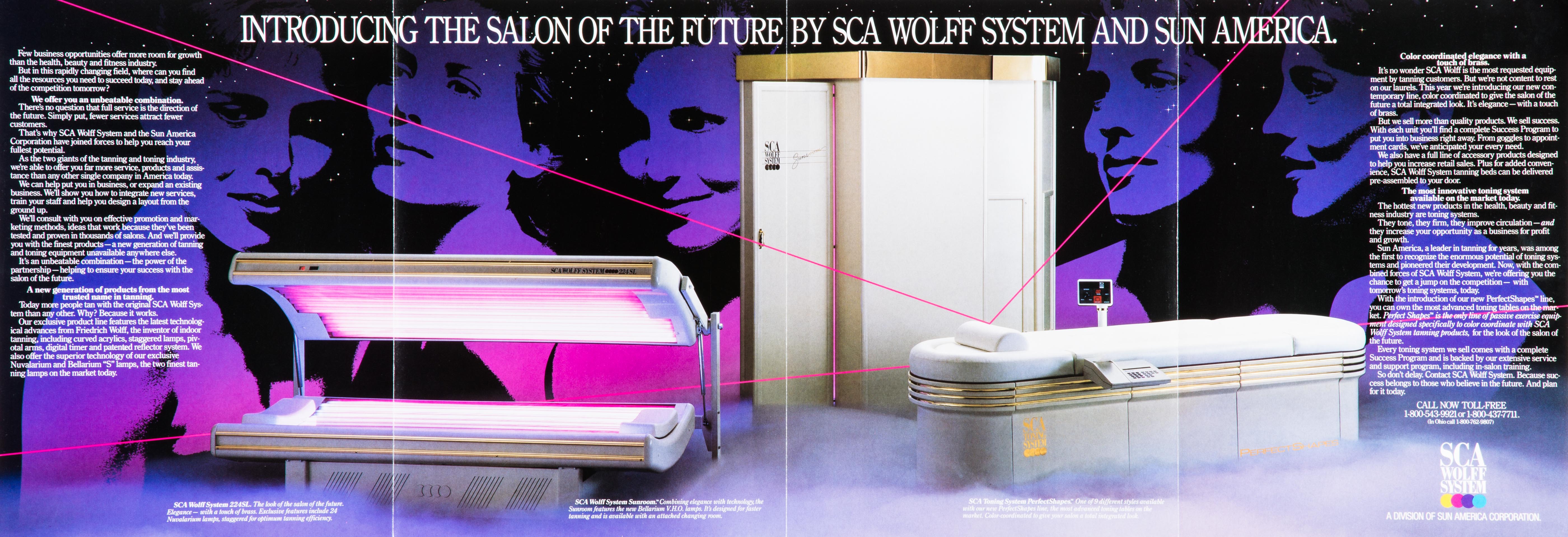
In the heyday of salon tanning (before that whole skin cancer thing got in the way), SCA Wolff System/Sun American Corporation was looking for a way to market their new tanning beds to salon owners and called on Studio 3 to execute. The brief for this shoot was to make the product look glamorous and have the cover shot act as the entrance the world of tanning, where through that open door lay a futuristic, glamorous world full of glowing beauties. At the time, laser beams in photography and visual media were mad trendy with Star Wars and Laser Tag leading the charge. The idea was to incorporate this trend with tanning beds to emphasize their futuristic and cutting-edge technology.

Mid-1980’s Product Photography

Shot in Studio 3’s earlier location at Lenora Square in Seattle, this shoot relied on large format 4×5 film for the cover image. (And 8×10 film for the image below.) What that means is that the actual 4″ x 5″ sheets of film were loaded, ViewMaster-style, into a Sinar-P technical camera, exposed, removed, flipped around, inserted, and exposed again. Creating just a single image was a great deal more hardcore than the much simpler point-and-shoot DSLR’s of today!

Here’s the 4-1-1 on how it went down: The doorway was shot first, and then on a completely different set Henry and Craig used a lithomask with different-colored gels in different areas to create the colorful pink and purple tint to the lights. The “laser” light streaks were created in-camera by either pulling or pushing the camera lens during a timed exposure. (Similar to the concept of creating a long exposure on a camera facing a highway at dusk: the cars’ tail lights appear as streaks traveling down the highway.)

TBT ScaWolff 008  — Studio 3, Inc.For the photo inside the brochure, the tanning beds were shot with a longer lens in our Portland location. The background star field was easily created with black seamless [paper] lit from behind, with holes punched in it.
Once all the images were shot, the superimposing of the final photographs and client-chosen artwork was done at a prepress house, rather than our own Studio 3 Digital Department like we use for post-processing today.

The process may have changed in all the years since, but we still create laser-focused, high-quality images for discerning clients. Check out our other totally awesome product imagery, and Just Say Yes to Studio 3 doing your next product photoshoot or video. Catch you later!

Related posts:

Editorial Photography – Weed Drops

Posted on November 4, 2014

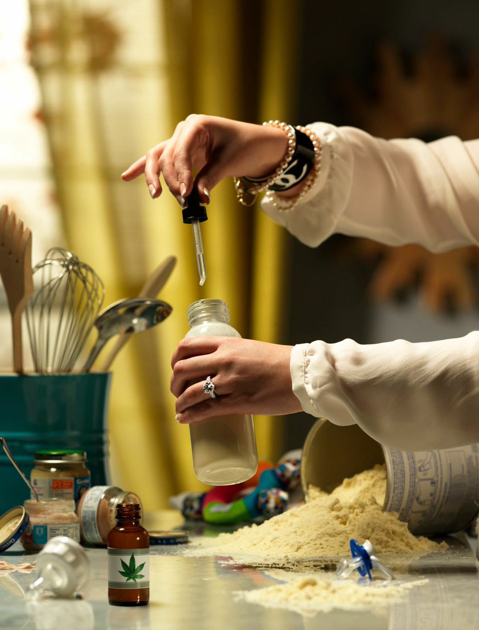
Photo of a Womans Hands with Weed Drops and Baby Bottle  — Studio 3, Inc.Today’s the day! With legalizing cannabis up for vote in Oregon, Alaska, and Washington D.C., we thought it timely to blow some smoke at the establishment and share our latest Editorial Photography project Weed Drops.
To create a visual pun requires taking a traditional environment and the viewer’s expectations – and turning both on their heads. The brief was to create something controversial and racy, telling a story by utilizing props and setting to create visual interest. The goal was to make people say “What?” and “Why?” and spark some good ol’-fashioned social commentary.

Despite the homey setting for the backdrop, the lighting had to be elegant and chic. The Studio 3 Team endeavored to evoke a moodiness to the scene with an overall warm yellow tint. Yellow was selected because not only can it evoke warm, pleasant feelings, but it can also act as a warning signal, indicating danger. That combination underscored the controversy surrounding the social issue of marijuana legalization. All of the props, wardrobe, and jewelry were selected by Producer Megan Nolan to create an environment of luxury and excess. The label on the weed bottle was created by Digital Artist Carl Beery and attached to the selected bottle.

One of Photographer Chris Eltrich’s strengths is capturing both comedy and many elements within a single shot – which made him the ideal choice for this editorial photograph. Utilizing a longer focal length on the camera, he created a shallow depth of field in the foreground to draw more attention to the hands and baby bottle. Harmonizing the many different props was a challenge, but the Team styled the ideal array of baby food jars, toy, kitchen utensils, and pacifier to focus everything on the action in the center of the frame. What came together was a blend of stellar product photography with ironic social commentary.

When we’re not pushing the envelope on high-end Editorial Photography we also create award-winning digital art, cool footwear photos, cutting-edge technology photography, and mouthwatering food and beverage photography. Check out other portfolio images above, and if you’re in Oregon, Alaska, or Washington D.C., don’t forget to cast your vote today on this burning issue!

Photographer: Chris Eltrich

Producer: Megan Nolan

Props/Set/Wardrobe: Megan Nolan

Digital Artist: Carl Beery

Lighting: Speedotron Strobes, Beauty Dish, and large Softbox

Camera: Hasselblad H-System Camera with HC 210mm Lens

Related posts:

Digital Art – Day of the Dead

Posted on October 31, 2014
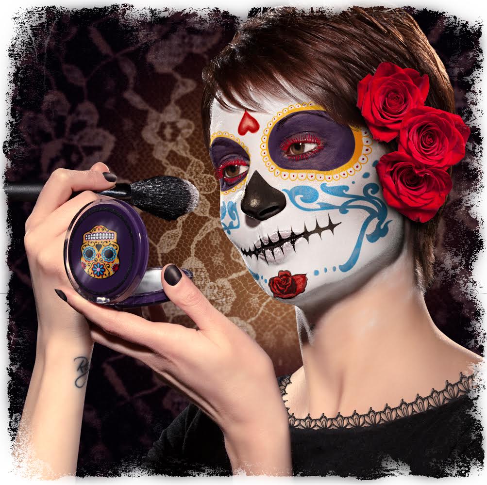
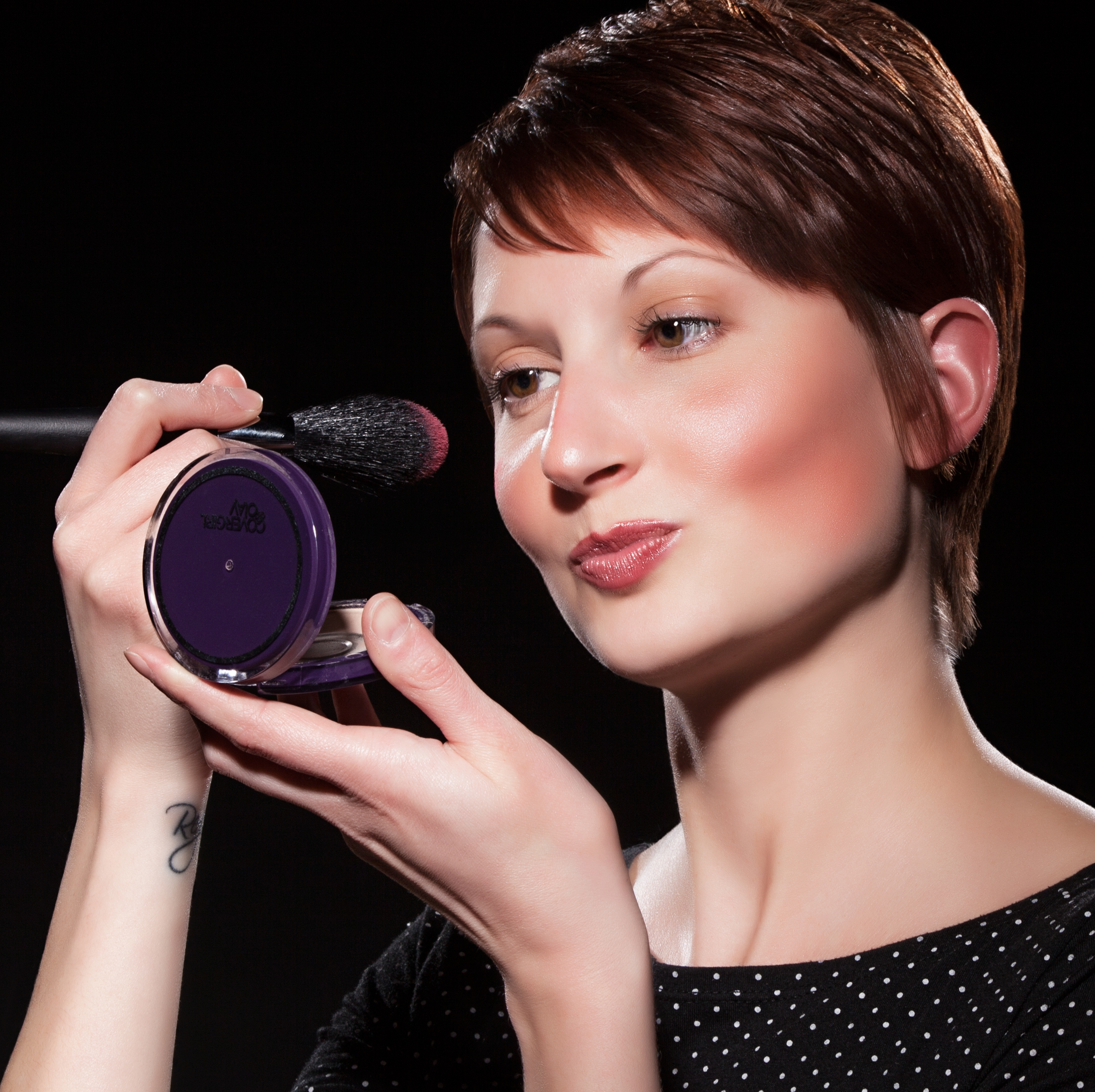
Day of the Dead Makeup by Studio 3 Digital Artist Carl Beery  — Studio 3, Inc.

After some digital makeup


Day of the Dead Makeup by Studio 3 Digital Artist Carl Beery  — Studio 3, Inc.

Liz’s portrait, before Carl got creative

This time of year evokes the spooky, the eerie, and the haunted: graveyards, ghosts, ghouls, haunted houses, and of course, skeletons. Studio 3 went all-out this year in celebrating, creating a beauty-meets-death digital art image evoking the traditions of iconic Day of the Dead calaveras makeup.

Known as Dia de los Muertos and celebrated for more than 4000 years among Meso-American cultures, the Day of the Dead is a yearly holiday that gathers family and friends to pray for and remember those closest to them who have passed away. Though called a “Day,” the celebration actually spans the triduum of Allhallowtide: All Hallows’ Eve, Hallowmas, and All Souls’ Day (October 31, November 1 and November 2, respectively). Though people in Mexico wear traditional skull masks to celebrate, the ritual has evolved here to include a highly artistic style of make-up design (the skeletal face of La Calavera Catrina: the icon of death in Mexico), combining stunning and elaborate face-paint with various flowers, beads and any other props. The skull makeup acts as the wearer’s mask to overcome fear of death, act recklessly and get up to the mischief that is forbidden at other times of the year.

Studio 3 Digital Artist Carl Beery created this Day of the Dead-themed calaveras makeup utilizing a photo of our very own Producer Liz Swales, shot by Photographer Jim Felt. As with all projects Carl approaches, he endeavors to solve a creative problem utilizing digital tools and incorporate the different source imagery into a single image in an aesthetically pleasing manner. Carl also strives to keep an open mind during source imagery searching, since at times there can be new resources discovered that take the image in a better and more cohesive direction. In beginning the brainstorming process he first went back to his roots of traditional artistry by printing out the source imagery and sketching design ideas over Miss Liz’s photograph. During further reference image searching, he came across some skull and flower vector graphics that begged to be used. He seamlessly integrated these with the photograph and added a sugar skull graphic to the makeup case as an interesting visual pun. Employing his color skills and emphasizing color guiding the eye through the canvas, Carl utilized a favorite palette of rich purples and golds to offset the white and black tones of the makeup. The resulting image celebrates the richness of the Mexican tradition, updated with whimsical modern graphics for a boldly irreverent feel.

If you’re wanting to create your own Day of the Dead makeup, there are many tutorials out there to get you all decked out La Calavera Catrina-style. Or you can just give us a ring and let our Digital Artists do it for you, Photoshop-style. Let’s hope Miss Liz won’t be up to any mischief this year!


Related posts:

Product Photography – Water Cartons

Posted on October 21, 2014

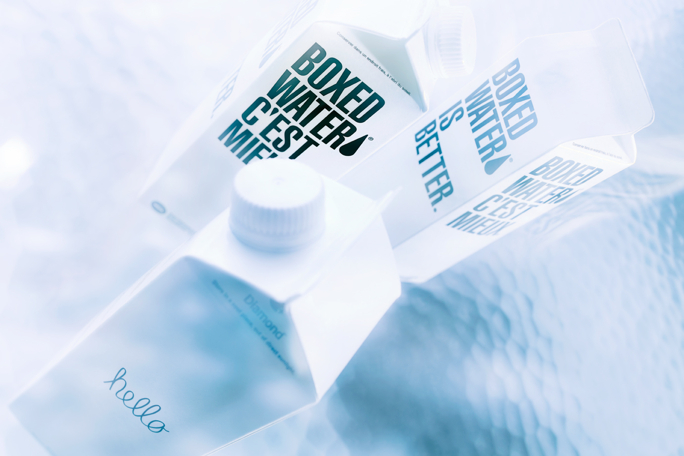
Water Carton Test  — Studio 3, Inc.When it comes to exceptional product photography, lighting is the essential in making the product come to life. Case in point: these simple, minimalistic water cartons begged to have the spotlight shone on their clean lines and stark contrast. The goal was to take something simple, and render it elegant and breathtaking with creating the perfect lighting setup. For the client, this creates a product that is new and sexy – elevating it to be slick, cool, and utterly covetable.  With the right lighting and direction we can make every product look amazing!
The choice of photographer was obvious. With a reputation as a maestro of light techniques, Craig Wagner is always able to attain optimal lighting to showcase products. The goal was to create the distorted water effect to the background in-camera, rather than digitally. To add interest and texture to the image, Mr. Wagner utilized a large sheet of rippled glass as the background from our extensive prop closet at the Studio. He kept the lighting simple, only using one 2000w Junior Mole, and redirecting it as needed with silver cards and a Mini-Mole as a kicker. Using the tungsten lights allowed him to drag the shutter for 4-6 seconds, during which he altered different parts of the image to create the visual wavy effect. Our post-production team adjusted the color temperature and saturation to achieve a flawless color tone, and the final beauty shot.

Producer: Liz Swales

Photographer: Craig Wagner

Digital Artist: Carl Beery

Equipment: Canon 5D MKIII w/ TS-E 45mm 2.8

Lighting: 200W Mini-Mole, 2000W Junior Mole (Key light)

Check out our other product photography, where the product sits center stage with lighting that highlights the unique attributes of each item. Then give us a ring so we can capture your product in the limelight.


Related posts:

Food Photography – Mac & Cheese Shoot

Posted on October 14, 2014

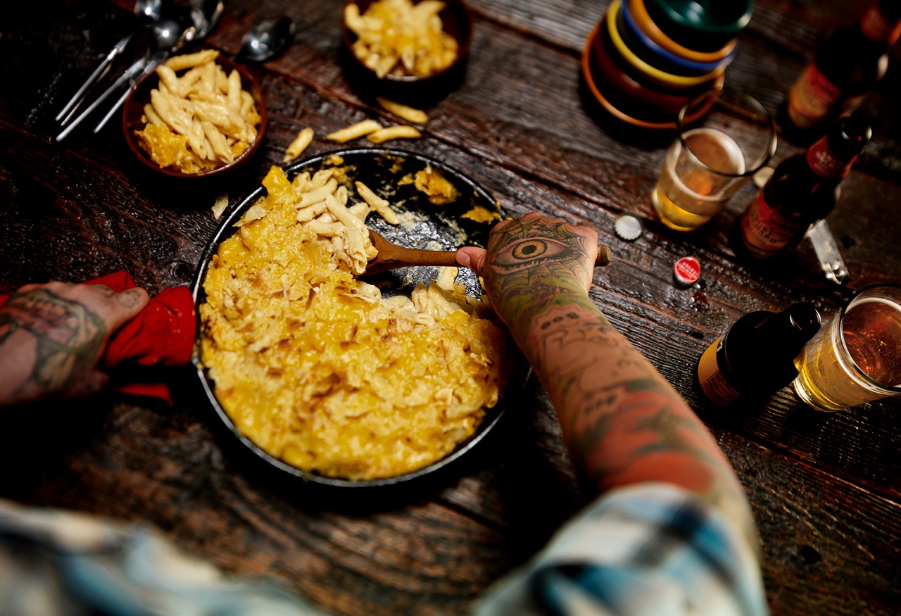
Mac n Cheese 0162  — Studio 3, Inc.This Mac & Cheese food photography shoot showcases the Studio 3 creative Team’s exceptional ability with food photography and food styling. The goal was to show the quintessential down-home comfort food (macaroni & cheese) in a cozy Fall table setting, creating a warm, family-inspired atmosphere. The color palette featured an array of rustic wood, reds, and yellows…but with a Seattle twist. A Thanksgiving with friends = a “Friendsgiving.” The resulting photo depicts a homey environment in a beautiful, relatable way.
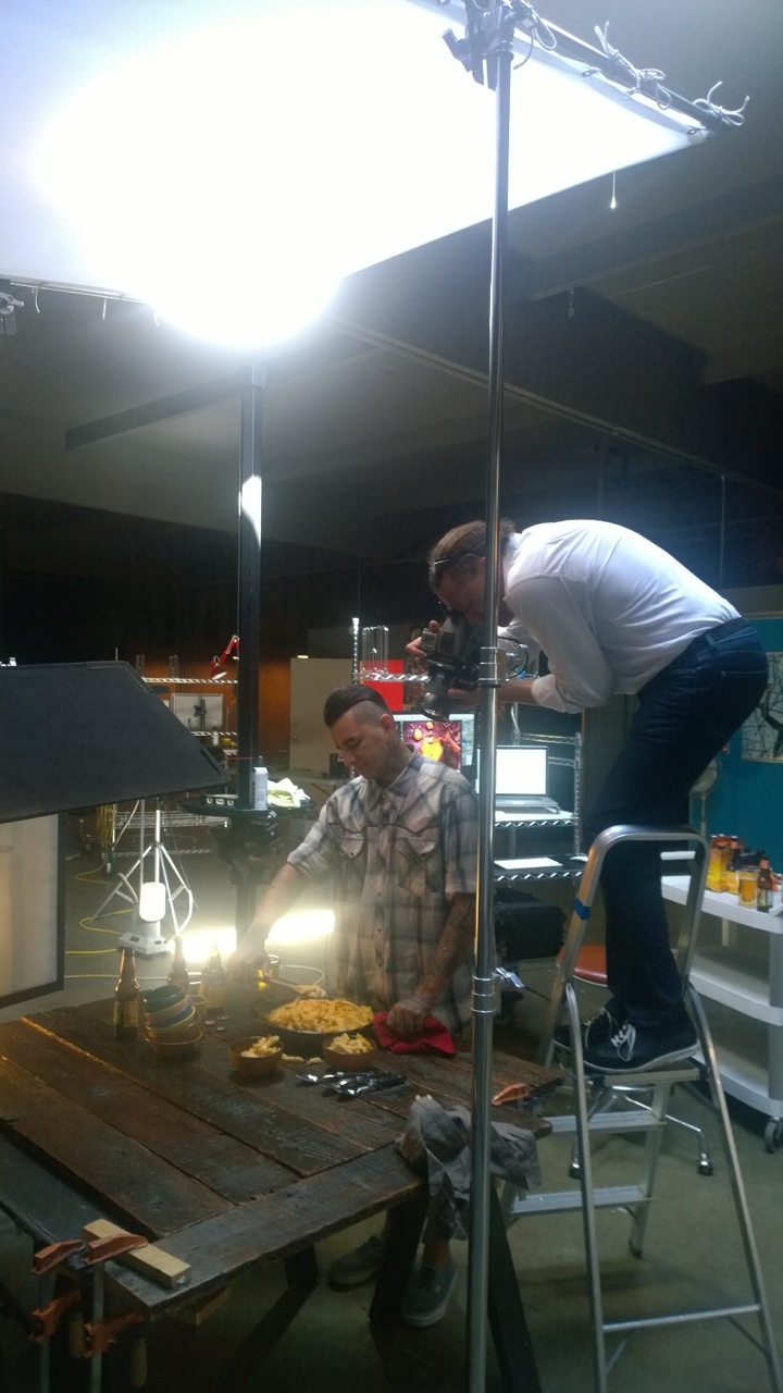
David Bell was the ideal choice as photographer for this shoot since creating a dark, moody atmosphere is one of his many skills. David and our fabulous Producer Ms. Megan spent half a day just working on the lighting and playing with the tilt-shift the week before the shoot. The tilt shift adapter is a favorite tool of Mr. Bell’s, allowing more control of the plane of focus. With this he was able to get the essential shallow focus to the shot, directing where the viewer looks. Due to the extensive lighting preparation once the model was actually on-set, the shoot was executed seamlessly within just 2 hours, making the model budget reasonable.

The team utilized an old cast iron skillet that had been loved for many years, and mis-matched bowls to give the sense of Seattle “found” goods. (It seems to be a recent trend in food photography and prop styling to have an eclectic collection of silverware, plates, bowls, glasses etc. instead of “matched sets” of everything – check out the latest issues of your favorite food and lifestyle magazines to see this in action!). In trying to stay authentic to the creative vision, we used the bowls as our (seemingly) random element and kept consistency with the silverware and glassware. Cider right now is the new beer (isn’t it, though?) and we have a BIG love for local ciders, so wanted to make that option available on our endless prop table. The request for a model with a hipster vibe took us visiting tattoo parlors instead of the normal modeling agencies. WP 20140910 14 18 31 Pro  — Studio 3, Inc.

Besides the food, the model’s arms were the most important element in the image. We needed someone that had interesting colors, patterns, and art covering their whole forearms, and ideally, with tattoos on their hands as well. (No makeup necessary!) We originally toyed with the idea of a woman serving the food, but thought that was too conventional. We settled on a rugged PNW (that’s Pacific Northwest for those of you not familiar with our local slang!) male with the perfect amount of unique designs, color, and composition to his tattoos. This edgy element really took the shot to the next level.WP 20140910 14 18 42 Pro  — Studio 3, Inc.

Food Photography Essentials in a Professional Photoshoot

*Food photography often has a short window of time before the food starts to cool off or look less than “appetizing.” Unlike other product photography shoots, there is a time-sensitive imperative to capture the shot quickly.

*Allow time before the shoot to extensively text lighting setups and prop styling. The more time spent beforehand on these details, the more efficiently the shoot can be carried out. (Time is money!)

*The Producer’s skills are essential in executing the shoot and in coordinating all the necessary logistics. Our Producer Megan Nolan has years of experience with Food and Beverage Photography, so is able to coordinate efficiently and effectively to capture that perfect shot.

Producer: Megan Nolan

Props: Megan Nolan

Wardrobe: Megan Nolan

Comic Relief & Prop Removal…aka eater of mac: Chris Eltrich

Photographer: David Bell

Digital Artist: Alex Gumina

Model: Michael Lopez

Camera: Hasselblad V-Series with a 35mm lens and the tilt shift adapter

Lighting: Speedotron Fresnel flash head

Check out more of our food photography here – but we’re not responsible if your mouth starts watering uncontrollably. And if you’re in the market for photography that makes your products, beverages, and food entice, give us a ring anytime.

Related posts:

Newer Posts
Older Posts