Happy Earth Day from Studio 3, Inc.

We not only create green brand campaigns for clients, we live them.

Earth Day is the world’s largest environmental movement, celebrating sustainability, environmental protection, and the green movement across the globe. Today, we celebrate the earthy efforts of our team and clients- highlighting six clients who put their green foot forward.

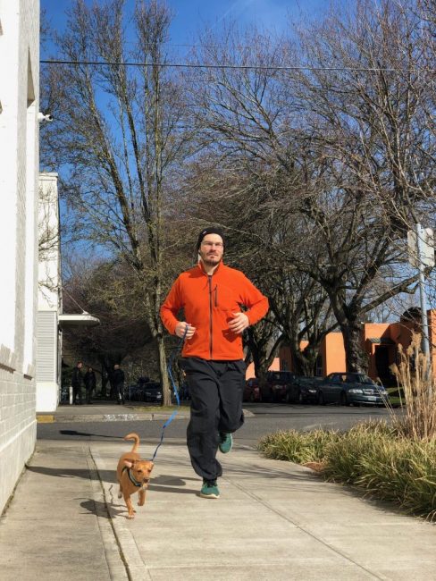
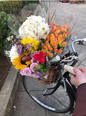
Working to reduce our ecological footprint our team jogs to work, takes the Tri-met and Metro Transit systems, and runs errands on our bikes.

Studio 3 TeamBike Portland

Many members of our team have adopted an eco-friendly plant-based diet, positively impacting the planet with each meal. Here are a few of our favorite neighborhood eateries: Sudra, the Slice Pizza Company, and Providore.

Meet the Studio 3, Inc Team

Studio 3 Service Day

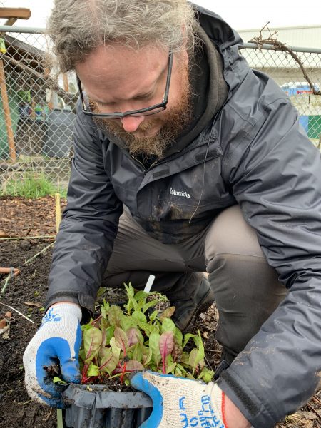
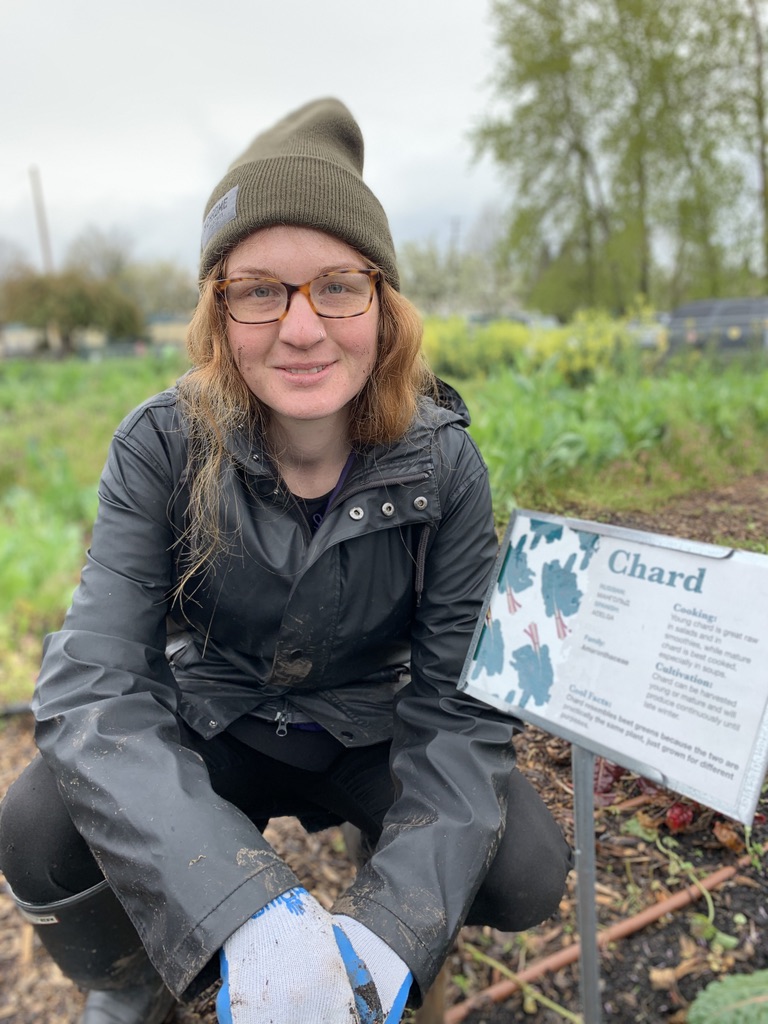
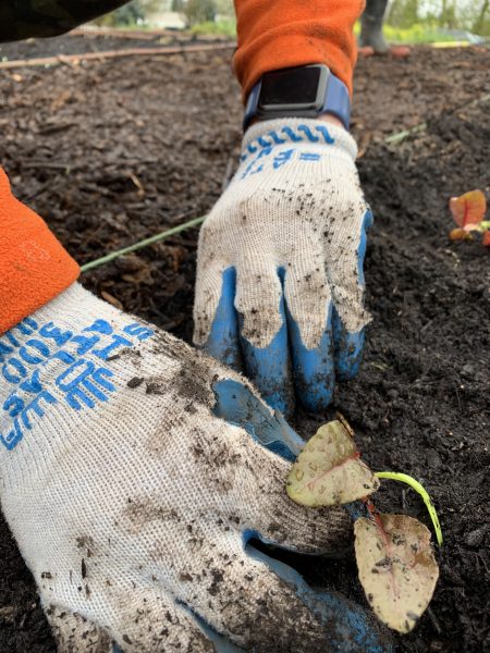
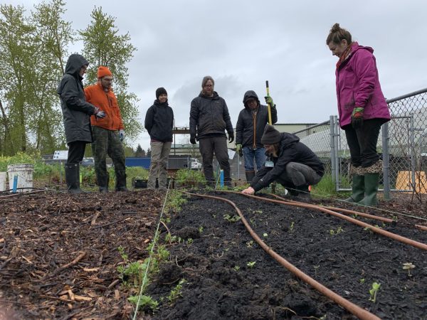
Each year our team decides on a service day to honor our community and environment. This year we volunteered at the Oregon Food Bank’s Eastside Learning Garden to dig in and work together on seasonal gardening projects. We prepped, weeded, and cleared garden beds to then plant rows of swiss chard. Go, team!

sFVJwrhGR+iZ3BxOSyvU5Q_thumb_64eIMG_0464IMG_0454

In alignment with our office values, many of our clients strongly believe in and practice social and environmental responsibility.

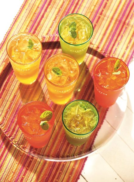
Stash Tea reuses and recycles packing materials in their shipping department while investing in renewable energy through the purchase of green power through Portland General Electric.

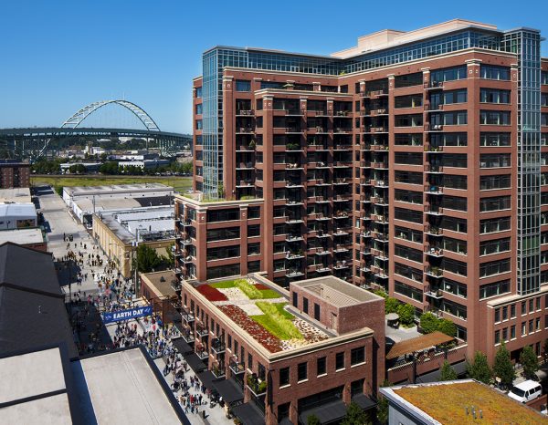
Have you heard of Ecoroofs?
HN_14645L_EnvironServices_b_SP_2

We captured Portland’s Ecoroof Program for Portland client, Environmental Services. These Ecoroofs replace conventional roofing with a living, breathing vegetated roof system. They save energy, reduce pollution, decrease erosion, and significantly lower stormwater runoff.

Other Studio 3 clients such as Costco, Amazon, Adidas, and Nike do their part to reduce, reuse, and recycle.

Costco understands that it has a responsibility to source its products in a way that is respectful to the environment and to the people associated with that environment. Our goal is to help provide a net positive impact for communities in commodity-producing landscapes, by doing our part to help reduce the loss of natural forests and other natural ecosystems, which include native and/or intact grasslands, peatlands, savannas, and wetlands.” – Costco Spokesperson

Amazon has installed rooftop solar on distribution warehouses and has implemented wind and solar farms in Ireland, Switzerland, and the United States.

HN_13826L_Bonneville_b_SP_1500Solar Panel

Adidas recently unveiled Futurecraft Loop, a running shoe that was made to be re-made. Adidas designed the shoe with 100 percent reusable TPU and it’s constructed with no other added chemicals or adhesives.

Nike started a Reuse-a-Shoe program which encourages its customers to recycle their shoes. The program accepts any brand of athletic shoes and grinds them into new sports surfaces. So far, 28 million shoes have been tossed in the shredder box.

We have entered the era of conscious consumerism.

In need of photography or videography for your farm, production, recycling, or shipping methods to demonstrate your eco-friendly side? Studio 3 will capture the greener side of your company. We’ll bring cameras, drones, and herbivorous snacks.

Happy Earth Day from Studio 3, Inc.
Creating Sunshine: Lighting, Props, And Backdrops

Here at Studio 3, we create warm summer days year-round.

Our amazing team brings sunshine and warmth to the office every day. Likewise, we bring sunshine solutions to your product photography with lighting, props, backdrops, and our digital media team. You bring the product, we’ll bring the summer-location your budget approves.

Product Photography Summer LightingProduct Photography Summer Lighting

Lighting and backdrops and props, oh my!

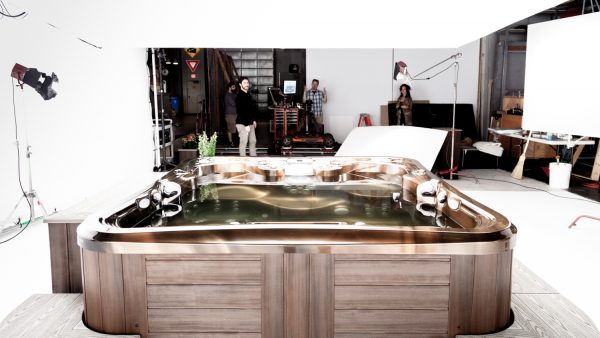
The most important technique our team applies to create sunshine for a photo is lighting. For example, one of our photographers, Craig Wagner, modifies and utilizes lighting at different angles to create specialized shadows and ambiance for your creative projects. Just call him walking sunshine. The key is properly spaced lighting to obtain the perfect shadow every time. High ceilings are used to our advantage for room sets creating that needed distance for a large subject like this shot for Marquis Spas.

Marquis Spa Behind The Scene Lighting PhotoMarquis Spa Photo In-Studio Lighting

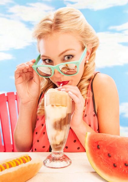
Our photographer’s crisp shadows and dramatic sunlight are not all we can provide in-studio. We also have amazing props and backdrops. The color and texture of the background add a sentiment to the photo evoking a mood. Backdrops can range from subtle soft colors to a crisp white or a seamless backdrop to create that sunny day.

In this photo, you can see how the backdrop, lighting, and various props tell a summer story on their own.
DJ_9118_RootBeerFloat_b_PO_1500Summer Lighting Photo In-Studio 

 Our Digital Media team:

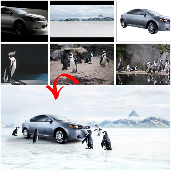
Along with our photographers, our digital media team create sunshine and warmth even on the rainiest days. For composite images, they combine multiple layers to create one beautiful and flawless scene. When putting together a composite image, one has to consider many different variables. The most obvious are the colors, placement, and size of different elements. As a result, these decisions will affect how, where, and in what order the viewer focuses their attention. 

CW_15609DA_1500_Fetch_Test_a_DA_1500

‘For this piece, I played a lot with the placement of the surfboard and boombox to make it feel natural, organic, and compositionally pleasing. Light and color also play a critical role in how a viewer responds to a piece and whether an image looks “realistic”. I wanted this particular piece to have a nostalgic, yet timeless vibe, and I think the long shadows and warm tones created by the sunset help convey this feeling.’ Lucio Barbarino Digital Artists at Studio 3

Rain or shine, the team at Studio 3 have your back to create that perfect photo you visualize for your brand. Give us a call. We would love to add a little sunshine to your day.

A Focus On Food: Our Tricks And Tips Behind Food + Beverage Photography

Most people don’t think about the way food is photographed – they think about how it will taste! But ask any professional photographer that has worked with food or beverages, and they’ll tell you that there’s a litany of tricks and tips to making food look delicious and distinctive. From Hollywood trickery to spatial geometry – we’ve put together a list of our own to help you capture your next meal with expert-level elegance.

  1. Choosing the right background for the food at hand

Not all surfaces and backgrounds are photogenic. And while others might be beautiful on their own, they still may not necessarily complement the food/beverage at hand. So, what are some factors to consider when selecting a background? Color is a big one. Ideally, you want to avoid overly-bright colors or busy patterns that will distract from your subject. A shiny surface probably wouldn’t be a good choice either. Using neutral or pastel color palettes can go a long way in making your food/beverage ‘pop’- in a similar way that a certain color might bring out a person’s eyes. For instance, if most food contains warm color tones, it might be a good idea to shoot against cool-toned surfaces to create a pleasing contrast. If you want to learn more about how to create ‘color harmony,’ check out this helpful article on the subject, which also includes some useful guides.
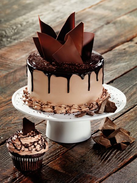
You can also use the background to express character, suggest a mood, or establish a sense of place. Here’s a photo taken by Studio 3’s very own David Bell, which showcases a delicious chocolate cake placed in a rustic environment. The flooring suggests farm-style, naturalism, organic ingredients etc., while the rich brown tones in the wood compliment the chocolate perfectly.     
9866_Judy Woods Flavor Right

  1. Knolling style – to use or not to use?

You may not be familiar with the term, but you’re definitely familiar with the style. ‘Knolling’ refers to this style of photography:
Screen Shot 2018-11-07 at 12.59.01 PM
Bright + even lighting, Birds-Eye point-of-view, and a meticulous arrangement of items. First popularized in 1987 by a janitor who would fastidiously arrange the various construction tools he found around the warehouse, ‘Knolling’ photography has recently taken over Instagram as one of the most prolific trends in recent years – and has also found a strong niche in food/beverage photography. It’s easy to see why: if executed correctly, Knolling photography has a unique way of making any subject look bold and dazzling – even if it’s just some popcorn. Right angles, clusters of color, and clean/crisp lines are the name of the game. An appreciation of image composition, as well as the spatial relationships between objects will help your Knolling photography soar.

  1. Using mist, glycerine, and other fakery

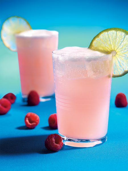
Want that ultra-fresh, dripping condensation look? Simply hit your glass with some mist! Or even better yet, many professionals will use Glycerin to the same effect. It gives your food/drinks a cold, fresh look, which in turn makes them appear more delectable. This is especially true of foods like fruits and veggies. If you see food in photographs looking wet or frosty, then you can bet your top dollar that glycerin was used! Think of your classic vending machine: can you picture those big water droplets rolling off a cold can of Coke on the front image? Yup, that’s either mist or Glycerin.
CW_13672_Imbibe_a_FD_1500 (1)
If your image requires ice, we highly suggest the use of fake ice cubes. Obviously, real ice melts, thus requiring frequent re-sets, which can take time and money away from your project (and also make a mess!). If you happen to be using glass, real ice will also cause significant fogging, obscuring your subject even more. These are just a few of the reasons professional photographers have embraced the use of fake ice and other perishable food prop replacements.   

  1. Styling: Paint, pins, and putty

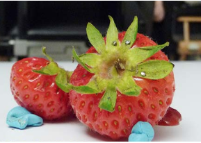
Screen Shot 2018-11-07 at 1.00.32 PMIt takes a fine touch. There are countless cosmetic steps food stylists can take to improve the overall quality and composition of your food/beverage photography. Remember, we’re not actually serving the food, so no need to shy away from using un-edible items to get the necessary shot. Metal pins, for instance, can be used to hold food in place if you want to display the perfect balance of ingredients without them falling over. Photographer and food stylists will also use non-stick putty to the same effect, like so:
Screen Shot 2018-11-07 at 1.01.08 PM
Ultimately, it’s about arranging and styling your subject to maximize it’s photogenic potential. Is your food stackable, or should it be fanned out, serving style? Does your subject have green stems? Should a side dish be included? What about some unique serving flatware? You can even utilize acrylic paint to boost colors, cover up blemishes, and even create patterns if desired. Get creative here! Like any good dish, there is a lot more to the finished product than merely the sum of the individual parts. It’s about how they all interact!
Here at Studio 3 Inc., we not only specialize in food and beverage photography, but also portraiture, lifestyle, sports, and product photography. Since 1974, we’ve been making your photography dreams come to life! Partner with us for your next creative endeavor, and see just how we stay inspired.
 

Our Process: From Start To Finish With Studio 3

 
DA_15622DT_Lexus Fish_DA_1500
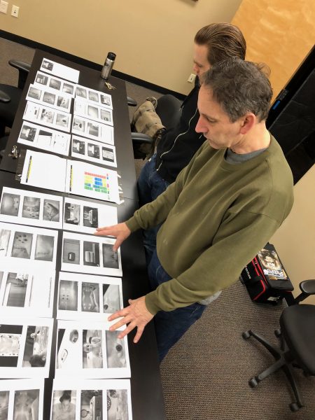
When Studio 3 begins a photography or branding project, our first step is to sit down with the client and dream up ideas. Collaborating on a concept might involve a handful of approaches, depending on the project at hand – anything from examining examples of similar work, creative brainstorming with our in-house team, and establishing a shared visual language using Style Guides, Mood Boards, or Pinterest. Below you can see an example of what a typical brainstorming session looks like at Studio 3.
IMG_5522Once an idea is hatched, our Producer-Extraordinaire Eva Goldfarb kicks it into high-gear – scheduling stylists, organizing set builds, balancing budgets, and handling any propping/costuming as needed. This work frees up our clients and photographers to stay in a creative mindset, and not get caught up in the operational details of the project.
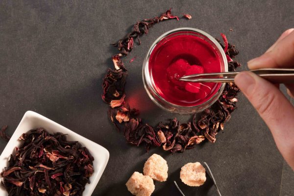
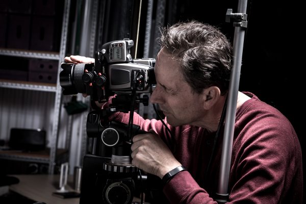
15611T_Tea TestOnto the shoot! Photographer Craig Wagner is among the best photographers in the Northwest – and has been with the studio since the early days. Forever perfecting his craft, Craig does what it takes to get the perfect shot – even if it means inventing a new piece of equipment specifically for the shoot at hand.   

15463_Production Stills_029
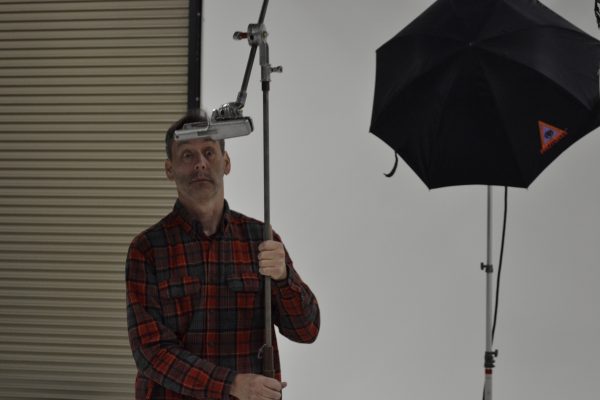
We have a good time on set

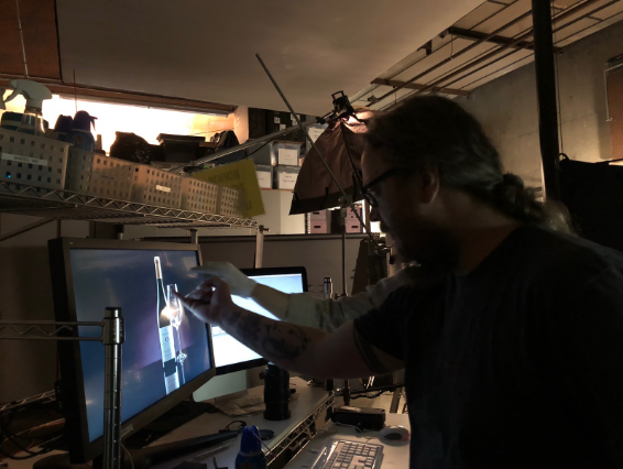
_DSC0489Lastly, our Digital Team steps in and works their magic.  The processes of Color Grading and Digital Retouching are extremely intricate – just ask Sean Yates, one of our in-house Graphic Artists:

Screen Shot 2018-10-01 at 12.57.56 PM

“Color and clarity are of central importance when retouching images. …We always strive for and deliver accurate color.”

In reality, the Digital Team does a lot more than just retouching:
pjimage copy
 
Finished product:
CW_LanternMoon_CL_1500
And that’s not the end! Studio 3 partners with the same clients year after year because they love the end result, and appreciate the creative relationships formed. We take the utmost pride in these collaborations and are always striving to bring something new and exciting to the table for the next shoot. Give us a call today, and find out how Studio 3 can help elevate your brand with the coolest+catchiest photography in the Pacific Northwest.
 

Tis The Season For Client Comfort

The hustle and bustle of the holiday season; To-do lists unroll to the floor, coffee is taken through IV drips, and the studio always vaguely smells of cookies.

Tray Of Cookies
During the holiday season we understand you would rather be at home with a book and warm cup of Stash Tea, so we have done what we can to bring the cozy here.
Cue the elves (aka Studio 3, Inc.’s production team,) sit back, relax, and let us make your photographic dreams come true.
Holiday2
We have decked the halls, strung the ornaments, and lit the client area with holiday cheer.
The Studio 3 Inc. creative team not only does whatever it takes to make your project a success, we do it while feeding you cookies and telling you jokes.
…We have even been known to have Fashion Santa drop by every now and then (We know him!)
Production Stills_9024VL_197
Our studio is equipped with ample snacks, coffee as strong as our wifi connection, tea, any magazine you could dream of, and a crazy amount of crayons for the kid in you.
There are multiple conference rooms available for those times when you just need to be alone. Client meeting, business call, or impromptu dance party; We’ve got you covered.
Production Stills_9024VL_178
We pride ourselves in providing a comprehensive client experience. Not only can you expect top of the line photography but also a welcoming work environment, great food, and even better company.
Drop us a line, let’s talk photography! We’re here 24 hours a day, it feels like, but let’s say 9-5. We can’t wait to work with you.
Happy Holidays!!

Let's Unpack This: A Look Inside Studio 3's Location Lighting Kit

When shooting lifestyle or product photography on location in the Pacific Northwest you rarely know what you’re going to get. The rain gods in our home states of Oregon and Washington are prevalent and powerful. Deluge or mist, the Studio 3 team arrives on location prepared for anything.
How do we juggle variously lit environments, keep a tight timetable and budget, and still exceed our client expectations? Experience. We have perfected our method in the madness that is this glorious industry.  Now, thanks to the Internet and the power of social media marketing, we are able to share some of that wisdom with you.

What does the Studio 3, Inc. team need to create beautiful photography on location, you ask?

Be it a location shoot for Danner Boots, ShedRain Umbrellas, Amazon, or Kaiser Permenante our fail-safe location lighting kit includes;

  • Radio Slaves
  • 3 Lighting Stands
  • 3 ft. Soft box
  • Medium Umbrella
  • AA Batteries
  • CTB Gel
  • CTO Gel
  • Light Meter

This minimalistic kit is best used for atmospheric, lifestyle, and commercial work.
“[This lighting kit] is best used in situations where your key light is the light already available. When working on location you’re supplementing available light with the strobes you bring with you. An important part of that is to match the color temperature of that available light—we do this using gels [CTB or CTO]. This allows you to separate your subject from the background and really focus the viewer’s attention on the product. ” – Joshua Romberg, Photographer
In need new lifestyle photography for your next campaign? Give us a shout; we’ll get the gear.

Who Runs Our World (Liz)

Studio 3, Inc. Producer, Liz Swales, is the driving force behind our photography magic. It’s truly amazing what all she can get done in a day. In order for all of you to get to know a little bit more about our Top Boss, I sat down with her at the Portland studio’s neighborhood tea spot, The Jasmine Pearl Tea Co.
OLYMPUS DIGITAL CAMERA
What do you look for in a photo?
“Overall composition; different angles, dimensions, lighting—something out of the ordinary. I always check highlights, styling, and color tonality but ultimately if a photo makes me feel, its good. ”
What is one thing from your Interior design training that has stuck creatively?
“Everything in design should be odd numbers. Always go odd.”
OLYMPUS DIGITAL CAMERA
What is your favorite thing about your role as Producer?
“Seeing the result of everyone’s work… from beginning to end. It is a cool process and one that only I get to see [come to fruition], whereas everyone else just plays their specific roles. I love delivering the final images to the client and getting their positive feedback— “Awesome! You guys are awesome!” or “Thank you so much Liz, your crew is great to work with.”
Marquis shoots are really fun to produce. Showing up to the shoot and realizing Oh! I did that. I got the forklift, the model has arrived, the crew is working hard, the set is beautiful and the props look amazing. Seeing it all happen from beginning to end is a rewarding process.”
Read more about the production behind a Marquis Spa commercial here.
Liz On Set with Marquis Spa

“Our top boss, Liz Swales! She oversees and schedules the organized chaos and somehow (probably magic) is able to orchestrate the entire production seamlessly.”

What is one difficulty in your current role that you did not expect?
“I have an eye for design and how things should be placed and layered, so when I was told I would be doing a lot of propping and styling, I thought, cool this will be fun and easy! But it’s not. Propping for the camera is completely different than interior propping. Things look like they are touching when they aren’t, colors don’t look good together, and balance can sometimes be hard to accomplish. Oh, and prop shopping is whole different kind of shopping. Let’s just say get 5-6 options of each item that you think you will need. Over shop, because you never know what the perfect item will be for the perfect image.”
What Studio 3, Inc. Image are you the most proud of this year?
“The top-down drink photography shot of GT’s Kombucha that I made with [Photographer] David Bell. Its something I would see in a magazine and think, “That’s beautiful.”
DB_9043T_Kombucha Drink Test_c_FD_1500
What is your favorite problem-solving tool?
“There’s a lot to be said for just a note pad and pen. I write things out, make diagrams. Before I do estimates I draw out how the job would go to make sure it makes sense or see if there is another way that would be better.”
How do you unwind?
“At the beginning of this year I realized I work a lot. At all hours of the day and night. All I was doing was working.
Don’t get me wrong, I love my work, but I needed to catch up on all the movies and TV shows my friends were watching. Just kidding, but I decided to make a change.
So at the beginning of the year I started doing yoga and Nia. It relieves stress and provides a physical break in my day. I go every day after work and afterwards I do not work any more. ”
LIZ-01
What do you predict will be the biggest change in photography over the next 10 years?
“Virtual reality. People will want to interact with a product virtually before buying it. I think it will become a role within the studio, like our in-house digital team.”
Evolving with the photography, videography, and retouching business over the past 40 years we have picked up a few tricks. Possessing studios in Seattle, WA and Portland, OR, our ability to meet the needs of our clientele is second to none, especially when you factor in our in-house digital team, producers, stylists and assistants at the ready. We take care of it all, so you can kick back, relax, and watch as we make your creative ambitions come to life.
 

Brand Identity; Telling YOUR Story Through Photography and Video

In an era of constant online noise, brand identity becomes quintessential. Customers are seeking not only quality, but also an authentic buying experience; the real people behind the business. They are seeking companies with similar values and lifestyles as their own.
How do you build an unmistakable brand identity? How do you tell your story? Whether you are creating a new ad campaign, or updating your catalogue’s product photography, every image should speak to your customers.
Once you have defined your brand, you can begin to effectively market it. That’s where we come in. Studio 3, Inc. works with you to create personal visual solutions. We show the world how awesome you are.
Let’s take a closer look at how different photos craft different emotional responses. In other words, what your photography is saying about your brand.
1.   Your Colorways; Cool vs. Warm
View over Side of Boat
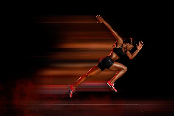
Colors evoke emotion. Cool colors calm, while warm colors educe action—like this photo for Nike that encourages me to get out of this chair and go for a run.
Nike Athlete Running
2.   Your Lighting; Studio vs. Natural
Whether your image is sun-soaked or sleekly structured, the quality can’t be compromised.
Glass of Whiskey with Ice Dropped In
This beautiful cocktail shot for Seattle Magazine is captured with a splash! Inspiring thought on what a customer should do next (hint: buy some whiskey). Need help deciding? Here are Five new Washington Whiskeys to Try.
Two Smiling Women Drinking Coca-Cola
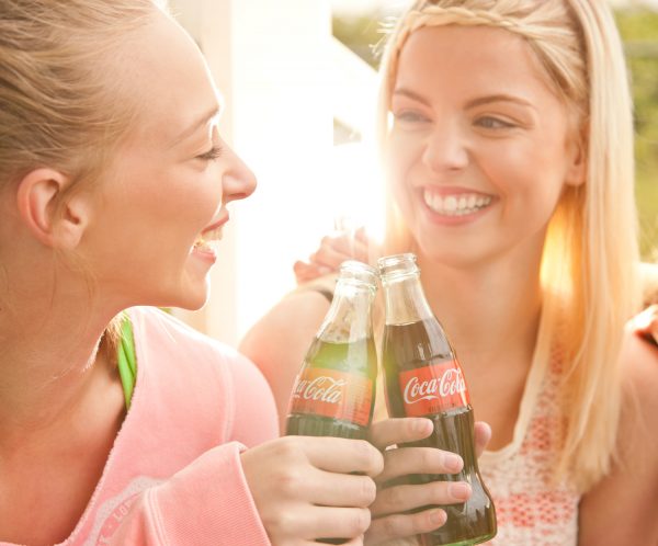
Embracing the brand identity of Coca-Cola, natural lighting was used to flood the scene with a sense of summer. Now that’s affective lifestyle photography.
3.   Your Audience; Outdoor vs. Luxury
Who is your target market? What do they value? Creating environments for your product takes target market research.
Hiker Wearing Danner Boots
What better way to appeal to Danner Boot’s outdoor customer, while staying true to the Brand’s value of craftsmanship, than to put their boots to the test in the Pacific Northwest.

“Hold a Danner boot in your hand and you’ll notice the hand crafted precision. Try it on and you’ll feel the difference. Test it against the elements and you’ll appreciate the value of a product that is built to last.”   -Danner, Since 1932

Jimmy Choo Red Shoes
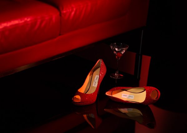
However, when your marketing luxury like Jimmy Choo, the environment changes with the contrasting brand identity.

“A 21st Century Luxury Accessories Brand, with shoes at its heart, offering an empowered sense of glamour and a playfully daring Spirit.”   – Jimmy Choo

4.   Your Appearance; Organic vs. Styled
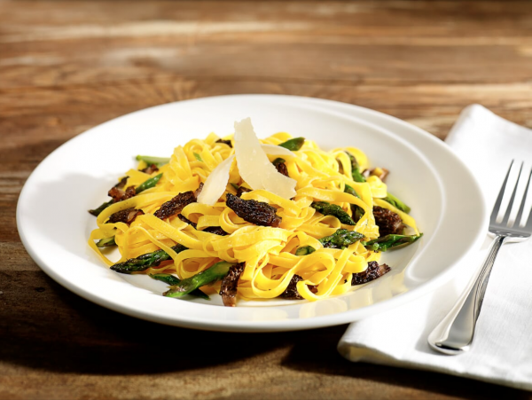
Cook Making Pasta
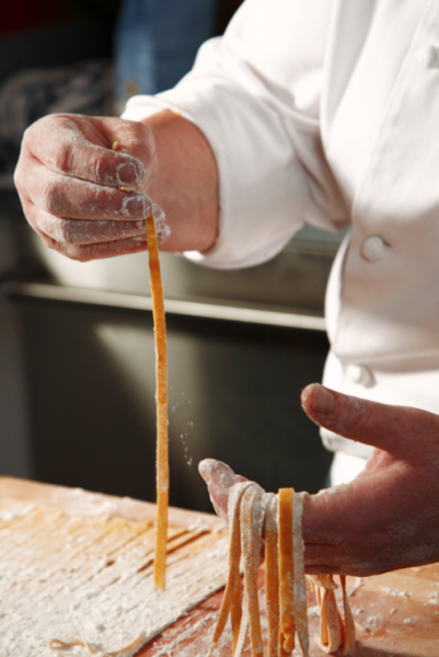
Are you showing a process or presenting it’s end result? As brands and agencies move towards targeting the holistic customer, we see the shift manifest in an increase of lifestyle photography… And that’s in addition to the perfect product shot, 360-degree spin, and detail so good you can almost feel it. It’s a comprehensive marketing approach. You are your brand, and we are your people for all things photography, videography, and retouching.
Plate of Pasta
5.   Your Quality; iPhone vs. Professional Photographer
If you think it’s expensive to hire a professional, just wait until you hire an amateur… said a brilliant person. After meeting with a client, and doing a little research on their product, we stumbled upon this brilliant blog post that couldn’t say it any better.

“It’s amazing how big of a difference having really nice pictures of your space can make. A few months ago I ran an informal experiment (as research for another project) where I listed my apartment for rent on craigslist. They were both the same price, in the same area. One listing had really nice pictures taken with a high quality dslr and wide angel lens and the other had badly lit pictures taken with my iPhone. The listing with the nice pictures got 10x the emails.”   – Jon Wheatley of Need/Want

Maybe it’s obvious, but maybe not. In today’s digital age everyone has a camera in their pocket, and iPhone 7s are promoted as so good they can be used for magazine covers and advertising (We won’t name names). We are bombarded with mediocre images… like this production still that I took versus Craig Wagner’s beautiful image masterfully finished by digital artist Michelle Smith. See the difference?
[image-comparator left=”https://studio3.com/our-blog/wp-content/uploads/2017/08/IMG_1799.jpg” right=”https://studio3.com/our-blog/wp-content/uploads/2017/08/CW_15468T_Draft_Day_c_DA_1500.jpg” width=”100%” classes=”hover”][/image-comparator]
Regardless of the project or scope, Studio 3, Inc. works with our clients, building relationships and crafting the perfect image for their brand. If you have yet to work with us, what are you waiting for? Drop us a line, let’s put our heads together to create something beautiful.

I Have a Therapist, Her Name Is Nature

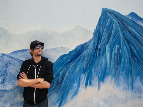
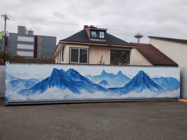
Studio 3, Inc. has commissioned a new tourist attraction in the shadow of the Space Needle. When we’re not moving mountains for clients, we are painting them. With artist and mountain-man Trace Gough’s mural, we have brought a bit of the PNW beauty to our own backyard. How is that for the highest quality visual solutions? Come by, check it out, and while you’re here let’s talk photography, videography and retouching.
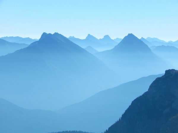
“The mural is my interpretation of a photo taken while climbing in the Cascade Mountain Range. The photo was taken very early in the morning, from a high camp near the Neve Glacier in North Cascades National Park.  I’ve been all over the Cascades, and this is hands-down one of the prettiest places, though laborious to get to. There was a layer of haze hanging in the valleys to the north.  “ – Trace Gough, Artist

10540694_861590417184306_9110136454327137472_o (1)
Inspiration Image photographed and painted by Trace Gough @Studio 3, Inc.

 
Transforming a storage container into a mural in 7 easy steps:
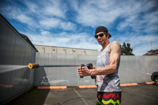
Step 1: Power washing and prepping the storage container, or “the can” as we at Studio 3, Inc. fondly refer to it.
pressure washer
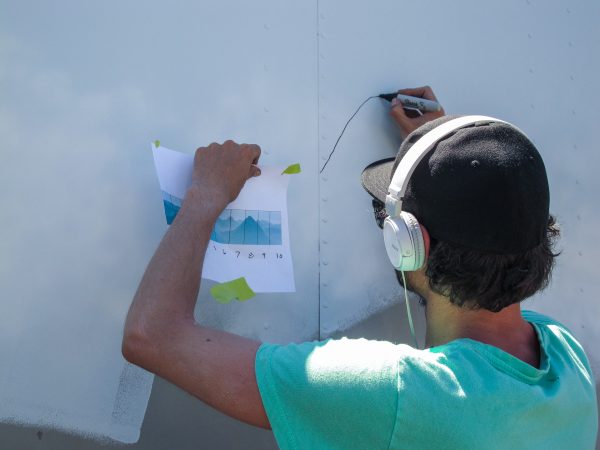
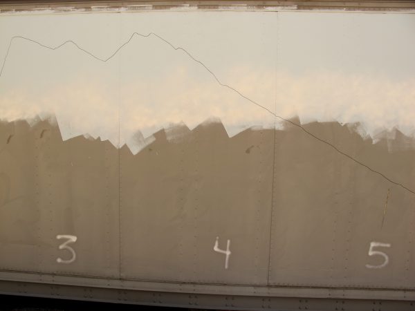
Step 2: Use the Grid Method to enlarge the reference image onto the scale of your surface.
Outlining Mountains
Step 3: Outline the mural in sharpie or paint.
Mountains Outlined
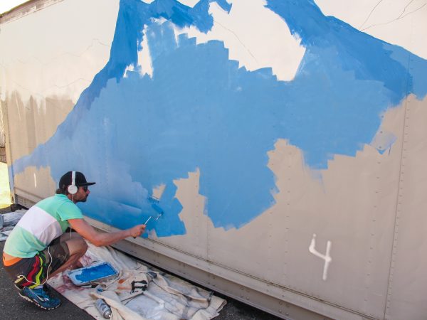
Step 4: Start from the back, painting first the sky, then the mountains.
IMG_6119
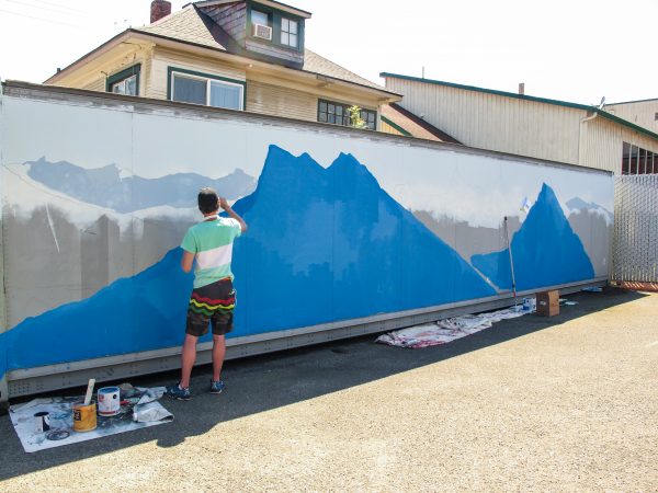
Step 5: Gradually get darker as you paint your way forward, creating depth of field.
IMG_6123
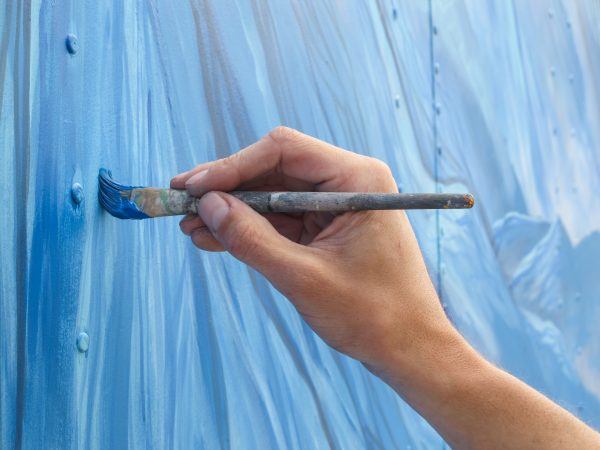
Step 6: Save the details for last, enhancing the “wow” factor with textured ridges and moody clouds.
IMG_6219
Step 7: Step back and admire your work, you’ve just created a masterpiece.  (Now if only we could paint that house in the background).
Trace Gough and Mural
Finished Mural